Chapter 3
Building your maze with Blocks
In this chapter, we look at the building blocks available to collect qualitative and quantitative data from your users.
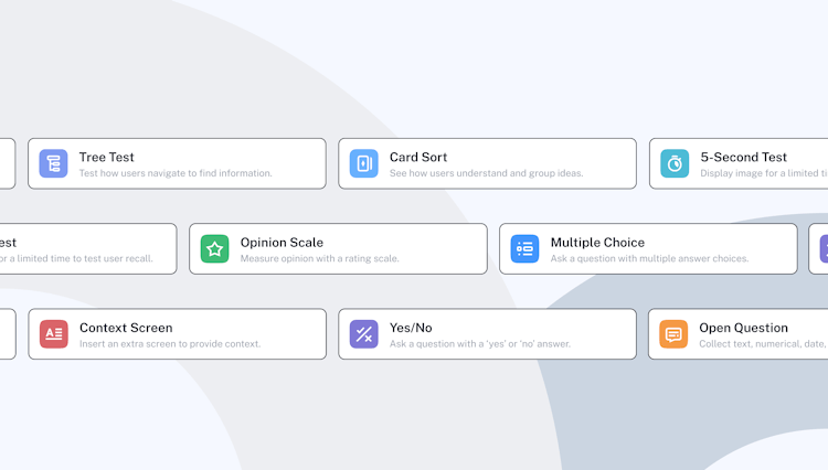
Question Blocks
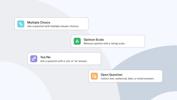
There are four types of question Blocks you can add to your maze:
- Open Question: collect open-ended text feedback or dates, numbers, and emails from users
- Multiple Choice: allows users to multi- or single-select answers from a list and gives you quantitative data on preferences
- Opinion Scale: gather data points about users’ opinions with a rating from zero to 10
- Yes/No: get closed-ended replies to a question where the answer is either ‘yes’ or ‘no’
Question Blocks
Add a mixture of open and closed questions to develop a range in qualitative and quantitative feedback. The quantitative (like a Yes/No block) will make it easier to analyze insights, but the qualitative (like the Open Question block) will add context, opinions, and the ‘why’ behind the data.
Adding Opinion Scales brings a visual element to your results, where you can encourage users to rate their feelings on a numerical scale or through a star or happiness rating.
Multiple Choice questions will help you control the range of answers and also removes the analysis and grouping that comes with breaking down Open Questions, providing clarity across user results.
Good to know! 💡
For Open Questions, you’ll be able to choose which answers go into your maze report. For Multiple Choice, Opinion Scale, and Yes/No questions, you can read individual replies and view the aggregate results for each question.
Context Screens
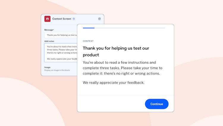
Context Screen
Adding a Context Screen to your maze enables you to engage customers and provide instructions at the start and throughout the test. It’s a great way to communicate with your testers during their session!
Add a Context Screen block from the list and create a title and description informing the user of the additional information you’d like to provide. You can upload an image for additional context, giving testers reference to the product, asset, or copy you’re testing.
Using the text fields you can provide an example of copy you’d like to test or simply provide some more context to the questions that will follow. Be creative here and make the test as easy to understand as possible!
Get first impressions with 5-second Tests
A 5-second test is a great way to understand the impact of your messaging, design, and copy. You can easily test user recall, measure what information they take away and understand what impressions they get within the first five seconds of viewing a design.
Select the 5-Second Test block from the list and import an image to display to users. This could be a landing page, website homepage, app screen, and the like.
If you’d like to, you can adjust the duration of this block and increase it up to 20 seconds. Depending on what you're testing, your users might need more time to absorb what you’re showing them.
Test information architecture with Tree Tests
Running a Tree Test enables you to test navigation branches before you’ve designed them, which means your designers and product team are armed with valuable information on the solution before they start working on it.
Add the Tree Test from the list of Maze blocks, add a title instructing the user to take an action, like ‘Unsubscribe from marketing emails’, then create a tree structure that reflects your site or product structure. Users will then navigate through the structure as they see fit and you can analyze the paths they took.
This will help you understand if your labeling makes sense and whether your content is grouped in the way users would expect. A great block to validate ideas early on for the foundations of your IA structure.
Learn how users group information with Card Sorting
Giving users a card sorting task helps you understand how they categorize and understand information. Perfect for learning how to optimize groupings inside your design.
Choose the Card Sort block from the list of Maze blocks, add your card titles and at least two categories. This will let users sort cards into the categories they see fit. Perfect for when you want to understand where users expect certain content to be found, gathering inspiration for labeling or grouping content, or validating how users perceive information.
Tip 💡
You can shuffle the order that your users see cards, this helps remove any bias that may occur.
