Chapter 8
Using heuristic evaluation to find and prevent UI and UX usability mistakes (+ free checklist)
Heuristic evaluation in UX is a systematic assessment to determine if your user interface is fit for use. Heuristics themselves are the predetermined, recognized usability principles that usability experts use to guide this assessment, and these UI principles (heuristics) will vary depending on your product and its mission.
This usability inspection method, also known as heuristic analysis, is typically performed by someone with extensive UX/UI knowledge. It aims to highlight any usability issues relating to the user interface (UI); enabling designers to decrease user time to value and create more intuitive products for end users.
In short, heuristic evaluation should be at the top of every UI-build checklist.
What are the Nielsen heuristics for user interface design?
The most commonly cited heuristics are Jakob Nielsen’s ten heuristics for user interface design.

But these aren’t the only heuristics available to you—similarly to how you have different recipes for the same dish, the 10 heuristics developed by Jakob Nielsen are just one set of usability heuristics.
Some other usability heuristics to consider include:
- Ben Shneiderman’s eight golden rules of interface design
- Jill Gerhardt-Powals’ ten cognitive engineering principles
- Weinschenk and Barker classification
- Alan Cooper’s About Face 2.0: The Essentials of Interaction Design
There are also many inspection methods for heuristic evaluation:
- Heuristic analysis
- Cognitive walkthrough
- User testing
In this chapter, we’ll cover the basics of heuristic evaluation, how it helps you spot and fix UI issues, how it compares to usability testing, and how you can conduct your own evaluation.
With our free customizable checklist, you'll have everything you need to refine and improve your user experience like a pro.
When and why should you conduct a heuristic evaluation?
Heuristic evaluation is a quick way to find big design problems, ensuring your products and experiences are easy to use right from the start.
A thorough heuristic evaluation can:
- Help build a more inclusive product for a more diverse audience
- Reduce your product’s time-to-value for new users
- Help fight churn rates by delivering a more intuitive learning curve
- Increase NPS by giving users more control over the product
- Minimize tickets for your customer support team
- Reduce the number of product iterations by getting things close to perfect quicker
8 Times you should conduct heuristic evaluation:
Unlike other user testing methods that require real users, your internal UX team can handle heuristic evaluation. This flexibility makes it easy to run heuristic evaluation at various stages of the product design process, especially in the earlier phases.
During competitor analysis: This strategic evaluation highlights what competitors are doing right or wrong from a usability standpoint, giving you insights and opportunities for differentiation.
At the start of the design phase: Conducting heuristic evaluation allows you to identify potential usability issues before they become deeply embedded in the design. It enables you to align your foundational designs with usability best practices from the get-go.
When you’re facing budget constraints: Heuristics offer a high-level overview of usability at a fraction of the cost and time of extensive user testing, making it an efficient use of limited budgets.
Before product launch: This checkpoint ensures any last-minute design changes haven't compromised the user experience. It's a final walk-through to catch any issues that might have been previously missed, or introduced late in the process.
After design changes: Whenever major updates or redesigns are applied to a product, you need to reassess its usability. Heuristic evaluation at this stage helps quickly evaluate the impact of these changes on the user experience against previous heuristic benchmarks.
As part of periodic usability audits: Regular evaluations help keep your product's usability in check, and ensure you adapt to users' evolving needs and expectations. Consider it routine product maintenance so everything remains in top condition.
In response to user feedback: Direct issues raised by users can be systematically addressed through heuristic evaluation. It allows you to focus on specific areas of concern and implement solutions grounded in usability principles.
For cross-platform consistency: As users often switch between devices, you need to maintain a consistent user experience. Evaluating each platform ensures your product delivers an intuitive experience, regardless of where it's accessed.
What is the difference between heuristic analysis and usability testing?
While both usability testing and heuristic evaluation provide usability data points for product teams to act on, the two methods for gathering insights are very different.
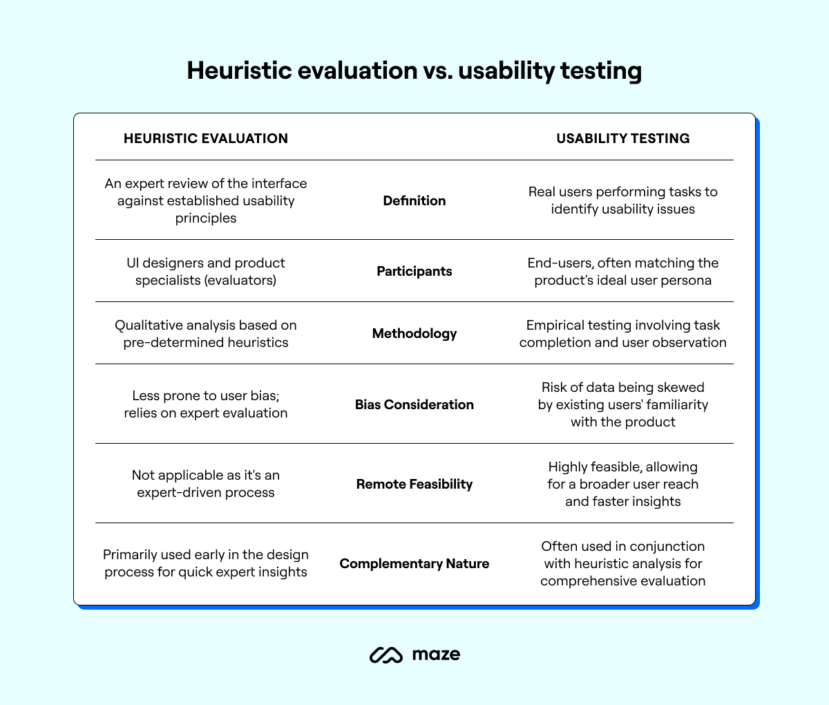
Usability testing is completed by the end-user—often the ideal user persona for your product. User testing asks real people to complete a list of in-product tasks to assess the ease with which they complete them. Researchers can conduct usability testing remotely or in-person, and it helps identify issues that real users face when engaging with your products. Remote usability testing is common in today’s world as it enables product teams to reach a broader spectrum of users and get their user testing done faster.
One reason product teams may opt for heuristic evaluation over user testing is that—when running usability tests or guerrilla tests, with existing users—you may end up with skewed data, as current users have too much context around how the product works, what you’re looking for, and may aim to please or fall under social desirability bias. This often gives an inaccurate idea of an objective or first-time user’s perspective.
In comparison, heuristic evaluation is completed directly on the product (human computer interaction) by UI designers and product specialists (known as ‘evaluators’ in this process). These people have a solid understanding of product development, user psychology, and heuristic evaluation—they are not, however, end users. These evaluators examine a product’s interface and assess its compliance with pre-determined heuristics.
We spoke to Senior UX Lead Designer at Foyer Group, Geoffrey Crofte, to get his definition on the difference:
Heuristic analysis is a method of evaluating usability by an expert, while usability testing is a method of evaluating usability by observing real users interacting with a product. Both are complementary tools to make better interfaces and products.
Geoffrey Crofte
Senior UX Lead Designer at Foyer Group
Share
Heads up 💡
Looking for more ways to test the usability of your product? Try these usability testing templates.
How to conduct a heuristic evaluation for a holistic usability assessment
We spoke with Geoffrey about how he approaches heuristic analysis. These are the eight steps he shared to conduct a complete UX audit.
1. Choose a set of heuristics to use as a guide
There are several sets of heuristics available, such as Jakob Nielsen's 10 Usability Heuristics, Bastien & Scapin’s Heuristics or even the ISO 9241-110 standard. Choose a set of heuristics that are relevant to the user interface design being evaluated, or select your own.
2. Gather a team of evaluators
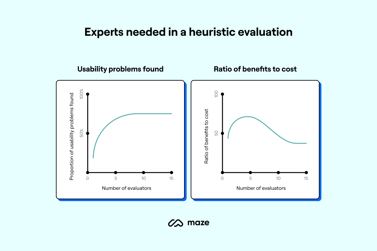
If you have the chance to use more than one evaluator, seize it. It’s often helpful to have a team of evaluators with different backgrounds and perspectives to ensure a thorough and diverse evaluation.
Jakob Nielsen found that using just one evaluator might help discover only 35% of usability problems. When you bring more evaluators into the mix, you increase the chances of spotting more issues. Three to five evaluators should give your team a comprehensive assessment of your UI.
It’s important to consider the cost-to-benefit ratio when choosing the number of evaluators.
3. Familiarize your evaluators
Make sure your evaluators are up-to-speed with the chosen heuristics and the interface being evaluated. Try to standardize this briefing to ensure all your evaluators receive the same information and avoid any personal bias or presumptions they may bring with them.
4. Prepare common paths
Prepare common user paths people are likely to take, so your evaluators can explore the same flow. This brings more direction to your assessment and heightens the chance of running into real-world UI problems.
Common paths like profile builds, sign-ups, or checking out, are useful to get a complete heuristic evaluation. You’ll want to include hidden features in these pathways too, so a complete picture of your product can be evaluated.
5. Conduct the evaluation
Each evaluator should independently inspect the user interface, following common user paths, and looking for problems or areas for improvement.
When an error occurs that violates the selected heuristic criteria, evaluators should document this accordingly:
- Issue found
- Heuristic violated
- Description of the issue
- Severity level
- Impact on user
6. Review and prioritize the findings
Your evaluators should review all the issues found and prioritize them based on their severity and impact on your user. This is a collaborative process—although the evaluators conduct assessments individually, it’s worth everyone coming together so they can compare, contrast, and prioritize their findings.
7. Action your changes
Present the findings and recommendations to your product team and stakeholders in a clear, actionable way. Now’s the time that everyone gets stuck in to focus on the usability issues that were discovered, and solve them.
8. Run a follow-up
Finally, it’s important to schedule a follow-up session—either using evaluators, or assessing other usability data, to recap the issues that were identified during the evaluation, and review how they’ve progressed and if they’ve been addressed.
💡 Ready to get started on your heuristic evaluation?
Our comprehensive heuristic evaluation checklist covers everything you need to know about conducting a heuristic analysis of your product’s interface.
11 Usability heuristics + examples
So, what exactly should you be looking out for when conducting a heuristic evaluation? Let’s take a look at some popular usability heuristics to evaluate when running your own product investigations.
1. Accessibility and inclusion
If you’re not running accessibility tests during prototyping stages, you’re missing a valuable opportunity to maximize the inclusivity of your product. Accessibility is a relatively new heuristic on the table—considering Jakob Nielsen and Rolf Molich’s original ten heuristics date back to 1995, we’ve come a long way.
Geoffrey Crofte, Senior UX Lead Designer @ Foyer Group, shares more:
“When you do usability testing or heuristic analysis, most of the experts forget about accessibility and usability of user interfaces because expert analysis has the imperfection of bringing the flaws and biases of the expert with it. Unfortunately, unless the experts are themselves impaired people, accessibility won’t be analyzed.
Introducing accessibility in your heuristic analysis is a way to put your own biases to the side and work on an aspect of your design that’s usually forgotten.”
Example of accessibility and inclusion
There are multiple areas of accessibility and inclusive design to consider when testing the user interface design of your prototypes, including:
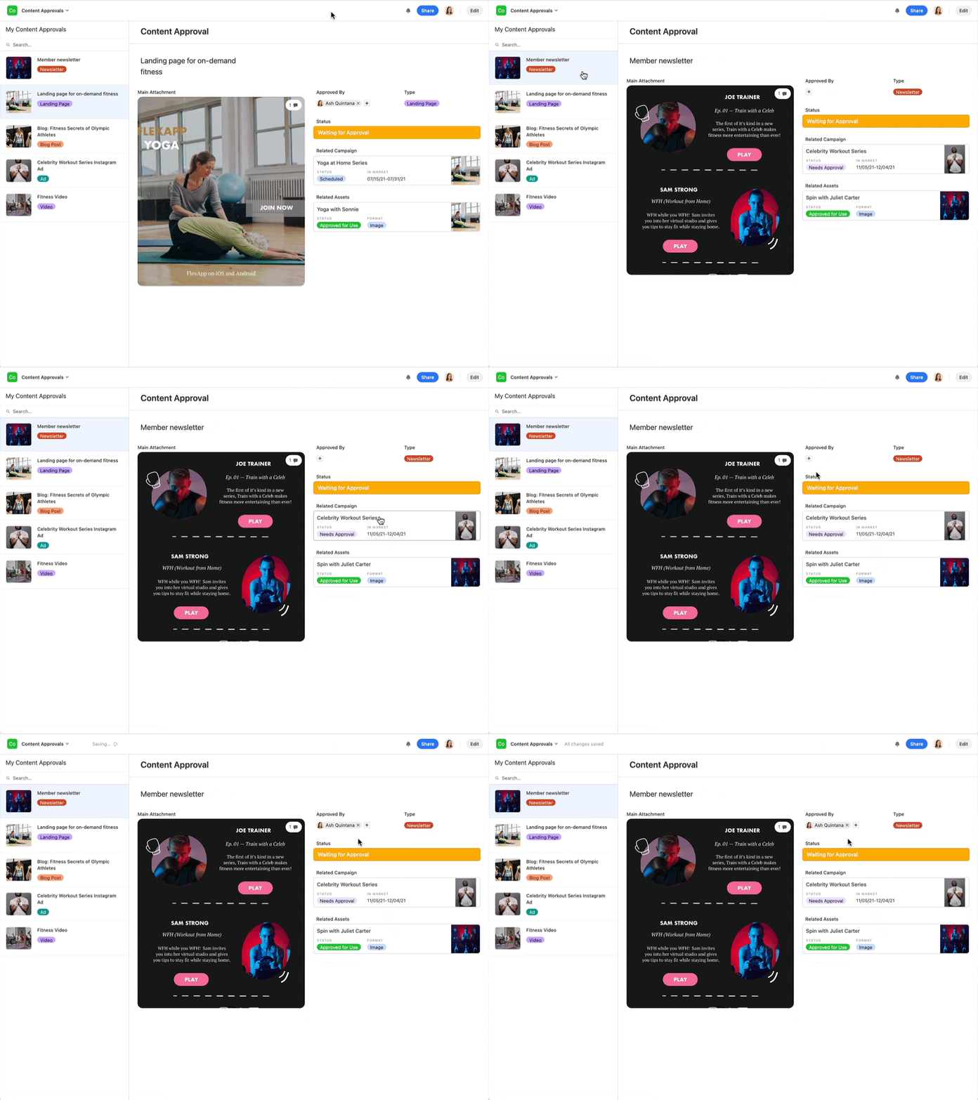
- Legibility: content on the page can be easily read in plain language, comes in optional sizes, and can be accessed by a screen reader. Airtable does a fantastic job of this by offering users various interfaces to select from that match their needs; plus, if the template isn’t there, the user can design their own interface avoiding overworking a user’s memory load.
- Timing: users are given enough time to process information—like error messages—or complete a task without losing information, and have the option to adjust time-needed.
- Movement & flash: elements of the page that move or flash are not overwhelming and can easily be turned off. Additionally, for this part of heuristic evaluation, you can include warnings for areas which include these elements.
- Auditory options: the product does not solely rely on sound at any point to deliver information, and you present users with options to turn off or adjust audio.
- Compatibility: products are optimized for compatibility with assistive technology, from providing alternative text for images and non-text elements, to ensuring keyboard accessibility, and keeping users informed of their options along the way.
2. Aesthetic and minimalist design
White space, or negative space as it’s often referred to in design, helps your users digest information. When designing, it should be viewed as an object on page and hold as much weight as your in-app content that delivers information or provides a function. Space can come between text, images, interactive buttons, and more.
For example, user testing research suggests the ideal spacing between lines of text is between 130-150% of your font size.
Example of aesthetic and minimalist design
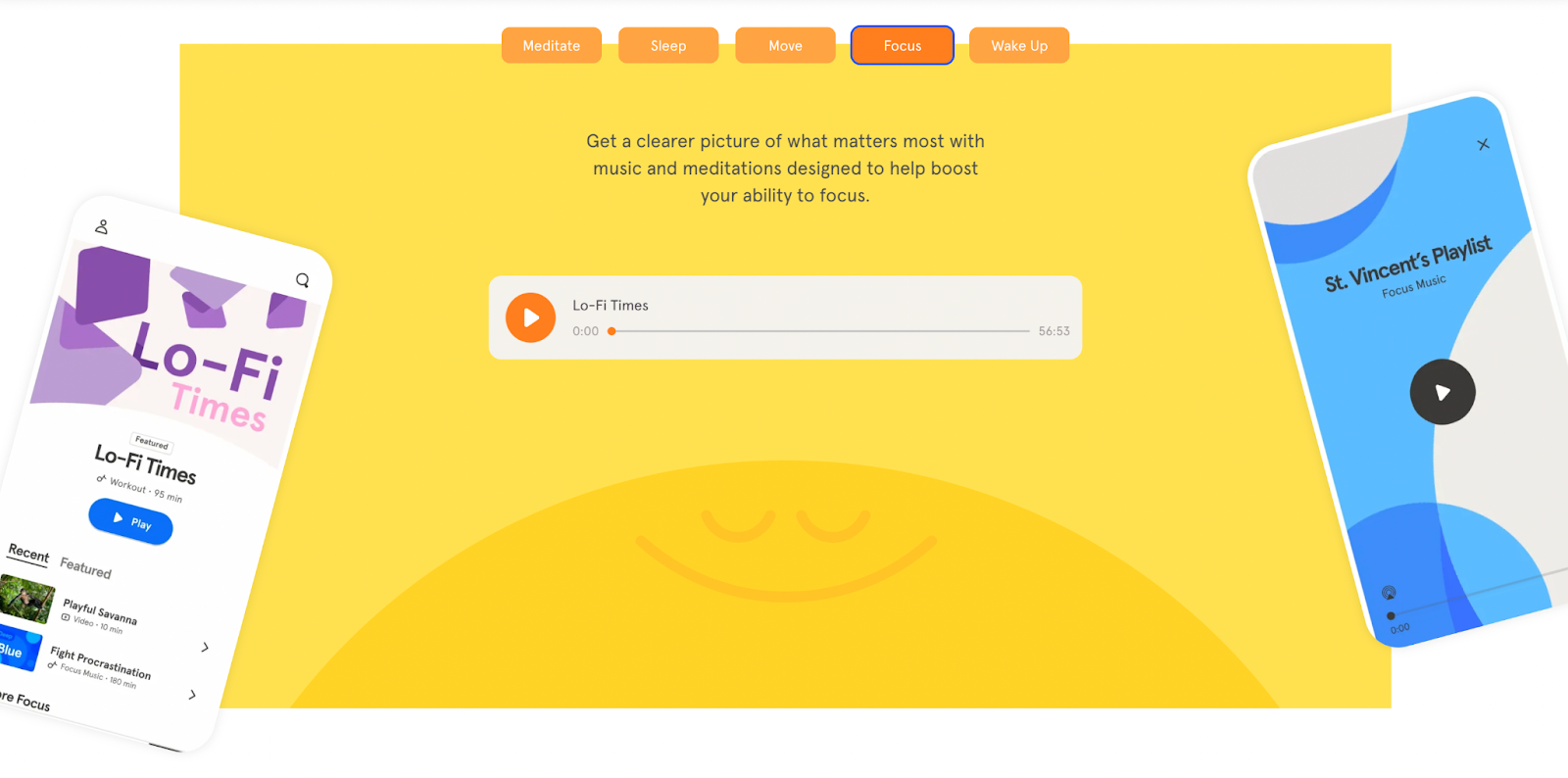
Headspace does aesthetic and minimalist design exceptionally well, and rightly so given their focus as a mental wellbeing app. They can’t afford to overwhelm users with clutter or busy interfaces. Take a look at their Headspace for work app—the negative space coupled with plain language allows for digestion of the content, and provides clear focus for the relevant page aspects.
3. Consistency and specific standards
Successful products rely on what people already know. It takes a lot to get someone to delve into a new product and be open-minded in learning how to navigate it. Consistency and certain standards ensure you’re building on existing knowledge to provide your user with a minimal learning curve.
We spoke to Gene Kamenez, Co-Founder & CEO @ Uxcel, for his insights on heuristics.
“When the system follows established conventions and standards, users can more easily transfer their knowledge and skills from one part of the system to another. This can make it easier for them to navigate the system and find the information or tools they need to achieve their goals.”
Example of consistency and standards
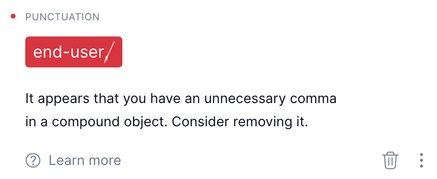
Grammarly for Business relies on familiar CTA phrasing to tell their users exactly where the button leads. The “learn more” CTA in their suggestions is typical across multiple technologies and is something users are familiar with, and comfortable clicking. If the language used was uncommon, their click-through rate may be impacted, ultimately leading to confused users.
4. Error prevention and forgiveness
In usability, ‘slips’ are unconscious mistakes due to a lack of attention or an accidental click of a button, while ‘mistakes’ are conscious errors due to someone incorrectly interpreting what will happen.
This heuristic ensures you’re avoiding slips and mistakes, by delivering a UI that clearly conveys information and action repercussions, so users don’t make mistakes. Additionally, it encourages products to provide a margin of forgiveness so your user can easily undo their error.
Error prevention techniques, such as input validation and error checking, can help reduce the likelihood of errors occurring in the first place. This makes it easier for users to complete tasks and achieve their goals without being interrupted by errors or having to spend time correcting mistakes.
Gene Kamenez
Co-Founder & CEO @ Uxcel
Share
Example of prevention and forgiveness
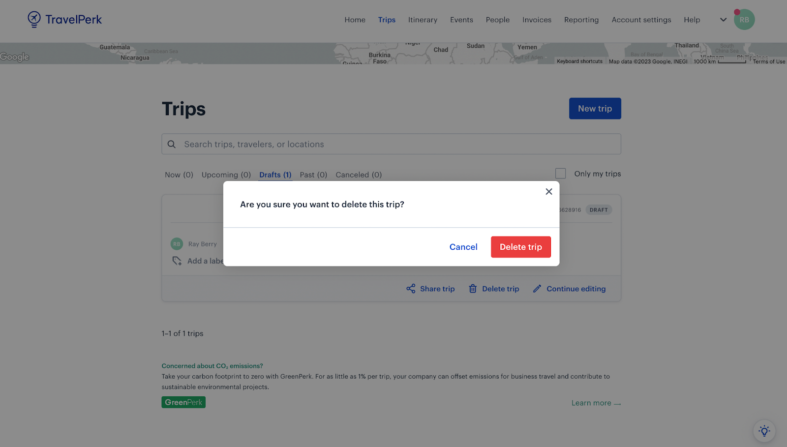
TravelPerk does this well with their desktop application: users receive a warning message when they click ‘delete trip’, giving them the opportunity to amend their slip—or confirm this is the action they want to take.
5. Flexibility and efficiency of use
Not all users are going to have the same product knowledge—some users will be happy with the basic functionalities that get their job done, while others may excel in understanding your product, use it frequently and consistently, and demand more features. We call these people ‘power users’.
Flexibility and efficiency as a heuristic encourages you to think about optimizing the experience for these users. Analysis from this angle allows you to deliver a rapid and expansive product experience to those who are looking for it. While flexibility may often lead to efficiency of use, it can be tricky to balance, as too much flexibility can make some users lose their way.
Example of flexibility and efficiency of use
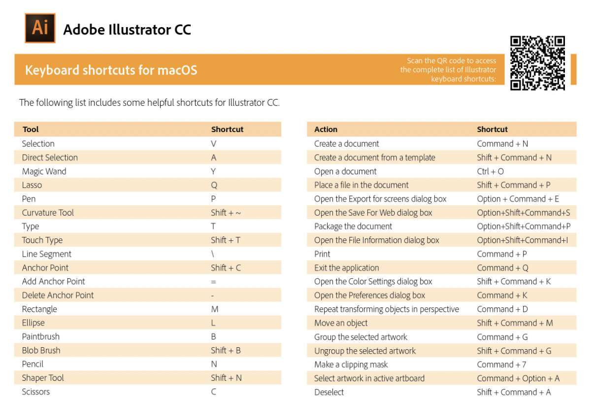
A common example of flexibility in practice is offering ways to navigate your product quicker for those who want it, i.e. keyboard shortcuts.
Adobe does this exceptionally well with their entire tech stack. Their knowledge base offers users a way to download keyboard shortcut cheat sheets, so they’re able to navigate the tool quicker and in a way that works for them. Take a look at the example cheat sheet for Adobe Illustrator.
6. Help and documentation
Help and documentation gives users the supporting information and instructions they need as soon as they need it—it avoids product friction, frustrated users, and promotes customer success. This comes in many formats—here, we’re talking about low-touch customer success models (which offer help via a digital format) as opposed to high-touch (where a human team steps in to help).
Help and documentation can be proactive:
- Product tours
- Onboarding tutorials
- In-app product launchers
- Help bars
Or, it can be reactive:
- Tooltips
- Knowledge bases
- FAQ sections
- Action-based product modals
What’s important is this heuristic ensures you’re delivering users the support they need, exactly when they need it.
Example of help and documentation
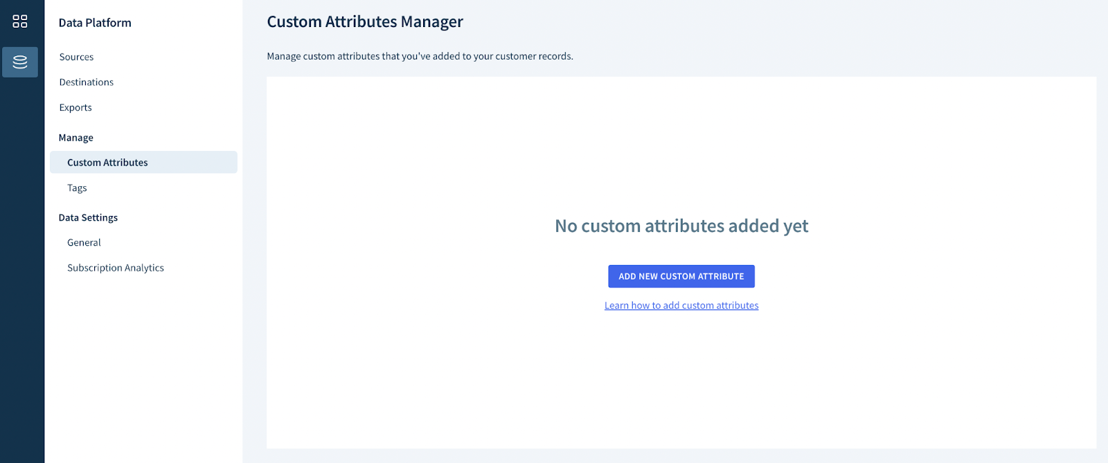
Take a look at how ChartMogul handles their help and documentation—by providing a link and tip to ‘Learn how to add custom attributes’, the platform goes beyond informing the user that they need to add custom attributes, and offers the opportunity to learn how to do this.
This takes what could be a frustrating product moment, to a proactive learning moment, directing the user to a knowledge base and walkthrough
7. Help users recognize, diagnose, and recover from errors
Different from error prevention and forgiveness, this heuristic refers to how you present error messages, and the solutions you offer to solve them. Much like consistency and standards, your error messages should follow patterns users are familiar with seeing in other applications. And, above all, it should offer solutions to how the user can avoid seeing the same error again in the future.
Geoffrey’s rule of thumb on recognizing, diagnosing and recovering from errors comes in two parts, padded with a ‘reality check’ either side:
- Prevention: give clear instructions
- Reality check: errors will likely still happen
- Diagnose and recover: explain how to fix the error with an error message
- Reality check: if the message doesn’t help the user address the issue, it’s not a helpful message and you should rework it
Example of helping users recognize, diagnose, and recover from errors
Senior UX Lead Designer, Geoffrey Crofte, walks us through an example of a form completion task—and how to help users recognize, diagnose, and recover from an error.
“Let’s say you complete and submit a form, and something goes wrong: two fields are flagged red, but you don’t have the information required to address these issues. You recognize, but cannot diagnose or recover from errors. You are stuck.”
Following this heuristic, you’d need to add a message explaining why these fields were flagged, and how to solve the issue.
8. Match between the system and the real world
Otherwise known as natural mapping, your product and UI navigation should match your users’ logical flow. You can do this by pulling on what you know they know from their real-world setting. This is also the time to scan for internal company jargon or abbreviations that you may use regularly, but would confuse an end-user.
To follow this heuristic successfully, you’ll need to step into your user’s shoes—delivering language, content type, and product navigation in a way that makes sense to them. A great way to ensure you’re doing all of this is by running card sorting and tree testing during the wireframing stage.
A match between the system and the real world can help users feel more connected to the system and their actions within it. When the system feels like a natural extension of the real world, rather than a disconnected or abstract tool, users can feel more motivated and engaged in using it to achieve their goals.
Gene Kamenez
Co-Founder & CEO @ Uxcel
Share
Example of match between system and the real world
Icons are powerful examples of real-world matches and helping users relate to and understand UI, and Fiverr uses them brilliantly. Icons on Fiverr perfectly match a project status with an appropriate icon to provide users with a more joyful and visual experience. This gives the user a kind of visual shorthand for knowing where their order is in the project status flow.

9. Recognition rather than recall
Users learn at different rates, and you can’t expect all users to have the same muscle memory. Recognition rather than recall ensures you’re delivering product learning curves that cater to all types of users. Among all usability inspection methods, this heuristic is commonly overlooked by experts—due to them already being familiar with the user interface in question.
It often includes an assortment of in-app product modals, tooltips, launchers, and micro tours to allow your user to recognize what they need to do on each product page rather than requiring them to recall the information from a lengthy onboarding video they saw once when first signing up.
By providing users with clear and visible cues and prompts, the system can help them recognize the information or actions they need, rather than requiring them to recall it from memory.
Gene Kamenez
Co-Founder & CEO @ Uxcel
Share
Recognition rather than recall can be achieved through various design techniques:
- Providing clear and descriptive labels for buttons, links, and other interface elements
- Using consistent layout and navigation patterns across the interface
- Displaying important information prominently and using visual hierarchy to guide the user's attention
Example of recognition rather than recall
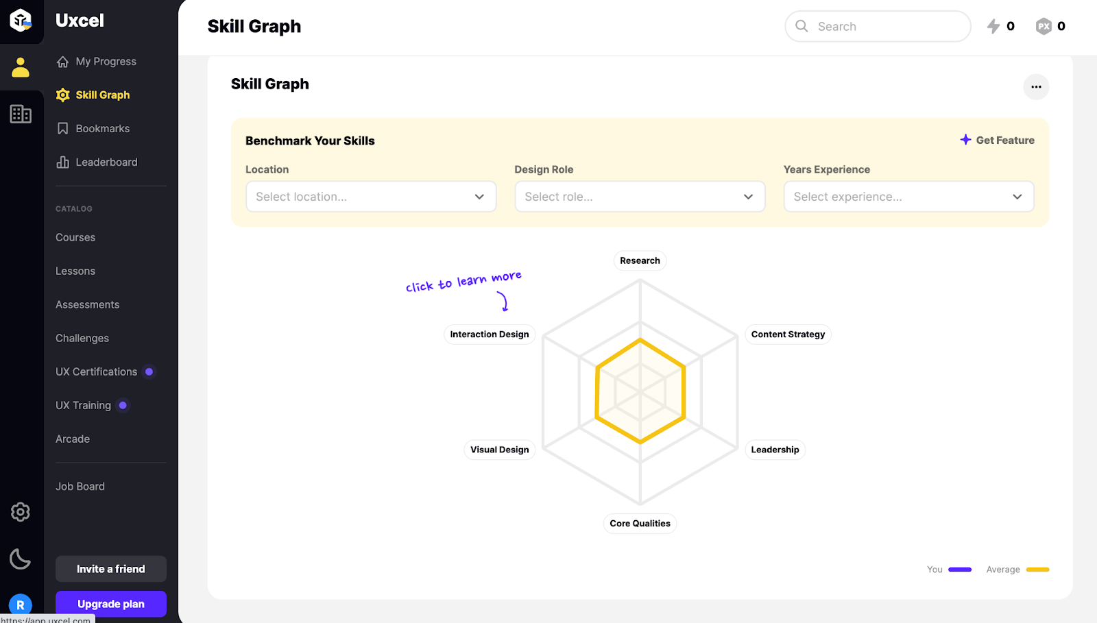
Uxcel manages this heuristic by encouraging new users to ‘Click to learn more’ on app pages they’re visiting for the first time. Rather than overwhelming users with a lengthy onboarding tutorial, they empower users to learn as they go, when they want to, with prompts in all the right places.
10. User control and freedom
A sense of control and freedom to roam your product will do wonders for your retention rates and user experience. Somewhat ironically, the best way to do this is by giving users the chance to bow out whenever they want or need to.
Autosave features, clearly marked ‘escape exits’, and keyboard shortcuts are all ways you can put the power in the hands of the user. Gene Kamenez, Co-Founder & CEO @ Uxcel, suggests that:
“User control and freedom can be crucial for helping users achieve their goals by giving them the flexibility and autonomy they need to work effectively within the system.
“It’s particularly important in complex systems, where users may have a wide range of goals and needs. For example, if a user is given the ability to customize their work environment or set their own preferences, they may be able to work more efficiently and effectively.”
Example of user control and freedom
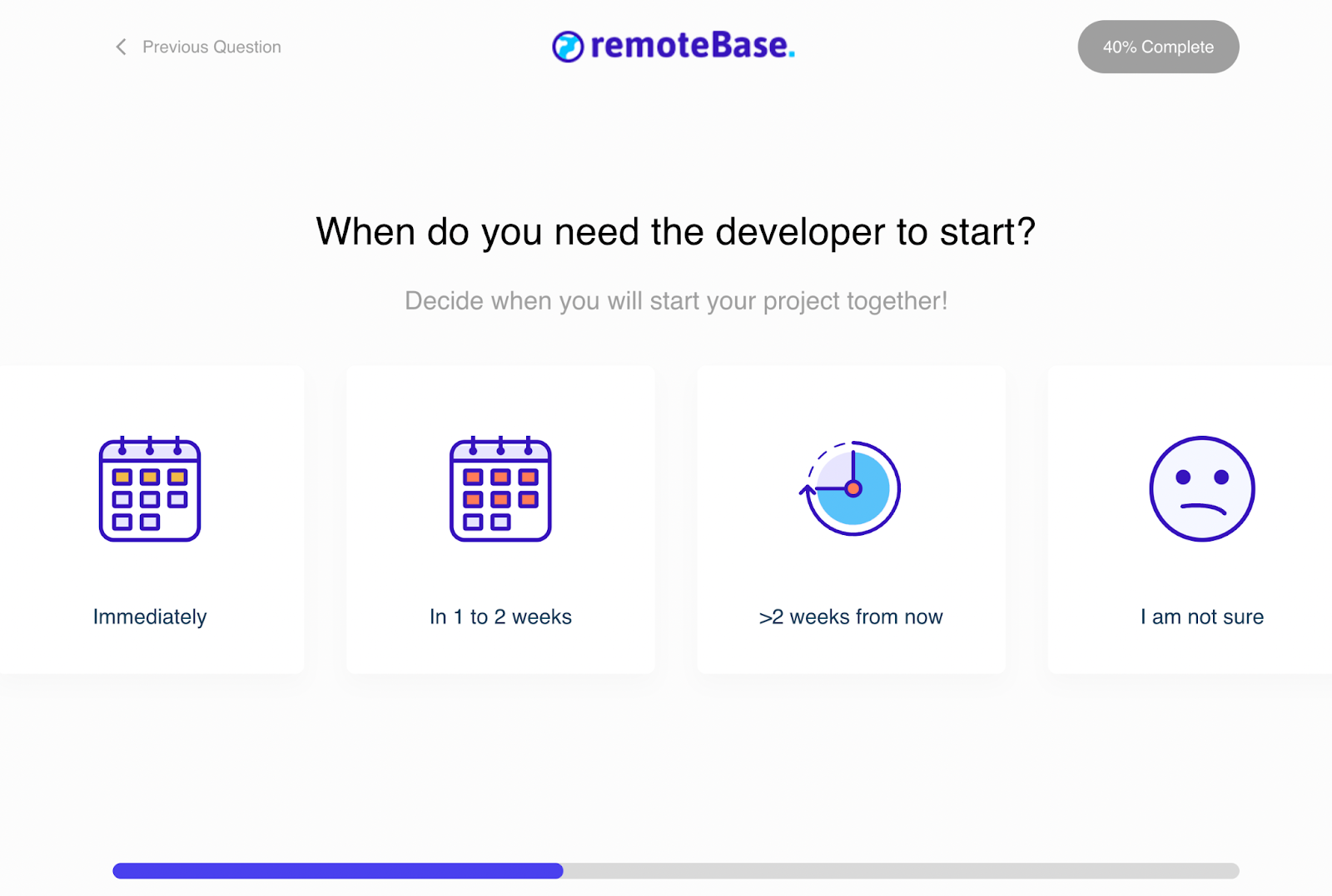
Remotebase is a prime example in giving their users control during the signup process. In the top left corner, users have the option to go back to the previous question. This page also uses our next heuristic example, visibility of system status, with the completion bar at the bottom of the screen and the percentage completion rate in the top right.
11. Visibility of system status
Trust comes from communication, and communication is a two-way street. This heuristic ensures feedback to your user as soon as they input something into your product. That could be a button click, a data upload, or another action. Whatever your user is doing, let them know the status of that task and what your product is working on to achieve their job-to-be-done.
This will also help manage user expectations and give them a better understanding of what will happen after they’ve submitted a task—including the timeframe it takes your product to complete the action.
Gene Kamenez explains that: “Giving immediate feedback on users’ actions is vital. It can help the user understand what’s happening within the system and whether their actions have the desired effect. For example, if a user is trying to download a file and they can see a progress bar, they know the system is working on their request and the file will be downloaded eventually.”
Example of visibility of system status
Geoffrey Crofte, Senior UX Lead Designer @ Foyer Group, shares an example he’s currently facing with his team:
“In the insurance industry, we handle sensitive information including medical data, so it's common for our interfaces to use limited-time sessions for security purposes.
“However, this feature has often been hidden in the background of the app, leading to frustration when users would finish 30 minutes of work only to be unable to save it because their session had ended.
“This goes against the principles of visibility of system status and user control and freedom. To address the issue, we should notify users when their session is about to end and give them the option to extend it if needed. This will restore control to the user, improve transparency, and make the interface more inclusive.”
What are the pros and cons of heuristic evaluation?
We asked Geoffrey, who created a checklist to improve the usability of web forms, to share some of the pros and cons he’s run into when conducting heuristic evaluations in the past.
Pros of heuristic evaluation
- Collaborative: heuristic evaluation can be used in collaboration with other usability testing tools and methodologies to give your teams a well-rounded insight on potential problems users may face within your product.
- Fast & affordable: to conduct a heuristic evaluation teams often use in-house resources, which means, as long as it's given priority, this project can move fast and you won’t be paying extra for it.
- Flexible: this type of analysis can be performed at any stage in the design process, from lo-fi prototypes to production-ready interfaces, giving you a chance to check your interface early and often.
- Helps prioritize: measuring usability against heuristics helps you efficiently prioritize UI updates you’ll need for a smooth release, as your evaluators mark urgency of issues according to a severity scale.
There are certainly a lot of pros to running heuristic analysis—however, it’s always good to be prepared before you dive in. Here’s some of the challenges to be aware of that can crop up when conducting heuristic evaluation.
Cons of heuristic evaluation
- Potentially subjective results: different evaluators may have different opinions on what constitutes a usability problem or the severity of an issue—this is why it’s critical to ensure you have a robust usability testing plan and clear aims, objectives, and metrics in mind.
- Evaluation is only as good as the heuristics being used: it’s important to use a set of heuristics that are comprehensive, and relevant to the user interface being evaluated. Not all heuristics may apply to your specific product or user base, so it’s a good idea to go beyond the basics or typical heuristics if you can.
- It doesn’t involve real users: on the one hand, this can be a positive, as it removes the risk of bias from current users. However, it can also mean you risk UX cognitive biases like false-consensus bias cropping up, if your evaluators have worked closely on the product, or are predisposed to think in a positive light about the design. To a certain extent, certain problems may only ever become apparent when the product is in the hands of real users.
As with any type of research, there are pros and cons—all of which are important to weigh up if you’re considering running this type of user interface design analysis.
Your heuristic evaluation checklist template
Conducting heuristic evaluation in UX is a key step in mitigating errors and identifying reasons behind low engagement. The challenge is remembering each heuristic and ensuring you’ve reviewed each element of UX/UI—from accessibility to error prevention.
That’s why we’ve created a checklist, leaning on the core principles of UX heuristic analysis. It includes targeted questions that push you to think about how your design matches up with real-world expectations, how much control and freedom your users truly have, and whether your system’s feedback is as intuitive as you think.
Transform your product with insights that hit the mark. Download your heuristic evaluation checklist template here.
Run heuristic analysis for usability evaluation
Fixing problems after launch can be costly and damage your product's reputation. That’s why heuristics should be on any product team’s list when building a new product or launching a new feature.
Combining heuristics with other usability testing methods is the ideal way to embed a user-first mentality throughout the development cycle. It allows you to gather a holistic view of your product, and ultimately ensure minimal user issues when you launch.
Frequently asked questions about heuristic evaluation
What is a heuristic evaluation?
What is a heuristic evaluation?
A heuristic evaluation is an expert review of a user interface against a set of usability principles (heuristics). It involves assessing key flows, flagging instances in which the interface fails to adhere to heuristic principles, and rating the severity of each issue. The goal is to quickly identify usability problems before or alongside testing with real users.
What are the 3 elements of heuristic evaluation?
What are the 3 elements of heuristic evaluation?
Heuristic evaluation relies on three core elements: a clear set of heuristics, defined user tasks or paths, and experienced evaluators. The heuristics give you the lens to judge the interface, the tasks ensure everyone reviews the same parts of the product, and the evaluators use their UX expertise to spot issues and estimate impact on users.
Which usability heuristics are most commonly used by UX teams?
Which usability heuristics are most commonly used by UX teams?
Most UX teams start with Jakob Nielsen’s 10 usability heuristics, such as visibility of system status, match between system and real world, consistency and standards, error prevention, and user control and freedom. Many teams extend this list with accessibility and inclusion, help and documentation, and recognition or adapt existing frameworks, like Shneiderman’s rules or ISO 9241-110, to fit their product and audience.
How do you conduct a heuristic evaluation step by step?
How do you conduct a heuristic evaluation step by step?
First, choose the heuristic set you’ll use and define the main user tasks or journeys to review. Then brief your evaluators so they share the same context, and ask each person to independently walk through the interface, noting issues, defied heuristics, issue severity, and likely user impact. Finally, bring the findings together, cluster similar problems, prioritize by severity and business risk, share recommendations with the Product team, and run a follow-up review after change.
What is the difference between an heuristic evaluation and an UX audit?
What is the difference between an heuristic evaluation and an UX audit?
A heuristic evaluation is one specific method for assessing interfaces and experiences: experts review an interface against usability principles and report issues. A UX audit is broader and usually combines several inputs, like heuristic evaluation, analytics, user research, competitive analysis, and business goals. to diagnose where a product is underperforming and why. In practice, heuristic evaluation is often one component inside a larger UX audit.


