


Whether you’re looking to improve the design of your product, or are new to the field and want to learn the ropes of UI design, knowing the rules and principles of interface design is imperative.
As Jonathan Widawski, Maze CEO explains,“User interface design is about using typography, images, and other visual design elements to turn a basic interface into something digestible and usable.”
A successful UI is one that people want to interact with. It’s not just aesthetically pleasing, but also easy for people to use. After all, a well-designed user interface could raise your website's conversion rate by up to 200%.
So let’s discuss the golden rules and key principles of a beautiful, effective, and simple to use UI design.
Golden rules of user interface design
In his book Designing the User Interface, Ben Shneiderman describes eight golden rules of UI design. Let’s look at them in detail:
1. Make user interfaces consistent
Mike Gilfillan, Technical Lead Developer at Edge of the Web says, “Consistency is key - multiple acolors, fonts and styles can create confusion, whilst consistency creates familiarity.”
Consistent UI means using similar design patterns, identical terminology in prompts, homogenous menus and screens, and consistent commands throughout the interface.


2. Allow users to navigate easily via shortcuts
Expert users, or users who frequent your website or use your product regularly, need shortcuts to move quickly through the interface.
Just like how most Windows users make use of the shortcut CTRL + C to quickly copy text and CTRL + V to paste it, you need to make navigation and operating user interfaces easy through shortcuts.
3. Provide informative feedback
Provide feedback through readable UI copy for all user moves. Ben Shneiderman explains: “For frequent and minor actions, the response can be modest, whereas for infrequent and major actions, the response should be more substantial.”
For example, when users are asked to create a password, your UI should offer information on how strong it should be by either giving an example of a strong password or using symbols that demonstrate how strong the user’s password currently is.
A great example is DropBox’s signup form. It shows the strength of a user’s password through a sleek bar. When I added just my name in the password field, it signaled how weak my password was through that one bar.

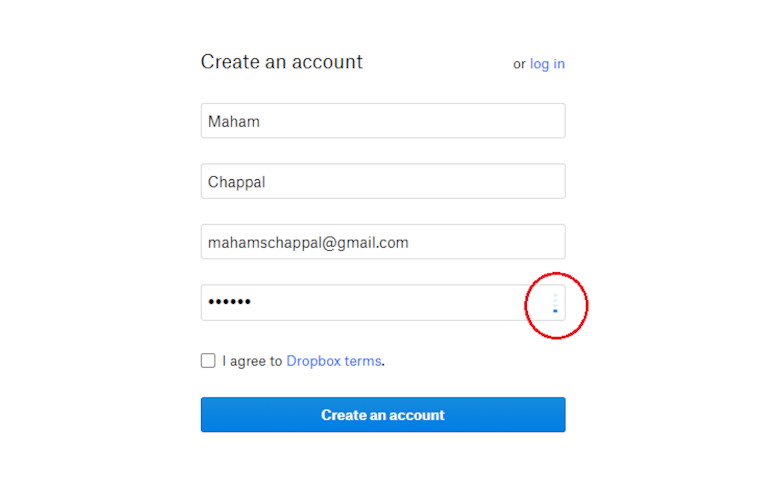
Creating an account on Dropbox
So I created a significantly difficult password with multiple numbers and symbols:

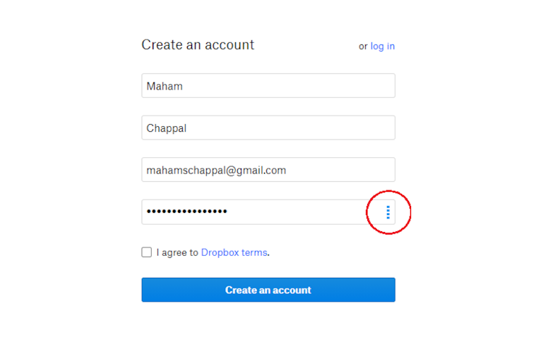
Creating an account on Dropbox
4. Design dialog to yield closure
According to Shneiderman, “Sequences of actions should be organized into groups with a beginning, middle, and end. Informative feedback at the completion of a group of actions gives users the satisfaction of accomplishment, a sense of relief, a signal to drop contingency plans from their minds, and an indicator to prepare for the next group of actions.”
A great example is taking users to a Thank You page with a summary after they complete an order, informing them it’s confirmed.
5. Prevent error as much as possible
Make the UI as easy to use as possible by preventing serious user errors.
So from greying out menu items that are not available to preventing users from typing in alphabets in fields that ask for phone numbers, try to prevent error as much as possible.
This is also where usability testing comes in. As a designer, you need to ensure everything works as intended by testing the design with users before launching. It not only helps to test the functionality and usability of your product, but also helps you to understand your target audience’s needs better.
However, occasionally errors happen. So if a user has made an error, make sure to offer them a clear explanation to understand the error and an easy solution to solve it.
6. Allow users ways to reverse their actions easily
Offer users easy and obvious ways to reverse their steps when they’ve taken a wrong step.
Shneiderman explains: “This feature relieves anxiety, since users know that errors can be undone, and encourages exploration of unfamiliar options.”
Say someone has accidentally added the wrong information in a multi-page form, allow them to go back to that page and rectify their mistake easily without having to start all over again.
7. Support internal locus of control
“Experienced users strongly desire the sense that they are in charge of the interface and that the interface responds to their actions. They don’t want surprises or changes in familiar behavior, and they are annoyed by tedious data-entry sequences, difficulty in obtaining necessary information, and inability to produce their desired result,” says Shneiderman.
A great example of keeping users in control is when someone is about to exit Microsoft Office and is asked by the system if they’re sure they want to exit without saving their work. Not only does this make the user feel in control, but it also ensures that in case of an accidental exit, their work is not lost.
8. Minimize memory load
A key rule for making user interfaces easy for people to use is minimizing cognitive load. Cognitive load (or memory load) can reduce a user’s capacity to perform important tasks, so it’s critical that computers take over the burden of memory from them as much as they can.
For instance, don’t make users re-enter personal information every time they’re buying from your website or add their email address and name every time they log into your website.
While designing, always choose recognition over recall to enable users to complete their tasks quickly and without hassle.


6 key UI design principles
So what are the key design principles of a high-performing user interface? Let’s take a look at them.
Clarity
From recognizing interactive and static elements to making navigation intuitive, clarity is an essential part of a great UI design.

As Peep Laja aptly says, “Your job is to build an interface that minimizes the knowledge gap between what users know prior to coming to your site and what they must know to use it properly.”
So when you create your product, ask yourself the following questions:
- Is your navigation intuitive? Are users directed and encouraged to move from one page to the next with ease?
- Have you used highly visible buttons that prompt users into clicking them?
- Is the purpose of each element on your product, website or application, clear and easy to understand?
You only have eight seconds to grab a user's attention, so make sure you don’t waste those seconds by creating confusion and chaos.
Familiarity
Do you automatically look for the menu at the top of the homepage of a new website?
Why? Because that’s where we perceive the menu to be.

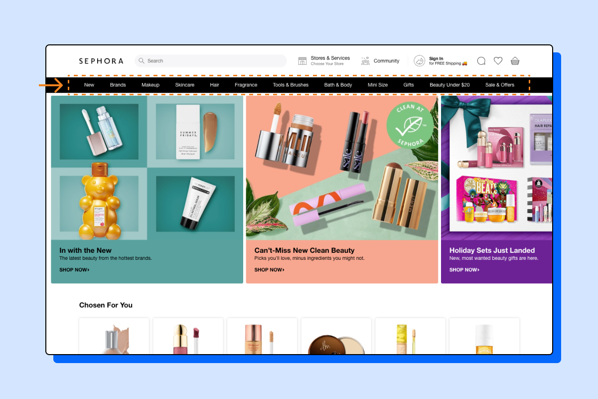
Displaying the website menu at the top is a great way of incorporating the design principle of familiarity like Sephora does here
The best interfaces are familiar for users.
Usability, i.e. how easily a user interacts with a product or a website, is closely related to familiarity. Users depend on elements and interfaces acting in a way that’s familiar to their digital experience.
Jacob’s Law states that “Users spend most of their time on other sites. This means that users prefer your site to work the same way as all the other sites they already know.”
Not only should you leverage established UI design principles and rules (like Ben Shneiderman’s golden rules of UI design described above) to incorporate familiarity in your design, but also ensure that all elements are in sync throughout the interface.
There are several benefits of incorporating the UI design principle of familiarity in your product:
- Increases user retention
The more familiar the user is with your interface and more easily they can use your website or app, the more they’ll come back to it.
And since research shows that acquiring a new customer costs 6x to 7x times more than to retain an old one, it’s vital that you create a seamless user experience by leveraging familiarity.
- Easier for UI designers
It’s easier for UI designers to incorporate tried and tested interface design solutions than create new ones from scratch.
- Reduces the learning curve for users
The less time visitors have to spend understanding how the user interface works, the faster they can start using your product or service.
It also reduces the chances of them exiting your website and moving on to the next website because yours had a steep learning curve.
User Control
Place users in control of the interface. Jakob Nielsen explains why this is important: “Users often choose system functions by mistake and will need a clearly marked ‘emergency exit’ to leave the unwanted state without having to go through an extended dialogue. Support undo and redo.”
This basically means giving users different options to go back a step when they feel they’ve made a mistake. This is closely related to Ben Shneiderman’s golden UI design rule, ‘Supporting internal locus of control’, and ‘Allowing users to reverse their actions easily’.
As an example, whenever you’re creating forms, allow users to click the <Back> button and go back to the page they were last on. Don’t take them all the way back to the homepage or the start of the form.
Similarly, when using overlays on your website, make sure the exit button {x} is clear. Otherwise, users might click the back button on the browser and go back two steps instead of just exiting the overlay.
See how the small x button is clear and instantly noticeable here.


Making the exit button on an overlay visible is a great way of placing users in control of the interface.
But, can you find the exit button on this screen?

An invisible exit button on an overlay can easily confuse and frustrate users
Hierarchy
Strong visual hierarchy is a core design principle of a successful user interface. It consists of arranging visual elements in a way that explains the level of importance of each element and guides users to take the desired action. As a designer, your job is to organize UI design elements in a way that makes it easy for users to navigate within your product.
As Pascal Potvin, design lead at IBM, says, “[...] Visual hierarchy creates an order of importance to visual elements in order to direct a user’s attention and make information easier to consume.”
It ensures that users see the most important information first, then the next, and so on, and is established through various elements. Some of them include:
- Color
The first and one of the most important elements of establishing visual hierarchy is color. Bright colors stand out the most and can be used in muted color schemes to direct users to take a certain action.


Colour blocking is an excellent way of highlighting certain UI elements
- Size
Size matters a lot in UI design, especially when establishing visual hierarchy. The bigger the element is, the more visible it is. Smaller elements are usually those of less importance. So, as a designer, try to make important things (like headlines or CTAs) bigger and bolder.
- Fonts
Play around with different sizes, weights and styles of fonts to establish visual hierarchy. This is exactly what Odoo does here.


Odoo using different sized fonts to create visual hierarchy
Notice how the main headline, which aptly explains what it’s all about, is of the largest font size and two main words (‘real’ and ‘CRM’) are written in bold to emphasise it’s message.
And while the CTA is of smaller font size, it’s highlighted through a coloured box to ensure that the audience’s eyes are drawn to it immediately after reading the headline.
- Negative space
Give your elements some breathing room - don’t cram all the objects and elements together on the screen. Negative space makes important elements pop and stand out. Swaggar makes great use of negative space on their website’s main page.

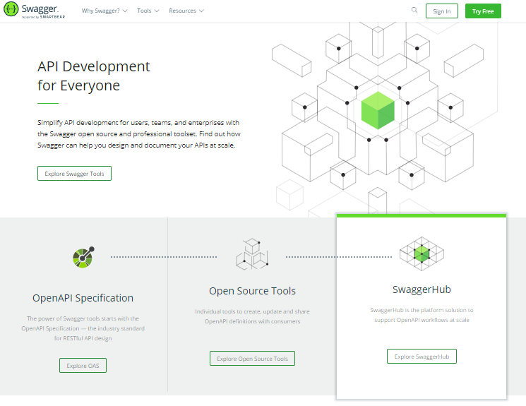
Swagger uses negative space in a great manner to highlight its various features and main message
As Nick Kampouris, User Experience & User Interface Designer, advises, “Social distance your elements, text blocks and everything on your darn screen. Space is everyone's friend. Use the Law of Proximity to help users visually navigate your pages. This is as much a part of your design than everything else so please mind the gap.”
Flexibility
“Flexibility doesn’t just follow a linear path, it’s about knowing your customers and giving flexibility for different customer intents,” explains Brooke Cowling, Co-founder & CMO of Digital of Things.
So from designing solutions that work great in all situations (from your grand dad’s old computer to your son’s latest iPad), to using shortcuts that speed up interaction for users, flexibility is a key principle of user interface design.
You not only need to make your user interface learnable for new users, but it should also have accelerators that help expert users speed up their processes. From novices to experts, ensure your product is flexible and efficient for all kinds of users.
Some examples of a flexible UI design include:
- Shortcuts for performing frequently used steps with a single click
- Advanced search features
- Incorporating filter bars
And think multi-modal.
A multimodal user interface allows users to interact with the system through multiple modes, such as speech, text touch, vision. As a designer, you need to be mindful of all these modes. Also, design the user interface keeping in mind that your audience might use it via mobile, tablet, laptop, or a rusty old computer.
“Many users depend mostly or entirely on mobile access; optimize the UI for the strengths of each device. Be mindful that users' experiences may span across devices and modes of interaction (phone, email, mobile device, desktop, in-person) - design experiences across those modes to support their needs,” shares Jon Fukuda, Co-founder and Principal at Limina, and a design and UX industry leader.
Accessibility
Designing your website for all users is essential. According to the WHO, around 285 million people are visually impaired, between 110 million and 190 million adults have significant mobility difficulties and 360 million people worldwide have disabling hearing loss.
Jesse Hausler, Principal Accessibility Specialist at Salesforce, writes, “Accessibility will not force you to make a product that is ugly, boring, or cluttered. It will introduce a set of constraints to incorporate as you consider your design.”
When designing products and websites, make sure that you meet the requirements of WCAG (Web Content Accessibility Guidelines).
Some easy ways to incorporate the principle of accessibility while designing products are:
- Use the WebAim Color Contrast checker to create strong color contrasts
- Ensure all your images have corresponding alt attributes
- Ask yourself if users can easily navigate your website via the tab key on your keyboard


Concluding thoughts
So when working on your next user interface design project, keep all these rules and UI design principles in mind and you’ll end up creating a product that’s not only beautiful but also user-friendly.
And make sure to constantly test your designs with Maze to iterate as you go through the process and launch confidently. Getting user feedback on your product prior to launching it ensures that it’s as user-friendly as possible.


")


