Improving the application experience on Useful School’s website
Useful School explored an opportunity to improve the application process to reduce the time spent answering support questions and optimize the user experience.
About Useful School
Useful School is a unique online educational institution that aims to equip its students with practical skills for real-world challenges.
Industry
Education
Opportunity
Improving the application process and user experience of the class page can lead to increased student satisfaction, reduced support burden, and improved perception of the school's brand.
Key Maze features used
Prototype Testing
Surveys
Share
Outcome
Based on user feedback, they redesigned the class page to be more user-friendly and informative. This included adding clearer CTAs, more content for student understanding, and incorporating the brand's unique vibe. The feedback from the Maze test was positive, indicating users strongly preferred the new design.
Useful School is the world’s first pay-what-you-can online design school for people of color. Our initial design helped us launch a great first cohort, but we knew we had some things to improve before driving traffic to our second cohort.
Here we break down how we refined the web experience to satisfy both business and user needs.
Context
Useful School is the world’s first pay-what-you-can online design school for people of color. The platform launched in December 2021, with our first cohorts running from February to April 2022. We have a large number of applicants on a rolling basis, and a second cohort starting in Summer 2022. Before driving even more traffic to our new program, we wanted to optimize the web experience.
Students in our first cohort had a lot of questions about the class experience, so we realized we could improve the application process by adding more context. Not only would this reduce the time spent answering questions via email and live calls, it would also provide a great first impression and UX to potential new students.
Understanding the problem
Our discovery process relied on qualitative and quantitative feedback.
Our quantitative feedback came from two of our primary data sources: Google Analytics and Tally, our current application tool. Our main metrics were strong: bounce rate, click-through rate (CTR) from our class pages to the application, and total volume of applications. But we knew we could do even better by giving users more upfront value and a smoother experience.
The majority of our website traffic went to the homepage, class pages, and the student application. Online schools rely on application numbers, so we knew that even a 5% increase in clicks from the class page to the application would lead to a significant increase in growth. We also knew that improving the application experience would reduce our time responding to inquiries.
Qualitative feedback also played a key role in our exploration. I teach, lead curriculum creation, and respond to all emails, so I have a close relationship with our students and prospects. This opened a feedback floodgate from current students, future students, sponsors, and other working designers via emails, video calls, and Slack messages.
People wanted to know more about the class to help them decide if they should apply now or later. They were especially interested in who taught the classes, the required commitment, basic logistics, and if future classes would be offered.
We also conducted a benchmarking analysis of top-converting online programs and other-industry sites, including Netflix and Spotify, to understand best practices and areas of opportunity.
Important footnote on providing a unique experience: we heard from users that it’s important to be inspired by sites that perform well, but it’s equally important that we continue to provide a unique brand and student experience.
Based on our preliminary analysis, we felt there might be an opportunity to focus on improving a key micro-conversion to address both user and business needs—specifically, clicks from the class page to the application.
Defining the problem
We gathered each piece of feedback into a FigJam file and started ranking the potential return on investment to design and implement the different suggestions.
We typically use binary questions to understand which changes to make, and the ones with the strongest “yes” get pushed to production. These are questions like: Is this information critical? Is it experienced on high-traffic pages? Is it noticeable in the first 5 seconds of a page visit? Will this take no more than 2 hours for an engineer to implement?
After we ranked and organized all of the feedback, we grouped it into similar themes. A few clear takeaways emerged:
Insight #1: Users needed a clearer CTA on the page. The Apply button in the navigation bar was okay, but people also expected to see a similar button or link on the page itself. And people were used to submitting their email address early in application experiences, so that wasn’t a barrier.
Insight #2: Users wanted to know if they were a good fit for the class before they applied. They also wanted to know the time commitment, required materials and tools (e.g. laptop, software, etc.), application requirements, and so on.
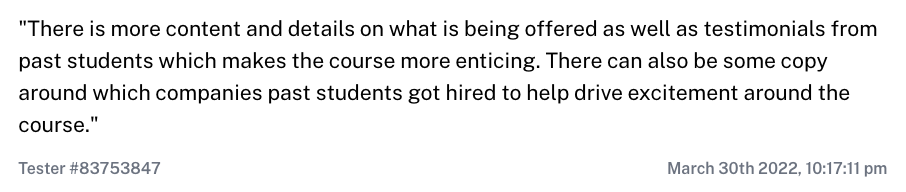
Insight #3: Users wanted to know the results of the program so far. They wanted to see past students’ work, student testimonials, and other success stories. Luckily, we already have lots of this, even though our first two classes haven’t even finished.
Insight #4: Users wanted the overall Useful School vibe. We needed to remain unpretentious and unique in our promise, while balancing fun, wit, and seriousness.

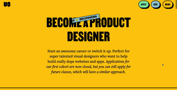
Useful School's website before their first cohort launch
Potential solutions
Next, we started brainstorming solutions with our freelance designer/developer and sketching wireframes. We used this key overarching question to help us focus:
How might we add more content and improve the user experience of the class page in a way that feels uniquely Useful School and creates a clearer, self-serve experience?
We started by mapping out a rough information architecture, site map, content and experience ideas, and references from other brands in Figma.
We then created a variety of medium-fidelity wireframes, from more conservative to really “out there” designs. Finally, we reviewed all the ideas and determined which versions best addressed the brief. (spoiler alert: many of the “out there” designs made it to the final. This taught us that it’s important to create a solid brief that also gives designers space to explore more creative designs.)
Here’s what else we learned:
- **Clearer CTAs: **Add clearer CTAs on the page that tap common mental models
- More content: Add content to help students understand if they’re right for the class, along with social proof that the Useful School model works
- Stay unique: Leverage our ever-evolving design system to express our fun and alive vibe

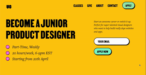
Useful School's website following a research-backed design update
The Maze Test
The goal of our Maze test was to validate that the solutions we created addressed the primary feedback. Our designs weren’t final, but we included enough fidelity so that users could grasp the vision and let us know that we were on the right track.
Given our limited resources and the need to announce new classes soon, speed was key.
The test involved showing people a medium-fidelity prototype, and asking for feedback on the experience. Here’s what users had to do in Our Maze test:
- Take 1-2 minutes to explore a medium-fidelity prototype of the new class page. Then click on the Apply button at the top to move onto the next question.
- Rate the overall experience with the prototype versus the currently live class page through an Opinion Scale.
- Provide the primary reason(s) for the score through an Open question.
- Let us know what projects would be valuable to see on our site through an Open question.
- Tell us what other education programs or websites people have taken or considered through an Open question.
Results & next steps
Within three days of sending out the maze test, we had 17 valuable responses.
Users preferred or strongly preferred the new design over the currently live website (average score: 7.8 out of 9). A review of the quantitative and qualitative feedback told us that students and prospective students would like to see:
- Clearer start dates and a CTA to apply in the hero section
- Class logistics directly in the hero section
- A separate section for key takeaways (which is currently embedded within the syllabus)
- A collapsible syllabus featuring class theme, week number, homework, and the secret guests
- More content to help understand student requirements, including class materials and time commitment
- More social proof demonstrating how Useful School has helped others, including quotes and past students’ work
- Information on the instructor
We reviewed the results and discussed how to tackle the changes using what I refer to as the “HiLo method”: putting all the ideas on a Highest Impact vs. Lowest Effort matrix.
Based on user feedback, we saw that we could improve the prototype in the following ways:
- Showcasing our unique brand on the new pages with animations, like the spinning 2D graphics students had seen on other pages.
- Including the total number of students we take on per class, to emphasize our network and one-on-one time with the instructor—things that students love about Useful School.
- Adding the time it will take for students to hear back from us regarding their application.
- Highlighting student outcomes and testimonials, like one student who was recently hired as a product designer at Spotify, and another who got a 17% salary raise.
The lowest effort, highest impact changes involved the hero section. This made sense, as it’s the highest trafficked section of the page.
We’re currently working to determine which parts to add, remove, and update. We hope to create a final prototype and start web development within a month. We’ll also consider creating the final prototype and asking the same questions from the Maze test to ensure that we’re staying on track and truly assessing our students’ needs.

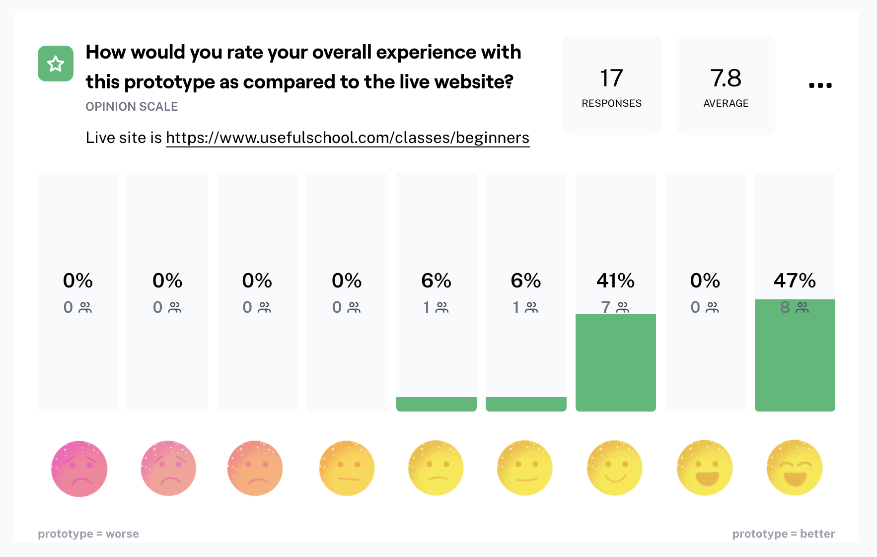
Overall user satisfaction with Useful School's new designs following a Maze test


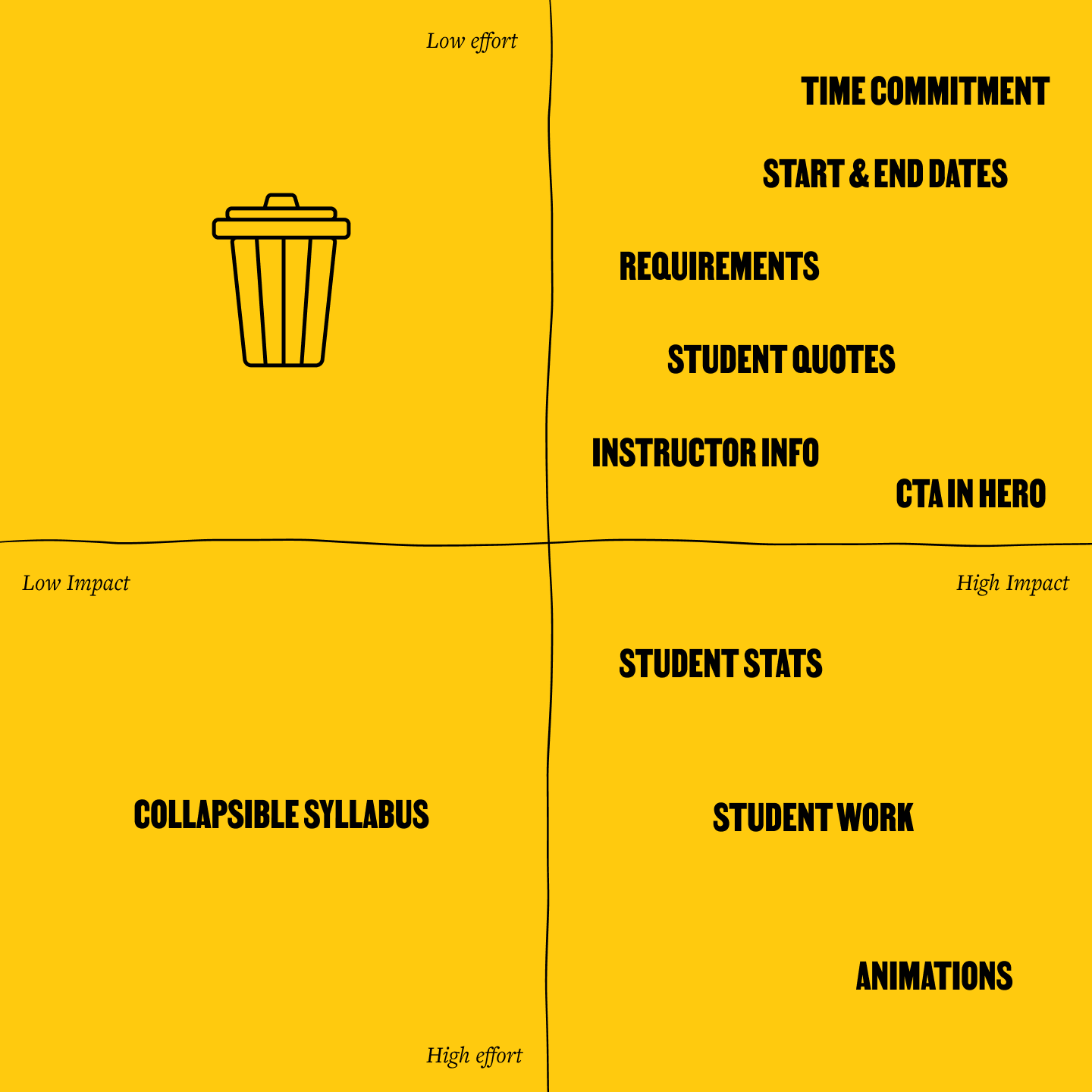
The HiLo matrix that Useful School used to help prioritize product changes
Key takeaways
- We wish we would’ve recorded users talking through their thoughts out loud as they were browsing the prototype and current site version. This is something we’ll plan differently for next time.
- User research takes a lot of time and energy, but it’s worth the effort. We were able to set up a maze within an hour to validate that we were on the right track and receive constructive insights and feedback.
- Emulating your competitor’s website isn’t always the right approach. You need to find your unique value, and focus on showcasing it through content and design.
Toolstack
- Gmail/Zoom (to get initial questions/inspiration)
- Tally (for student applications)
- Figma (for design)
- Figjam (for whiteboarding)
- Google Analytics (to understand user behavior)
- Slack (to communicate with users)