
Adding new editing capabilities to Uizard’s platform
Uizard launched their new editing capabilities feature with reduced risk by testing and validating the overall concept beforehand.
About Uizard Technologies
Uizard is an AI-powered design tool for non-designers, helping individuals and teams turn digital product ideas into interactive prototypes.
Industry
Tech & Software
Opportunity
Uizard wanted to validate a new version of their editing capabilities to improve activation and retention rates before releasing it to the wider public.
Key Maze features used
Prototype Testing
Usability Scoring
Share
Outcome
- Validated features
- De-risked product solution
- Achieved successful market result
We conducted a test in Maze to collect insights on a new version of Uizard’s editing capabilities. Our product was still in beta at the time, and our users frequently pointed out the limitations for editing within the platform.
With the help of a maze test, we designed a new and improved version of our editing capabilities, aimed at increasing activation and retention rates.
Context
Uizard is the AI-powered design tool for non-designers. We help individuals and teams easily turn digital product ideas into interactive prototypes, regardless of their design or technical experience.
In 2020, when Uizard was still in private beta, we offered limited editing capabilities within the tool. Users could drag-and-drop basic components, but they couldn’t modify or format them within the editor. Therefore, our product activation rate was low and the drop-off rate was high. To get to the high-quality prototypes and professional designs that people can rapidly create in Uizard today, we needed to make some changes.
Our research told us that expanding upon our editing capabilities would help improve activation and retention. To confirm our hypotheses, we needed to prototype a new version of our editing feature and test how users would interact with it.
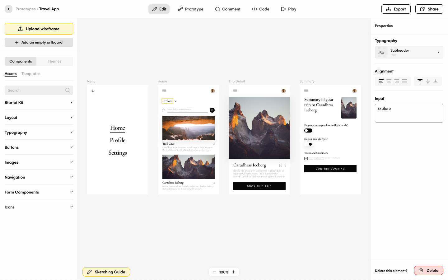
Uizard’s early 2020 platform, while still in its private beta version
Understanding the problem
When Uizard was in beta, we invited groups of 2,000 users per week to test the platform. This led to over 100,000 engaged beta users providing insightful product feedback.
We created Slack channels for people to share their initial thoughts and suggestions for product improvements. With our most active users, we conducted interviews where people repeatedly highlighted the need for more advanced editing capabilities. To complement this qualitative feedback, we also tracked product usage data in Pendo.
As a company, our most important metric was—and still is—recurrent active users. We hypothesized that while many users were eager to join Uizard, they would quickly lose interest and churn without more advanced editing capabilities.
Defining the problem
The Slack channels and interviews served as a first touch point to understand user pain points. The Pendo data enabled us to analyze time spent at various points in the user journey, but since a main goal of Uizard is being fast and easy-to-use, time spent is not always the best indicator of success. This made the interviews and Slack feedback essential when drawing conclusions about our users’ needs.
We grouped the feedback into themes and confirmed that better editing capability was the most frequent request. We were sure that editing improvements would have a measurable impact. The question was how best to improve it.
When users were building prototypes in Uizard and needed to modify components, they’d often hit one of the following blockers:
Insight #1: Most users weren’t able to make the change that they wanted because the specific editing function they needed didn’t exist.
Insight #2: Some users weren’t able to make the change in the way that they wanted to, because our editing capabilities didn’t work effectively.
Insight #3: Other users didn’t know how to use our existing editing capabilities, because our editing feature was not user-friendly.
The pain point was clear. And if users started projects in Uizard, but couldn’t finish them due to the platform’s editing limitations, then they would abandon the product.
Potential solutions
The next step was to understand which editing components people needed and how they wanted them to work. We led our brainstorming and ideation process with a user-centric question:
*“How might we enable users to jump seamlessly from other tools and processes over to Uizard with no major learning curve nor surprises?” *
To answer this question, we identified our top user personas which included product managers, product owners, founders, startup leaders, consultants, and students. We also researched the tools and processes most likely to accompany their work day. This helped us to understand the editing-related features they saw and were already used to on a regular basis.
Uizard’s lean product team came up with multiple ideas for how to allow editing directly on our canvas. The team then sketched wireframes to help visualize these options. We needed something that would be easy to test quickly, but conclusive enough to feel confident pursuing based on the results.
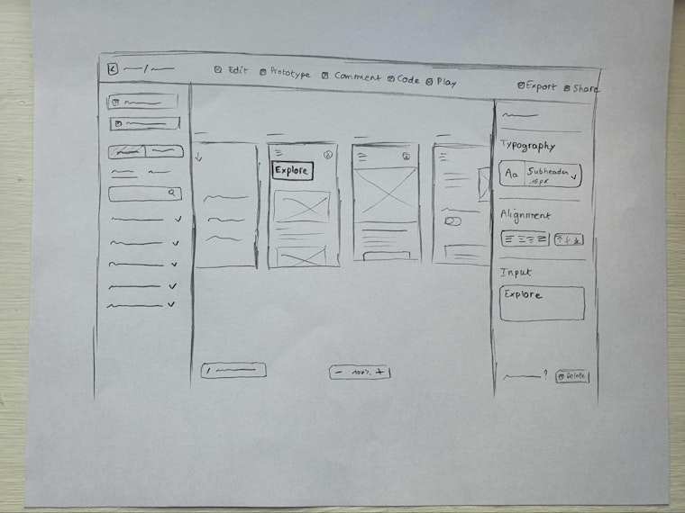
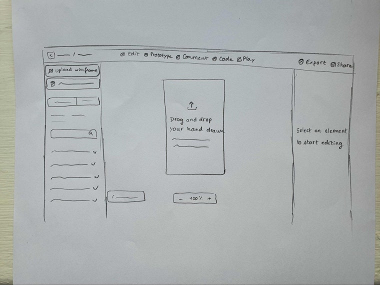
Example wireframes sketched by Uizard’s team in 2020, aimed at improving the editing capabilities of their then-beta product
The Maze Test
We created a prototype of a new editing feature, designed to tackle the adoption and activation issues that we were facing. The goal was to conduct a usability test to figure out if users would understand the feature and complete the entire process in the prototype. We also aimed to pinpoint potential drop-off points due to confusion, unfamiliarity, or other limitations.
We first created a visual design in Sketch that aimed to mirror the user behavior that would be required in the real feature. After gaining buy-in from internal stakeholders, we created an interactive version for the Maze test. So our testers clicked through the prototype in Maze, but it looked and acted as if it were coded within Uizard.
Our test included a series of mission blocks where users completed tasks within the editing feature, followed by opinion scales. Here are a few examples:
- “Upload a wireframe” (mission) followed by “How easy was it to upload the wireframe?” (opinion scale)
- “Change typography style” (mission) followed by “How easy was it to change the style?” (opinion scale)
- “Change prototype theme” (mission) followed by “How easy was it to change the theme?” (opinion scale)
In sum, we aimed to uncover whether our new editing feature would eliminate the three main blockers mentioned above: limited capabilities (not having all they need in the feature), ineffective capabilities (not liking how the feature works), and confusing capabilities (not understanding the feature altogether).
Results & next steps
To conduct the test, we sent an email to a group of roughly 50 users from our private beta. Within two days, we got most of the data we needed with a 78% response rate.
With one exception, the success rates for the mission blocks were all between 70% and 85%. This was enough to show sufficient proof of concept, and boost confidence that we could develop the feature and expect a successful result on the market. One mission block related to changing color had a success rate of only 56%, so this required a final refinement.
To conclude, our Maze test helped us validate the overall concept established in our prototype for the new editing capabilities. We were also able to clarify what users liked most, so we could prioritize where to expand and what to refine in the launch of our new feature.
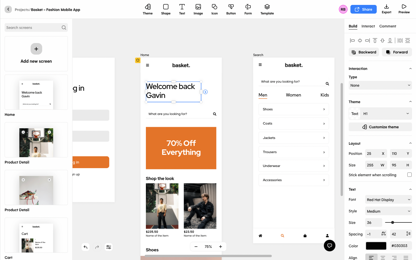
Uizard’s platform today, complete with easy to use editing capabilities
Key takeaways
- We confirmed our hypothesis regarding the need to improve our editing capabilities. The high success rates for the mission blocks and positive feedback via the opinion scales showed that the new design was effective and easy-to-use.
- The testing data revealed which aspects of the new editing capabilities feature were most attractive and useful, as well as showing that the proposed changing color function needed additional refinement.
- Maze helped reduce risks in product decision making and cut development costs, thanks to the real insights from our beta users that we could easily capture through the tests.
With help from Maze, Uizard has created the easiest design tool for non-technical professionals, now with more than 400,000 users.
Toolstack
- Slack (to interact with beta users)
- Zoom (to interview beta users)
- Pendo (for product usage data)
- Sketch (to build our design)
- Maze (for the user testing)

