
Improving the onboarding and adoption of Uxcel for new users
How Uxcel combined Maze testing with other interactive tools to better understand their users and improve and customize the onboarding experience.
About Uxcel
Uxcel empowers designers to build their careers with interactive learning tools, insightful skill tests, and powerful job matching.
Industry
Tech & Software
Opportunity
Improve product adoption across for newly released core features.
Key Maze features used
Prototype Testing
Surveys
Share
Uxcel has grown from initially focusing on UX learning, to now offering three core tools: learning, testing, and getting hired. With this growth came the need to improve our onboarding process and adoption rates.
In the case study, we show how we combine Maze testing with our existing interactive tools to better understand our users and improve product onboarding. This led to a new onboarding experience which more clearly guides users toward the parts of the product that would best serve their needs.
Context
Uxcel empowers designers to build their careers with interactive learning tools, insightful skill tests, and powerful job matching. We started out with little more than an idea and an Instagram account, and we’ve since expanded into a complete digital product.
But as our core features expanded, it became clear that the traditional signup flow that brought users to our Home page wasn’t sufficient. We noticed a reduction in activation rates, so we immediately looked into our Amplitude funnels to see where users were dropping off. The data pointed to one issue: an increase of users abandoning their session after account creation. Next question: how to fix it.
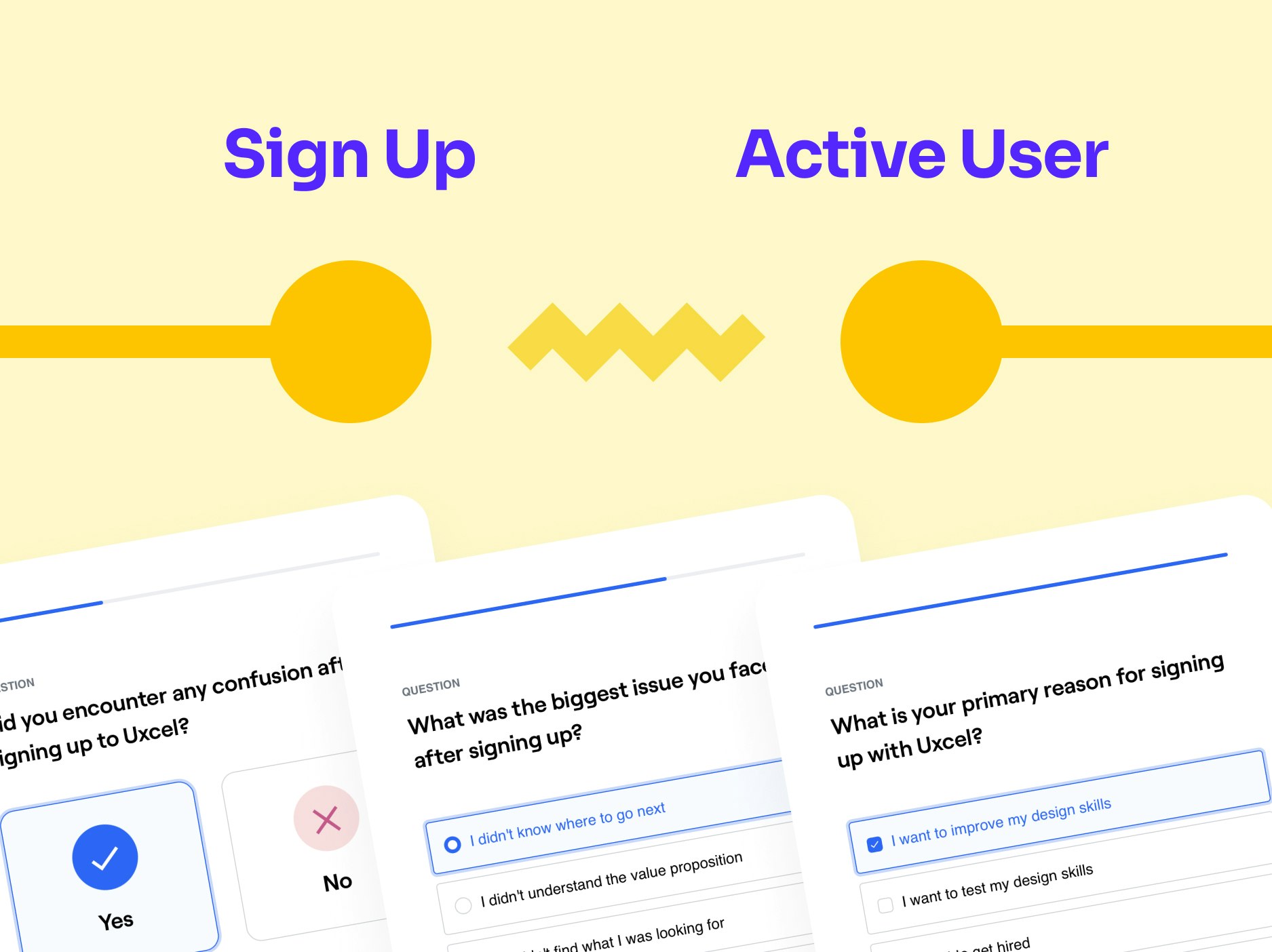
Uxcel's data indicated a big gap between people signing up to the product, and becoming active users
Understanding the problem
Before we could fix our onboarding woes, we needed a firm understanding of what the problem was. We knew people had different reasons for signing up—learning, skill testing, finding a new job—and many users were unaware of all of the features of the Uxcel product.
We also knew there was a lot of opportunity to upgrade the onboarding experience. It was fairly optimized for our learning tools, but there was plenty of room to improve our other products.
For our skill test and job search tools, data revealed that the biggest gap was between getting new users to sign up, and getting them to become active users. Interviews confirmed that it wasn’t clear what people should do after creating a new user account.
So we created a Maze questionnaire about signup motives. Surprisingly, we found nearly half of users were coming to Uxcel to test their skills or find a job, not for learning. But regardless of why users were coming to the site, the drop-off rate during onboarding remained much too high.
Defining the problem
To get started, we needed to put all of our qualitative and quantitative data in one place. So we compiled all of the data we had from Amplitude and moved it into Notion where it could easily be shared. Then our product, design, and engineering teams got together over several sessions to review the data and look at problem areas.
Three primary insights were discovered:
Insight #1: During our interview sessions, we found that almost half of our users were coming to Uxcel to take skill tests or get hired in a design job. Less than half were coming to learn.
Insight #2: We learned that users didn’t know what to do when they landed on the Home page. To successfully complete their goals in the app, they needed the in-product experience to better reflect their reason for signing up.
Insight #3: Many users who signed up for one thing weren’t unaware of the different features offered in the Uxcel product.
Potential solutions
Our marketing, product, design, and engineering teams discussed how we might identify and segment new users to create a better onboarding experience and improve activation rates.
Our big question was:
“How might we be able to better enable our users to become active Uxcel users?”
We came up with a number of strategies for how to best run the test. Some ideas included:
- Running a longer onboarding process that mimicked the interactivity of the Uxcel exercise player similar to the way Duolingo onboards users.
- Prompting users to build their profile when creating their account, which helps create a closer bond with the Uxcel product.
- Allowing users to select their motive while signing up, so we could immediately point them in the right direction without the guesswork.
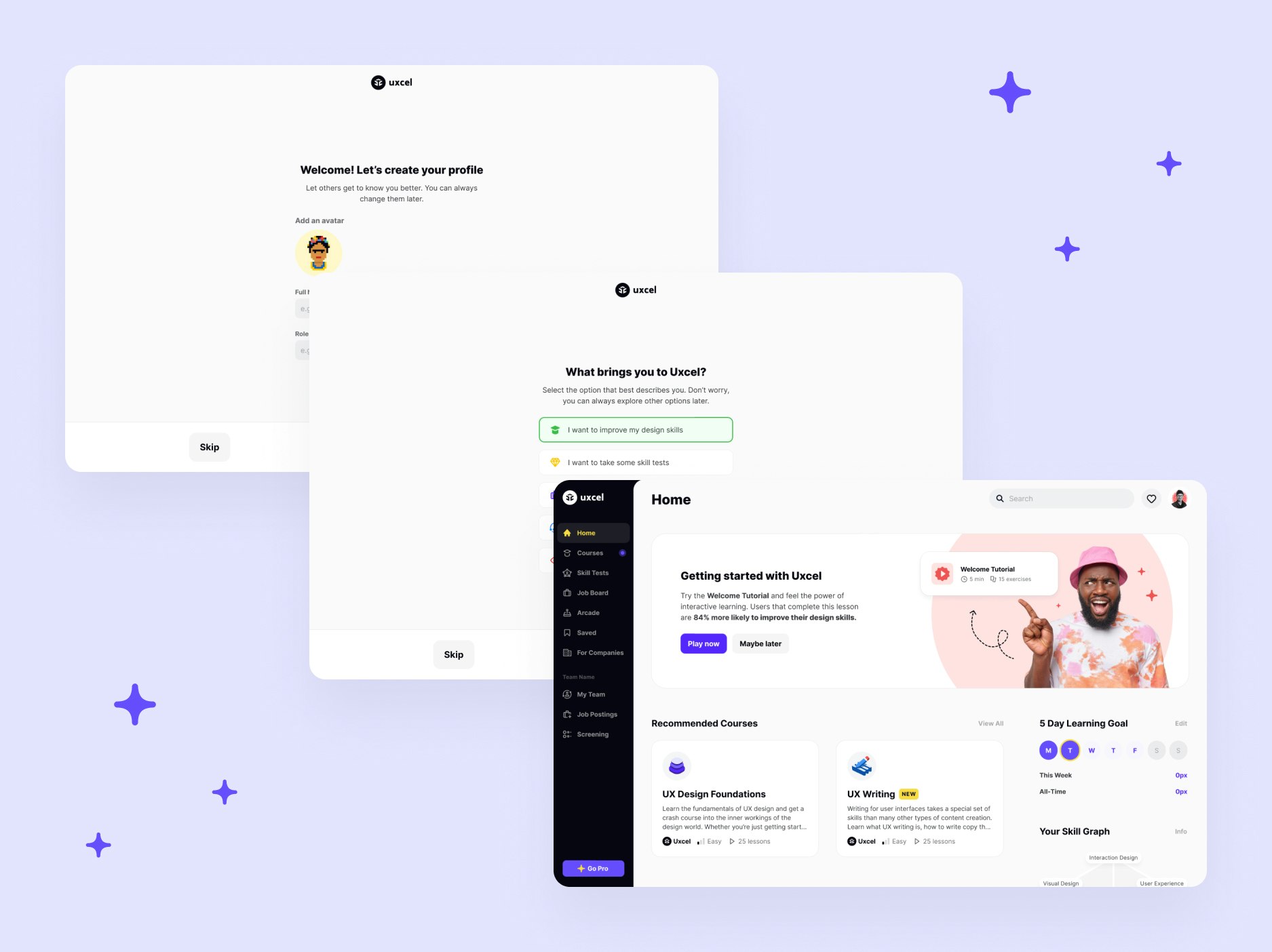
An example of the old Uxcel onboarding flow
The Maze Test
We created our first Maze test with a few key things in mind:
- Further validate why users were coming to Uxcel apart from learning
- Understand the percentage of users coming for each motive
- Obtain a mix of qualitative and quantitative results we could apply for further product improvements
Results & next steps
We collected nearly 100 responses from our second Maze test, and the results were positive. We were able to reduce the number of mission drop offs, and we almost doubled our activation rates. Overall feedback from users was positive and enthusiastic.
By implementing the onboarding flow that included a motive selection option, we were able to clearly direct people to where they should proceed from the Home page. As expected, providing a clear onboarding path based on someone’s motives for using the product led to a significantly higher product adoption rate and more active and engaged users.
Key takeaways
Here are a few things we learned:
1.We should confirm a user’s motive when they visit the product. Since Uxcel started as a learning platform, we assumed learning was still the main motivation for most users who signed up. We were wrong.
2.Awareness of new features had spread much more quickly than we anticipated, so more people knew about our skill tests and job search features than we thought.
3.There were still plenty of users who didn’t know about all three key areas of the Uxcel product. By finding out people’s motivations, we’re able to subtly introduce features they might not have been aware of.
4.We should’ve implemented Maze testing into our workflow at a much earlier stage. Gaining these insights earlier would have helped us identify pains and create solutions even faster.
Uxcel's ecosystem of apps for getting things done
Toolstack
- Figma (to create designs and new flows)
- Amplitude (to analyze existing and new onboarding funnels)
- Notion (to compile data, create mission brief, and share results)
- Slack (for internal communication with the team)


