Revamping Safelite’s scheduling experience to improve customer satisfaction
Safelite validated their new scheduling experience for speed, convenience, and clarity, with an impact to the customer’s overall satisfaction.
About Safelite
Safelite is a provider of vehicle glass repair and replacement services in the United States.
Industry
Retail, Automotive, Tech & Software
Opportunity
Validate how the scheduling experience would improve customer satisfaction and conversions and gain insights to make the necessary improvements.
Key Maze features used
Prototype Testing
Clips
Share
Outcome
By using Maze, Safelite could enhance its customer experience, increase operational efficiency, and further improve its brand reputation. Improvements drove ease of purchase/conversions to purchase on their site.
In this case study, we share how we pitched a new digital concept for our website and the steps we took to discover, explore, and solve challenges for our customers.
Context
At Safelite, we help our customers get their broken auto glass fixed fast. But like so many other industries, the pandemic shook up how we interact with customers. This put us on a path to become a digital-first company, and created new opportunities for us to think differently.
One of our biggest priorities for the year was developing a quote and scheduling experience that felt easy and natural on mobile. But our UX design principles and technologies weren’t primed for this new mobile-native customer. We needed a way to quickly run product research, collect user insights, and prototype smart solutions.
Understanding the problem
When it comes to product improvements, our digital team follows our own special flavor of the Double Diamond process. It looks like this:
- Uncover challenges and create a change/benefit hypothesis
- Explore what to solve and how to solve it
- Hone in on the best way to solve it
- Test potential solutions and measure the value
- Observe how behavior is changed and uncover new challenges
This looping process lets us work together towards common goals, with an understanding that each step requires both subject matter expertise and general team input.

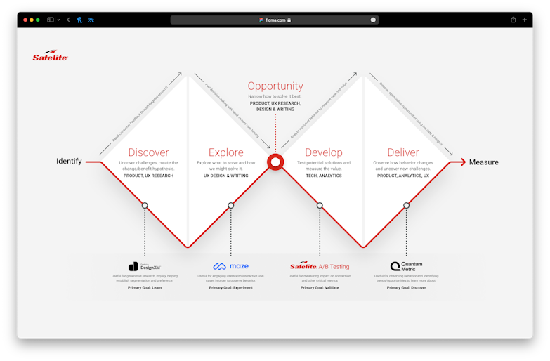
Safelite's Double Dimond design process
Our discovery can be driven top-down through business goals, or bottom-up by customer challenges. But more often than not, it’s an interplay between the two.
For this project, we gathered site behavior from Google Analytics, customer feedback from Qualaroo, and performance data from internal business units. We found that many first-time visitors wanted to get an estimate to fix their vehicle glass without feeling the pressure to schedule an appointment. Others struggled to identify their correct vehicle and/or parts. And for some, they simply preferred to speak with a real person.
Defining the problem
To better understand the challenges of our customers, we created short surveys using Qualtrics DesignXM. This helped us understand customer preferences and expectations in situations like pricing, vehicle identification methods, and clarity of terms. As we completed these user surveys, our UX researchers translated the data into shareable insights using Miro.

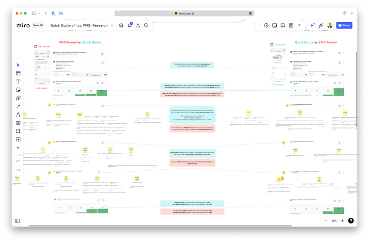
User survey data translated into shareable insights in Miro.
These surveys led to a few key insights that directed our exploration:
- Speed - Many first-time visitors wanted a quick cost estimate for a fast glass fix, but weren’t interested in scheduling an appointment.
- Convenience - People found it hard to locate their VIN (vehicle identification number), and answer additional questions to ensure they got the right part.
- Clarity - Some people were unsure about receiving the correct part. There were also concerns about additional costs that weren’t clear up front.
We also discovered other opportunities like mobile optimization, page load speed, and accessibility. Putting these findings together, we created change/benefit hypotheses to help prioritize the opportunities with the highest impact for both our customers and the business.
Potential solutions
We approach design exploration like an automotive manufacturer might design a new vehicle. We call it building the “concept car.” Basically, our designers and writers are set loose to prototype their most creative ideas to address a need in the most ideal way. No technical constraints, no budget, no limits. Just create an experience that’s really, really cool.
The goal was to address the insights discovered above.
- To increase speed, we explored how to estimate a price range with the least possible information.
- To improve convenience, we explored what easy-to-access information we could use—like license plate and home address—to match a customer’s exact vehicle and part.
- To gain clarity, we explored using vehicle images, clearer language, and upfront pricing to improve expectations.

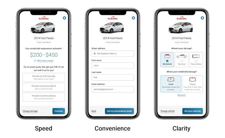
Caption: Prototypes addressing three key insights: speed, convenience, and clarity.
We got together as a UX team to share ideas and come up with a refined example of our future vision. Then we turned these into high-fidelity prototypes that told a story along different points of a customer’s journey. Finally, we shared our ideas with the Product and Technology leads to validate our approach and get their feedback.
Giving other teams the opportunity to invest in the concept led to feasible ideas we could begin testing with real people.
The Maze Test
We refined our exploration through additional Maze tests. And then came the moment of truth.
To get the thumbs-up from senior stakeholders, we needed to validate that our new experience could be completed faster, with more accuracy, and with a higher customer satisfaction rate than our current digital experience. That was a big commitment to make before a single line of code was written.
So here’s what we did. We created two prototypes in Figma: a 1:1 version that mirrored our existing digital experience, and another for our new concept.
Then we A/B tested both versions, keeping an eye on interactions and misclicks, and measuring overall satisfaction and time to complete the experiences.
It’s simple to import Figma prototypes into Maze, making the test super easy to set up. We just combined both prototype experiences into a single Figma file that we imported into a Maze test. To eliminate order bias, we created a second Maze test with the order of the prototypes flipped. Then we tested half of our participants with each Maze test.

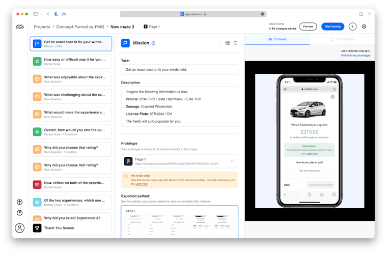
A backend view of Safelite's Maze test.
We gave each participant these simple instructions: “Imagine your vehicle has a cracked windshield. Select your vehicle and the type of damage to get a quote.”
This seemingly simple mission was the culmination of many smaller Maze tests. Would our small successes work together as a large seamless experience? What would we learn? Fingers crossed!
Results & next steps
Within 24 hours we had over 60 responses using Maze’s testers panel. First insight: participants navigated the new experience 12% faster with 2% fewer misclicks. That was great news, since speed is related to less confusion and more completions. But the most telling results would come from the qualitative data.
For our existing quote and schedule experience, 76% of our participants rated it easy (4/5) or extremely easy (5/5). This wasn’t a big surprise, as our existing funnel was already performing well. But this meant that we would need strong justification for the new concept to justify the large investment.
Overall, 92% of our participants rated our new concept experience as easy (4/5) or extremely easy (5/5)—a 16% improvement over the existing site! We were confident the new concept would be better, but even we were surprised at how big of a jump we achieved.
Other data showed that:
- 74% rated the new concept as the easiest to navigate
- 68% rated the new concept as the quickest to complete
- 72% rated the new concept as their favorite experience
This Maze test validated our assumption that speed, convenience, and clarity can have meaningful impacts to the customer’s overall experience. And with this new data in hand, we were ready to show our executive sponsors that this opportunity would be worth the investment.

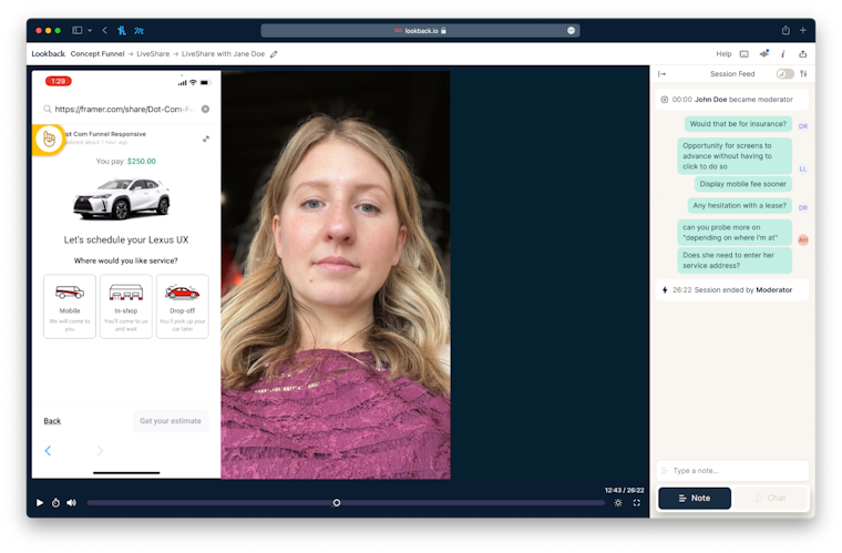
A moderated usability test in action, using Lookback and Framer.
There was one last step before development. We ran moderated usability testing sessions with Lookback and a dynamic prototype created with Framer that allowed participants to enter their real vehicle type, insurance provider, address, and payment information to calculate a personal quote on the fly.
This wasn’t as quick and simple as building a Maze test with Figma, but we found it extremely valuable to observe participants entering real data on their mobile device in real-time, without development.
Remember our concept car approach? This step was when we moved our lofty concept car into the down-to-earth vehicle that finally makes it to the dealership. Still sexy, but more practical and affordable to build.
Key takeaways
Throughout this process, we discovered five main findings that will shape our new UX design principles and frame every new design idea:
1.One screen, one hand, one minute. Every experience we create should be visually concise, accessible to everyone, and quick to execute. We strive for the least amount of user input to reach a goal. Every interaction that’s required from the user increases friction and the chance they leave frustrated.
2.Meet the customer in their moment. We’re aware of our customers’ feelings, we understand their needs, and we’re ready to serve them at that moment.
Invest in what’s best. Doing what’s right for our customers enhances our reputation, attracts new customers, sets us apart as a leader, and helps us sleep better at night.
3.Invest in what’s best. Doing what’s right for our customers enhances our reputation, attracts new customers, sets us apart as a leader, and helps us sleep better at night.
4.Never make the customer ask “why.” We build purpose-driven interactions that answer our customers’ questions before they ask them. We guide users with recommendations to boost confidence. Don’t go for “ah-ha,” go for “of course.”
5.Unexpected happiness. We seek ways to surprise and delight our customers and our team. Why? Because happy experiences are the best experiences.
These principles are already inspiring groups across our organization and igniting more innovative thinking. It’s been a big success. But we’re also thinking about what we can still improve.
First, we want to recruit more targeted participants ourselves. Maze helped us magically recruit hundreds of testers, and we couldn’t have gotten started without it. Moving forward, we’ll start using our own site users as volunteers to increase volume and authenticity.
Second, we want to better understand how participants are interacting with our tests. We’re excited to dive deeper into Maze Clips to see how testers interact with specific missions and screens.
Third, we’d like to make the results of our tests more widely accessible. It’s taken some time to create best practices and build confidence with our process. Now we want to dive deep into tools like Qualtrics DesignXM, Maze, and others to discover more valuable insights that we can share more frequently across our company.
If we had to pick one word to summarize the outcome of this project, it would be “growth.” We’ve grown our UX team size, research experience, toolsets, along with our ability to better support our customers and the business. It wasn’t quick or easy, but with the team committed to the same goal, we made it happen.
Fast forward to today, and we’re in full development mode, with our MVP expected to launch in a few months. Just in time to loop back to the start of our double diamond to identify a new set of challenges to solve.
Toolstack
- Figma (for the design)
- Miro (to share insights with stakeholders)
- Maze (for unmoderated usability testing)
- Framer (to create a dynamic prototype)
- Lookback (for moderated usability testing sessions)
- Qualtrics DesignXM (to compile insights)