
A/B testing designs to expand Braze’s product offering for SMS
The team at Braze used Maze to understand their users' interactions and satisfaction with the new SMS feature, delivering a superior product experience.
About Braze
Braze is a comprehensive customer engagement platform that powers relevant and memorable experiences between consumers and brands they love.
Industry
Tech & Software
Opportunity
Braze wanted to test and validate their new SMS feature with their users, while also capturing overall satisfaction and users' interaction with UI changes.
Key Maze features used
Prototype Testing
Usability Scoring
Automated Reporting
Share
Outcome
- Validated SMS feature successfully
- Enhanced positive user interactions
- Increased user satisfaction
A/B testing lets you compare variations of a design to find out which one performs better.
In this case study, we’ll show you how the design team at Braze used Maze to validate new designs of their SMS product offering through A/B testing. Apart from the intended insights, the tests also helped identify other frictions to improve, creating an even better product experience.
Context
At Braze, we connect companies to their customers through our lifecycle engagement platform. To create even better interactive conversations, we wanted to add Multimedia Messaging Service (MMS) to our SMS capabilities. This would allow users to add media files—like images, videos and GIFs—to their SMS messages. But adding this new functionality came with new UI elements that we had to get right.
To ensure that everything worked as it should, we needed to test the new designs against our existing flow. This let us see how users navigated the product, where they got stuck, and what steps they took to get their jobs done. And it gave us the confidence that we were providing something that our customers both wanted and could easily use.
Understanding and defining the problem
At Braze, we do a significant amount of research to understand and prioritize product development. We spend a lot of time speaking with customers and understanding their pain points, and have several formats for capturing input on product enhancements and the value they would provide, and we use ProductBoard to compile and organize most of the customer feedback we receive. The data compiled from research revealed that customers would like the ability to add multimedia content like images, GIFs, and videos to their SMS campaigns.

: MMS capabilities let people add multimedia files to their SMS messages
Potential solutions
The question then was – how might we best enable marketers to easily add images and GIFs to their SMS campaigns?
I sat down with the engineering and product leads to talk about minimal functionalities and technical considerations. Together, we aligned on the high-level goals and defined what a successful outcome would look like. For this project success was clear: feature adoption.
Next, we developed an initial design that we could test with customers, keeping our key adoption metric in mind.
The Maze Test
We decided to run an A/B test with two different mazes to:
- Identify which design would maximize the discoverability of the new feature
- Discover any usability related problems
- Test different visual treatments
We created two prototypes with the same high-level design components, but different layouts and ordering. For example, Prototype B put more emphasis on the zone for media attachments to bring more attention to this option, as compared to Prototype A . As you can see below, the team tested different visual treatments for some UI elements.
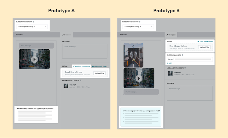
Two prototypes tested by Braze emphasizing different layouts and UI elements
We set up each Maze test as follows:
- Provide a brief intro to the usability testing tasks and goals
- Present an interactive prototype imported from Figma
- Ask follow-up questions, for example:
- Rate your overall satisfaction (opinion scale)
Why: We found that capturing overall satisfaction helped us find gaps between the completion rates and the actual satisfaction rates, which don't always reflect each other. - Did any part of the flow in particular stand out? (open-ended question)
Why: Rather than trying to nudge people toward particular positive or negative feedback, this question creates space for users to mention what was top-of-mind from their test. We were particularly interested if users noticed UI changes like button placement, banner styling, or subtle interaction elements. - Can we reach out to you for further feedback?
Why: As you analyze results, you often come up with new questions or to clarify, or interpretations of results that you want to validate. Reconnecting with participants can help boost confidence in the final design.
- Rate your overall satisfaction (opinion scale)
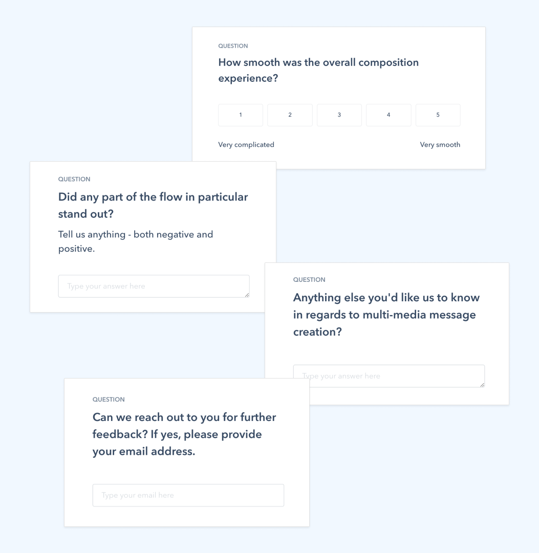
Questions presented to Braze users during their Maze test
Results & next steps
To collect responses, we posted the test in our community called Braze Bonfire. As of January 31, 2022, over 5,000 community members use Braze Bonfire to chat, ask questions, and provide feedback on key platform features. For customers willing to participate, we created a private group for the test. We garnered nearly 20 responses per Maze test, most of which came in the first couple of days. Then we started observing behavior and assessing results.
First, we compared the prototype satisfaction rating, where Prototype A had a clear advantage.
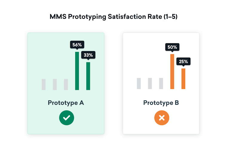
Satisfaction ratings comparing Braze's two prototypes in their Maze test
From there, we took a deeper dive into the results of each maze. We were particularly interested in the bounced user paths, which helped us pinpoint where people were interacting before leaving the test. Were people misclicking? Were they spending more time than expected on a given screen?
There were plenty of unexpected but interesting results.
One was a dropdown selection where users had to choose MMS or SMS phone numbers. We saw people spending way too much time on this selection, along with a fair number of misclicks.
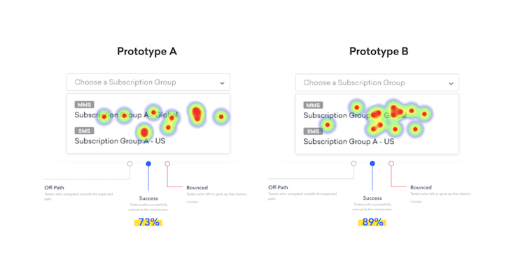
Heatmaps showing the click patterns and success rates from a Maze test
Even though the heatmap showed an overall higher success rate on this version, we knew we could do better. So we tweaked the design to make the selections even clearer.
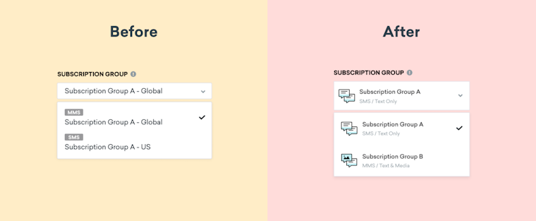
A deeper analysis of Maze heatmaps led to an updated design with clearer menus
Finally, we scheduled a 30-minute follow-up call to chat with participants about their experience. We also walked them through our updated designs for additional feedback.
This feedback validated our designs and gave us the confidence to roll out our new MMS functionality. And it’s been great to see the adoption of this highly requested feature, allowing our customers to add enhanced multimedia to their SMS messages in a clear and convenient way.
Key takeaways
- Remote, non-narrated usability testing is best suited for evaluative research: testing solutions to validate a product or concept before too much work has been done.
- You need a well-defined problem and a strong conviction for your design to support an effective test.
- Focus on A/B testing only one thing at a time (e.g. only layout; only copy). If not, you risk spending more time analyzing results with lower certainty about what really matters.
Toolstack
- Productboard (to compile and organize customer feedback)
- Figma (for interface design)
- Confluence (to collaborate with the team)
- Gsuite (Sheets, Docs)
