User Research
Remote user research: Why you need it and the tools to get started
Discover how your audience naturally groups parts of your site using this website navigation template. Collect valuable feedback to help improve your website's information architecture (IA) in a way that is intuitive to your users, and supports your organization’s business goals.
Template by
Mithilia Fox, UX Research Lead @ Stack Overflow
Run a remote card sorting exercise with users to help you understand how users group information, so you can then apply it to your product, website, or app.
Identify whether your naming or labels are difficult for users to understand and discover more opportunities for iteration and optimization.
Listen to your users to help uncover potential missing categories, and track common themes that can help inform core changes to your site.
Validate ideas around your information architecture with users early on, and remove assumptions that can slow users down and impact product usage, conversion or feature discoverability.
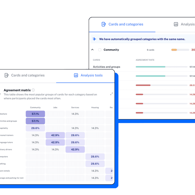
Card sorting results are showcased as agreement rates, a similarity matrix, and an agreement matrix to speed up your time to insight.
What is Information Architecture (IA)?
Information architecture (IA) focuses on the effective organization, structuring, and labeling of content within digital products, to help users find information and complete tasks.
Why is information architecture important in UX?
Information architecture is incredibly important to your product—poorly categorized or labelled information can affect your product’s usability, lead to customer frustrations, and cause low adoption rates of certain features.
Testing whether your information architecture makes sense is therefore beneficial to both your users and your organization as a whole.
How do I test my information architecture?
The two most common approaches to test information architecture are tree testing and card sorting. While both have overlapping benefits and can be used as complementing research methods, they’re typically used at slightly different stages in the research process:
Card sorting. Card sorting is a UX research method in which users organize topic cards into categories in a way that makes sense to them. This research activity is an important step to creating an intuitive information architecture (IA) and user experience. Card sorting is a good method for defining and testing new website architectures, where learnings can show how your users would categorize information.
Tree testing. This research method helps you evaluate the hierarchy and findability of topics in an app or website. Tree testing is a good way to test existing information architecture models and see if users can ultimately find what they’re looking for.
💡 To discover more about tree testing and card sorting, check out our What is UX Research Guide.
Test live website navigation
Design • Product • Usability Testing
Test live website navigation
Gather navigation insights on your website
PRO
Get preference on web designs
Design • Concept Validation
Get preference on web designs
Create exceptional web designs with valuable feedback
PRO
Test your website sign-up flow
Design • Research • Usability Testing • Wireframe Testing
Test your website sign-up flow
Validate your sign-up flow
PRO
Assess information architecture (IA)
Research • Design • Concept Validation
Assess information architecture (IA)
Compare and test variants of a design
PRO
A/B test landing page copy
Marketing • Copy Testing
A/B test landing page copy
Verify copy variants to engage users
A-mazeing to meet you!
Welcome Screen
We're improving our website navigation
Context Screen
Card Sort
Card Sort
Were there any cards or categories that you felt were unclear or hard to understand?
Yes/No
Which cards or categories did you find unclear or hard to understand?
Multiple Choice
Were there any cards that you feel didn’t belong to any of the categories?
Yes/No
Which cards did you feel did not belong to any of the categories?
Multiple Choice
Would you rename any of the categories?
Yes/No
Which categories would you rename?
Multiple Choice
Please share what you would like to rename them to.
Simple Input
Would you add any categories?
Yes/No
What categories would you like to add?
Simple Input
Would you remove any categories?
Yes/No
Which categories would you remove?
Multiple Choice
Thank You!
Thank You Screen
