


The idea of being data-driven is everywhere, and with good reason. Validating your design decisions with data collected from user research or user behavior analysis is a vital part of the design process, if nothing new.
But with data now accessible to Product teams when making decisions, fresh questions have popped up: can we rely too much on data? How do we make sure we’re using data correctly? Should design really be driven by data, or just informed by it?
Data-driven design vs. data-informed design
The difference in the data-driven versus data-informed design debate is subtle. Data-driven design in UX means making design decisions where hard data is the most important (or sometimes only) factor in decision-making. There’s often little room for anything else in the decision-making process.
Data-informed design, however, involves making decisions based on data as well several other inputs, such as professional experience, business goals, qualitative feedback, and more. It takes more than just data into account, and puts different levels of value on each factor based on the project and objective at hand.
Ultimately, the right approach for your business depends on your product, your user’s needs, your goals, and more.
For an expert take, we spoke to someone who played an early role in making data part of the design process: Design Advisor Chris Linnett. Having been a Design Lead at Microsoft, Spotify, Typeform, and Deliveroo, he’s seen it all when it comes to data and design—from big wins to big what-ifs.
Here are Chris’ top stories and takeaways on how to use data to drive and inform your decisions.
1. Some data is always better than no data: The first A/B test at Microsoft
In the early days of the web, you’d open up Internet Explorer and the first thing you’d see was the MSN homepage. For younger readers, here’s what it looked like:

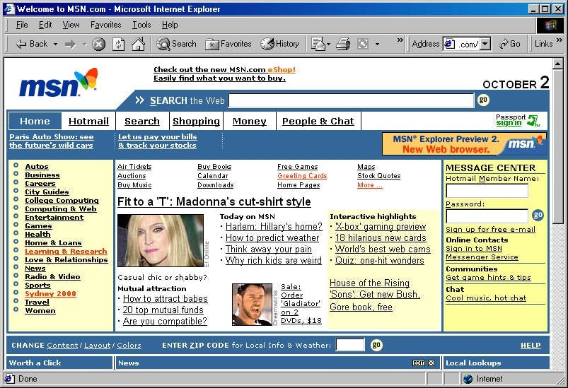
It might look a bit rough around the edges by modern standards, but this was a monumental first experience of the internet for most people—including the digital designers of the early 2000s.
Chris, who was at Microsoft at the time, explains how the rise of the web impacted design:
“Prior to the web, we were creating multimedia CD-ROMs and selling them in stores. We didn’t have much data to validate decisions. When the web arrived, Design took a big hit because early pages were pretty much blue text on a white background. But the web brought this great evolution of data. We just had to figure out how to use it.”
Designers could begin to track exactly how people interacted with their designs. They could see metrics like the number of page visits, time on page, bounce rates, and what people were clicking. It was the dawn of what we now call product analytics, and a huge step toward using quantitative data collection and analysis to drive and inform design.
Chris’ first job in the new age of internet data? Redesign MSN.
Before Google’s web domination, there was a lot of competition between different search engines and web portals. MSN was losing to Yahoo. Badly.
“MSN’s top three search terms were Yahoo, yahoo.com, and www.yahoo.com. So when redesigning MSN, we knew we had the amount of time it takes somebody to type ‘Yahoo’ in our search box to capture their attention.”
The key to turning the tide was data. As you can see from the screenshot, MSN was basically a page full of links. Back in the 90s, links were always underlined. Chris wondered if removing these underlines would help people scan the page faster, making it easier for them to spot something interesting before bouncing to Yahoo.
“I thought there must be a way we could show some people the page without underlines, and compare the results to people seeing the page with underlines. We had this hypothesis and we wanted to test it.”
There was no such thing as A/B testing or multivariate testing at Microsoft at the time, so it was quite a lot of work to set up. But once the results came back, Chris and the team realized they had a powerful new way to validate design changes with real-world user data.
As we continued to dive into the data, we understood more and more of exactly what was happening on the page at every moment—and how to build a better experience as a result. Today this is all common practice, but back then it was absolutely mind-blowing.
Share
With data-driven design decisions, Chris and the team went on to build the most successful MSN yet—no underlines needed.
2. Precise tests lead to useful data: Dark vs. light at Spotify
The first Microsoft A/B test provided useful results because it had a clear research hypothesis, and was set up to test that hypothesis. Being data-informed or driven means knowing how to ask the right question—which can be a challenge.
“Thinking of the right question to ask and constructing a test that will answer it is really hard, so people sometimes run tests that aren’t going to answer the question they want.”
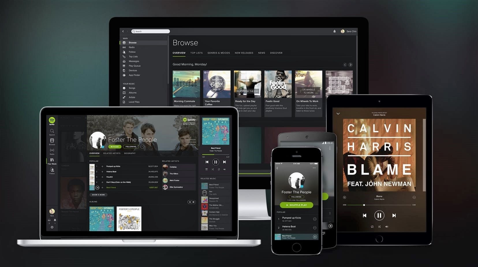
When Chris joined Spotify, the interface was light on some devices and dark on others.
Here’s an example of how they created a precise research hypothesis to get data that could inform their designs:
“The Design team wanted to create a holistic visual interface—but should it be dark or light? The team designed light and dark versions and conducted user research to answer this very specific question.”
While the Design team assumed people would prefer a light app, the data came back and dark was the winner.

"It was a great project to gather data on because at the time, the result was counterintuitive. It allowed Spotify to own a look that others didn’t have." says Chris.
Using different types of data to validate precise product design decisions in this way is a great example of a data-driven approach.
3. Data doesn’t always get you what you want: Increasing engagement on MSN
Sometimes, collecting quantitative and qualitative data can lead to counterintuitive results. This could be because you set up the test badly:
“I’ve seen several poorly-designed experiments lead to unexpected results, and teams will still use this bad data in the name of making data-driven decisions. If the result is counterintuitive, make sure the experiment is correctly designed to answer the question you want.”
But it could also be that the answer really is counterintuitive. Chris encountered this a few times while working on increasing engagement on MSN. Excited about the possibilities of data-informed design, the team ran another A/B test to see whether people would engage with content more if it was tailored to their interests.
“We put more financial headlines on the MSN homepage for a group of people who regularly visited MSN Money and compared engagement to a control group who saw the regular MSN. We were surprised to discover there was no significant difference in homepage clicks between the two groups.”
The team double-checked the experiment, but it was run correctly. So they started drawing insights from the data.
“Concluding that people don’t want a personalized experience would’ve gone well beyond what we tested—perhaps people enjoy some serendipity in their homepage headlines. So we decided to explore other ideas to drive engagement.”
Their next experiment with design changes also produced counterintuitive results. But this time, the graphs showed an increase in user engagement.
“We highlighted some links in red to draw attention to them. Our hypothesis was that clicks would go up while the links were red and then back down when we turned them black again. The data showed an increase in clicks. But surprisingly, the increase remained even after the link went back to black.”
From the data, the team realized that highlighting the link showed people that this area existed on MSN, and that people would remember it. This case study shows us how a data-driven design process can provide insights we’d never considered—helping limit the effect of assumptions and biases on final designs.
Be prepared for surprises from your data—that’s what makes it so important. At the same time, you shouldn’t exclusively rely on data. Here’s why.
4. Validate your designs with data: The Spotify payment flow redesign
So far, we’ve looked at case studies of specific design decisions being driven and informed by data. But what about bigger design updates, like a new landing page or product area?
According to Chris, you have two options:
- Break it all down into small experiments and test every change
- Launch a big update, measure how it performs, and iterate from there
Back at Spotify, Chris faced this exact dilemma with their payment flow.
“The previous Spotify payment flow was confusing and had low completion and conversion rate. Most people quit before successfully subscribing.”
So, he redesigned the user flow’s UI design based on interactions that fit best practice on the web. The Product team was excited, but also concerned about launching such a big update without testing each change. On the other hand, a bunch of small experiments would take a very long time.
Chris had an idea:
“I said, ‘What if we release the whole new payment flow at once? If it performs better, we’ll improve much faster and we can build on that. If it’s worse, we can deconstruct it and test the components.’ The team were like, ‘Can we do that!?’”
While the normal design philosophy at Spotify is to test and iterate design changes as much as possible, Chris said he’d take responsibility for the bigger release. After all, they’d still test this new version against the old one and continue to iterate it from that point on.
The result? An instant and significant increase in successful subscription payments. For Chris, the takeaway was clear:
Professional experience is a lot like data. Designers do a bunch of experiments over their careers. They see what works and doesn’t work. We should use this experience to solve problems. Testing every change separately can make it more difficult to achieve holistic improvements.
Share
So while designers should focus on validating designs, running usability tests, and analyzing data, they shouldn’t be afraid to take a bigger leap if they’re able to base it on experience. It’s not always best to just focus on being data-driven. In fact, it’s often a lot more beneficial to use data alongside other knowledge and information.
Can data-driven design succeed?
For Chris, the realization that it’s possible to rely too much on data has been a strange one:
“With my science background, I’ve spent years in tech promoting the idea of relying on data-driven design processes and decisions. And now I’m like, sometimes you want to use less data!”
There are several solid reasons why data shouldn’t 100% drive your design choices:
- The amount of qualitative and quantitative data types modern companies collect often requires skilled data scientists to design experiments and analyze results properly
- Data often doesn’t reveal a conclusive course of action—if a test is inconclusive, you might still want to take other factors into account
- Testing every change is perfect for incremental product development, but can make it more difficult to achieve bigger step changes
- If Henry Ford had been data-driven, we’d have faster horses instead of cars
Like many modern designers, Chris believes that data should back up a designer’s talent, intuition, and experience—not the other way round.
But what about companies that rely very heavily on data to inform their design decisions, like the massively successful booking.com? Sometimes being data-driven in UX design decision-making can be beneficial.
Chris agrees that if you can carry out enough tests correctly at scale, this can drive success. However, if you were to optimize everything automatically according to data, you could run into a potential downside:
Optimizing design based solely on data can drive growth. But you may find yourself optimizing to the top of a small peak (local maximum) while missing out on the larger mountain (global maximum). Without designers thinking outside the box, there’s always a risk that you’ll miss opportunities.
Share
How does booking.com make sure it doesn’t miss the larger mountain? They employ a ton of UX designers and UX researchers to run their tests and make sense of their data. In their own words, even the king of A/B testing is “informed by data, driven by empathy”.
So if you’re a designer who’s worried that data will optimize you out of a job, remember: the data shows that we need people, we need designers, and we need expertise.
Chris is currently an advisor at Deployed.co.


Frequently asked questions about data-driven design
What is data-driven design?
What is data-driven design?
Data-driven design is the practice of basing design decisions solely on data collected through user, product, and market research. It does not take into account any other factors, such as existing knowledge, professional expertise, or personal preference.
What is the data-driven approach in UX design?
What is the data-driven approach in UX design?
The data-driven approach in UX design looks to make all design decisions based only on user experience insights, such as those collected through user interviews, focus groups, usability testing, heatmaps, and other UX research methods.