


")


User experience (and the teams behind it!) shapes how users convert, succeed, and stay in your product. But proving that impact isn’t always easy. That’s where OKRs help. OKRs (objectives and key results) give your UX team a way to focus on outcomes:
- Objectives are what you want to achieve
- Key results are how you measure success
The best OKRs are created with the SMART goal framework in mind: specific, measurable, achievable, and time-bound.
Solid UX objectives are built for alignment. They make it easier to connect UX work to business metrics—and track whether your design decisions actually move the needle. In this article, you’ll learn how to write effective UX OKRs, align them with business goals, and see real examples from product teams doing it well. We’ll also share a free UX OKR template to track your own goals.
7 Steps to set effective UX OKRs that drive results
It’s not enough to show what UX changes you’ve made—setting UX OKRs is about aligning design efforts with business impact.
Here are the steps for creating meaningful objectives and measurable key results—because if it’s not measurable, it’s not trackable (aka, it’s not a good OKR).
1. Start with your company’s priorities
Before setting any UX objectives, zoom out. What’s the business trying to achieve this quarter—growth, retention, reduced churn? Your UX OKRs should align with those larger UX research initiatives that you’ve already established as key for business success. This creates shared focus across teams and makes it easier to connect your design work to real outcomes like conversion rate, onboarding completion, or user satisfaction.
If your objective doesn’t support a business goal, it’s probably not the right one.
2. Define clear and ambitious objectives
A strong objective sets direction—it should be bold enough to inspire your team, and focused enough to guide decisions. In UX, this could mean tackling a known friction point, improving usability metrics, or driving engagement.
Instead of a vague goal like ‘improve navigation,’ a better OKR would be to ‘decrease the average time to find a key feature by 30%.’
Peter Barnett
VP of Product Strategy at Action1
Share
At Action1, Peter’s team set a UX OKR to reduce frustration in their patch management workflow, where users were struggling to schedule patches efficiently. That single objective led to a measurable, user-driven redesign that simplified the UI, added tooltips, and introduced in-app guidance.
If your UX objective isn’t solving a specific user pain point—or can’t be validated through behavior or feedback—it’s not doing its job.
For example:
❌ Make the product better → too vague, no clear outcome
✅ Improve first-time user activation experience → specific, tied to a real user journey
If your team can read the objective and immediately picture the problem they’re solving, you’ve nailed it.
3. Establish measurable key results
Key results turn your objective into something you can track. They should be outcome-focused, time-bound, and tied to real metrics—not just tasks. This is where the M in SMART goals comes in: if you can’t measure it, you can’t prove progress.
Always validate through user testing and feedback loops. Measurable key results like decreasing task completion time by 20% or improving satisfaction scores are much more powerful than vague goals like make users work faster.
Kevin Liu
VP of Products at Octoparse
Share
For example:
🎯 Objective: Improve first-time user activation experience
✅ Key results:
- Increase onboarding completion rate from 60% to 80%
- Reduce time-to-first-action from three minutes to < two
- Achieve a 4.5/5 satisfaction score in post-onboarding survey
Pro tip 💡
Stick to between two to four key results per objective. Anything more, and you risk diluting focus.
4. Collaborate across the UX team
UX team OKRs should reflect your team’s real work, UX roadmap, and UX strategy. Involve your researchers, designers, and writers early so your objectives align with your UX workflow and the problems you're actively solving.
Use a workshop or async doc to ask:
- What’s the most important UX problem we need to solve this quarter?
- Where do our goals fit within the larger UX roadmap?
- How will we measure success in a way that supports our UX strategy?
When your team helps shape the OKRs, they’re more likely to stay focused, aligned, and accountable.
We take an approach where UX designers, researchers, and product managers work together in pods focused on specific features. Each pod has UX OKRs tied to its specific area, ensuring that design improvements are not just aesthetic but functional. We also involve customer success teams in UX OKR planning, since they interact directly with users and know their pain points best.
Peter Barnett
VP of Product Strategy at Action1
Share
5. Use OKR frameworks to help standardize and prioritize
OKR frameworks can be invaluable in helping define and understand UX OKRs. Peter Barnett, VP of Product Strategy, explains how the team at Action1 do this: “We use a Jobs-to-Be-Done framework to ensure UX OKRs are tied to user goals—not just button clicks, but real outcomes.”

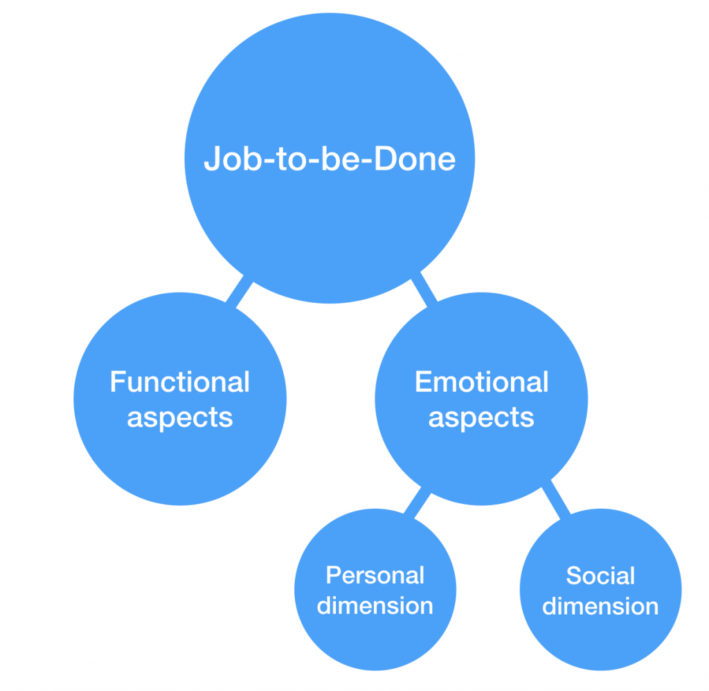
The Jobs-to-be-Done (JTBD) framework is about understanding what job the customer is trying to get done. It involves breaking this down into:and understanding the customer’s jobs-to-be-done, desired outcome, and current solutions:
- Job-to-be-done: What is the problem the customer’s trying to solve
- Desired outcome: What is the customer looking to accomplish
- Current solutions: What tool are they currently using
- Functional aspects of the JTBD
- Emotional (personal) aspects of the JTBD
- Emotional (social) aspects of the JTBD
…And then designing a solution that considers all of these elements.
To decide what’s worth pursuing, Kevin Liu, VP of Products at Octoparse, relies on a different combination of frameworks:
“We use a combination of Google’s HEART framework and North Star Metrics to track UX impact. HEART helps us understand user satisfaction and engagement, while North Star Metrics keep us aligned with overall product goals.”
HEART was developed by Google and helps evaluate which UX efforts matter most. It focuses on five key user-centered metrics:
- Happiness: User satisfaction, feedback, or NPS®
- Engagement: How often or deeply users interact with your product
- Adoption: How many new users try a feature or flow
- Retention: How often users come back
- Task success: Completion rates, errors, or time-on-task


Let’s say your objective is to improve onboarding. HEART helps you decide whether to focus on reducing drop-off (task success), increasing return visits (retention), or improving first impressions (happiness).
With an OKR framework to fall back on, you can refer back to your roadmap with UX insights and measurable outcomes, and you’ll find it easier to say no to distractions and yes to what actually moves the needle.
6. Track and grade progress
Setting UX OKRs is just the beginning—tracking and grading progress keeps your team aligned and focused. Use a simple system like 0.0 to 1.0 scoring, or calculate percentage progress for each key result:
- (Current value – Starting value) / (Target value – Starting value) × 100
For example, if your goal is to increase task success rate from 60% to 90%, and you’re currently at 75%, the progress would be:
- (75 – 60) / (90 – 60) × 100 = 50% progress
This gives you a tangible view of how your UX design goals are progressing, and where to iterate.
Here are a few UX OKRs examples with progress metrics:
🎯 Objective: Improve mobile onboarding experience
- KR1: Increase completion rate from 60% to 85%
- KR2: Cut average time-to-first-action from 3 minutes to under 90 seconds
- KR3: Collect a 4.5/5 satisfaction score in post-onboarding user feedback
🎯 Objective: Improve overall user interface usability
- KR1: Reduce error clicks in checkout flow by 30%
- KR2: Raise usability testing success rate to 90%
- KR3: Resolve 100% of high-priority issues flagged in feedback
Depending on your UX team structure, you can assign different key results to UX researchers, designers, or product managers. For example, researchers can lead metrics around functionality and satisfaction, while designers might focus on reducing friction or improving visual clarity.
If you’re stuck on how to lay out your objectives and track the results, we’ve created a simple and effective UX OKR template to track progress and see results at a glance.
Give your UX goals a glow-up
Plan smarter, track cleaner, and actually show what your team is achieving.
7. Iterate each quarter
UX OKRs are built for iteration—both your product and your users are constantly evolving. At the end of each quarter, review what worked, what didn’t, and what you learned from real user feedback. Then adjust your OKRs to reflect that.
Agile product development teams already operate in loops, and UX OKRs fit right in. Use what you’ve learned through user testing, metrics, and stakeholder input to shape your next set of goals.
Ask your team:
- Did we meet our key results?
- Which initiatives actually improved the user experience?
- What new pain points or user needs came up?
This reflection keeps your UX strategy grounded in impact. Over time, it builds a culture of continuous development—where each quarter gets you closer to smarter design, stronger alignment, and a product your users love.
How to track UX OKR progress
Setting UX OKRs is step one. Step two? Confirming you're actually making progress. Use the right tools, frameworks, and tracking habits to stay aligned with your UX strategy and business goals.
1. Use a clear OKR grading system
The OKR grading system—scored from 0.0 to 1.0—was first introduced by Andy Grove at Intel, then adopted and popularized at Google by venture capitalist John Doerr. It’s now one of the most widely used methods for evaluating OKR progress in agile teams across industries, including UX design.
This system gives each key result a numerical score:
- 0.0–0.3 = No progress
- 0.4–0.6 = Partial progress
- 0.7–1.0 = Strong performance
Here’s the catch: 0.7 is the goal—not 1.0
Why? Because OKRs are meant to be ambitious. If you’re hitting 1.0 every time, you’re probably playing it safe. Google’s teams aim for 70% completion because it pushes teams to stretch without fear of failure.
For example:
🎯 Objective: Improve onboarding experience for new users
- KR1: Increase tutorial completion rate by 25% → Score: 0.6
- KR2: Reduce time-to-value in onboarding flow to under 2 mins → Score: 0.7
- KR3: Raise new user satisfaction score from 7.5 to 8.5 → Score: 0.8
Average score: 0.7 → This means the team made good progress, even if not every metric was perfectly hit.
You can download and customize Google’s OKRs (Objectives and Key Results) Scorecard as a Google Document or as a spreadsheet.
2. Weighted key results
We touched on this earlier—but not every key result contributes equally to your UX objective. Some have a bigger impact, while others support progress in smaller (but still meaningful) ways.
While this technique isn’t part of the original OKR framework, many teams adapt it to get a more accurate view of progress. It’s especially useful when your UX team OKRs include a mix of metrics across usability, engagement, or user feedback.
Here’s how it works:
You assign a weight (%) to each key result based on its importance to the objective. Then, you multiply each key result’s score by its weight to calculate a weighted average.
For example:
🎯 Objective: Improve the UX of the mobile checkout flow
Key result | Score | Weight | Weighted score |
|---|---|---|---|
Reduce time-to-complete from 90s to 60s | 0.6 | 50% | 0.30 |
Raise SUS score from 70 to 85 | 0.8 | 30% | 0.24 |
Decrease support tickets related to checkout | 0.9 | 20% | 0.18 |
Total | — | 100% | 0.72 |
Instead of just averaging the scores (which would be 0.77), the weighted score (0.72) reflects where impact truly lies. In this case, task completion time mattered most, so its slower progress pulls down the overall score.
3. Apply SMART criteria to key results
We know the SMART goals framework helps you write better key results—but key results for UX are not the same as UX KPIs. Here’s the difference:
- A KPI (key performance indicator) is a metric you track over time (e.g., NPS, bounce rate, conversion rate).
- A key result is a targeted outcome you want to achieve within a set time frame. It often includes a KPI, but adds a goal and deadline.
This goal-setting filter helps you write clear, measurable key results. It's especially useful when you're setting OKRs that rely on UX metrics, like usability, satisfaction, or task success.
For example:
If your KPI is ‘onboarding completion rate,’ your SMART key result might be:
Increase onboarding tutorial completion rate from 45% to 65% by the end of Q2
This makes it:
- Specific: Onboarding tutorial
- Measurable: From 45% to 65%
- Achievable: A 20% lift
- Relevant: Connects to user activation and retention
- Time-bound: Within the quarter
4. Color-code your key results
Color-coding is a simple but powerful technique to visualize the status of your key results at a glance. It’s especially helpful for UX team OKRs, where multiple metrics move in parallel and different stakeholders need quick clarity on progress.
This method assigns a color to each key result based on its current score:
- 🟢 Green: On track (score: 0.7–1.0)
- 🟡 Yellow: Progressing, but needs attention (score: 0.4–0.6)
- 🔴 Red: Off track or stalled (score: 0.0–0.3)
It’s often used in tandem with the OKR grading system (0.0 to 1.0), giving you a visual layer that complements the numeric data.
Example: UX OKRs for improving self-serve onboarding
Key result | Owner | Target | Current progress | Score | Status |
|---|---|---|---|---|---|
Increase onboarding tutorial completion rate from 48% to 70% | Product Designer | 70% | 62% | 0.6 | 🟡 |
Reduce time to first meaningful action from 3 min to 1.5 min | UX Researcher | 1.5 min | 2.2 min | 0.4 | 🟡 |
Increase activation rate (D1 to D7 retention) from 22% to 35% | Product Manager | 35% | 38% | 0.9 | 🟢 |
Reduce support tickets about setup confusion by 30% | UX Writer | -30% | -10% | 0.2 | 🔴 |
In this table, color-coding helps the UX team and other stakeholders:
- Spot weak areas early
- Discuss blockers with the right owners
- Decide whether to reprioritize initiatives or increase collaboration
Color-coding is a low-effort, high-impact way to make your UX OKRs more transparent and actionable—especially when managing complex UX workflows, multi-role team structures, or sharing progress across UX leadership.
6. Progress tracking formula
When you’re dealing with moving metrics like user satisfaction, task completion time, or retention, you need a reliable way to show progress.
This formula helps you translate raw numbers into a clear percentage:
(Current value – Starting value) ÷ (Target value – Starting value) × 100
Why it’s useful:
- It gives your team a shared understanding of where things stand
- You can compare progress across different key results
- It works for both performance-based and perception-based metrics
For example:
- Key result: Increase mobile checkout completion rate from 52% → 75%
- Starting value: 52%
- Current value: 64%
- Target value: 75%
(64 – 52) ÷ (75 – 52) × 100 = 52% progress
This tells your UX team and stakeholders that you’re over halfway there—even if the raw metric doesn’t seem that impressive yet. It’s especially helpful in design reviews or when reporting upwards to product management or leadership.
💡 Pro tip
Visualize this progress alongside your color-coded key results to spot trends and risk areas fast.
Best practices for creating UX OKRs
These best practices will help you create OKRs that align with business goals, focus on user needs, and deliver measurable improvements.
- Tie every objective to a broader business goal: Your OKRs shouldn't live in a UX silo. Use strategic frameworks like Jobs-to-Be-Done to keep UX OKRs grounded in what users are trying to accomplish—not just what they’re clicking.
- Limit OKRs to what the UX team can influence: It’s tempting to chase metrics like revenue or MQLs, but your key results should stay within the team’s control—things like usability scores%2F2)))-,Maze%20Usability%20Score%20(MAUS),every%20mission%20in%20the%20maze.), onboarding completion, or user satisfaction.
- Balance qualitative and quantitative results: Combine metrics (like completion rate or NPS) with insights (like feedback from usability testing). This gives a fuller picture of impact and helps track progress even when numbers lag.
- Review and recalibrate OKRs every quarter: UX is iterative—your OKRs should be too. Make time to review, grade, and update them based on what you’ve learned from testing, research, and product changes.
- Use purpose-built tools to track and align: Spreadsheets work, but you can also explore OKR tools like Tability, Perdoo, or Quantive to help UX teams visualize progress, assign owners, and keep everyone aligned. Bonus: they integrate with tools your team already uses—like Slack, Notion, or Jira—so updates stay visible and timely.
Implementing UX OKRs: 4 Examples
Get inspired by how leading teams use UX OKRs to align design efforts with business goals. These real examples show what effective, measurable UX OKRs look like in action.
1. Octoparse
At Octoparse, the team set a UX OKR focused on improving their data extraction success rate—a major pain point for users dealing with complex website structures. Their key results targeted a 30% reduction in failed extractions, a 20% decrease in onboarding time, and an increase in successfully completed tasks per user.
We tackled this by improving our auto-detection algorithm, redesigning the onboarding flow, and adding real-time error suggestions.
Kevin Liu
VP of Products at Octoparse
Share
To track progress, they combined session recordings, user surveys, and support ticket analysis. Within six months, they achieved all their goals and saw a clear drop in user complaints—proving how well-crafted UX OKRs can directly improve user outcomes.
2. Adobe
Adobe’s Digital Imaging team—home to products like Photoshop and Lightroom—was using spreadsheets to manage UX OKRs, which led to inconsistent tracking and slow decisions. To fix this, they partnered with their data science team to build an Automated OKR Reporting Framework.
This framework pulled product usage metrics directly from internal analytics tools and fed them into a unified dashboard, eliminating manual updates. With real-time data tied to each key result, UX teams could track progress instantly, align with the broader UX strategy, and focus on design decisions.
The result? Faster product decisions, stronger UX strategy alignment, and over 1,000 key results tracked automatically across eight products.
3. Action1
At Action1, Peter’s team set a UX OKR aimed at reducing user frustration in their patch management workflow—a critical flow users often found confusing and time-consuming. The objective focused on streamlining the experience, with key results set to decrease the average time to schedule a patch by 40%, improve the self-service success rate by 25%, and boost NPS scores related to ease of use.
We achieved this by simplifying the patch selection UI, adding tooltips, and creating an in-app walkthrough.
Peter Barnett
VP of Product Strategy at Action1.
Share
The results spoke for themselves: time-to-schedule dropped by 45%, and support tickets related to patching fell by 30%!
4. Amazon
Amazon’s journey with UX OKRs centers on one principle: customer obsession. They adopted OKRs to align every team with this mission—starting with the customer and working backward.
During the dot-com crash, Amazon used OKRs to double down on logistics and customer service, setting specific, measurable goals tied to operational excellence and product innovation. Teams tracked quantitative metrics like delivery speed and NPS, and qualitative data like user feedback.
Over time, they built a culture of continuous improvement. This framework helped Amazon stay agile, empowered teams to own UX goals, and scaled innovation across every product line.
Key takeaways
UX OKRs help show the real value of your team’s work. When you align design efforts with business goals and track measurable outcomes, you prove that UX drives growth, retention, and revenue.
Here’s what to take away:
- Start with company priorities and link your UX goals to them
- Make every key result measurable—think in metrics
- Keep your team aligned with regular reviews and transparent tracking
Use frameworks and tools to make OKRs part of your workflow, not a one-time effort
When you implement UX OKRs, you give your team direction, focus, and a way to prove impact. You start showing real results—making it easier to get buy-in, funding, and recognition for the work you do.
Give your UX goals a glow-up
Plan smarter, track cleaner, and actually show what your team is achieving.
Frequently asked questions about UX OKRs
What are good OKR examples in UX?
What are good OKR examples in UX?
Good UX OKRs are clear, measurable, and aligned with user impact. UX OKRs should focus on real outcomes—like user satisfaction, task success, or reduced friction—and be easy to track.
For example:
- Objective: Improve user onboarding
- Key result: Increase onboarding completion rate from 60% to 85%
- Objective: Boost mobile usability
- Key result: Reduce app bounce rate by 25%
- Objective: Strengthen research culture
- Key result: Share monthly UX insights with all product teams
What’s the difference between a UX OKR and a UX KPI?
What’s the difference between a UX OKR and a UX KPI?
UX OKRs are goal-setting frameworks that focus on outcomes you want to achieve. UX KPIs are performance metrics you track over time. OKRs drive change, KPIs measure ongoing performance.