


Good UX design can make or break your business’s product and customer relationships. Because of this, products are more people-focused than they’ve ever been. Today, best practices include answering JTBD (jobs-to-be-done) or customer needs, accommodating diverse people, offering easy-to-use interfaces, and delighting users at every step of the journey.
In this article, we’ll take our hat off for some of the most delightful user experience examples we’ve seen in recent years, whether it’s new tech, innovative visuals, or smart—JTBD-focused—experiences. Here are the products that leave users coming back for more, and can inspire best practices to apply in your own UX design strategy.
Grab a cup of something hot, sit back, and enjoy some of the top UX examples at the moment.
Top B2B & B2C UX design examples
UX matters. A PwC survey of 15,000 consumers found that one in three consumers will leave a brand they love after one bad experience. That same survey study found that almost 80% of American consumers say convenience and speed are among the most important factors to a good customer experience.
There’s no denying the wonders good UX design can do for your brand, so let’s take a look at what it looks like in this article.
Airbnb's booking experience

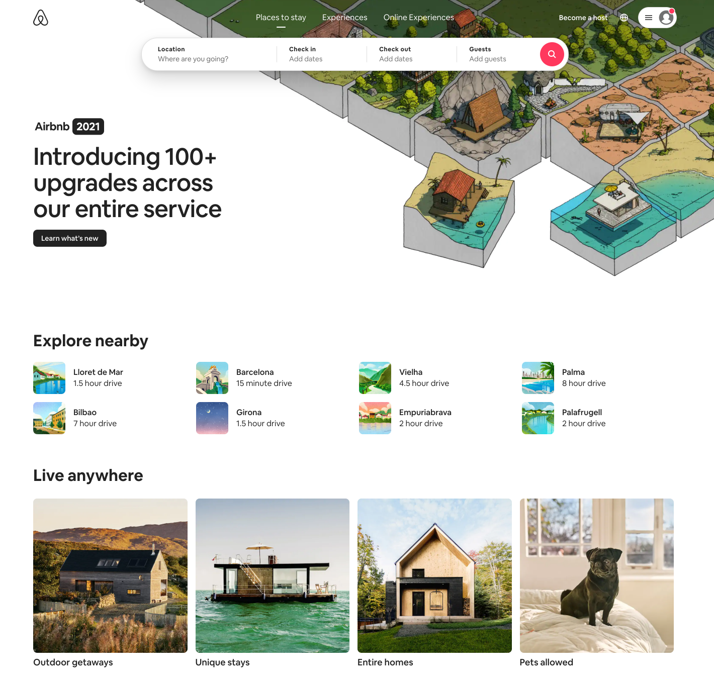
Source: Airbnb
A UX design example most are familiar with, Airbnb is leading the charge when it comes to creating a booking experience that gets the job done for websites. Airbnb has clearly done their research. The homepage design addresses typical pain points travelers have when trying to find accommodation.
The homepage also inspires travelers who are unsure where to go by offering popular destinations nearby. It gives a mix of what people love: entire homes, pet-friendly homes, or unique stays. The action of booking is simple and at the top of the fold. Quick, clear, and user-friendly.

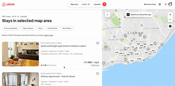
Source: Airbnb
Lesson learned? Research users’ needs and problems in your design process and use the data to determine what matters most to them. Once you know, offer it up on a plate.
Netflix’s autoplay features

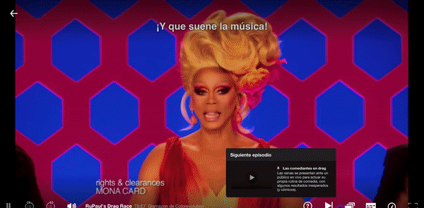
Source: Netflix
The autoplay features from Netflix are quite possibly some of the most intrusive and heavily debated UX features to grace the planet.
There are two autoplay features that people have a love/hate relationship with.
- The Netflix ‘play next episode’ feature has made our minds up for us on more than one occasion. It’s a fantastic example of doing a job the user wants to do without even needing to ask.
- Netflix also introduced an autoplay trailer feature as you scroll through their media library—giving users quick insights into the movies and series they hover over. This particular autoplay feature was met with a great deal of controversy and debate.
The second feature forces engagement at the cost of the annoyance of the users and is generally referred to as a Dark UX pattern.
After a general uproar, the time came for Netflix to enable users to switch off this autoplay feature.

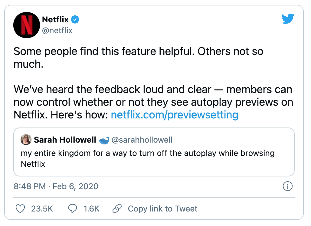
You win some; you lose some. Lesson learned? Test new features with your users before you mass-release. Stay customer-centric, not product-centric, and integrate data-driven user experiences.
Miro’s user onboarding

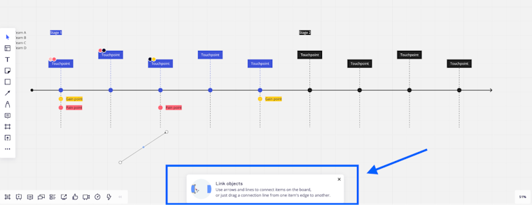
Source: Miro
Miro does a fantastic job of nudging their user base towards an Aha! moment by focusing on a user’s job to be done.
Miro enables users to build the board they need and learn as they go with modal popups as they navigate their way through building a board. The popups are unobtrusive and tailored to the user’s in-app actions.
Lesson learned? Helping a user get value from your app and reach their Aha! Moment faster is a key principle of a great user experience. Find small ways to support your users by providing them the information they need upfront to complete their tasks. You can do this in-app, or with email and visit a user’s inbox with product tips, and onboarding bumpers.
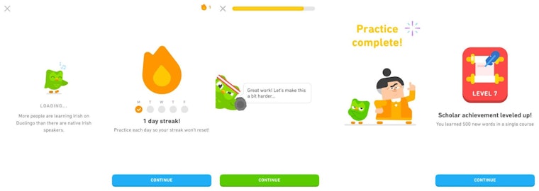
Headspace’s inspiring UX retention strategy

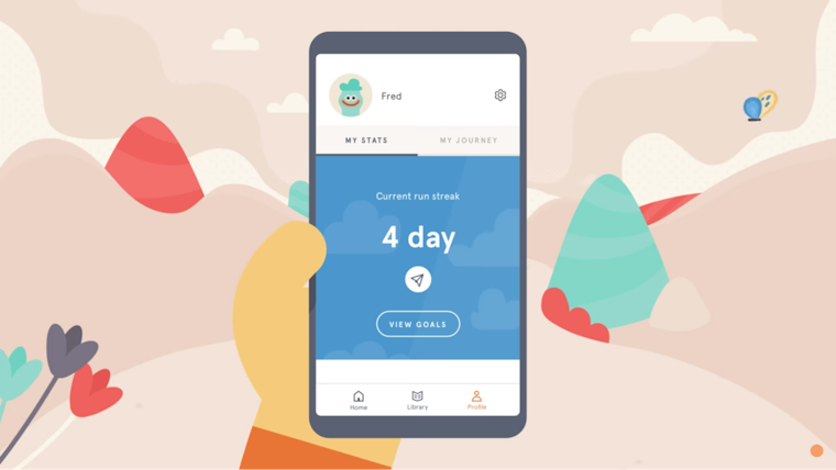
With a 4.8 star rating on the app store and over 13k reviews, Headspace is a leader in the online meditation market. Dealing with users looking to overcome stress and anxiety, sleep better, and live a mentally healthier life, it’s critical that the app experience is as smooth as any meditation they practice.
We particularly love the Headspace app’s focus on gamification to build user retention. Much like Duolingo, Headspace manages to bring a competitive edge to the educational world. It offers goals and keeps users active daily on the app with an ongoing streak—pushing people to meditate every day and keep a regular practice.
Lesson learned? Good UX can help toward critical product success metrics. 90% of users have stopped using an app due to poor performance. A great experience can not only deter someone from leaving, but it can encourage them to use your app even more.
Todoist’s recurring tasks feature

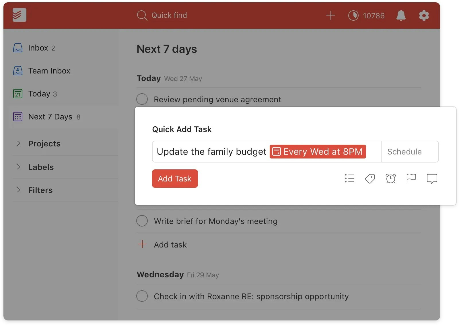
Source: Todoist
Todoist have a wealth of features to help people manage their personal or team tasks. The app is easy to navigate, drag and drop-friendly and gives you that ingrained sense of gratification when you cross a task off a to-do list.
However, the UX design example we particularly want to call out is Todoist’s recurring due dates. It’s a simple feature that showcases Todoist has really done their user research and identified one of their users’ key tasks.
Lesson learned? Identify your users’ needs by researching their recurring tasks. If there’s a way to simplify or automate a key task, design accordingly.
Mailchimp’s password guidance

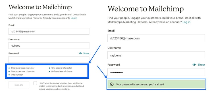
Source: Mailchimp
Mailchimp is often championed when it comes to its brand. They sit at the top of the food chain and for good reason. However, it’s not their branding alone that’s doing them favors; it’s the way they deliver it—through innovative UX design and copy.
Their password guidance in their welcome form is a fantastic example of this. No one likes to be told they need their go-to password to be stronger and fulfil criteria it’s never had to before. However, Mailchimp guides users in a friendly way to generate a stronger password. Plus, at the end of it, you get this gratifying checkbox popup. You’re all set!
Lesson learned? Good UX design can make routine tasks that people typically don’t enjoy more pleasant. Sign-up forms or profile creation can become a great experience with the right UX guidance and design principles.
Revolut’s customizable app

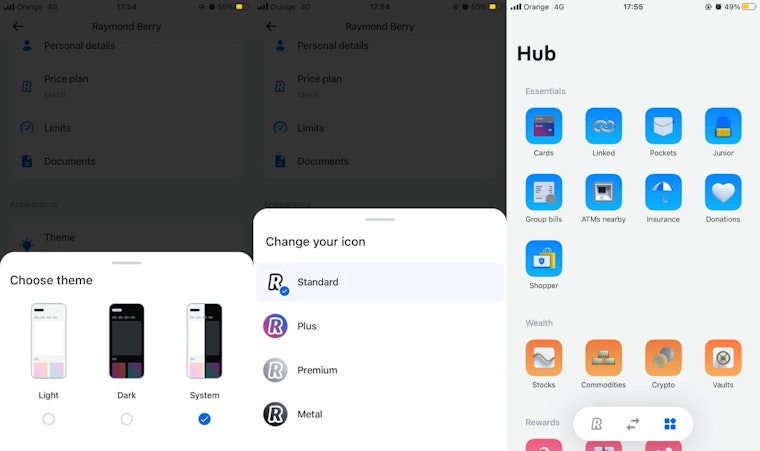
Source: Revolut
Who said we couldn’t enjoy banking? Revolut is leading the charge with its user-friendly banking app that allows users to customize their own experience as they like. For this, they get pride of place in this UX design examples list. Customers can switch out backgrounds, icons, and chop and change the home screen as they see fit.
Lesson learned? Empower users to make a product theirs by allowing them to tweak the design to fit their preferences.
Duolingo’s gamified experience

Source: Duolingo
We briefly mentioned Duolingo earlier and likened its gamification to that of Headspace, however, Duolingo takes gamification to a whole new level in their UX design.
The platform is fun and friendly while challenging users to keep learning. They manage to make the experience of learning a new language more interesting by combining animations, a light-hearted tone of voice, and gamified UX such as levels, streaks, and more.
Lesson learned? Gamification still works wonders and it’s expected to be a $30.7 billion market by 2025. Think about ways you can gamify your brand experience. Badges, levels, unlocking new content—all of these features will encourage users to stick around.
Take it a step further and gamify brand communications via email, chat responses, or other communication channels.
Medium’s “clap” feature

Source: Medium
This one’s an oldie but a goldie. Medium’s clap your appreciation feature was fantastically innovative when it first aired, and it still is. It’s a simple yet unique way of showing appreciation as opposed to hitting a like button. We’ve seen it tweaked and adapted over the years—most recently by TikTok.
Lesson learned? If it’s not broken, don’t fix it. Good UX design doesn’t need to be about reinventing the wheel. If you like a UX design idea and think it will work well with your product or website and audience—then make it your own and try it out.
If it’s simple, joyful, and serves its purpose, you’re on to a winner.
Spotify’s Year Wrapped

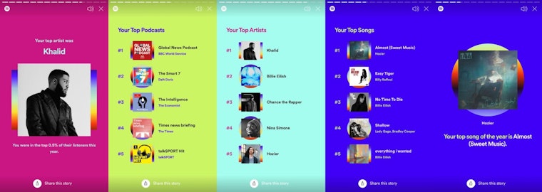
Source: Spotify
You’re most likely familiar with Spotify’s end-of-year wrapped stories that flood your social feeds. Spotify makes the list as a top UX design example for the power of data and what it can do for your content.
They share this piece of content in a story format, one that most are familiar with thanks to Instagram and give users one-click options to share their story with friends.
Lesson learned? Leverage user data stories in your designs and deliver users content that’s entirely unique to them. Spotify gets pride of place on this list of UX design examples for their innovative use of data, sticking to formats people know, and creating an experience that has the potential and ease to go viral.

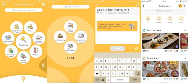
Last but not least on our UX design list is Glovo. The app has a tricky job. There’s a high chance people are coming to it hungry, which means they want their need to be met in the quickest way possible.
Glovo not only set up great navigation to find a food source but the UX of their app makes each button clear, and perfectly pairs visuals with copy.
As you click through to find your restaurant, you’re given fewer options and eventually, a list of restaurants broken down by user needs: something fast, something cheap, something rated well.
The entire experience is rapid, done in a few clicks, and fills bellies as quickly as possible. Keeping everyone happy.
Lesson learned? Remember what your users are here for, and get them to it as quickly as possible.
UX Design FAQs
To help us answer these UX design FAQs, we spoke to Adriano Trenahi, Product Design Manager at Eventbrite (previously eDreams & Mango).
- What is considered good UX design? What is considered bad UX?
“There are standard ways of evaluating UX. The most famous is Jakob Nielsen's 10 general principles for interaction design, also known as usability heuristics—although this does not necessarily apply only to usability.
Personally, I say good UX is when a user can achieve a certain objective in the easiest, fastest, and most pleasurable way possible; considering the situation, environment, and UX tools available.
For example, imagine a person that wants to share a photo on their phone with friends. There are plenty of ways in which you could do that, good UX designers would aim to reduce effort and avoid unnecessary taps by predicting and prompting suggestions on the phone interface. It would also consider more aspects such as voice commands or proximity sensors.
Good UX is unnoticeable most of the time, although a feeling of relief and easiness when completing a task or using a service are positive indicators.

Adriano Trenahi
Product Design Manager at Eventbrite
Share
That feeling of relief and easiness when completing a task or using a service are also indicators of good UX.
Bad UX, on the other hand, is very noticeable as it generates frustration, annoyance, and anxiety, whether in a user’s app or inbox. It can make a user feel stupid when that’s not the case.
An excellent example of that? Norman Doors. A Norman door is a door whose design tells the person to do the opposite of what they're supposed to do. Watch this video from VOX, and to better understand how bad UX is embedded in our world.”— Adriano Trenahi, Product Design Manager at Eventbrite
- Is it possible to have good UX with bad UI?
“In my opinion, no. They go hand in hand. UX is only good when its aesthetics follows. Imagine creating a great product or service but displaying them with hard-to-read typography, a small or super big button, a color palette that is perceived as untrustful, or images that are disrespectful to a particular culture. Those are essential aspects that you need to consider, and your product or service won't thrive if you don’t nail them all.” — Adriano Trenahi, Product Design Manager at Eventbrite
- What does a UX designer do?
A UX designer (user experience designer) focuses on building a positive experience for someone and a business’s product. UX designers are typically responsible for user research, creating design solutions, and user testing. UX designers are the in-house voice of the customer.