
Rolling out an app navigation revamp to 60 million Doctolib users
Doctolib used Maze's unmoderated testing to quantitatively assess their mobile app navigation experience and validate new changes introduced in the product.
About Doctolib
Doctolib is a consultation management software from Europe, with the confidence of more than 100,000 health professionals and 2,000 health facilities.
Industry
Healthcare
Opportunity
Validate the navigation experience redesign of Doctolib’s mobile app.
Key Maze features used
Prototype Testing
Share
500
user responses collected in France
4000
user responses collected in Germany
Outcome
• Achieved User-Centric design
• Increased feature visibility
• Improved navigation experience on the tab bar
• Stakeholder alignment
As Doctolib’s service offering grew, so did our need to update our app navigation and hierarchy. We wanted to highlight new services, while maintaining the clear user experience that people had always valued. And to convince stakeholders, we needed to complement qualitative research with quantitative data. Here’s how we did it.
Context
Doctolib facilitates access to healthcare and healthcare management for patients. We currently have 60 million user accounts and 1,7 million medical appointments booked each day in three countries: France, Germany, and Italy.
Over the past two years, Doctolib has added a range of new services on top of appointment booking, including video consultation, relatives management, and a vault for medical documentation.
With this growth came the need to revamp our app sections and navigation. We wanted to offer new features and services without compromising the experience of the people who use our app. And with offerings in three countries, we needed to adapt to the needs of each market.
Understanding the problem
User experience has always been a priority at Doctolib, so we try to meet users as often as possible for interviews, user tests, and workshops. In recent sessions, we began noticing a few recurring UX themes:
- People were unaware of new services we now provided
- People wanted the mobile app to have the same features that are available on the web app
- People were confused by the marketing content they found blocking important notifications about their appointments
The data was clear: at least 70% of our users weren’t interacting with our new services. We also saw that we had a lot of first-time users in Germany and Italy, where Doctolib’s awareness was still low.
Beyond digging through our own data, we also benchmarked other healthcare management apps, along with similar apps from other industries. This gave us some insight into what others were doing well, and where we had room for improvement.
Defining the problem
After data-diving and other stakeholder discussions, we decided to focus on improving the global app experience. It was a big challenge.
To keep things manageable, we set up a 6-month plan with user validation at every step of the way. This let us keep a user-centric approach including both qualitative and quantitative user research.

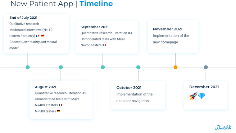
Doctolib's 6-month plan included lots of user research
Before diving in, we wanted to build a common internal vision for the project. So we organized a discovery workshop to make sure everyone agreed on our main challenges. Based on user research and data insights, we identified three main challenges:
- Insight #1: 80% of our traffic was on mobile. So we wanted to create a mobile-first experience. This meant we would do all of our user research on mobile prototypes, potentially including some new features.
- Insight #2: Most of our users were not aware of our new services. So we wanted to imagine a new navigation architecture that highlighted new features and clarified the hierarchy of the content. And we’d build in scalability to help us more smoothly integrate future features.
- Insight #3: Our user base was highly diverse, including many with disabilities. So we wanted to make sure the patient platform was highly accessible. This meant some of our legacy features that weren't meeting the AA accessibility standard would need an upgrade.
Potential solutions
We arrived at potential solutions following three information-gathering steps:
1. Workshop with internal stakeholders
We had a first workshop to introduce the data we’d collected from user insights and the benchmark analysis, keeping in mind this question:
How might we redesign our current lookalike “mobile browser app” into a top player, while introducing our new patient services?
We presented the insights and possible solutions to product management. One idea was to replace the burger menu with a tab bar to help push new patient services. Other ideas included revamping the Homepage with things like a carousel to ease the appointment management.

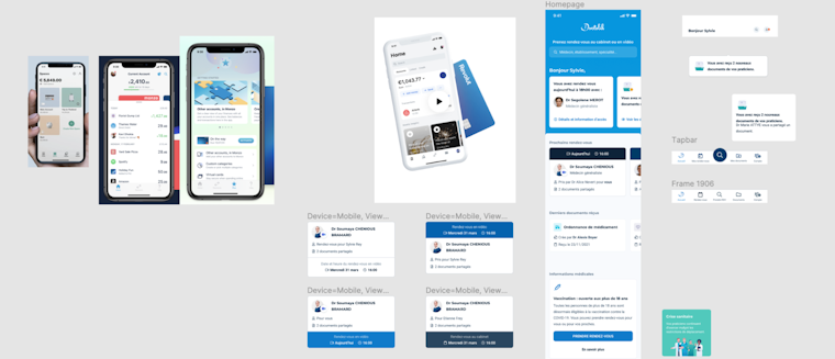
An idea board presenting app references and explorations
2. Validating initial concepts through qualitative research
Before testing with our users, we conducted concept testing and card sorting with internal stakeholders. Then we held 1-to-1 moderated user tests and card sorting with 10 different people in both France and Germany.
These tests revealed that users didn’t associate our new services with the current core appointment management service. This validated our approach of dividing our different services (e.g. booking, documents, relatives management) into separate sections in the app.
3. Tech review with stakeholders
After a few ideation sessions with the design team, we introduced the concepts to our stakeholders during a tech review session. With members from product design, user research, product management, and engineers, we brainstormed possible tech barriers, and which existing components could still be used.


Doctolib app designs taking shape in FigJam
The Maze Test
As a data-driven company, we knew we also needed quantitative user tests to convince our stakeholders. Our design team saw unmoderated testing as a chance to quantitatively test our new designs to ensure our proposals were backed up with data.
With that in mind, we set up a Maze test. The main goal was to validate the two main changes we’d introduced into the product: a revamped homepage, and the introduction of a tab bar.
We focused on Germany and France, since those are our primary markets with more than a million users. This meant we needed two Maze tests, one in each language.
Based on our research objectives, we set up the mission blocks. These asked users to accomplish different tasks related to different areas of the app: booking an appointment, checking the details of an upcoming appointment, previewing a document in the medical documentation vault, and accessing a list of relatives.
Results & next steps
We launched the test over a weekend and collected more than 500 responses in Germany and over 4,000 in France. Here’s what we found.
- The “Book an appointment” button on the tab bar was the least taken path, with only 11% of French and German testers using it as a first click.
- The direct access to the appointment lists via the tab bar was confirmed as a preferred route for patients.
- Our new Home button icon was more easily recognized and helped users with overall app orientation.
- Document access via the tab bar improved the overall access to documents. The path was taken by 60% of French users and 51% of German users.
So overall, we validated all of our main hypotheses about the utility of the new tab bar,except for when people needed to book an appointment.
We decided to keep the tab bar for the Home, Appointments, Documents, and My Account elements. And we removed the “Book an appointment” element from the new tab bar experience.
To address the appointment booking management area, we launched a second Maze with a new iteration: integration of a floating action button (FAB) button to book a new appointment, and a divider for upcoming and past appointments.
Key takeaways
- Understanding through multiple research approaches. We conducted robust research by combining qualitative and quantitative research. Using Maze, our design team could use data to test their concept and validate their hypotheses in a structured way.
- Quantitative usability testing at scale. Thanks to the Maze platform and the volume of traffic on our website, we were able to do in-depth quantitative usability testing over the weekend. Something we hadn’t done before.
- Unmoderated testing in a truly agile way. On Monday, we had a third iteration that emerged from a design review session, and teams aligned on key missions to validate the approach. On Tuesday, the Maze project was set up and rolled out as an in-product poll. By Thursday, we collected enough results to make a decision. That’s an efficient design sprint.
- Demographic questions. We didn’t include demographic and usage questions in the first round, but wish we would have. So in follow-up tests we are including these alongside the mission blocks to better understand our user segments.
Toolstack
- Maze (for unmoderated usability testing)
- Google Slides (for moderated card sorting sessions)
- Figma (for design)
- Zoom (for moderated sessions with users)