


TL;DR
estalt principles explain how users naturally group and interpret visual elements, so Product teams can simplify navigation, improve consistency, and build designs that feel familiar and easy to use. From proximity and similarity to closure and focal point, these psychological rules guide layout, hierarchy, and engagement.
Gestalt principles, or the laws of visual perception, help us understand how the brain groups individual elements, recognizes patterns, and simplifies complex images.
The concept came about in the early 1900s when German psychologists Max Wertheimer, Kurt Koffka, and Wolfgang Köhler identified how the mind 'translates' everything the eye sees into a unified whole. The German word for 'unified whole' being—you guessed it—Gestalt.
Today, these psychologically-proven grouping laws are used in UX design to help build more human-friendly products, increase product engagement, lower learning curves, and build all-around positive experiences for users.
In this article, we'll take a closer look at:
- The psychology behind the Gestalt principles
- The different grouping principles + examples
- How UX/UI designers use these principles
- A Gestalt principles product case study with Foyer
What are the Gestalt grouping principles?
The Gestalt principles of perception are psychology laws that describe how the human brain processes and groups visual elements. It was Wertheimer’s 1912 ‘Experimentelle Studien über das Sehen von Bewegung’ (‘Experimental Studies of the Perception of Movement) that marked the inception of the Gestalt school of psychology—which Wertheimer, Koffka, and Köhler led for the next few decades.
Since its creation, more and more Gestalt principles have been studied and added to the list of Gestalt principles. What were originally seven principles has now turned into many more. Today, we’re listing 10 of the most prominent and widely-used Gestalt principles:
- Parallelism principle
- Continuity principle
- Similarity principle
- Proximity principle
- Closure principle
- Prägnanz principle
- Common fate principle
- Common region principle
- Figure ground principle
- Focal point principle
Each of these principles expresses a unique way the human mind processes and interprets complex visual elements into more manageable patterns. Although these were originally coined by the Gestalt psychologists we mentioned earlier, these Gestalt laws are heavily relied on by UX designers today.
Gestalt principles are fundamental in the design world, so they influence the user's experience. In short: they help the human eyes fill in the 'gaps' and perceive separate elements as a whole.
Emilia Negoescu
Growth Designer at Stoica
Share
10 Gestalt principles and examples
There are several ways the human brain can recognize patterns, each of these Gestalt laws has its own rules, some of which overrule others.
1. Parallelism principle

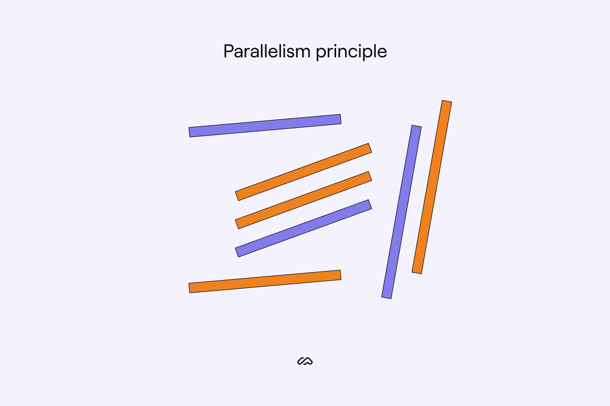
Elements that are parallel to each other are perceived as more related than elements that aren’t parallel to each other. This can be lines, curves, and even shapes—although the latter needs to be somewhat line-like in order for the principle to apply.
2. Continuity principle
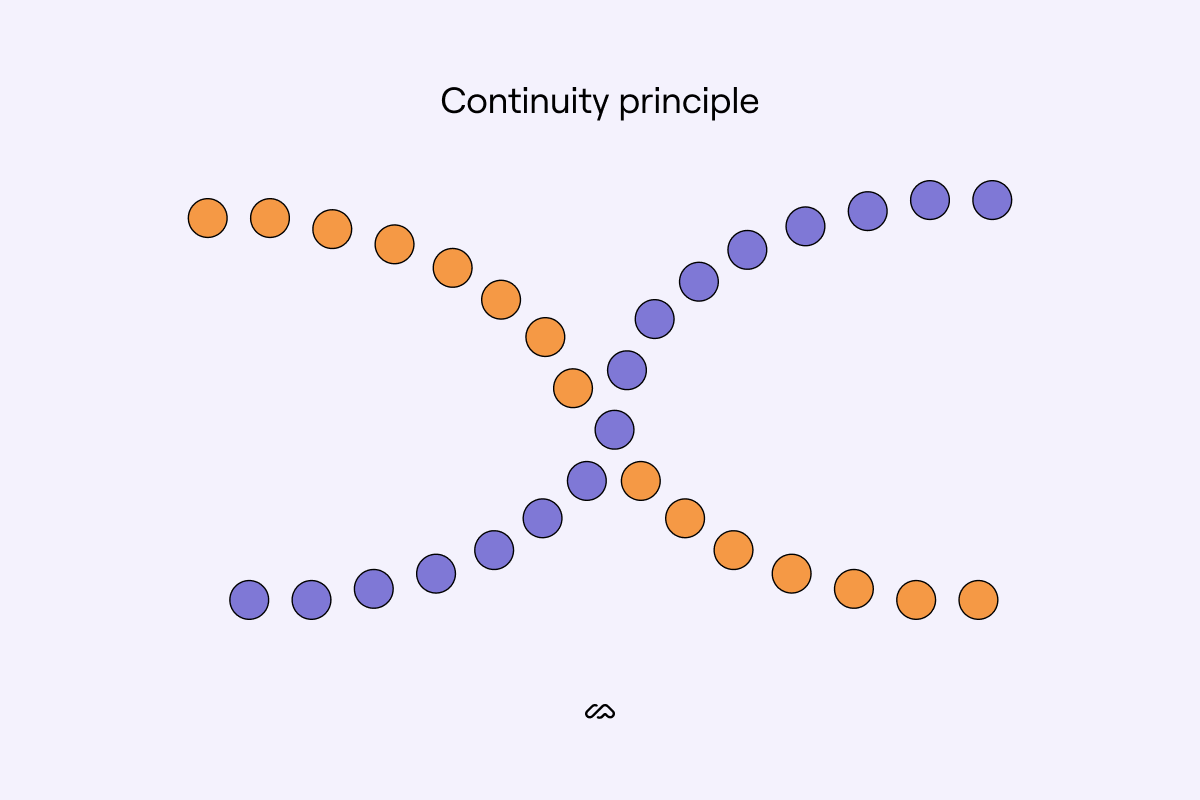
The principle of continuity states that the mind will always tend to follow the simplest line pattern on the page, even if they are not obviously linked. In the example above, the mind disregards color for grouping the dots. Instead, the mind registers each curved line as one figure.
3. Similarity principle


The principle of similarity states that our mind naturally groups similar things, even if they are not physically together. We look for common patterns in visual information, such as colors, shapes, and sizes. The mind also tends to think that similar things have the same function. It's the foundation of stereotyping.
In the above example, the mind will group all violet dots and presume they serve the same purpose, even though they are not physically together on the page.
4. Proximity principle

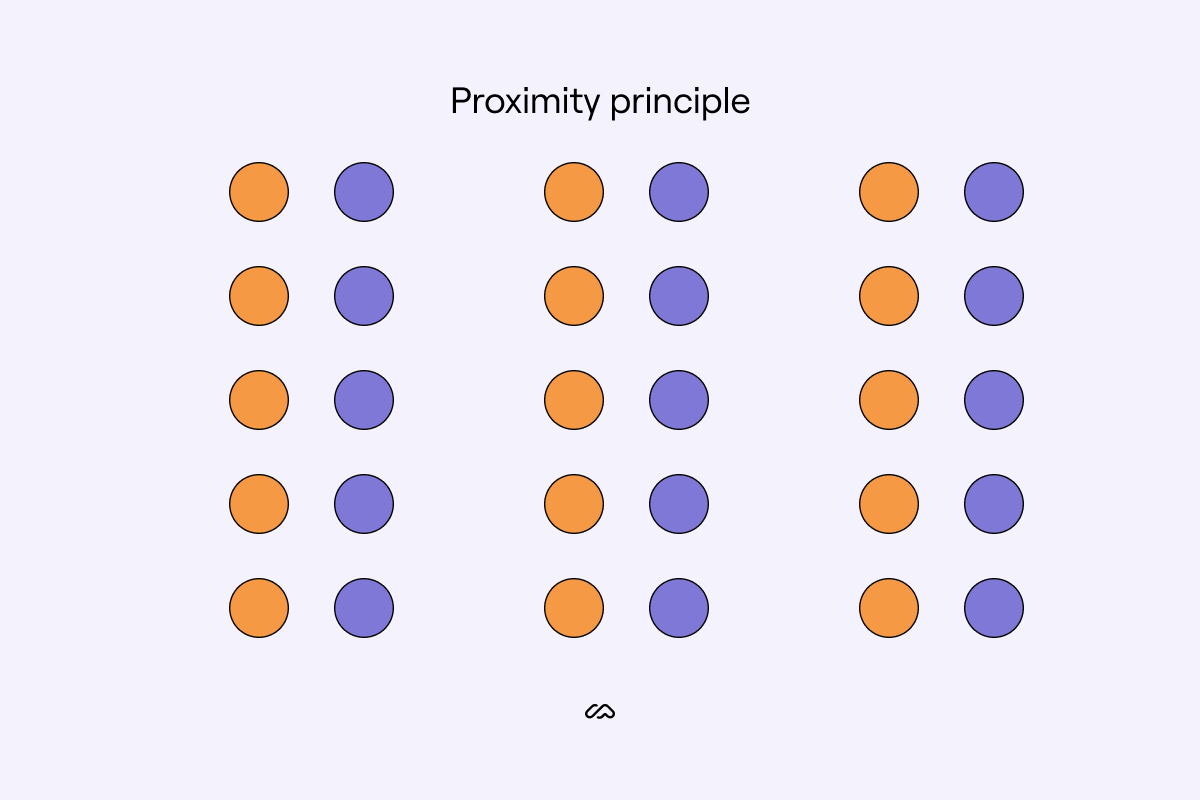
How close or far apart objects are depends on how close we consider they are in function to each other. The law of proximity is exceptionally interesting as it tends to override other Gestalt principles.
We tend to link visual elements that are close together as a whole. At the same time, if things are far apart, we consider them as doing different things even if they are visually the same.
The proximity principle boosts relations between elements, visual hierarchy, and content flow, making everything easier to ‘read.’
Emilia Negoescu
Growth Designer at Stoica
Share
When it comes to adjacent and overlapping objects, we consider their function to be even stronger than other objects. In the example above, the brain will consider overlapping to have a stronger relation than objects simply close together.
5. Closure principle

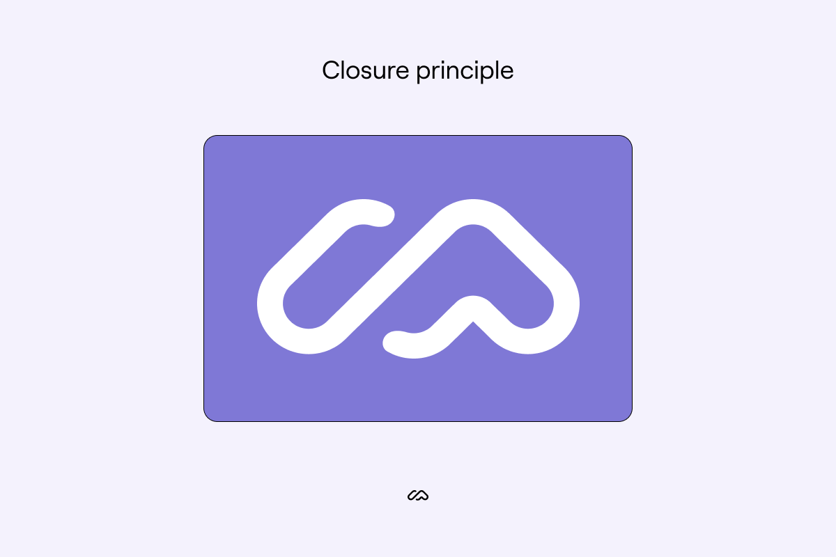
Out of all of the Gestalt laws, the principle of closure is probably one of the most interesting. Humans naturally perceive objects as complete, even if they are not. This Gestalt principle is often in logos. The closure principle means the human brain interprets incomplete lines and patterns as 'closed' to see something they're familiar with.
We're taking our Maze logo for the law of closure example. Despite the lines not being connected, the brain completes them anyway and you will still perceive our logo as an 'M.' The logo also plays with continuation, symmetry, and order.
6. Prägnanz principle

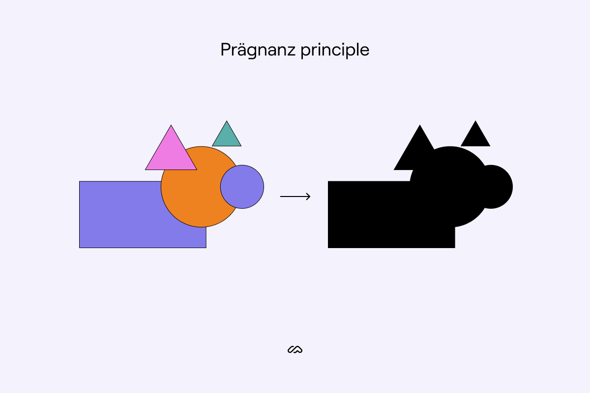
The law of Prägnanz is a fundamental principle of Gestalt that dictates that people will perceive complex images in the simplest form possible. Instead of attempting to interpret an overly complex shape, we tend to break them down into a simpler whole.
7. Common fate principle
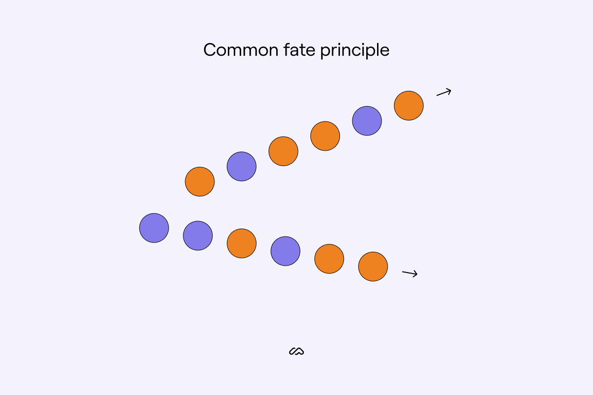
The law of common fate dictates that elements that move in the same direction are interpreted as more related than elements that move in different directions. This principle also applies to stationary objects that are seen to have a common destination.
8. Common region principle

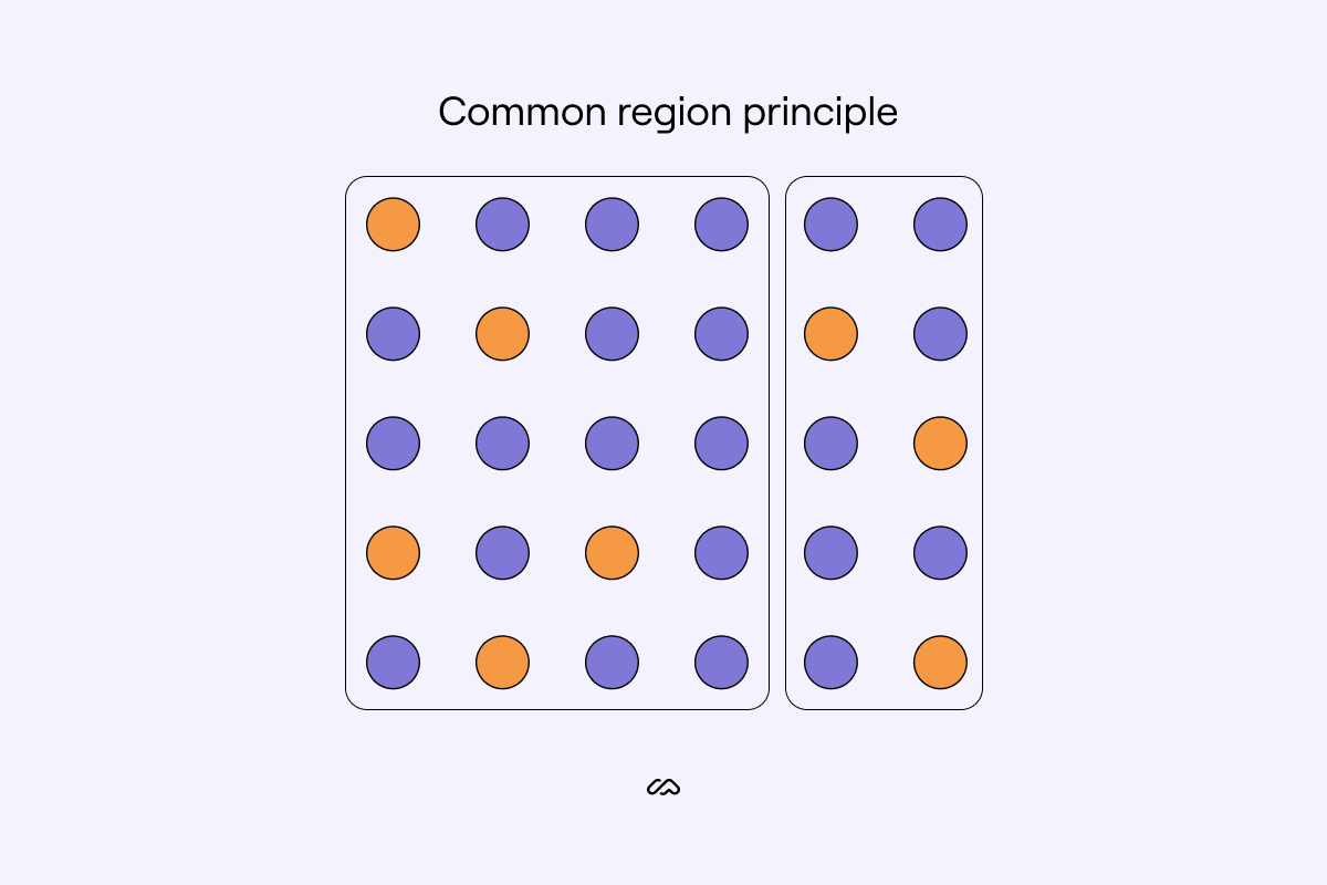
Perhaps the most obvious of the Gestalt principles, common region pulls on aspects from proximity vision science but is more straightforward. The common region principle states we group objects when the same barrier encompasses them.
In the example above, we group the shapes by those within the same box, overriding their color or shape connections.
9. The figure-ground principle

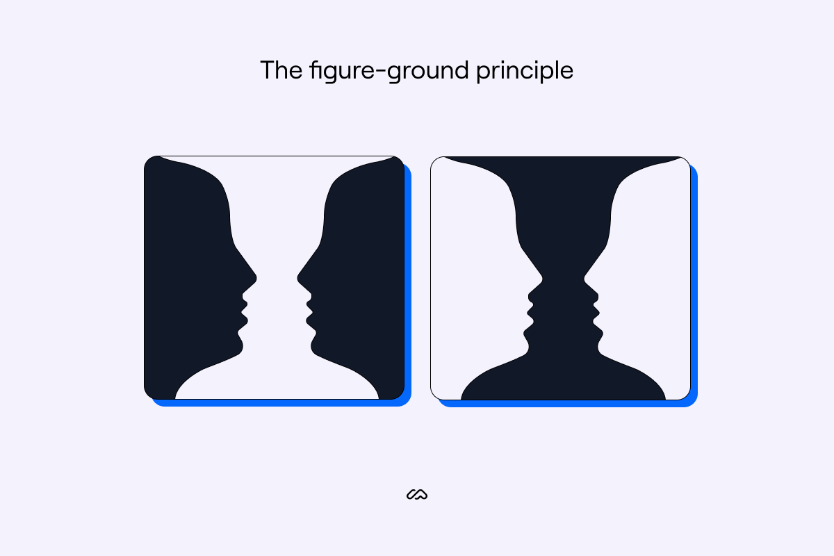
This Gestalt principle focuses on how the brain interprets negative space and what it determines as the foreground and the background of an image.
The brain will typically process the smaller item in the image as the 'figure' and the larger item as the 'ground'—immediately processing the figure first.
However, the figure-ground object perception can be influenced by color, focus, and contrast. In the example above, the brain processes the black object first and the white object as negative space—your focal point, therefore, changes per image when only the color switches.
10. Focal point principle

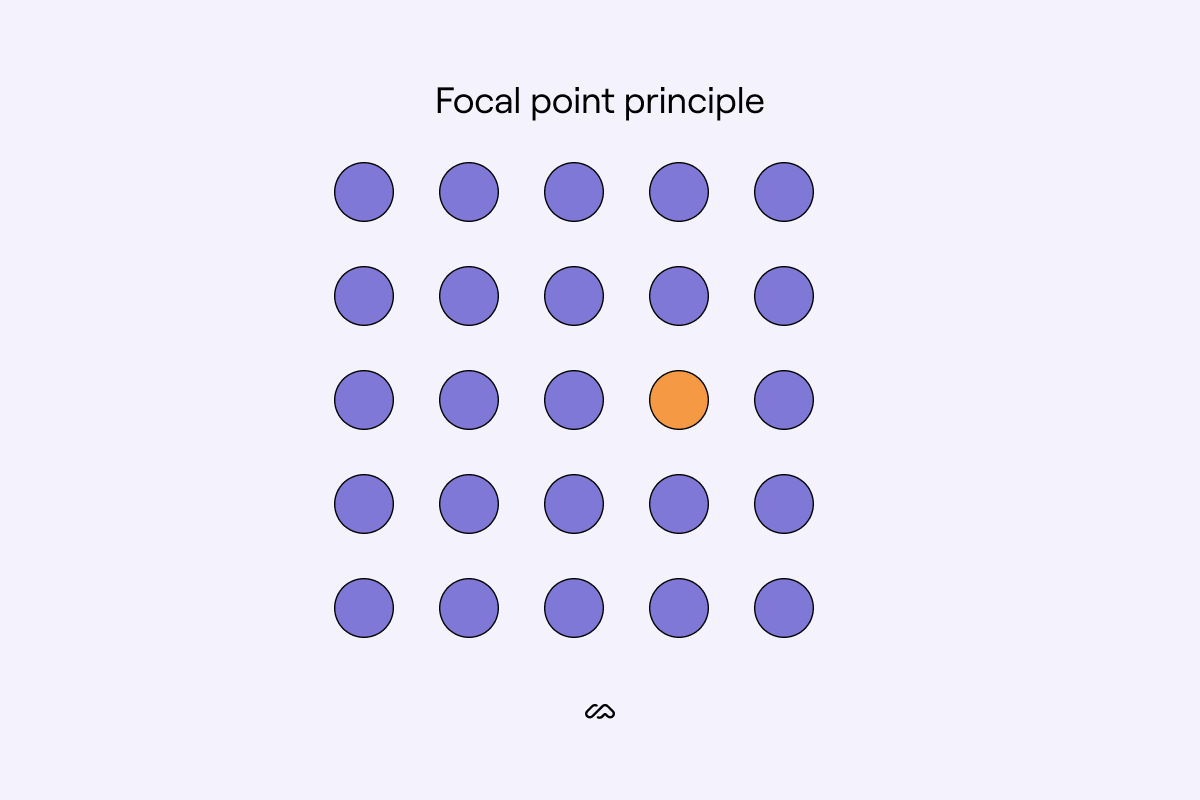
The simplest Gestalt principle, the focal point principle. The brain places a visual hierarchy on things that stand out against a regular pattern. Anything that doesn't follow an order grabs our attention first, and anything following the similarity law wins our attention second.
This is the case in the focal point principle example above; you process the yellow dot for its color before processing anything else—regardless of how centered the dot is on the page.
Let’s take a look at these principles out in the real world.
How are Gestalt principles used in design?
Gestalt principles are used heavily as UX visual perception tactics. These design elements help guide users through products or websites without needing to give obvious direction.
1. Parallelism design example

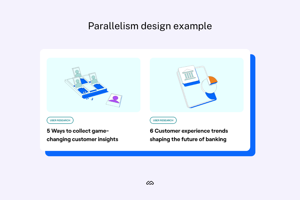
An example of parallelism in design is the consistent margins and padding that is often seen online. This example, taken from the Maze blog, shows consistent, parallel spacing between articles.
2. Continuation design example
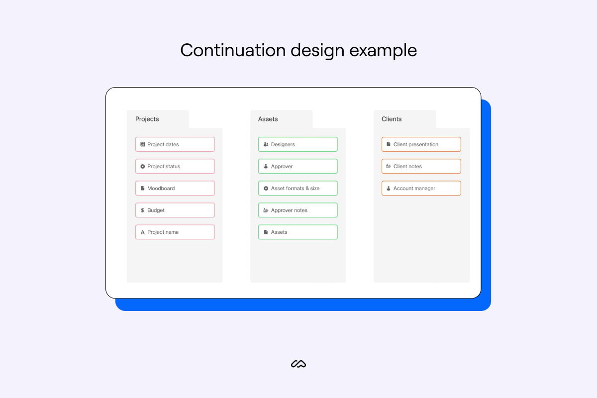
You'll most commonly see the law of continuity in-app onboarding or blogs. It's a fantastic UX example to encourage users to continue through flows or keep reading.
Airtable uses continuation in their onboarding visuals to acclimatize users to this learning style and better process the educational journey.
3. Similarity UX example

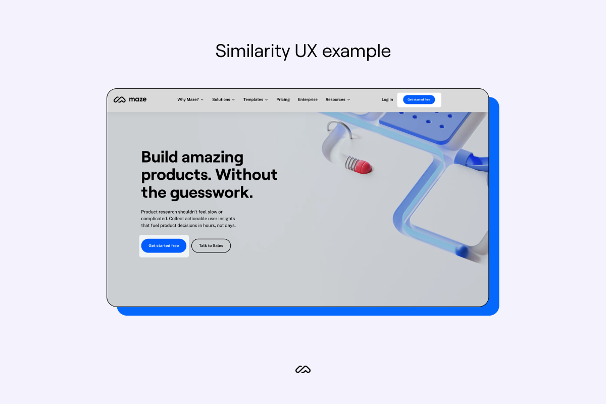
You'll find Gestalt laws peppered throughout the Maze website. Many brands use similarity design elements to create a clicking habit for users. CTAs are often the same color and shape on websites to subconsciously teach users where to click and what to register as a clickable opportunity.
Chameleon discussed in their article “First-Time User Experience” that it only takes users 50 milliseconds to assess the visual appeal of a website or a product design. The similarity principle on your homepage can massively aid a positive and seemingly familiar experience for new visitors.
Emilia Negoescu, Growth Designer at Stoica, explains where she uses this principle within her design work:
"The similarity principle is the most frequent principle used in web design. The similarity is influenced by the color, size, shape, texture, dimension, and orientation of the elements.
"One example in which the principle is used: the header, which is placed over the content and is different in font, color, and size from the body of the content. Another example in which similarity plays a significant role is the CTA (call to action); here it’s the part where your design is brought out by bending the principle a little."
4. Proximity in-product example

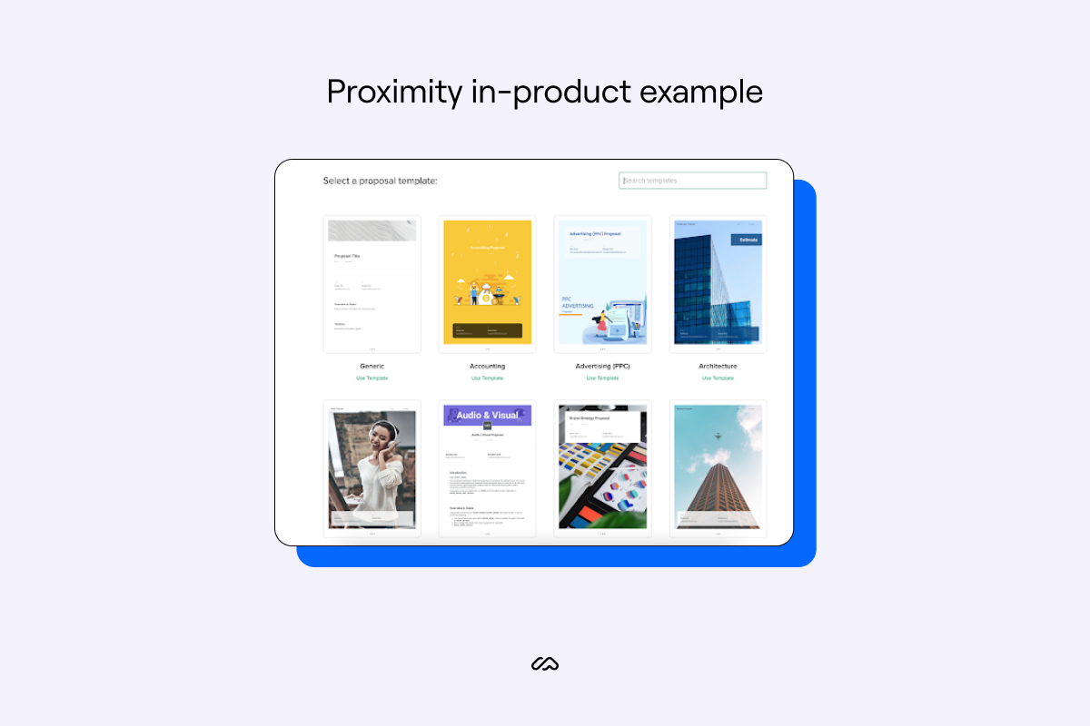
Bonsai, a tool to help freelancers run their business online, uses proximity principles to group certain resources. In the example above, you'll see the organization of their proposal templates helps users easily navigate to the template they need while assuring them that all of these templates are proposals.
You'll see this Gestalt theory most commonly in e-commerce websites as the Gestalt principle can subconsciously encourage shoppers to buy more 'similar' items.
5. Closure logo example
As we mentioned earlier, you'll see this Gestalt principle most commonly in logos, such as the IBM logo. They are a great design element to play with and allow for more creative freedom when using the logo across various brand assets.
6. Prägnanz principle logo example

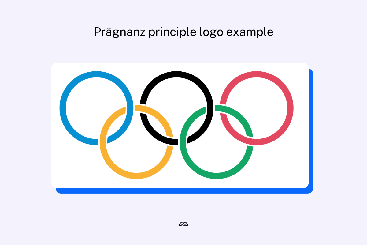
One of the most well-known examples of the law of prägnanz are the five Olympic rings. We automatically see five interlocked rings, instead of an assortment of C shapes and pointed ovals.
This principle is used in a lot of design, and is a driving reason behind why most online interfaces are built with simple shapes, like rectangles and circles.
7. Common fate example on websites

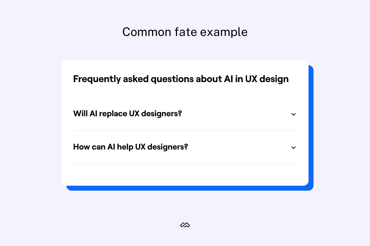
Somewhere you’ll frequently see the common fate principle in action is in the FAQ section of many blogs and websites—like these taken from our article on AI in UX Design. It’s a small touch, but the downward-pointing arrows on these FAQs help group them together visually.
8. Common region principle in-app example

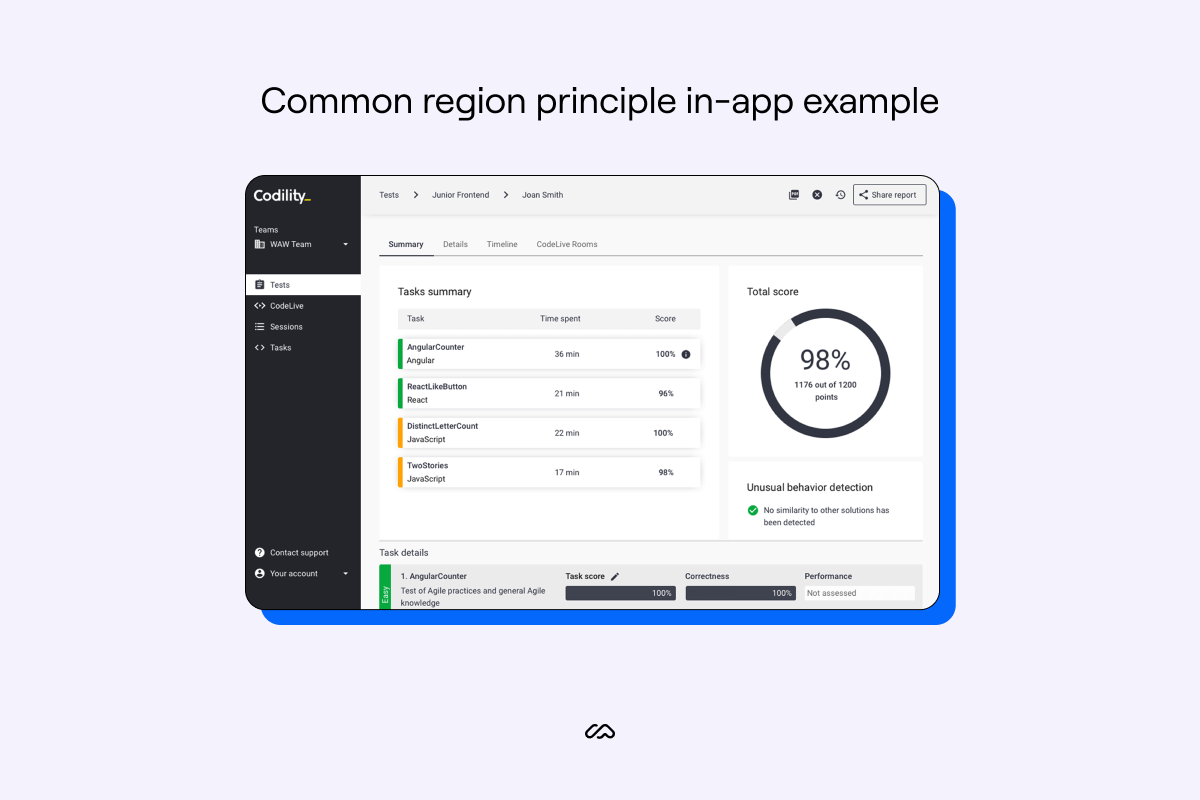
As this is one of the most basic ways of displaying visual hierarchy or grouping visuals using Gestalt psychology, we see it a lot within web products and apps.
Codility, a tech recruitment platform, uses common region principles within its application interface to help users navigate and group different areas of the tool.
Emilia tells us more:
"The common region principle organizes and separates content, boosting hierarchy and scannability. Often found in cards, banners, tables, that have a defined rectangular area with different information presented as one."
9. The figure-ground onboarding example

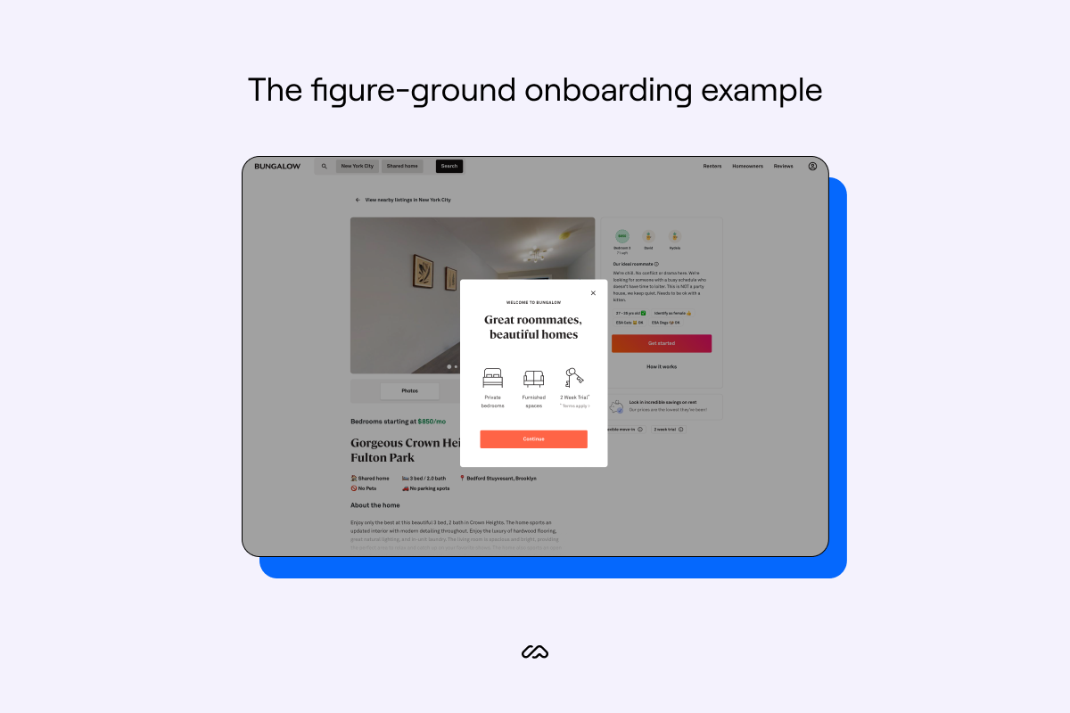
Brands will rarely use a flamboyant example of the figure-ground principle in their UX/UI design. However, you'll see it a lot as above. Product modals or website pop-ups are an easy solution to demonstrate this UI design principle.
Here, Bungalow, a home rental service currently based in the USA, uses the figure-ground Gestalt principle to help with their user onboarding flow and pull the user's attention to where it needs to be.
10. Focal point principle example

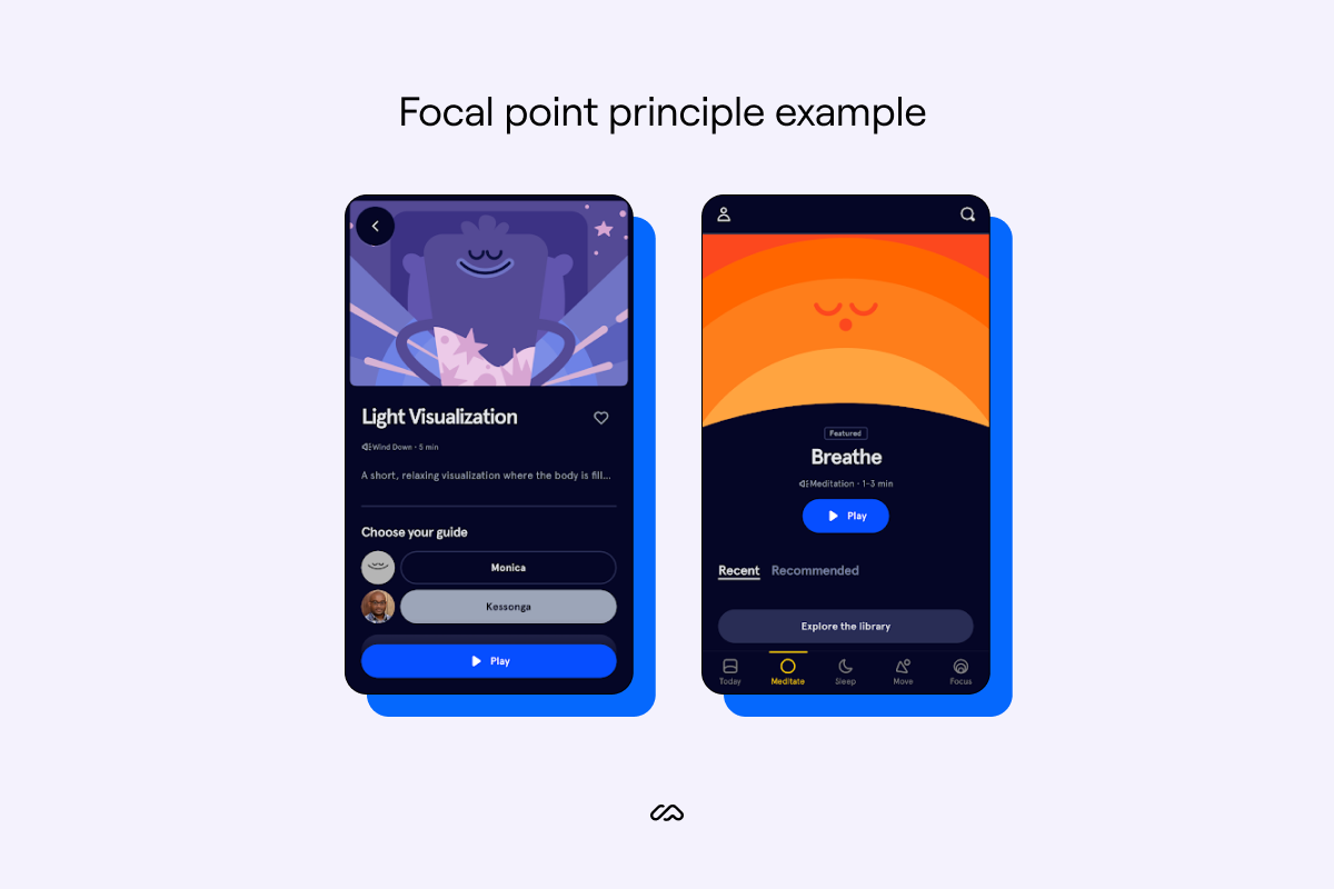
Headspace, the popular meditation app, has a tricky task in their product. Headspace needs to encourage users to be active in their product in order to retain them. However, they also need to keep users calm and not feel overwhelmed.
Juggling typical human perception of CTAs, Headspace uses Gestalt psychology around the focal point principle to hit their goals.
Headspace uses this Gestalt principle by placing the retention-focused CTAs in a stronger shade of blue on the app. So, despite multiple options for the user to click in the above examples, they're not overwhelmed with choices and are still subtly encouraged to click the CTA, leading to better in-app engagement.
Emilia explains how her team uses this principle in branding efforts for clients:
"One Gestalt principle we use in branding is the focal point—whatever stands out visually will capture and hold the viewer's attention first.
"We try to lead with the most important message first and make it stand out. When writing copy for our website or a social post, we eliminate the fluff and cut right to the core of the message."
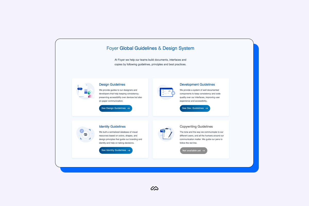
How Foyer uses grouping principles in their design strategy and visual elements
We spoke to Geoffrey Crofte, Lead UX designer at Foyer, a Global Guidelines & Design System. Geoffrey works with ten designers in this company and is in charge of the Foyer Design System and several applications for Foyer group's different companies.
Geoffrey also gives a course at Strasbourg University on UX and Usability and regularly teaches all about Gestalt principles to his students. We asked Geoffrey how his team applies Gestalt principles and Gestalt theory to the Foyer website.
"To me, proximity principles are one of the most important out of all Gestalt principles. If you remove all the others, you can already improve the clarity of your design by playing with this principle of proximity—or its opposite: distance.
"This visual perception rule is in the game all the time, and we use it all the time:
- An interface that is too condensed becomes illegible
- An interface that offers too much space between elements becomes unstable
"Our role, as designers, is to find the right balance between proximity and distance to create groups.
"The funny thing with proximity is that you can combine the common region principle and closure principle if you play your cards right."
You can't really separate all the principles because they are coming from the same law: ‘the whole is greater than the sum of its parts.'
Geoffrey Crofte
Lead UX Designer at Foyer
At Foyer, Geoffrey’s team helps other teams build documents, interfaces, and copies by following guidelines, principles, and best practices. To do this, Geoffrey needs to provide a customer-centric interface in order to promote a self-serve culture for page visitors, and eventually clients.

“The above example works pretty well because it combines several rules like similarity principle, closure principle, proximity, and common region principle. But, if we remove some visual grouping indicators, we can see that the proximity (and similarity) are still working—even if I kill the common region and closure principles.
"What's at work here is the proximity: an image, title, text, and button are grouped, close enough to create a consistent item.
"You can see that all the items are not the exact same ones, they are not duplicates, but they are really similar: One image, one title, one text, and one button. They share the same color codes. Except for one item that seems grayer and doesn't have a shadow on the button. It's supposed to be the same item, same function, but a bit different. This is the similarity design principle at play.
"We expect similar items to share attributes and functions; it's a way to tell your brain to learn the function only once and expect the same kind of result. As our last item is a little bit different in our example, we hope that human perception naturally understands this last item isn't available yet—using disabled visual codes."
We asked Geoffrey how his team uses Gestalt psychology when presenting the Foyer brand, products, or services. Geoffrey dived right in:
"I think that the similarity and continuity principles are one of the best to match with a brand strategy. But, I say so because I'm in charge of a design system, where similarity and continuity are really important.
"Similarity makes all your users learn things faster: If you keep your different features and functions consistent, you can expect a faster learning curve from them. Continuity states that things that are aligned visually on a line or curve seem to be related.
"For a brand, it's kind of the same idea: don't change things too quickly and adopt shared behavior for your client support, for instance. If, as a client, one day I have a great support experience with Lynda, and the other day I crash against a human wall called Roger, the continuity of the perception of the brand is broken. When it is, I lose trust in it."
We closed our interview with Geoffrey by asking if there are any tools or metrics he uses to measure the success of these principles.
"That's a good question. To be fair, I never thought about measuring this kind of thing. We did collect some verbatim from clients and users telling us about 'more consistency' and 'easier to recognize Foyer tools,' but I don't know if this counts as 'metrics.'
"For our design team, client and user satisfaction, and brand recognition are our first qualitative metrics. We'll need to work on quantifiable metrics to suggest design implementation success."
Wrapping up
From the same closed region to the figure-ground principle, that’s a wrap on how the human brain can group elements and how your SaaS can use this knowledge to build better products.
Try to optimize your own products to align with each Gestalt law. When you do, you’ll end up in building user experiences that are psychologically easier to process and navigate.
Lastly, save the guesswork around if you’ve hit the mark and consider running your product research with Maze. Rapidly collect user insights, and have your new knowledge on Gestalt principles pair with actionable data to help lift user engagement and retention rates.


Frequently asked questions about gestalt principles
What are the Gestalt principles?
What are the Gestalt principles?
Gestalt principles are the way in which the human brain processes individual images or elements of a scene. There are seven principles in total, and each one today is used by designers to help build better products for customers.
Why is Gestalt theory important?
Why is Gestalt theory important?
Gestalt theory is important as it breaks down how the human brain perceives images using cognitive psychology. Understanding Gestalt theory can massively help businesses build better products and websites for their customers.
How many Gestalt principles are there?
How many Gestalt principles are there?
There are seven perceptual organization principles coined as the Gestalt Principles. Those seven are:
- Continuity principle
- Similarity principle
- Proximity principle
- Closure principle
- Common region principle
- Figure-ground principle
- Focal point principle
Although some principles have many different labels, like the figure-ground principle, there are ultimately seven ways the human brain perceives multiple images.
How are Gestalt principles used in design?
How are Gestalt principles used in design?
Gestalt principles are used in design to guide users through a product or experience. They can give users a better understanding of what they see without explicitly saying it. Gestalt principles act as instantaneous onboarding aids to any digital product.