


Whether you’re a rookie UX designer or an experienced product marketer, you need to know the foundational UX laws.
These UX principles guide product design as they shed light on the psychology behind users’ expectations. Therefore, following them is a must for anyone aiming to create winning designs.
So, in this post, let's look at 21 UX laws—originally curated by product designer, Jon Yablonski, in his book and the resource Laws of UX. We’ll also look at examples so you can better understand how to put each law into practice.
Jacob’s Law
Users prefer your site to be designed the way other sites they use are designed.
This law was defined by the director of the Nielsen Norman Group, Jakob Nielsen, who insists you design for familiarity.
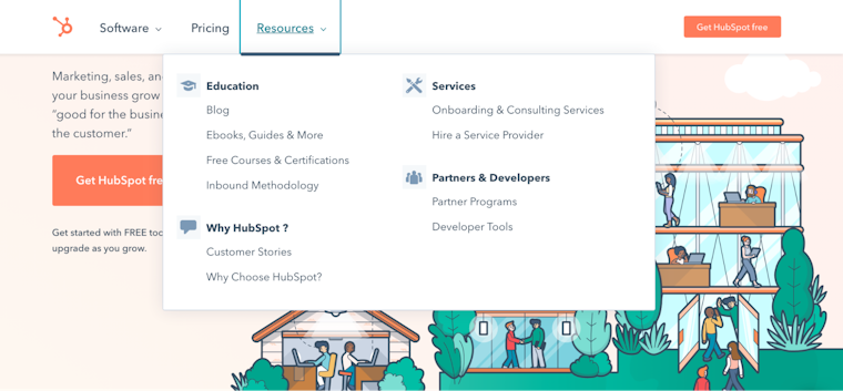
Since the best designs are user-centric, it helps to leverage prevailing mental models or to create designs that meet users’ expectations. For instance, users expect to find the ‘shopping bag’ on an ecommerce site in the navigation bar.

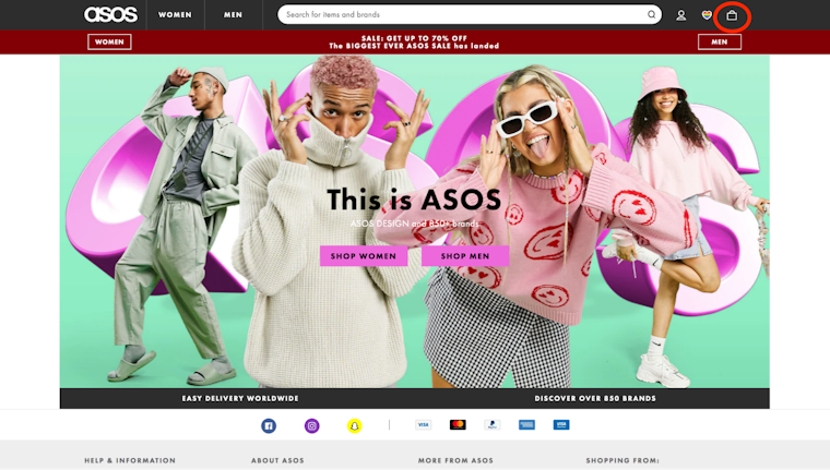
Source: asos.com
Put simply, designing according to existing mental models reduces the friction involved in learning to navigate a design. This, in turn, improves user experience as users can easily focus on the task at hand.
Aesthetic-Usability Effect
Users perceive visually pleasing sites as more usable.
Put another way, first impressions matter. So make sure yours is a visually appealing one.
In fact, scientists analyzed the impact of visual appeal on site usability and learned that the visual appeal of a design influences first impressions the most. Test participants gave high interest and usability ratings to websites that looked visually stunning and low interest and ratings to sites with low visual appeal.


Doherty Threshold
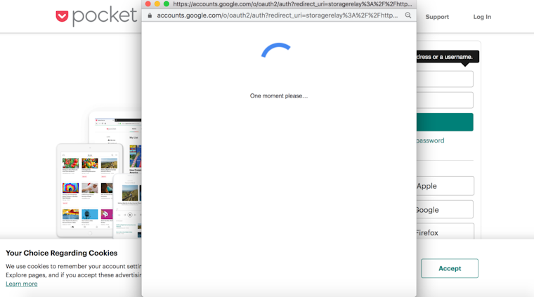
Human-computer interaction is ideal when the interaction pace is less than 400 ms so that no one has to wait for the other’s response.
The Doherty Threshold is all about your design’s timely reaction. The idea is to hold your audience’s attention by making them feel they’re in charge of the interaction. Think of it like this: when people see a response to each of their clicks, they’re likely to feel in charge of the interaction, which helps them stick with using the interface.
A good rule of thumb is to display a response within one second of the user action to encourage navigation. If you go any slower, you risk losing users as they feel that the design isn’t responding and it’s holding them back. Even if the process takes long, ensure the design engages users in the meantime. Progress bars and animations can help by telling users there’s work going on in the background.
Pocket showing a progress indicator as a user logs in is a practical design application of this law:

Source: Pocket
Fitts’s Law
Make sure the target action is always easily accessible to the user—both in terms of the distance the user has to travel and the target’s size.
According to this design law by psychologist Paul Fitts, a design’s usability increases by making sure the interactive element is:
- Large enough for users to select it easily
- Separate from other elements in the interface (larger in size and differently colored, for instance)
- Clickable anywhere so it’s easy to carry out the action and
- Within a users’ reach so they have to do minimal work
For example, floating social media sharing options are typically within a site visitors’ reach—encouraging them to share content. Another way to make sure the target is easy to acquire: arrange the action item(s) in a pie menu. Here, choices are presented at an equal distance in a circle—in sharp contrast with a navigation bar where the travel distance is longer.
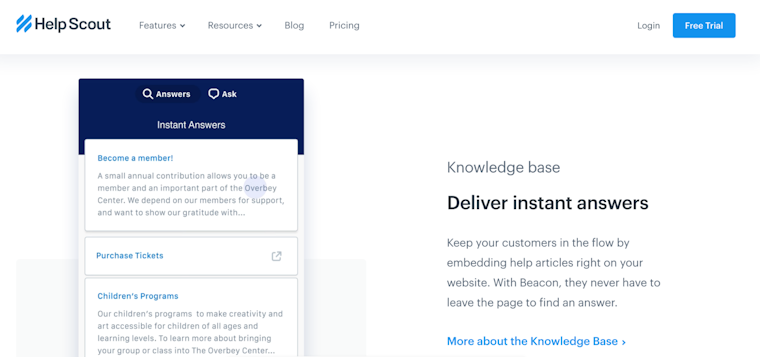
Hick’s Law
Too many and too complicated choices reduces the odds of the user actually making a choice.
If you’ve ever given up on taking a course because the option list was too long, you know what Hick’s Law or Hick-Hyman Law (based on the psychologists duo, William Edmund Hick and Ray Hyman who created this law) is.
Essentially, too many choices lead to choice or analysis paralysis, i.e., information overload preventing users from taking any action at all. So limit available options. HelpScout’s navigation bar design, for instance, only includes essential categories:

Source: helpscout.com
Miller’s Law
The average person can hold only 7 (plus or minus 2) items in their working memory.
Miller’s law explains why attention is limited.
Since people can hold seven items in their working memory at most, aim to reduce their cognitive load or the mental effort it takes to remember everything to make a decision.
Some ways to do so:
- Minimize choices as Hick’s Law states
- Design based on learning models to reduce learning load (circle back to Jacob’s Law for this)
- Keep your design clutter-free so there are fewer design elements vying for users’ attention
Google Meet’s design follows these principles—clutter-free design with minimal choices.


Source: Google Meet
Goal-gradient effect
The closer users are to a goal, the faster they are going to work to complete it.
Case in point: Dropbox’s onboarding process. It uses a checklist to tell users how much of the job is complete, therefore, leveraging the goal-gradient effect to encourage them to complete the onboarding process.

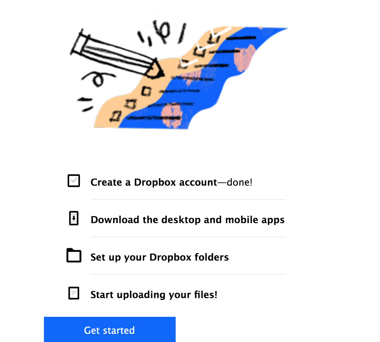
Source: Dropbox
For designers, this means it’s essential to provide a visual representation of the progress made or highlight the remaining steps to motivate users. Uber’s UX is another fitting example. The app tells users their wait time to keep them glued to their goal:

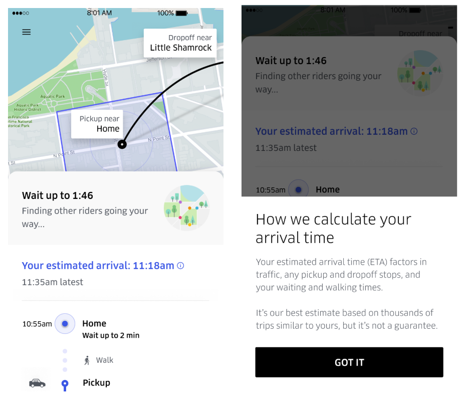
Source: Uber
Law of Common Region
Users group together elements that share an area with a defined boundary.
When users visit a design, they make quick judgments based on grouped elements in a target area to understand which UI areas to interact with.
Shading a group of elements, adding a background color, or designating elements in the header, footer, and navigation panel are some ways to create common regions for interactive designs.

Source: Hubspot
Law of Proximity
Users group together elements or objects that are positioned close to each other.
Like the Law of Common Region, this law is also a grouping principle that makes it easy for users to interact with your design. And, like the law above, it means that users perceive elements that are near each other or arranged close together in a series to be linked.
Simply put, you need to put thought into how you arrange elements so you can create common region elements. This requires strategic use of whitespace to separate or group elements to show meaningful groupings.
See how this section from a Maze report groups together the percentage of people answering with the number of people according to the Law of Proximity:

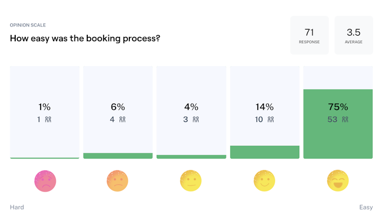
Source: Maze
Law of Uniform Connectedness
Visually connected elements are perceived as more related than elements with no connection.
This one’s another grouping principle. According to it, users see grouped-together elements as connected. Again, this means you use visual direction to group elements that are linked to meet your audience’s expectations.
For instance, use the same shapes, frame, or color to unite related elements. This log in screen from Workona shares linked elements related to signing in in a white-colored box:

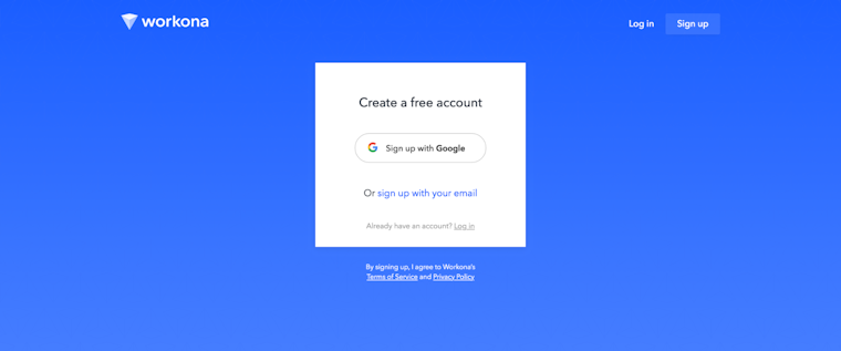
Source: Workona
Law of Prägnanz
People interpret complex or ambiguous images in simple forms because interpretation takes cognitive effort.
In simple words, your audience will always find simplicity in complex or ambiguous designs to save themselves from the mental overload. It’s why call to action (CTA) buttons tend to be rectangles rather than hexagons or any other complex structure.

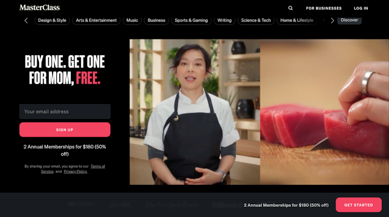
Source: MasterClass
Law of Similarity
Users tend to perceive similar elements in a design as a whole even if the elements are separated.
This means consumers perceive visually similar elements in a design such as those sharing the same color, size, shape, orientation, and movement as related in meaning or functionality. This is why clicked links have a different color in contrast with those that aren’t. Google’s purple color for a link you’ve visited is a prime example:

Google Search Results
Occam’s Razor
Select a design with the lowest possible complication.
Occam’s Razor comes in handy when you’re choosing between design prototypes. The goal is to select the design that’s simplest among all the options.
Don’t have a simple version? Work on removing elements as long as they don’t compromise with the overall design function. This resonates with what German designer, Dieter Rams, says: “Good design is as little design as possible.”
In short: aim to keep it simple, stupid, which is, interestingly, a rule in itself too. Apple is a good example of Occam’s Razor principle in action:

Source: www.apple.com
Pareto Principle
80% of the results come from 20% of the work.
The Pareto Principle is a pretty prominent one across several industries—not just the design field. You’ll find it highly valuable for projects with limited resources or tight timelines.
By keeping the Pareto principle in mind, focus on designing areas that’ll deliver the largest benefit to your audience. A minimum viable product (MVP) is an example of the Pareto Principle. Designers create low-fidelity prototypes that take less input but demonstrate the bulk of the outcome. To top that, UX designers can leverage this principle for prioritizing features to build by focusing on the ones that deliver the most results.
Parkinson’s Law
A task will inflate to take up all the available time.
Parkinson’s Law is also widely known in other fields, particularly, among productivity enthusiasts. For UX-ers, this law means you should limit the time it takes to complete a task to what users expect it’ll take.
Let’s say, users expect to fill in forms within three minutes (the exact expectation varies on the task at hand though. You can identify it using usability tests that show users completing the task in question). Anything shortening this duration works as a positive experience.
For example, the writing assistant software, Writer, remembers log in details. This reduces log in time—improving user experience:

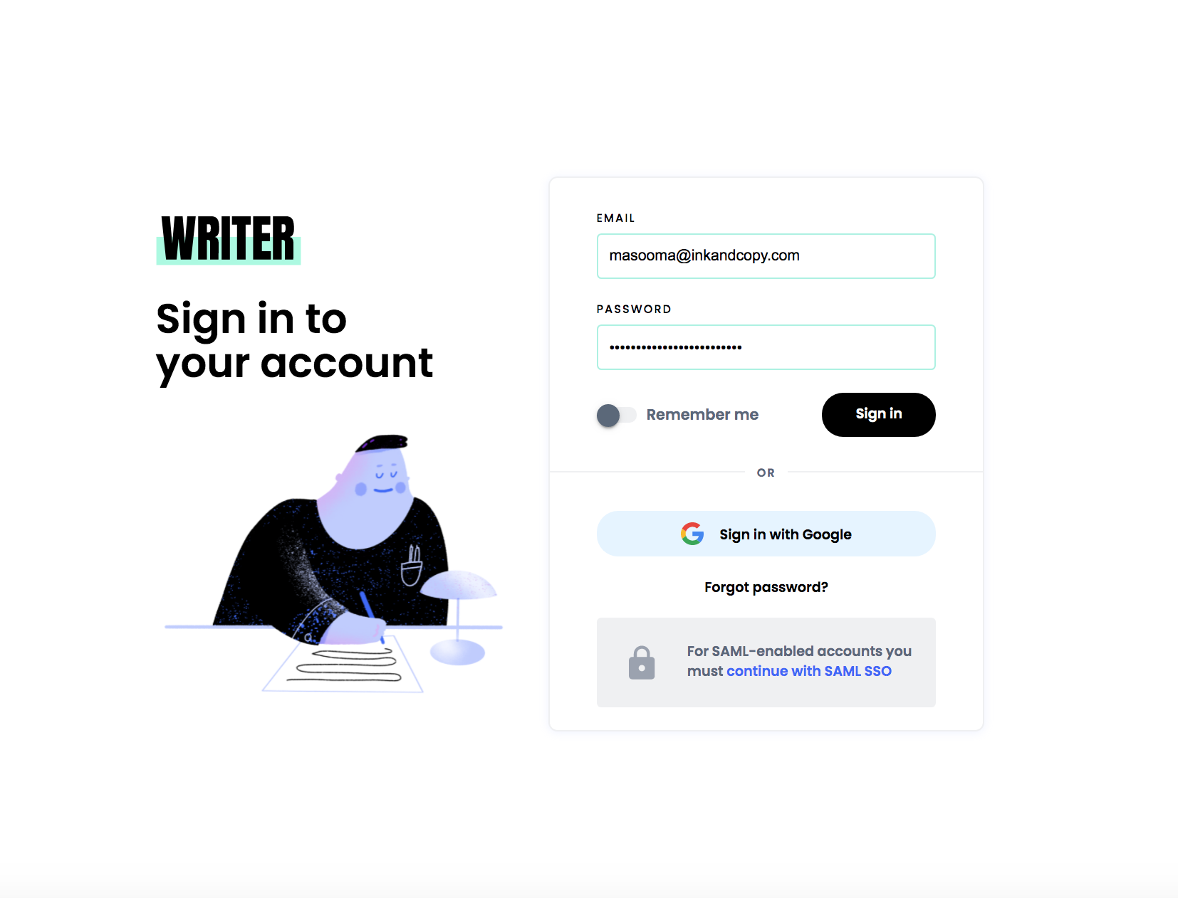
Source: Writer
Peak-End Rule
People judge an experience based on how they felt at peak moments and at the end, instead of the average or sum of all moments of the experience.
If you think of a project you enjoyed working on recently, you’ll note that you can recall some intense moments that you enjoyed and the final moments when you wrapped it up.
The same is true for a user’s journey. Keeping this in mind, it’s essential you focus on the most important and final moments in a consumer’s journey.
For instance, a lively animation or a cool illustration at the end of a successful interaction can boost user experience. In fact, it can make the overall experience memorable too. This illustration on Ahrefs’ 404 page, for instance, employs the peak-end rule, which makes it easy to remember.

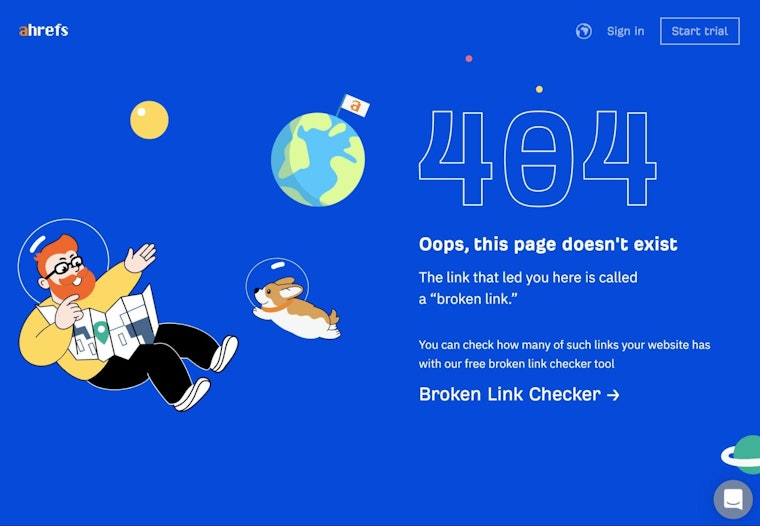
Source: Ahrefs
Postel’s Law
Be flexible in what you accept from your users and limit what you ask of them.
Postel’s law also goes by the name of the robustness principle. And it makes two points:
- Take what users share with you. For example, if you ask a user to share their country and they enter ‘US’ instead of ‘United States,’ accept it and convert the data for consistency yourself.
- Ask for limited information. This means you ask for only what’s important to encourage folks to take action—the same as Netflix does. After all, filling in a long form to get access to an eBook or service is repelling, isn’t it?

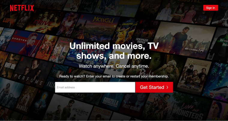
Source: Netflix
Serial Position Effect
People best remember the first and last items in a given sequence.
The Serial Position Effect suggests you position the most important UX elements on the far left and right of the design to improve memorization. On the other hand, place the least important elements in the middle.
Studies explain why this is essential. For one, multiple eye-tracking studies highlight that viewers consume online content in a zigzag layout, lawn-mower pattern, or an F, for instance. In all cases, they observe the extremes, which means placing important information in those areas brings the information to users’ attention.
And, two, the first and last items on the extremes tend to be best remembered. In experiments where participants were given a list of words, they showed a likelihood of remembering words at the extreme ends.
Look at how Twitter’s tweet option and DMs are both positioned on the extreme right for easy recall:

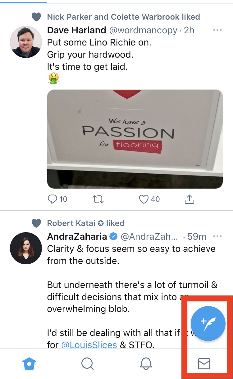
Source: Twitter
Tesler’s Law
Tesler’s Law or the Law of Conservation of Complexity states that there’s a certain amount of complication that’s intrinsic to every system.
Admittedly, each design has a certain level of complexity to it. Your responsibility is to reduce the complexity as much as possible. By doing so, you can help users focus on the task at hand instead of figuring out how to navigate the design.
Todoist, a to-do list maker, is a good case in point. It’s very simple to use as it focuses on encouraging users to take one step at a time without overwhelming them with tons of features as they visit the app.

Source: Todoist
To this end, you can remove features as well. Low-value features add clutter and increase users’ cognitive load. By removing these features, you reduce users’ mental burden and save them from having to look for high-value features they need.
Von Restorff Effect
The Von Restorff effect or The Isolation Effect says that people are more likely to remember an object that’s even slightly different than other similar objects.
Hedwig von Restorff, the psychiatrist behind this UX law, made a simple observation: package information you want to attract attention to in a visually distinct manner. It’s why CTA buttons tend to have different colors than the rest of the design as in this pop-up from Sleeknote.

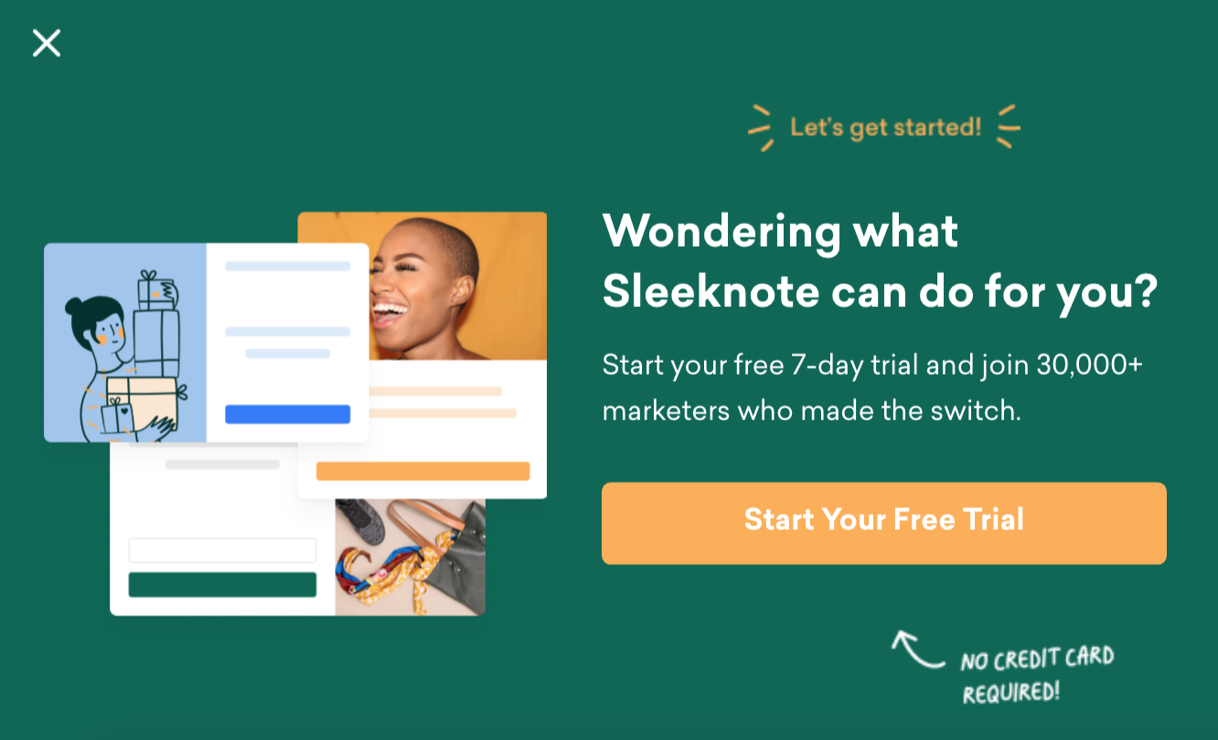
Source: Sleeknote
Also, be sure to carefully emphasize visual elements to prevent them from competing against each other for users’ attention.
Zeigarnik Effect
Users remember interrupted tasks better than completed tasks.
Soviet psychologist and psychiatrist, Bluma Wulfovna Zeigarnik, came up with the Zeigarnik Effect after her research on the impact of finished and unfinished tasks on memory. It turned out incomplete or interrupted tasks were easier to remember than completed tasks.
This stickiness in memory is what motivates users to complete the action too. Lewin’s field theory explains why.
Starting a task creates task-related tension that’s felt when the job is interrupted or incomplete. This tension is what improves memory of the task and is only relieved when the task is completed.
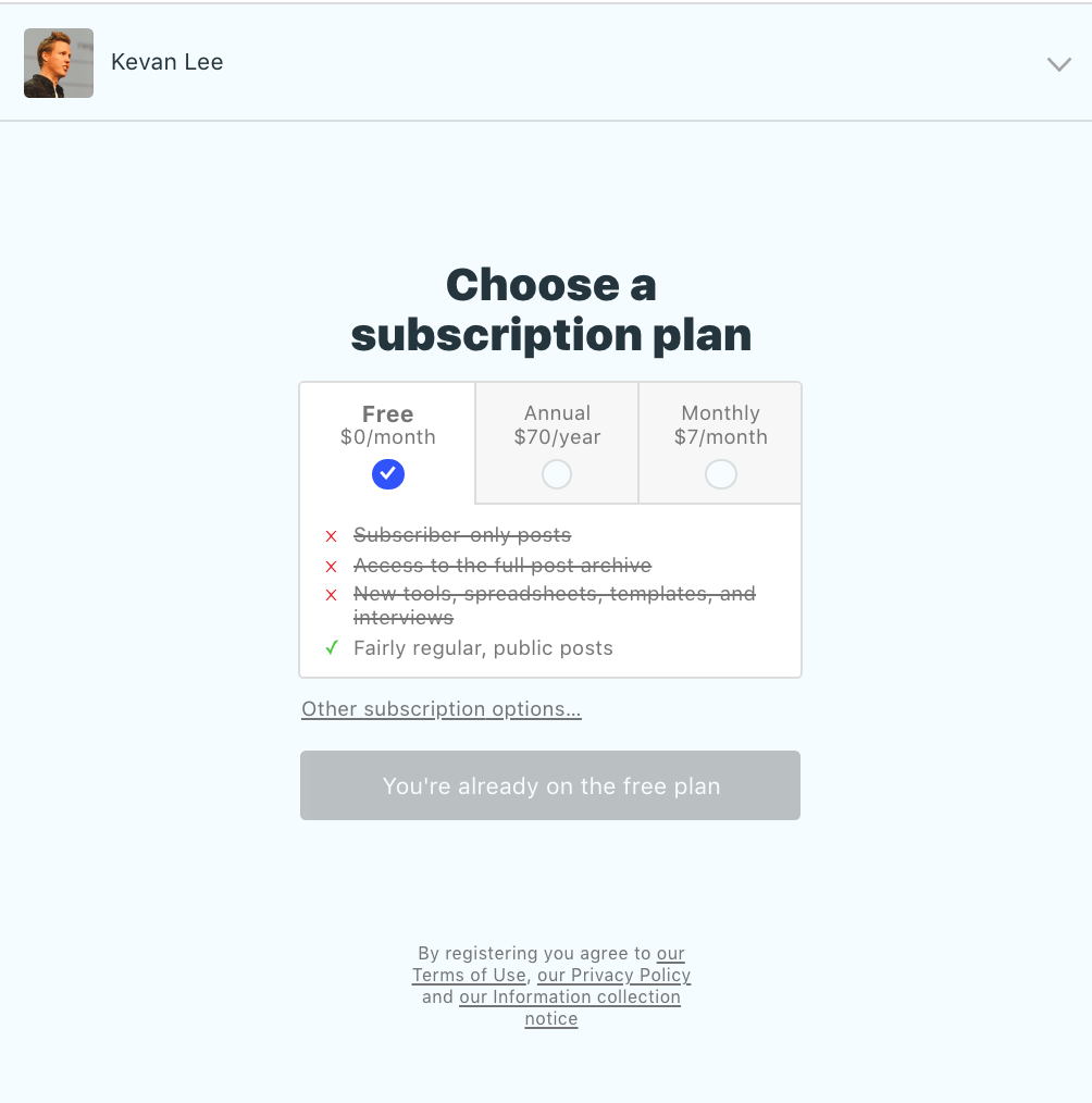
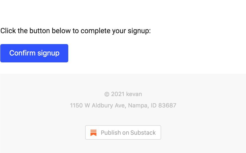
It’s why several companies leverage the Zeigarnik effect for newsletter subscriptions, for example. By dividing the process into two steps, you’re more likely to convince interested users to complete the subscription process and remember you too. Take Kevan Lee’s newsletter subscription, for example. Step 1 asks for your email address:
Source: Substack
And, step 2 asks for confirmation based on the Zeigarnik effect:

Typing together all the takeaways
As we bring these 21 laws of UX to a close, let’s leave you with actionable takeaways to remember:
- Create clutter-free, simple designs that are based on mental models to minimize the friction in understanding how to navigate your design
- Besides working on user-friendly UX, focus on creating engaging UI designs as users perceive visually appealing designs as usable
- Make sure the action button is always within users’ reach, large enough to be easily clickable and fully interactive so taking action is uber simple. Don’t forget to make it visually different from the rest of the design elements
- Create responsive designs to make users feel in control of the navigation. Leverage progress bars and animations to show work in progress and further this feeling
- Minimize choices, features, and break complex steps into easy steps to reduce mental overload
- Be thoughtful in the way you group elements together as users perceive closely arranged elements as linked by function. Use background color, boundaries, shapes, and other elements to group elements strategically for an interactive design.
- When limited for resources, focus on areas that users interact with the most
- Position key elements on the far right or left in your design to increase memorization
- Make sure no action takes longer than what users expect to dedicate to it
- Consider your design work done only when you can’t remove any additional items