


TL;DR
User research analysis is the process of turning your research data into insights that inform your product and business decisions. Depending on your research approach, it involves conducting qualitative and quantitative research analysis methods, like thematic analysis and affinity mapping (for qualitative data) or statistical analysis and UX benchmarking (for quantitative data), to uncover insights from user research.
A research platform like Maze helps by centralizing studies, using AI to identify themes and summaries, and generating visual reports that teams can act on.
User research analysis is where good research becomes a great product strategy. It's the process of finding patterns in what users said and did, connecting those patterns to business goals, and presenting them in ways that build confidence in every design decision.
In this guide, we look at where user research analysis fits in your workflow. You'll discover how to overcome common challenges and a step-by-step method for organizing, coding, and synthesizing findings.
What is data analysis in UX research?
Data analysis in UX research is how you turn raw research data into structured findings you can trust. It involves cleaning, organizing, and examining what you collected so you can spot patterns, quantify behaviors, and prepare it for reporting.
In a typical study, analysis sits in the middle of the research pipeline:
Collect data → Analyze data → Synthesize data → Report

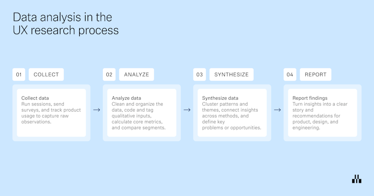
- Collect data: Run interviews or usability tests, tree tests, surveys, or analytics studies, and capture everything in a consistent format.
- Analyze data: Clean up the data set, remove duplicates or unusable entries, code and tag qualitative data, calculate quantitative metrics, and segment results by audience, device, scenario, or variant. For example, you might code interview transcripts to identify themes, or compute task success, time on task, and error rates for a usability test.
- Synthesize data: Combine those analyzed pieces into clear patterns, outliers, opportunity areas, and user stories that answer your original research questions. This is where you connect dots across participants and studies.
- Report and share: Turn the synthesized findings into reports, decks, highlight reels, or research repositories. Here, you translate findings into recommendations for UX, product, and engineering for continuous iteration and improvement.
Common challenges in analyzing UX research data
Once the data is in, you need to sort, compare, and pressure test what you see across methods before you share it as an insight.
Here are some of the most common challenges, plus ways to overcome them.
- Underestimating the effort of structuring raw data: A typical mistake is to dump everything into transcripts, notes, and recordings following your research studies, then start analysis by rereading it all piece by piece. Instead, take structured notes during sessions, tag behaviors and themes as you go, and block dedicated time for analysis in your plan. When you reach the analysis phase, you are working with pre-tagged material that directly links back to your research questions.
- Biased, single-source conclusions: Teams often lean on one small interview set, a single survey, or the stakeholder’s favorite clip. That combination of limited data and cognitive bias changes the story. To counter this, mix UX data from multiple research methods and secondary sources. Also, make key research hypotheses explicit before analysis so you can test whether the data supports or contradicts them.
- Separating qualitative and quantitative data: Build your analysis around both from the start. Use quantitative data to measure how big the problem is and qualitative data to explain why it happens, and present them together. For example, pair a drop-off rate or task success metric with a small set of representative quotes or clips that show what users struggled with.
- Limited stakeholder buy-in: Stakeholders don’t often see how you code data, choose behaviors or issues to focus on, or rule out other explanations. So it’s easy for them to doubt the conclusions or deprioritize the work. To counter this, share a small slice of analysis while it’s still in progress, like a few clips, a tagging board, or early themes, and invite quick reactions. This keeps people close to the evidence and makes it more likely they’ll act on the results.
- Vague, unactionable findings: It’s easy to close a project with generic suggestions like ‘improve navigation’ or ‘simplify onboarding.’ They sound reasonable, but do not tell anyone what to do on Monday. Tie each finding to specific evidence, affected users, and a concrete next step. For example, “Reduce the number of steps in the mobile checkout funnel; seven of 10 participants dropped off at step three when asked to enter card details.”
Keeping these tips in mind enables you to produce more reliable, actionable insights with less effort.
How to analyze UX research data step-by-step
At this stage, you’re turning observations about user behavior into structured, meaningful insights that can improve the user experience. The steps below outline a practical UX research analysis workflow you can use for most research projects, whether you are working with qualitative research, quantitative analysis, or a mix of both.
1. Organize and clean your UX research data for analysis
Start by bringing everything from your research sessions into one place and checking it against your research objectives.
You can focus on three things:
- Centralize and label your data: Bring recordings, transcripts, notes, survey responses, and spreadsheets into a single workspace. Label them with the research project, method (user interviews, usability test, survey), and participant details so team members are not guessing where things belong.
- Clean and standardize formats: Fix obvious issues in your UX research data. Remove duplicates, align rating scales, tidy column names, and make sure time stamps and task names match across files.
- Link data back to participants and tasks: Make it easy to see which type of data came from which participant and which task or user journey step. Consistent IDs or tags let you later connect a pain point from an interview to the same pattern in a usability test or analytics.
Once these three tasks are done, you have a clean foundation for qualitative or quantitative analysis and any methods you want to use next.
2. Code qualitative research and categorize your UX data
Once your UX research data is organized, the next step in UX research analysis is to code it. Coding means assigning short labels to pieces of qualitative research so you can sort, count, and compare what people said and did.
- Define a simple coding frame: Start from your research objectives and create a shortlist of codes that reflect what you care about: tasks, blockers, emotions, questions, feature requests, and so on. Keep it small enough that team members can apply codes consistently. You can always refine or split codes later as patterns become clearer.
- Apply codes across research sessions: Go through your qualitative research data and highlight relevant phrases, moments, or behaviors. Tag them with one or more codes, for example, ‘navigation confusion,’ ‘pricing uncertainty,’ or ‘workaround.’ Do this across user interviews, focus groups, and open-ended survey responses so you can compare like with like.
- Group related codes into categories: Once you have a first pass of codes, start clustering them. Codes that regularly appear together can form categories such as ‘onboarding friction,’ ‘search and discovery,’ or ‘account management.’ This is a light form of content analysis and affinity mapping that sets you up for more formal thematic analysis in the next step.
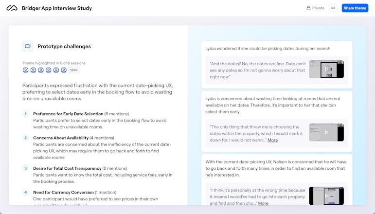
If you’re using a research platform like Maze, AI can take a lot of the time-consuming work out of this step. Maze’s AI-powered analysis features scan open-ended responses and interview data to surface common topics and sentiment in minutes, so you see patterns from the get-go. AI-supported user interview analysis can summarize sessions, highlight key takeaways, and point you to recurring themes across multiple calls, which makes it easier to refine your codes.


3. Use thematic analysis to synthesize categories into user insights
You now have coded data and broad categories, like ‘onboarding friction’ or ‘search and discovery’. Thematic analysis is where you interpret those categories and turn them into a small set of clear user insights.
Go through each category and ask what it really says about user behavior and user needs. Merge duplicates, split anything that is trying to cover multiple problems, and rename vague buckets into concrete themes. For example, shift from ‘onboarding friction’ to ‘people skip onboarding because it feels long and irrelevant to their immediate goal.’
Next, hold every theme up against your research objectives and segments.
- Does this theme help answer the questions you set at the start of the research project?
- Which users does it affect, and at which point in the user journey?
From there, write your themes as an insight statement. A good insight briefly states what is happening, who it affects, where it shows up, and the evidence behind it.
For example, “New mobile users frequently abandon checkout at the card details step because they do not trust the payment screen, as seen in seven of 10 user interviews and a 45% drop-off rate on this page.”
These statements become the backbone of your research findings and recommendations. If you work in Maze, Maze AI can group responses into themes and summarize what people said, giving you an initial thematic structure you can review and refine.
Plus, Clips lets you group related highlights, write a short analysis and summary, and share a reel that shows the theme plus supporting moments from sessions, so each insight is backed by real user footage.


4. Share research findings visually to improve the user experience
You need to show how users behaved, where they struggled, and what should change next, using charts, heatmaps, flows, and short, evidence-backed insights.
A UX report does three things:
- Shows what you learned in a handful of clear insights
- Makes it obvious where in the product those issues or opportunities live
- Clarifies what should happen next to improve the user experience
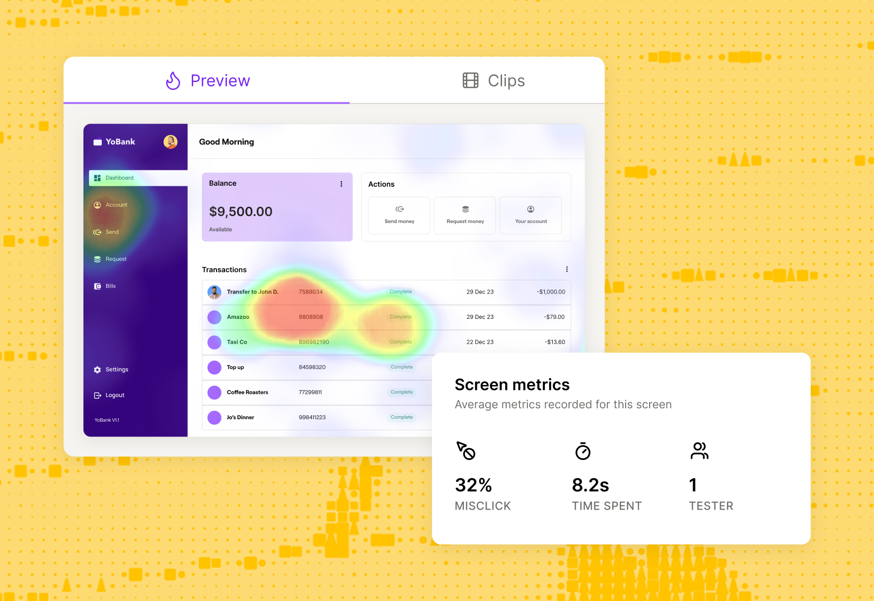
In Maze, each study generates a UX report with key usability metrics, paths through your missions, and visualizations like heatmaps and scores. You can layer your own themes, summaries, and recommendations on top, then share the report as a live link or embed it where teams already work.
The end result is a visual record of the research findings that keeps your insights visible long after the initial readout and makes it easier for teams to connect specific UX decisions back to real user evidence.


Quantitative vs. qualitative research data analysis in UX
Both quantitative and qualitative UX research methods provide valuable user insights, but each offers different angles of understanding your user. Mixed methods research combines both types, bridging the gap between hard data and user sentiment.
Here’s an overview of the main differences when analyzing quantitative vs. qualitative data in UX research:
Now, let’s explore different methods to synthesize and evaluate quantitative and qualitative data.
User research analysis methods for evaluating quantitative data
At this point, you should have already conducted UX quantitative research, such as live website usability testing, click tracking, or UX surveys. From here, you’ll have a large dataset of raw results.
There are different approaches to quantitative statistical analysis—descriptive and inferential.
- Descriptive statistics are your mean, median, mode, etc. and can easily be calculated in a spreadsheet
- Inferential statistics assess statistical significance to determine whether your finding can be generalized to all (or most) users
For the purposes of this guide, we’ll focus on inferential statistics within quantitative user research analysis. But before jumping into the methods of evaluating quantitative data, here are key terms you’ll need to know:
- Sample: A subset of people who are relevant to the study, chosen from your complete population
- Population: The entire group of people relevant to the study
- Statistical significance: Likelihood that a result or relationship observed in data is accurate and not due to random chance
Now, let’s look at four types of quantitative user research analysis.
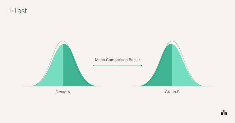
T-tests
In UX research, a t-test helps you infer if your sample-based assumptions apply to the entire population. For example, you might want to see if there's a significant difference in usability scores between new users (< six months) and experienced users (> six months).
There are three main types of t-tests you’ll typically use:
- One-sample t-test: Compare one group’s mean to a benchmark or target value. For example, “Is our average SUS score different from 68?”
- Independent two-sample t-test: Compare two different groups, like new vs experienced users, or users on variant A vs. variant B.
- Paired t-test: Compare the same group over time, such as CSAT scores before and after a redesign, or time-on-task in round vs. round two of testing.
When to use T-tests: Use t-tests whenever you want to identify statistical differences between two groups.

ANOVA
ANOVA (Analysis of Variance) is used to test whether there are statistically significant differences between the means of three or more groups. It’s similar to a t-test, but instead of comparing A vs. B, you can compare A vs. B vs. C in one go. In UX research, you might use ANOVA to see whether customer metrics like NPS or task success rates differ meaningfully across multiple user personas or regions.
When to use ANOVA: Use ANOVA analysis when you need to compare the statistical relationships between more than one group.


Correlation analysis
Correlation analysis measures how strongly two variables move together and in which direction. In UX research, you might ask: “When CSAT scores go down, does retention also drop?’ or ‘As task success improves, do support tickets decrease?”
The result is a correlation coefficient between -1 and +1. Positive values mean the variables tend to move in the same direction, negative values mean they move in opposite directions, and values near zero suggest little or no linear relationship.
When to use correlation analysis: Opt for correlation analysis if you’re looking to assess the relationship between two metrics:
- Exploratory analysis (spotting patterns, like traffic dropping on holidays)
- Simple prediction (expecting conversions to fall when traffic falls)
- Test a basic hypothesis (for example, whether higher usability scores are associated with higher satisfaction)
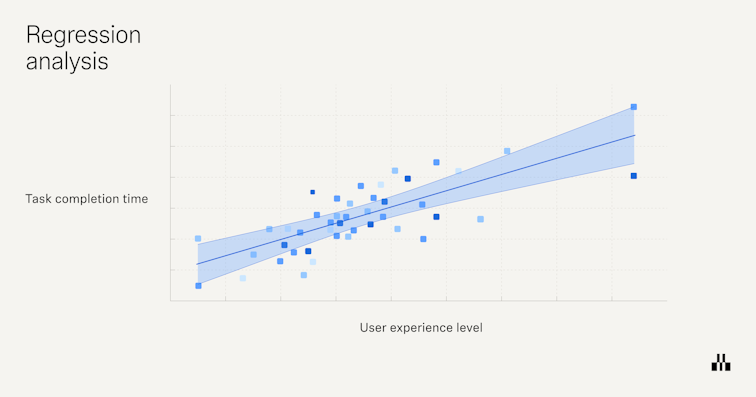
Regression analysis
Regression analysis builds on correlation by asking, “Does a change in one variable help explain or predict a change in another?” Instead of just saying two metrics move together, regression estimates how much one variable (for example, page load time) affects another (for example, conversion rate).
In UX research, you might use regression to see how task time, number of errors, or device type relate to outcomes like satisfaction, retention, or revenue. For example, you could model how often users convert when a page loads in under 1.5 seconds versus when it loads slower, or how changes to a checkout flow impact completion rate.
When to use regression analysis: Go with regression analysis if you’re looking to identify the specifics of cause-and-effect relationships between variables.

User research analysis methods for synthesizing qualitative data
Qualitative UX research methods provide a lot of data, so whether you’ve conducted user interviews, surveys with open-ended questions, focus groups, or contextual inquiries, step one is compiling the data into a central location.
Your results will likely look like interview transcripts, long-form text-based answers, or time-stamped user behaviors, so you’ll need a more robust location than a spreadsheet—here’s when your UX research repository can really shine!
From here, you can then begin to synthesize and analyze the data using one of these techniques.
Thematic analysis
Thematic analysis involves identifying recurring themes and patterns within your qualitative data and assigning codes (tags) to organize the research results. This allows you to summarize huge text-based databases into a few key shared insights and results.
You can make assumptions, see clear patterns, and determine the why behind your sample’s behavior. You can also turn this analysis into affinity diagrams to manage information groups and their relationships.
When to use thematic analysis: Use thematic analysis as a starting point for broadly grouping and organizing large amounts of qualitative data.
💡 Pro tip
If you use Maze for hosting Interview Studies, you can accelerate this step by 50% by getting an AI-generated transcript and summary of all your sessions. You can add tags to the transcript and build executive reports with those insights.

Narrative analysis
A narrative analysis is a qualitative research method that captures the complexity and richness of human experiences and provides deep insights into users' motivations, emotions, and thought processes. This helps you identify themes and patterns that may not be clear in quantitative results.
For example, you might spot that only a handful of users followed the intended sign-up path during usability testing. This is a fact, but it lacks an explanation. However, by analyzing the text-based data, you notice that users express confusion aloud, saying the red color of the registration button threw them off.
When to use narrative analysis: Go with this method for exploring user experiences and stories, understanding the context of their behaviors, and developing personas and journey maps.
Grounded theory analysis
Grounded theory analysis invites you to generate new theories based on data collected in the field. These new theories and frameworks need to be grounded in empirical data.
In UX research, you can use this method to develop new theories about user interactions and behaviors. For example, while coding users’ interview data, you might observe a correlation between positive CSAT and a highly-responsive support team.
When to use grounded theory analysis: Grounded theory analysis is best for exploring new or under-researched areas and continuously developing theoretical models that explain user behavior.
Content analysis
This method allows you to synthesize the text and all qualitative data to make generalizations, find patterns, and draw conclusions.
Here, you should also turn content into codes, like in thematic analysis. In content analysis, however, you want to identify the frequency and repetition of words and topics, getting to more granular detail, rather than just grouping recurring themes.
For example, if you’re analyzing unmoderated usability tests, you can code every comment that references the sign-up page as ‘SU’. Whereas, in thematic analysis, you’d group it into a bigger theme, such as ‘conversions’.
When to use content analysis: Content analysis is ideal for viewing data in snippets and digging into the weeds of specific insights.

Automate data research analysis and valuable insights with Maze
UX research analysis will always need human judgment. You still define the research goals, choose the right methodologies, and decide which user stories matter most.
Where you don’t need to spend your time is on repetitive admin work like transcribing user interviews, tagging every quote, or rebuilding reports from scratch after every study.
Maze helps you streamline that research process end-to-end. It gathers results from tests, surveys, and prototypes in one place, uses AI to identify themes and summarize what users said, and turns everything into visual reports your team can act on.
From testing to analyzing, Maze supports teams looking to prioritize and streamline their user research processes.
Frequently asked questions about user research analysis
What is user research analysis?
What is user research analysis?
User research analysis is the process of reviewing the collected user data through qualitative and quantitative analysis methods to uncover actionable insights.
How do you analyze UX research data?
How do you analyze UX research data?
To analyze user data, employ different research analysis methods such as content analysis and thematic analysis for qualitative data, and t-tests and regression analysis for quantitative data.
What are common mistakes in analyzing UX research data?
What are common mistakes in analyzing UX research data?
Common mistakes include:
- Starting analysis without clear research questions
- Skipping basic cleaning and structuring of the data
- Writing findings that aren’t clearly tied to evidence
- Sharing insights without specific next steps for Product or Design teams
How do you synthesize qualitative data?
How do you synthesize qualitative data?
You synthesize qualitative data by moving from scattered observations to a small set of clear insights. Start with your research questions, then review coded data (notes, interviews, open answers) and cluster related codes into a few themes that directly speak to those questions.
For each theme, spell out what’s happening, who it affects, where it shows up in the experience, and attach 1–3 concrete examples (quotes or clips) as evidence. Finally, prioritize those themes and turn them into recommendations so teams know what to change and why.
How does Maze ease the user research analysis?
How does Maze ease the user research analysis?
Maze records and transcribes sessions for you, summarizes interviews and open-ended answers, and uses AI to group similar responses into themes. For usability tests, it automatically calculates key metrics like task success, time on task, misclicks, completion paths, and generates heatmaps and a usability score. It then automatically assembles all of this into a visual, shareable report.