


 KPIs to measure (+ how to do it)")


When it comes to measuring and proving the performance of your UX efforts, data speaks volumes—and that's where UX KPIs come in.
UX KPIs, or key performance indicators, give you an objective way to measure progress over time, see if goals are being met, and analyze whether changes need to be made.
Also, tracking UX KPIs makes it easier to report back to executives and demonstrate the value that UX brings to the entire organization.
In this article, our goal is to highlight the top UX KPIs and share how to measure and report on them. To get an inside look into the metrics that matter most to real-world design teams, we spoke to Thais Souza, Design Director at PayFit.
What are UX KPIs?
Key performance indicators (KPIs) are quantifiable measurements used to evaluate the performance of an organization against its strategic objectives. KPIs are linked back to UX OKRs and used to monitor the progress and measure the success of UX activities are known as UX KPIs.
Why should you measure UX KPIs?
KPIs are critical in being able to review how your UX is progressing. There are many reasons to start measuring UX KPIs, let's look at the most relevant ones:
Track progress over time
UX KPIs translate abstract goals into tangible metrics and thus are a reliable way of finding out if you're on track to achieve the results you want. They let you know if your UX strategy is working or if you need to make adjustments to reach your goals. And if that's the case, they can show whether those improvements are successful. In the end, UX metrics are easily comparable: you can see how a particular design change performed last time and quickly determine if the new UX is better or worse.
Identify problem areas
Getting user feedback on your designs is one of the most effective UX design principles you can adopt. UX KPIs are numerical representations of what users do and what they think about your product. This makes them a great tool to assess the quality of UX design and identify problems.
For example, when you run usability testing and record a low success rate for task completion or a high misclick rate on a particular screen—it's evident that your users are finding it hard to complete their tasks. Such metrics can pinpoint what you need to improve to deliver a better user experience.
Make success visible to stakeholders
KPIs help you translate the value of UX into the language of stakeholders and decision-makers. Using numerical data makes it easier to compare results and objectively determine how your design performs. These metrics will spotlight the value your design team delivers to users and the organization with every project. Finally, KPIs that show the success of UX activities can be a helpful argument when it comes to allocating UX budgets.
Check out these brilliant UX design examples to see the wonders good UX design can do for your brand and discover best practices to apply in your own UX design strategy.


The difference between KPIs and ROI
KPI (Key Performance Indicator) and ROI (Return of Investment) are metrics that companies can use to measure their success in achieving a specific goal. KPIs are key figures used to measure the performance of different areas or activities of a company. On the other hand, ROI is a financial indicator used to evaluate the efficiency of an investment. It's expressed as a percentage and is calculated by dividing the total profit of a project by the investment into that project.
The main difference between KPIs and ROI is that KPIs measure how a particular activity is performing along the way, whereas ROI looks back at the bigger picture and final result.
You can think of UX KPIs as a guide or compass—they help you stay on course towards your goals. However, what exactly should you measure?
| Behavioral UX KPIs | Attitudinal UX KPIs |
|---|---|
| Task success rate | System Usability Scale (SUS) |
| Time on task | Customer Effort Score (CES) |
| Search vs. Navigation | Net Promoter Score (NPS) |
| User error rate | Customer Satisfaction Score (CSAT) |
| Misclick rate | Standardized User Experience Percentile Rank Questionnaire |
| Conversion rate | First impression |
As you can see above, there are various UX performance indicators to choose from. "Choosing the right UX metrics and what to measure is a matter of paying attention to what’s working and what’s not—for the users and the business," explains Thais Souza, Design Director at PayFit.
Instead of measuring everything, keep in mind what makes a metric most useful.


Thais Souza
Design Director at PayFit
Share
According to Thais, the best UX metrics should have:
- A timeframe
- A connection between user needs and business objectives
- A clear reason for being collected and reported
- A connection to an action you want your customers to take
The KPIs you should track will vary depending on the type of project you're running and the goals you've set. Yet, in the following section, we'll highlight six top KPIs that most UX design teams want to measure.
Tip ✨
Not what you're looking for? Check out the key usability metrics you should be tracking to take advantage of data and get ahead of your competitors.
Behavioral UX KPIs
Behavioral UX KPIs are numerical representations of what users do and how they interact with your product. They allow you to quickly determine if there are issues you need to fix and how your design performs over time.
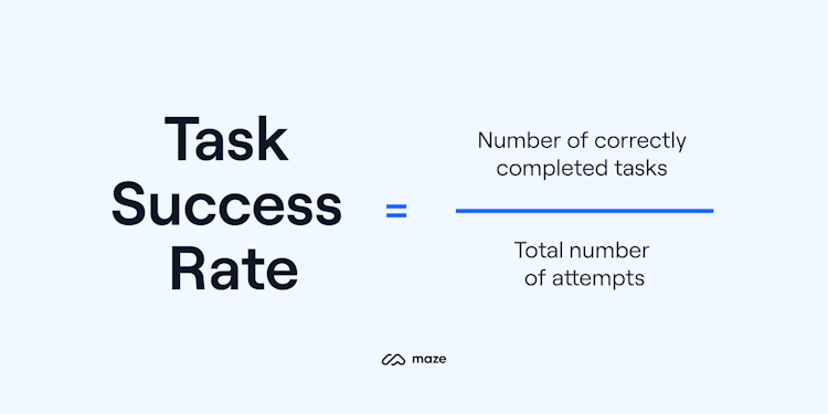
1. Task success rate
One of the most common metrics used to measure user experience is task success or task completion rate. Success rate shows the percentage of users who were able to complete a task in a study and helps designers identify usability issues.
How to measure task success rate
You can calculate task success rate using the following formula:

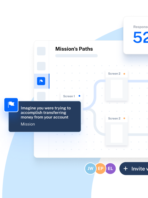
You first need to choose a task with a clearly defined goal and determine when the task is considered completed. In Maze, for example, you can set the expected flow(s) you think users will take through your prototype, and if it coincides with the one users take, the result is a direct success.
Examples of how to use task success rate
Some examples of measurable tasks are:
- Completing a registration form
- Adding a specific item to a shopping cart
- Signing up for an online class
Let’s take the example of a registration form for a product demo: initially, when 100 users visit the page, only 30 successfully complete and submit the form, resulting in a task success rate of 30%. After making improvements such as clarifying the job title field and addressing privacy concerns, you might find the task success rate increases to 50%. This would indicate a positive impact of optimizing the form's usability.
Success rates are easy to collect and offer a simple way to communicate usability findings to stakeholders. When assessing if the completion rate for your tasks is good or bad—context matters. However, studies have shown that, on average, 78% is a good completion rate.
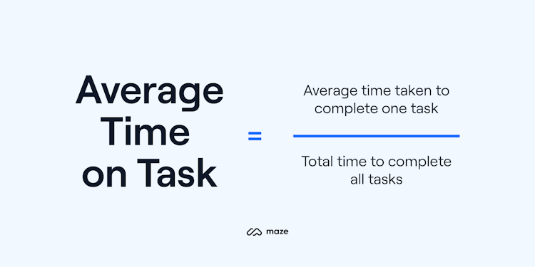
2. Time on task
Time on task, sometimes referred to as task completion time or task time, is another valuable metric for assessing the usability of a product. It describes the time that a user needs to complete a task successfully.
The time users spend on completing a task is a measure of efficiency. In general, the shorter the duration, the better the user experience. More time might mean users are having a hard time finding what they need on a page, are lost in the flow, or don't understand how to use the product. Yet, there are exceptions. If the task is meant to keep users engaged, a longer time on task could be good.
How to measure time on task
Depending on the evaluation method and type of project, there are different ways to measure task time. Yet, the most common way is to calculate the average time spent on each task.
Example of how to use time on task
When you record a long time spent on a task, it's important to identify the reason. Is it because users are getting lost through the design, so you might need to rework the navigation? Or perhaps it's because they didn't understand the task, in which case rephrasing the question might produce better results. The context in which the metric was recorded matters.
Bear in mind that if you encourage ‘thinking aloud’ during usability sessions or ask questions as participants complete their tasks, you’ll risk compromising the accuracy of this metric. As Jakob Nielsen and Raluca Budiu describe, “Think-aloud protocols are the best way to understand users' thinking and thus how to design for them. But the extra time it takes for users to verbalize their thoughts contaminates task time measures.”
Instead you may wish to gather qualitative feedback by conducting interviews or surveys after the test is over. Alternatively, you could split your participants into two groups—one with think-aloud protocols but less accurate time-on-task data, and one with less qualitative feedback but more accurate time data.
3. Search vs. navigation
Users have two options when it comes to finding what they’re looking for in your product. They can click through navigation to find what they’re after, or they can search for it directly by using a search function. Which they chose and when they they choose it helps you determine the navigability of your site or product—giving you insights into how users interact with the platform when completing tasks.
How to measure search vs. navigation
To measure search vs. navigation, you’ll need to set users a specific task (or set of tasks) and watch how they complete them. Do they use the search function and recall a keyword that could help them complete tasks, or do they click through your navigation to get the job done?
Once you’ve run your tests, you need to calculate the percentage of successful testers who used search, versus the percentage of testers who used navigation. Do this by taking the number of times successful testers used each method and dividing it by the total number of completed tasks. First divide testers who used the search function by the total number of tests, and then do the same for those who used navigation. Then, times your answer by 100 to get a percentage.
Example of how to use search vs. navigation
Let’s say you set 20 participants one task: find our latest press release.
Let them give it a go, and once everyone’s finished tally up the number of testers who successfully located the press release. In our example, imagine all 20 participants were able to locate the latest press release—therefore, we'll be dividing our results by 20.
Next, you need to determine how many of those testers used search versus how many used navigation. Do this by observing the tests—either with moderated testing or watching the session recording back.
You see that 12 participants used the search function, while eight navigated to your blog to find your latest press release. Using these figures, you calculate:
Percentage of searchers: 12 / 20 (x 100) = 60%
Percentage of navigators: 8 / 20 (x 100) = 40%
We can see more testers used search than navigation. This might hint that your information architecture and navigation system needs work, but it’s important not to jump to conclusions. This KPI is one to be considered alongside other important UX KPIs and further user research, but it’s great for evaluating your efforts to build a more logical, navigable site or user interface.
💡 Remember to adjust the number of total tasks in your calculation to reflect the amount of individual tasks successfully achieved—so if you’ve got five testers doing five tasks each, that’s 25 total tasks. If one of them doesn't manage to complete a task, that makes it 24 total tasks.
4. User error rate
The user error rate identifies the number of times a user makes a mistake while performing a task. Mistake examples are clicking on a heading that isn’t clickable, typing both first and last name in the first name field, or opening the wrong page.
According to Jakob's Law, users spend most of their time on other websites, so they expect yours to function similarly. Measuring the user error rate allows you to understand the user’s pain points and develop better UX designs and solutions.
How to measure user error rate
There are two common ways to calculate the error rate:
If a task allows one potential error or multiple error opportunities but you want to track only one of them, you need to measure the average error occurrence rate. You can do that by dividing the number of errors that occurred by the number of error opportunities.
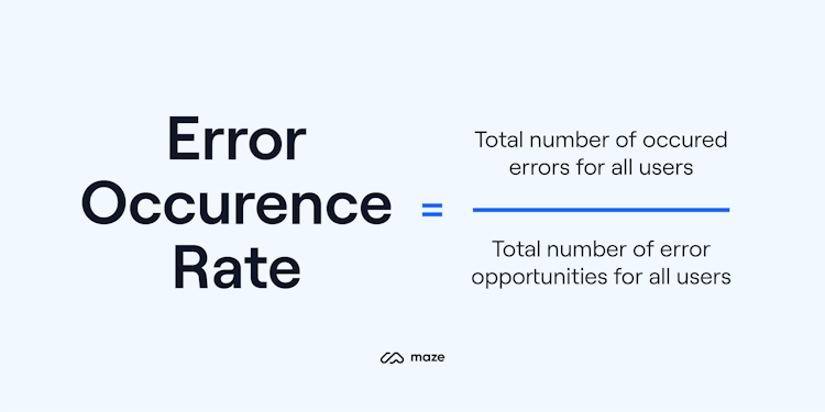
If there are multiple possible errors per task, or you want to measure multiple errors, you can calculate the error rate by dividing the number of errors by the total number of attempts.

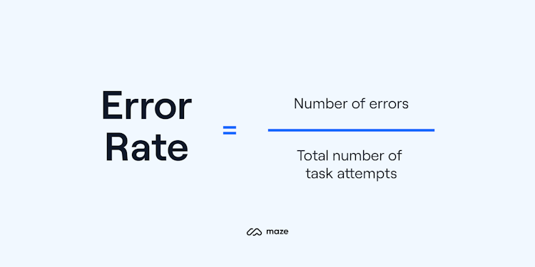
User errors can show how user-friendly your website or product is. A high user error rate indicates that users are confused, or that part of your design is misleading. This might lead to users getting lost or even bouncing on a live website.
Example of how to use user error rate
Let’s say you learn during live website testing that 80% of users struggle with errors on your website, including broken links, confusing product categorization, and slow-loading pages.
You’ll need to identify which errors to fix first using a prioritization exercise. You could assess the qualitative data to see which errors cause users most dissatisfaction—or for more rapid action, you can assess the user error rate and tackle the most common errors first. Over time, it’s worth systematically testing and addressing these issues to catch errors fast and improve the user experience.
Tip ✨
Maze Reports instantly turns your test results into quantitative data, from bounce rates and misclicks to heatmaps, so findings are easy to come by and even easier to share.
Attitudinal UX KPIs
Apart from metrics about what users do on your website, you can also measure what they think about the user experience of your product. These are often referred to as attitudinal UX metrics.
5. System Usability Scale (SUS)
Created by John Brooke in 1986, the System Usability Scale (SUS) is a quick and reliable method of measuring the usability of products and services.
The SUS is a post-test questionnaire given to a participant after a usability test is over. It consists of ten questions that address the usability and learnability of a system. Participants can answer each question using a five point scale, ranging from “I strongly agree” to “I strongly disagree.”

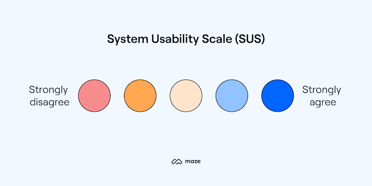
System Usability Scale template
You can use the following ten questions to create the questionnaire. Make sure to adapt them to your product or feature:
- I think that I would like to use this system frequently
- I found the system unnecessarily complex
- I thought the system was easy to use
- I think that I would need the support of a technical person to be able to use this system
- I found the various functions in this system were well integrated
- I thought there was too much inconsistency in this system
- I would imagine that most people would learn to use this system very quickly
- I found the system very cumbersome to use
- I felt very confident using the system
- I needed to learn a lot of things before I could get going with this system
How to measure system usability scale
Using the questionnaire results, you can calculate your SUS score by using the following framework:
- Convert the scale into numbers. For example, “Strongly disagree” corresponds to 1, and “Strongly agree” corresponds to 5.
- For each of the odd-numbered questions, subtract 1 from the score (X)
- For each of the even-numbered questions, subtract their value from 5 (Y)
- Sum all these numbers (X+Y) and multiply by 2.5
The SUS produces a score from 0-100 that indicates the perceived usability of a system. Based on research, a SUS score above 68 is above average, and anything below 68 is below average.
Example of how to use system usability scale
You can use the SUS to evaluate the usability of a mobile app or browser-based application. Users will rate statements on a five-point scale that ranges from one extreme attitude to another. For example, they could answer a question about the app ease of use with 'Yes, completely', 'Not at all', or somewhere in the middle.
Based on the results, you can identify specific areas of strengths and weaknesses of the system, make iterative improvements, and track changes with subsequent SUS tests.
Tip ✨
Gauge your tool’s usability with our “System Usability Scale (SUS) Test.” Get the template now.
6. Net Promoter Score (NPS)
The Net Promoter Score (NPS) is a metric that quantifies how likely your customers are to recommend your product to a friend or colleague. NPS is a key indicator of customer loyalty and is relatively easy to collect.
UX professionals often use this metric to promote buy-in from stakeholders and executives. If measured consistently and periodically, the Net Promoter Score can be a valuable tool that indicates how investments in improving the user experience affect customer loyalty.
Data shows that NPS is closely related to the perception of user experience. If customers think your product is easy to use, they are more likely to use it and recommend it to others.
However, NPS has its limitations. When used alone, it doesn't give a complete picture of the user experience. You might see participants giving a high score and find out that they struggled to use your product. Or just because your customers say they would recommend your product, this doesn't mean they'll do it.
Like most quantitative metrics, NPS should be paired with qualitative insights to bring more context behind the score and combined with other UX metrics. When paired with other metrics such as task success rate and task times, it can help you track the usability of your product and secure buy-in from upper management.
How to measure net promoter score

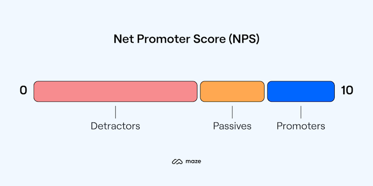
You can calculate your NPS by asking people to provide an answer, on a scale of 0-10, to the following question: "How likely are you to recommend this product to a friend or colleague?" Based on their rating, participants are classified into three categories:
- Promoters: Participants who answer the question with 9 or 10. They are enthusiastic, loyal customers who will refer your product to their friends, fueling growth.
- Passives: Participants who give a score of 7 or 8. Passive customers are satisfied but unenthusiastic. They could become promoters or switch to one of your competitors.
- Detractors: Participants who give a score lower or equal to 6. They are unhappy customers who probably won’t use your product again and who could potentially damage your brand through negative word-of-mouth.
Subtracting the percentage of Detractors from the percentage of Promoters yields the Net Promoter Score. This score can range from -100 (only detractors) to 100 (only promoters).
Example of how to use net promoter score
You can validate your NPS with quantitative data about customer satisfaction in the form of product ratings and surveys. From here, you can make strategic decisions to try and improve loyalty and positive recommendations. This might look like adding similar app features to those users currently enjoy, or optimizing the design to better align with user feedback.
Tip ✨
Collect valuable, qualitative insights that will add context to your net promoter score with our "Get fast NPS feedback survey." Get the template now.
7. Customer Satisfaction Score (CSAT)
The Customer Satisfaction Score (CSAT) is the most popular KPI for measuring how satisfied your users are with a specific product or feature, the user experience, or the business as a whole.
CSAT surveys are flexible and easy to implement—you can use them to measure the overall experience or focus on specific parts of the user journey.

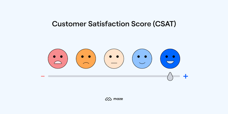
How to measure customer satisfaction score
Customer satisfaction is measured by asking customers a single question: "How satisfied are you with the product/feature/website?" Respondents can rate their satisfaction level on a scale from 1 (very unsatisfied) to 5 (very satisfied).
Your CSAT score is the number of satisfied customers (those who rated you 4 or 5), divided by the total responses, then multiplied by 100.
By running a customer satisfaction survey regularly, you'll be able to track the overall user satisfaction and see how customers respond to changes in your product, such as new features or UX changes.
Example of how to use customer satisfaction score
You can easily use a CSAT to assess customer satisfaction regarding different user journeys, such as a checkout process. By implementing a survey and collecting ratings from people after they complete a purchase, you gain insights into pain points and areas for improvement. From here, you can take targeted actions such as streamlining the checkout flow, improving the clarity of information, or enhancing error handling.
Tip ✨
Measure how satisfied users are with your product with our "Get regular satisfaction insights" survey. Use the template now.
How to report UX KPIs
Once you’ve measured a key performance indicator, you may need to present your progress in a KPI report. Here are a few tips from Thais Souza, Design Director at PayFit, on how to report UX KPIs to non-design stakeholders and executives.
Always provide context
There’s no easy way of measuring design’s impact on business. I'm the kind of designer who really likes to use data. However, it's vital not to evaluate metrics in isolation but to put them into a context where they mean something.
Thais Souza
Design Director at PayFit
Share
UX metrics by themselves have little value. For a UX KPI to be effective, you need to explain not only what you're measuring but also why you're tracking specific metrics, what you're doing to improve them, and how the resulting data contributes to the company’s success.
Connect your work to business goals
The best way to report a UX KPI to non-design executives is by connecting the UX KPI to a business KPI. The difference between a good designer and a great designer is the ability not only to solve problems but also to explain how the design is solving those problems and how the solution will help the company's goals.
Thais Souza
Design Director at PayFit
Share
Your UX KPIs should always be connected with business KPIs. Linking UX outcomes to business objectives will help you trace all UX contributions and make them visible across the organization.
Keep your report simple
A KPI report is a detailed document with information about the KPIs your UX team is tracking. Here are some best practices to follow for preparing your presentation:
- Create a direct link between your KPIs and your goals so everyone can easily evaluate the success of the current strategy
- Use visuals such as charts, graphics, or tables to make results easier to retain
- Try to simplify technical information or to explain technical terms using a glossary
- If applicable, compare current data with past data to track progress over time
Scaling your product with UX KPIs
UX KPIs are a great way to inform design decisions, monitor performance, and clearly communicate how your team's work impacts larger business goals.
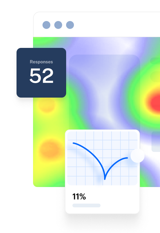
With tools like Maze, UX metrics are measured and aggregated into actionable reports, which allows you to act instantly on the data you record. That makes it painless to track your KPIs, communicate key insights in no time, and revisit progress and success in your iterations.


Frequently asked questions about UX KPIs
What are the top UX KPIs?
What are the top UX KPIs?
UX teams have numerous KPIs at their disposal. Although the ones you will choose will depend on your goals, some of the most important UX KPIs include task success rate, time on task, user error rate, System Usability Scale (SUS), Net Promoter Score (NPS), and Customer Satisfaction Score (CSAT).
How can UX KPIs be measured?
How can UX KPIs be measured?
How you measure a UX KPI depends on the actual KPI that you're measuring. In general, UX teams measure and track KPIs through testing, analytics, and reporting tools. For example, with tools like Maze, you can get actionable insights with automated metrics and reports.