


Chapter 3
UX survey analysis: 5 steps to uncover insights and extract value


It’s the moment you’ve been waiting for: the results are in.
All that’s left is to make sense of a vast amount of data and turn it into actionable insights…
In this chapter, we cover how to spot trends, identify sentiment, and use AI survey analysis to extract insights efficiently and make informed product decisions—without spending days sorting through raw responses.
Points to consider in your UX survey analysis
Before diving into your data, consider a few things to help you optimize your approach for efficient and effective analysis.
Revisit your objective and project scope
At the beginning of designing your UX survey, you’ll have identified an overarching research plan, goal, and project scope. When analyzing your data, you’ll need to revisit and remember the objectives you outlined at the start of the process. Doing so will help you spot relevant insights in your data and connect the dots, bringing you closer to your goal.
Revisiting objectives will also help you prioritize the most relevant user issues. For example, if your goal is to increase clicks on your CTA button, then you’ll prioritize insights indicating users have trouble finding the button over insights on search bar functionality.
Qualitative vs. quantitative data analysis
The type of data you’ve collected is another key concern that impacts your approach and overall analysis technique, and wider UX reporting.
Qualitative data is descriptive. It’s crucial for a deeper, more nuanced understanding of your users. Analyzing qualitative feedback from open-ended questions involves identifying key themes, concepts, narratives, and observations.
Quantitative data is numerical. It’s ideal for precise, measurable results and hypotheses testing on your chosen UX survey subject. Analyzing this data includes comparing variables like usability metrics and calculating averages, means, and percentages.
Use relevant tools for more efficient data analysis
As a UX researcher, you can opt to manually analyze both qualitative and quantitative data, but it’ll cost you time and effort that’s better spent actioning your insights. Using a UX data analysis solution can help automate much of the analysis process, speeding it up and giving you more time for other crucial tasks.
Ideally, you want to look for a flexible tool that offers all the data analysis solutions you need. If that same tool also offers complementary UX research methods that help with other aspects of the UX research process, like usability testing and card sorting, even better.
Check out chapter four for the top 7 UX survey tools if you’re unsure where to start, weighing up your UX solutions, or wondering if you made the right choice.


How to analyze UX survey data in 5 steps
With the considerations above in mind, you’re ready to begin analyzing your UX survey responses. These steps will help you turn your raw survey data into decision-driving insights on your product.
1. Collect your UX survey data
Interpreting vast amounts of data—whether qualitative or quantitative—can be messy and complicated when incorrectly organized.
If you’re using a UX survey tool like Maze, your data will already be consolidated on one interface, making survey feedback collection more efficient. A good UX survey tool will also enable you to analyze survey feedback within the platform, which saves a lot of time and effort (more on that in chapter four).
If you’re manually analyzing the data you’ve collected, the first step is pulling your results from the survey platform into an external repository, such as Excel or Google Sheets.
Once you know what you’re working with, your data is ready for exploration, review, and analysis—putting you closer to those valuable insights.
2. Clean corrupted and unusable data
Not all data is good data.
Your response rate might be high, but that doesn’t guarantee all your data will contribute to your pursuit of active user insights. You have to identify and weed out any corrupted or unusable data contaminating your repository:
- Remove incomplete responses: Participants may provide partial responses, intelligible text, or leave certain questions unanswered due to survey fatigue or technical issues. Remove these responses from your data set for better quality.
- Get rid of straightliners: Straightlining is a UX survey phenomenon most common with multiple-choice questions. If the same participant answered “B” on each of your ten multiple-choice questions, they most likely weren’t answering honestly but just trying to get through. Remove this data as it’s not genuine.
- Lose the speed repliers: Take a look at the average time participants take to complete your survey. If, on average, the survey takes about 4.5 minutes to complete and you’ve got responses that took dramatically less time, remove them from your database.
- Eliminate the outliers: Identifying outliers can be tricky. These are data points that deviate from the rest on a single subject. Sometimes, outliers can just be unique responses and honest feedback, but they can also be answers provided at random. Look for any contradicting answers within a single respondent—e.g. if a respondent answers an open-ended question noting they had no issues with usability but then rates usability as ‘very difficult to use,’ you’re dealing with an outlier that should be removed.
Once you’ve made your data squeaky clean, it’s time to get stuck in.
You likely used different survey question types for your UX survey. This is the ideal technique to get insightful feedback, but it also means you’ll have qualitative and quantitative data to analyze.
Both are valuable, but both have a unique analysis approach and require their own time and focus to extract value. Let’s start with qualitative data.
3. Qualitative data: explore, code, and sort into themes
Explore your qualitative data by conducting AI thematic analysis to code it and sort it into themes. This is when you’ll first begin to see the fruits of your UX research labor. Begin by reading through your responses to get a general overview of the feedback. While combing through, note any points of interest relevant to your project goals.
Assign indexes or ‘codes’ to these answers to identify points you’ll return to. A code shouldn’t interpret the responses but simply summarize relevant answer segments in as few words as possible. Here’s an example:
“I don’t like your smart suggestion feature all that much. Sometimes, it gives me rubbish responses, and the pop-up bubble follows my cursor, making it difficult to complete tasks.”
The first code could be: ‘doesn’t like smart suggestion feature,’ while the other two bolded phrases could be coded as ‘smart suggestion gives bad responses’ and ‘smart suggestion makes task completion difficult.’
Once you’ve sifted through all your data and coded any relevant points, move on to sorting them into overarching categories or themes. All the codes above could be sorted into the ‘smart suggestion feature usability’ theme category, for example.
If you’re not using a tool that can code and thematize your data, we recommend going the pen-and-paper route with sticky notes so you can easily group themes and make changes when necessary.
4. 4. Synthesize qualitative data: from codes to themes to insights
So you’ve read through your qualitative data, coded it, and identified themes. Next, it’s time to convert these themes into meaningful insights for your UX team. Start with themes you consider a priority for your overarching goal.
A good characteristic of important themes is the frequency it's mentioned and the sentiment.
Gabriella Lopes
Product Designer at Maze
Share
If your main objective is to identify friction points in new feature usability, then the theme ‘smart suggestion feature usability’ outlined in the codes above is a great place to start.
Go through all your codes to identify every time users complained about the smart suggestion usability, and continue doing this until you’ve identified several themes in your data. Once you’ve got your themes, you can further interpret people's words to develop insights. Your themes can also be a great starting point for further user research.
Using our example, here’s a clear view of how to move from codes to insights:
💡 Want an in-depth look at thematic analysis? Check out our in-depth article on analyzing qualitative data with thematic analysis.
5. Quantitative data: analyze for measurable trends
Now we’ve covered the ins and outs of qualitative data, let’s move on to analyzing the numerical, quantitative data derived from closed-ended questions, multiple choice, and rating scales.
While quantitative data doesn't give you the same rich and nuanced insights as qualitative data, it’s equally valuable. Quantitative data analysis helps identify measurable trends and uncover key satisfaction scores like Net Promoter Score® (NPS) or Customer Satisfaction Score (CSAT).
When dealing with a small data sample, use a spreadsheet to calculate important stats like averages and percentages. You can then identify user sentiment, usability, and customer satisfaction trends and correlations in your survey data.
For example, you may find that 70% of your respondents found your new website hard to navigate since you released a new feature. If 70% of your respondents also rated the feature as unhelpful, you can find a statistical correlation between those two insights.
Note: Manual calculation can take a lot of time before meaningful trends emerge, so when it comes to identifying measurable trends based on large amounts of quantitative research, we recommend using an AI-powered UX survey analysis tool like Maze to get the job done.
Transform your data into trackable trends and actionable insights
Maze makes automated reports based on your UX survey data, giving you key metrics that matter for actionable insights.


Types of UX survey analysis insights
UX surveys generate a vast amount of insights, which tend to fall into many different categories and sub-categories. However, broadly speaking, the UX insights you uncover through survey analysis will be one of three kinds:
- Survey analysis that uncovers sentiment: These insights help gauge a user’s overall feelings towards your product. The analysis uses themes and patterns to identify any emotions your users express through open-ended responses.
- Survey analysis that uncovers usability insights: These insights help you understand how users interact with your product. Do they they find it easy, difficult, or frustrating—why?
- Survey analysis that uncovers satisfaction sentiments: These insights give you an idea of how users feel about the overall user experience. This could be related to your product, brand, or team.
While these insights are valuable, manually analyzing them can be time-consuming. AI-powered tools help speed up the process, uncover patterns, and reduce bias.
How AI survey analysis speeds up research
Here’s how AI research tools can speed up the process while reducing human bias.
- AI-driven data cleaning: Not all survey responses are useful. Incomplete answers, straightliners, and rushed responses can distort findings and slow down decision-making. AI automatically flags and removes low-quality data, ensuring researchers work with accurate, trustworthy responses. For researchers conducting questionnaires or different types of surveys, this ensures that only valid responses contribute to real-time insights—leading to more accurate conclusions about your target audience and their pain points.
- Automated thematic analysis: Open-ended survey responses contain rich qualitative insights, but manually analyzing them can be overwhelming. AI-powered natural language processing (NLP) detects recurring themes, organizes qualitative feedback, and identifies patterns that might otherwise be missed.
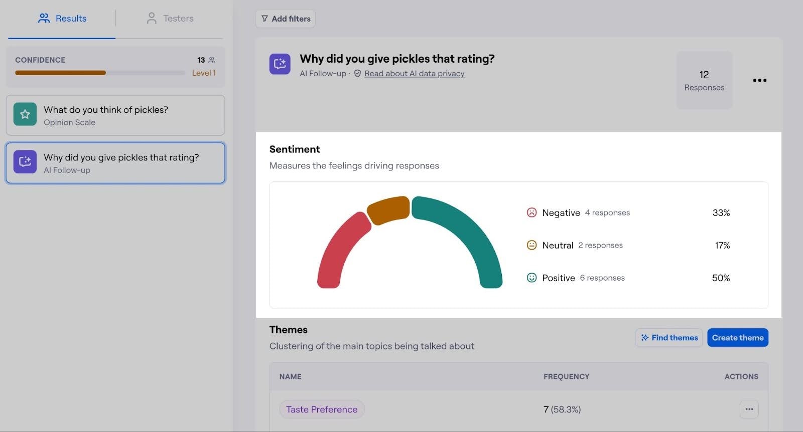
- Sentiment analysis: Beyond identifying what users say, AI helps uncover how they feel. Sentiment analysis categorizes responses as positive, neutral, or negative, providing an instant snapshot of user sentiment across the dataset. This allows teams to track emotional shifts over time, evaluate the impact of survey design, and determine whether recent product changes improve or frustrate the user experience.
💡 Product tip
Common mistakes to avoid in your UX survey analysis
Analyzing your survey data correctly is critical to achieving accurate insights. Otherwise, you could draw skewed conclusions and implement the wrong changes to your product. Here are three common mistakes to avoid when analyzing your UX surveys.
1. Using poor data collection and organization practices
The larger your data set is, the more you’ll need to keep it neat for efficient analysis. Things like inconsistent data formatting, duplicated entries, and corrupted or unclean responses can all contaminate your data set, leaving you with inaccurate insights and findings that don’t reflect your users' real experiences.
Consolidating and keeping your data neat and tidy is much easier with a UX survey tool, as the right UX research tool allows your team to easily access, read, and navigate entries. For larger data sets of 1000+ respondents, consider using a specialized UX survey platform rather than exporting to an external database.
2. Asking questions to confirm your preconceptions
When conducting a UX survey, you want to be as objective as possible and avoid any types of cognitive bias. Confirmation bias, in particular—where you tend to ask questions that search for answers that confirm your preexisting beliefs—is your nemesis in UX surveys. If let in, it stealthily skews your data and insights and can jeopardize your whole project.
Confirmation bias doesn't just occur when formulating questions. It can also slip in when interpreting open-ended responses. Some UX researchers may fall into the trap of (subconsciously) selecting and focusing on feedback that agrees with preconceived beliefs, while ignoring responses that don’t.
To avoid confirmation bias when analyzing data, ensure you’re looking at all responses and not disproportionately favoring certain findings over others. It helps to have a wide variety of UX researchers analyzing data, ensuring data integrity and objectivity standards are met. Needless to say, using a UX survey analysis solution is also an easy way to avoid subconscious bias creeping into your data analysis process.
Pro tip 💡
Even the best UX researchers can fall prey to cognitive biases. Utilize the technology available to avoid and identify biases. Maze’s AI-powered Perfect Question helps you spot and eliminate bias from your research questions while providing bias-free, re-phrased alternatives.
3. Jumping to conclusions based on quantitative data
With new data and insights into your user experience, you may be eager to implement changes in UX design. However, it’s important not to jump to conclusions. While quantitative data can help identify issues and trends, it doesn’t uncover nearly as much context as open-ended questions.
For example, analyzed data might show that 75% of users aren’t satisfied with your e-commerce platform’s product search usability. It might be tempting to address the issue outright—but don’t touch that algorithm just yet. The problem could stem from poor product categorization, a confusing interface, or many other factors. Only further research will help identify the root of the problem.
It’s always best practice to hold off on changes until you can understand the reason behind a problem. This helps you avoid wasting resources on the wrong fix or applying a quick-fix solution that merely acts as a Band-Aid for a bigger issue.
Analyzing survey results with Maze
Maze simplifies the entire survey analysis process, from cleaning data and identifying patterns, to generating reports and collaborating with teams. Here’s how.
Maze AI-powered survey analysis
Maze AI automates qualitative research by detecting recurring themes, sentiment, and trends in responses. Open-ended feedback is automatically categorized into themes, making it easier to spot patterns in user behavior, usability issues, and feature requests.
Maze AI also provides sentiment analysis, which evaluates participant responses and categorizes them as positive, neutral, or negative, giving you an instant snapshot of user satisfaction. Instead of manually reviewing hundreds of responses, teams can quickly see which product experiences frustrate users and which drive engagement.

Automated reports and visualized insights
Survey data is most useful when it’s easy to interpret and share. Maze automatically generates structured UX research reports, turning raw data into interactive dashboards and visual summaries.
Each Maze report includes:
- A high-level overview of study goals and findings
- Graphs, charts, and heatmaps to visualize trends
- Filtering options to break down insights by different user segments
Teams can export reports, share insights instantly, and collaborate with stakeholders, ensuring research findings lead to real product improvements.


Collaboration and stakeholder alignment
Maze is designed for team collaboration—researchers, designers, and product managers can work together within the platform. Reports are shareable in real time, allowing teams to comment, discuss, and align on key insights without back-and-forth emails or slide decks.
With integrations across your favorite productivity and UX design tools, Maze streamlines the entire UX workflow by making collaboration easy across Figma, Adobe XD, Amplitude, Atlassian, Notion, Slack, Miro, and more.
Whether you're running a survey, usability test, or prototype validation, Maze makes it simple for stakeholders to convert insights into product development workflows.
What should you do once UX survey analysis is done?
With your analysis complete, the next step is turning insights into actionable product decisions.
If you’ve concluded that a particular feature is lacking or unusable, you and your team can now work on solving the issue the user is facing. Of course, any changes should be informed and validated by further research.
The best research happens continuously, so you can inform future decisions, monitor user experience, and build a truly user-centered product.
Continuous product discovery and comprehensive UX analysis is essential for staying user-centric and understanding your users’ unique experiences. However, analysis can also be time-consuming for even the most savvy UX team. Choosing the right tool to support you can make the process more efficient, allowing you to reach insights quickly, with little chance for error.
In the next chapter, we explore how to select an adequate tool for designing, conducting, and analyzing UX surveys, so keep reading to find your perfect match.
Frequently asked questions about UX survey analysis
How do you analyze a UX survey?
How do you analyze a UX survey?
You analyze a UX survey by collecting your data in one place, reviewing it, and assigning codes and themes before extracting findings and insights. UX survey tools also help research teams calculate measurable trends, user sentiment, usability scores, and customer satisfaction.
What are the most common mistakes in UX survey analysis?
What are the most common mistakes in UX survey analysis?
The most common mistakes in UX survey analysis include not organizing and preparing data properly, selectively focusing on information that confirms your hypothesis, and jumping to conclusions or implementing design changes before fully-reviewing qualitative data.
How do you use survey analysis to improve UX?
How do you use survey analysis to improve UX?
Improving UX through survey analysis involves using insights extracted from data to create and implement potential UX solutions. For example, if user survey results indicate users cannot find a purchase button, researchers can uncover why this is and UX designers can make the purchase button more visible or accessible.