


TL;DR:
A mobile-first research strategy focuses on the behavior and expectations of mobile users at every phase of product development.
Instead of making your product simply function on mobile, it’s about building for mobile behaviors, constraints, and expectations from the outset.
With the right tools and strategy, product teams can uncover mobile-specific insights that drive better mobile user experiences and reduce rework later in the product cycle.
If you’re like most people, your smartphone is the go-to if you want to try a new product, website, or app. Mobile usage dominates how users engage with digital products, making it critical to understand those experiences as they happen, in real-world contexts.
Many product teams are shifting to mobile-first research strategies: to uncover how users navigate features, run into friction, and form habits on mobile devices.
Read on to start crafting your research strategy that centers on-the-go user experiences.
Why mobile-first research matters
A mobile-first research strategy isn’t just about prettier user interfaces, it’s about building better products. It puts mobile users at the center of your entire product development strategy, including research, design, and development. And with 58.7% of users turning to their smartphones, mobile has never mattered more.
To optimize your mobile user experiences, you need testing and strategy. Mobile testing reveals whether a digital product functions on a phone, while mobile strategy is about building the product specifically for mobile devices, from the very start.
- Mobile testing asks: “Does this work on mobile?”
- Mobile-first strategy declares: “Let’s build this experience for mobile users!”
When design and development teams work from a mobile-first research strategy their decisions are grounded in real user behavior—rather than guesswork. Early alignment reduces the risk of usability issues appearing later on, saving time and preventing reworks.
Mobile user behaviors and desktop user behaviors don’t align
The size of the mobile device and its hardware (such as smaller screens) fundamentally change user behavior on mobile vs. desktop.
Mobile users:
- Tend to engage in shorter, more frequent sessions when using a digital product
- Are more likely to browse or use digital products during commutes, breaks, or when multitasking
- Use digital products to perform quick, short, and defined functions, such as making a purchase
Desktop users:
- Tend to engage in longer, less frequent sessions
- Are much more likely to focus on the task when interacting with web content or using a digital product
- Use digital products for more complex features and functions, such as multi-step workflows
These fundamental differences mean mobile users also have different expectations when using your product. Since they aim to complete actions quickly, common friction points for mobile versions are:
- Slow load times
- No accommodations for different screen sizes
- Unintuitive navigation
- Typing difficulty
- Small buttons and a lack of touchscreen precision
Whereas friction points on desktop versions might include:
- Overwhelming and cluttered interfaces
- Browser incompatibilities
- Lack of personalization
Of course, you need to offer a user-friendly experience for both mobile and desktop users. But keep in mind that a ‘minor’ inconvenience for a desktop user (such as a slightly smaller button) can frustrate a mobile user to the point of quitting the mobile app altogether.
In mobile, it is even more important to make things quickly accessible, because you can’t ‘go back’ as easily as on desktop. Nobody wants to tap multiple times just to access something they use regularly.
Andres Kleverlaan
Rinkel
Share
4 Best practices for a mobile-first research strategy
Help make your UX research process for small screens just as effective as it is for larger screens by keeping these principles for mobile-first research in mind.
Prioritize mobile in discovery research
Product discovery research is the initial exploratory phase during product development. The main focus during this phase is to understand the users’ needs, problems, and expectations within the context of the service you’ll offer.
Adopting a mobile-first approach to this phase means asking:
- How do users solve a particular problem on mobile?
- What real-world context shapes their mobile behavior?
- Where does the mobile experience usually break down for them?
Tailor test tasks to real-world mobile behaviors
Your usability tests and remote mobile user research should mirror how people actually use their phones.
Mobile usability tests can mimic these real-world behaviors by:
- Setting short, clear tasks: Users interact with mobile products in short, focused bursts. Set clear tasks, like “Send your friend an invitation using the app.”
- Mimicking interruption-prone environments: People will often use their mobile devices during commutes, during breaks, or while waiting in line. You can mimic this environment by setting time constraints and breaks, and observing how fast participants resume completing tasks.
- Assuming they’re only using one hand: Since people often use their mobile device with one hand, set tasks like “Attempt to book a call with one hand while walking.”
Use mobile-native testing tools
Mobile-native testing tools are designed to specifically capture how users interact with your product on mobile. These tools offer features like mobile screen recordings and can capture gestures such as scrolls, swipes, punches, and taps.
Using mobile testing tools adds another dimension to your usability testing. Instead of relying on participants to tell you where they’re struggling, you can see their reactions and movements, giving you actionable mobile user data to share with your team.


Analyze platform-specific insights
Not all mobile users have the same habits or priorities when interacting with a digital product.
For example, Android users tend to prioritize higher levels of customization and flexibility, and tolerate more variety within the UX. On the other hand, iOS users prefer a seamless, streamlined, and integrated experience that’s easy to navigate.
During your UX research, include users from each platform your product will be available on, and test each operating system people will use. Then, note the differences between them for your design and development team.
Your mobile-first research strategy checklist
To help you prepare for smooth mobile product development, we’ve created a mobile-first research strategy checklist—the perfect companion for running your first mobile-focused test with Maze.

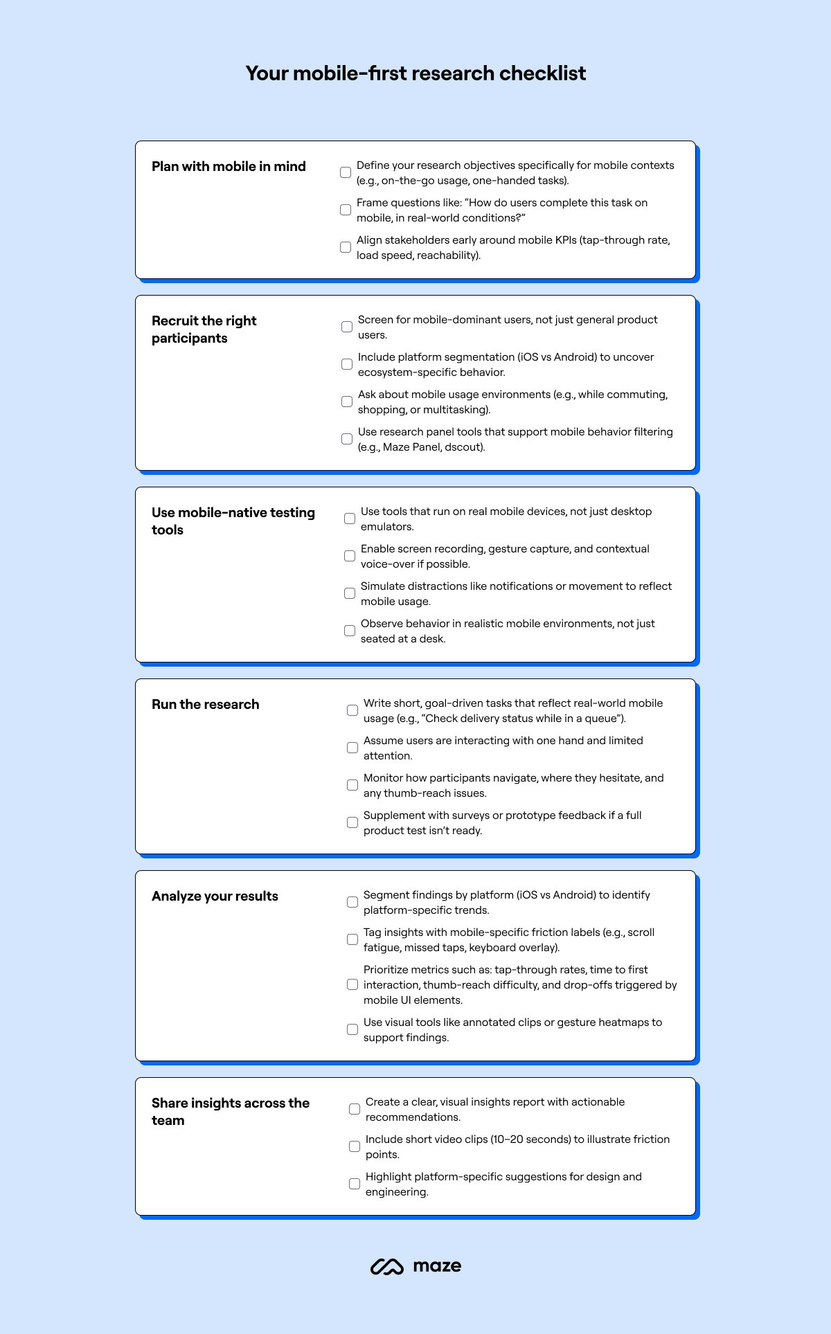
Right-click-save the image to get your own copy
How to run mobile-first research
A mobile-first research plan takes mobile users into consideration at every step. It’s similar to a normal research sprint—the main difference being your focus.
Gathering unique insights about mobile users will help your design and development team build a product for these users.
1. Create your mobile research plan
Similar to a standard research strategy, a mobile research plan involves determining your research goals and hypotheses, research questions, and a timeline for your entire project within the context of building a mobile-first solution.
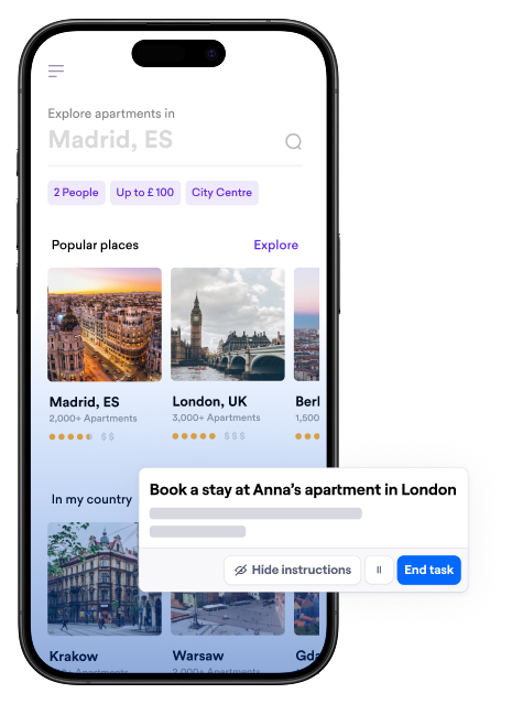
For example, let’s say you’re building a digital, mobile-first product that lets users find and secure active deals at local retail spots. It’s called ‘DealFind’.
Standard questions like “How do users onboard?” become: “What barriers do mobile users face during onboarding while shopping at the store?”
And a standard research objective like “Uncover what navigability problems users have while interacting with our newest GPS feature” becomes: “What navigability problems will users have while using the GPS feature while walking, or even driving?”
2. Recruit mobile using participants
You have your mobile research plan, now you need testers.
Recruiting the right research participants for your mobile-first product is crucial to gain accurate and actionable insights.
Tools like Maze Panel help with this step, giving you access to over 3 million pre-vetted testers.

For this phase, a simple but effective set of screening questions is your best friend.
Let’s say you’ve identified a few potential testers for DealFind. Before recruiting, you ask:
How often do you use apps that help you locate deals on mobile?
Where do you typically use these apps: A) At home, B) On your commute, C) While shopping
Do you use iOS or Android when using products like DealFind?
Andres Kleverlaan, from the Product Research and Design team at Rinkel, emphasizes the importance of considering your different user personas when recruiting for mobile. Just because they’ll be using your app, doesn’t mean they have the same expectations:
“Ask different people to interact with it, from different age groups and technological literacy. What’s logical for a tech-native Gen Z, might not be logical for a Gen X that usually works with their hands.”
This will ensure you’re testing participants who actually use the product, within the right context.
3. Run mobile-native research
You’re finally ready to test your wireframe, product, or new feature with mobile users.
Opt for mobile research methods such as native mobile testing. This method lets you set tasks for users, record screens, analyze gestures, and observe user flows. It tells you exactly how potential mobile users interact with your product.
Mobile user behavior is fast and frequent, so the tasks you set need to reflect that.
Keep the tasks lightweight and context-specific. Instead of “Find and successfully use the ‘locate sales’ feature,” assign a task like “Find a sale and reserve the item while waiting in line at the store.”
4. Analyze test results
Analyze your mobile-first test results by focusing on the usability metrics that reveal mobile user friction points.
Standard metrics like task completion are still important, but to get the full picture of the mobile user experience, take note of mobile-specific metrics like:
- Tap-through rates
- Keyboard drop-offs
- Thumb-reach direction
- Time to first interaction
Consider organizing your insights into categories specific to mobile friction. Examples include:
- Scroll fatigue
- Task flow obstacles
- Thumb reach issues
- Tap error due to spacing
- Keyboard overlay blocking modal
Break down your insights by platforms and different devices, too—such as iOS vs. Android and tablet vs. mobile phone—and note any differences between them.
5. Share insights cross-functionally
Your insights are helpful as long as your team implements them throughout the entire mobile product development and UX design process.
To ensure your mobile-first research results inform the final product, create bite-sized, digestible UX research reports with your key findings, tailored to specific stakeholders.
Include:
- 10–20 second clips: Show failed taps, rage scrolls, and thumb stretches from mobile usability testing
- Platform-specific suggestions: Highlight friction points and insights differ across platforms and devices?
- Opportunities for improvement: Use metrics from your mobile testing tool to back up your claims
Keep in mind that many of the solutions you request will fall upon designers and developers to implement. Establish feedback loops and timelines for implementation, and leave communication channels open. That way, you can supply your teams with continuous user feedback, helping them inform their decisions.
How Maze supports mobile-first research
A mobile-first strategy is only viable when you use the right tools.
Maze is a leading user research platform with a comprehensive suite of user testing methods—including mobile testing, of course—to ensure your design is ready for mobile users everywhere.
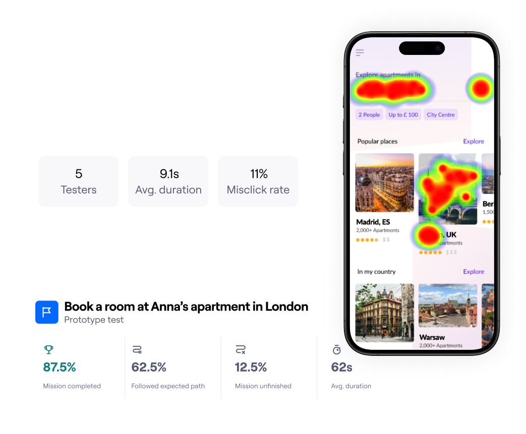
Maze Mobile Testing makes getting insights for mobile users easier and faster than ever. Maze helps you run studies directly on participants’ mobile devices, so you can capture full-screen recordings, study user behavior heatmaps, observe mobile user flows in real time, and get rich quantitative mobile research metrics.

Make mobile-first research a priority
Mobile-first design and research isn’t just a nice-to-have anymore—it’s a must-have. The number of people using their mobile devices to access digital products has been growing for years, and it’s only increasing.
Don’t wait before users are rage-tapping, save our mobile-first checklist, and start optimizing your product for mobile users now.
Frequently asked questions about mobile-first research strategy
What is the mobile-first approach to research and design?
What is the mobile-first approach to research and design?
The mobile-first approach to research and design puts mobile users and behaviors at the heart of your entire research and design strategy. Many of the unique insights that come from adopting a mobile-first approach also influence product design and developer decisions, leading to a better mobile-optimized product.
Is mobile-first better for SEO?
Is mobile-first better for SEO?
Pages from within your digital product are unlikely to appear on Google. However, optimizing your product’s mobile site is definitely a best practice for search engine optimization, crawling rankings, and heightening visibility. This process involves conducting keyword research and aligning your website’s content with search intent to attract website traffic.
Building a product for mobile is about prioritizing a mobile-first design and research approach while developing for device-specific behaviors and differences, such as gestures and varying screen sizes.