


")


User interface (UI) design focuses on the look and style of a product, website, or app interface. A UI designer’s job starts at the prototyping stage, turning wireframes into interfaces with the primary goal of usability while ensuring the design connects to the brand.
UI design involves visual elements such as color palettes, animations, typography, layout and composition, images, icons, UI copy, and material design UI elements.
A user interface is well-designed when the program behaves exactly how the user thought it would.
Joel Spolsky
Creator of Trello
Share
According to a study of the Google Play Store, most apps lose 77% of users within the first three days. As the user interface is one of the first touchpoints where interaction happens, good UI design is one of the most influential factors in user activation and adoption.
To provide some inspiration for your next project, here’s 15 UI design examples to spark your creativity, and set a benchmark for stellar UI design across industries, websites and apps. Plus, keep reading (or scroll ahead!) for our UI design checklist to guide you on your way.


1. Notion's product onboarding

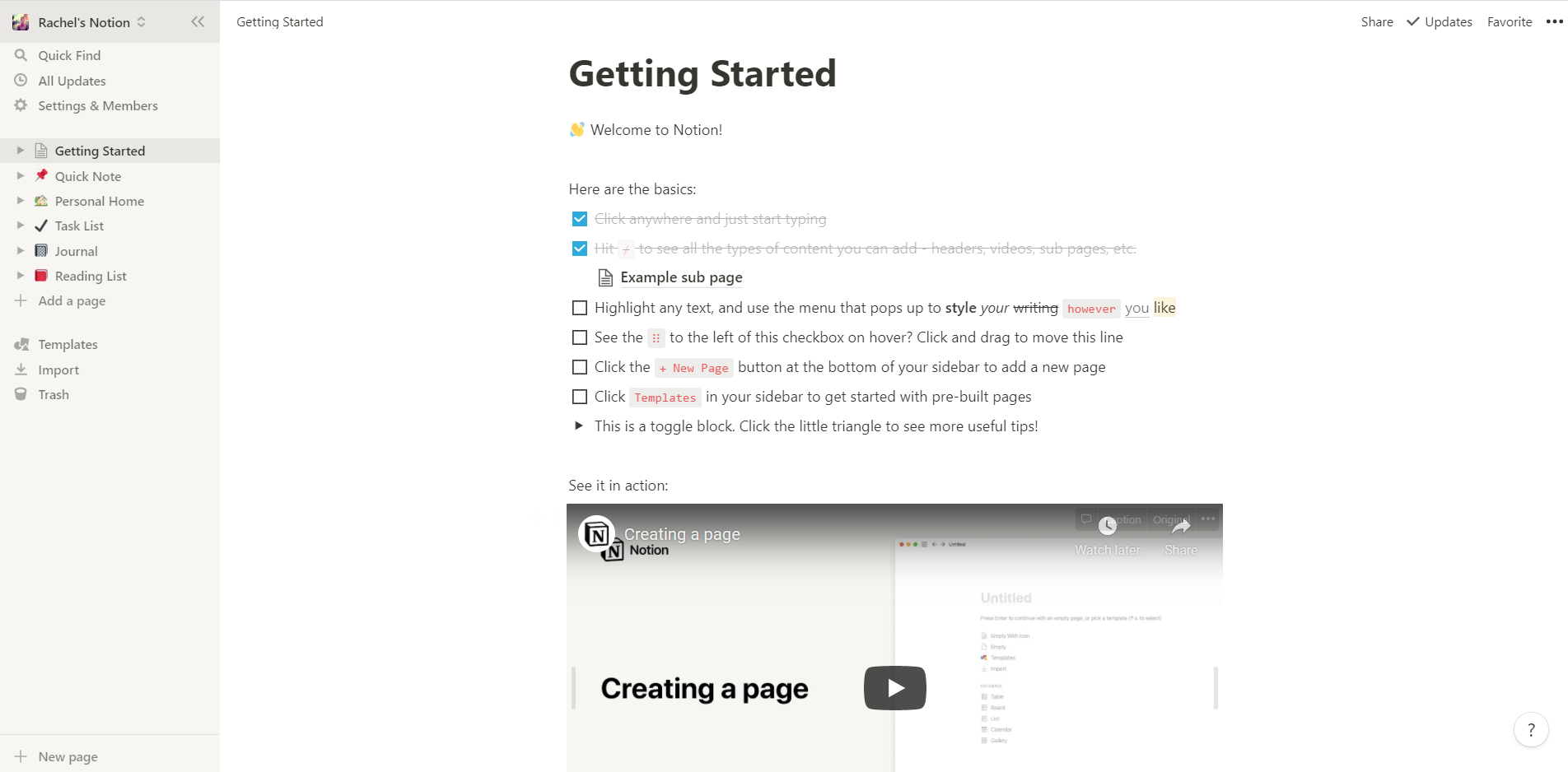
Being the first point of interaction between a user and a product, onboarding is key to user activation. Its second main goal is user retention, as it has a fundamental impact on a user’s ability to learn how to use a product.
Notion's onboarding process begins on this clear and well-structured ‘getting started’ page, providing instructions in easy-to-follow steps, a list to track and check off progress and motivate users to go through the steps, and a helpful video and articles for more resources. Notion employs a hands-on approach to onboarding, using their own product functionality to guide users on how to complete basic tasks—a fast and smart route to both activation and adoption.
2. FlowMapp's clear interface

FlowMapp’s clear and easy-to-use project page is optimized for learnability. The UI design is clean and simple, with a neutral color scheme, logically structured menus, and helpful articles. The strategic use of white space improves readability and navigation, making it easy for users to quickly sift through resources, find what’s useful for them, and ignore what isn’t.
Menus provide all relevant information at a glance, reducing a user’s short-term memory load and enabling them to use the product faster. The use of empty states and one + icon in the center of the page invites users to create a new project.
The design is consistent across all user interfaces and uses familiar, industry-standard icons such as accordions with arrows and a list format. This reduces the learning curve, creates trust, and minimizes surprise, as users know that they can rely on the UI to perform in the same way throughout the product.
3. Drink Half Past's consistent color palette

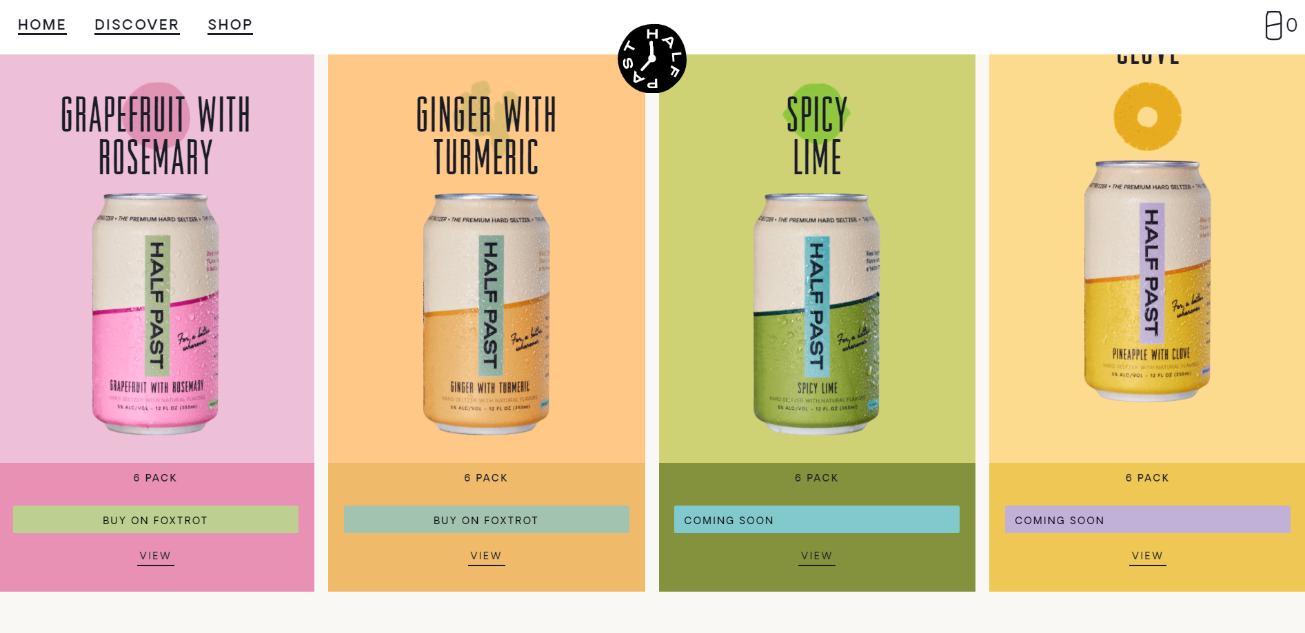
With 85% of shoppers placing color as a primary reason for buying a particular product from e-commerce websites, Drink Half Past applies this influential element on their product page and throughout their website design. Their pastel color palette is visually attractive and shows off the playful personality of the brand.
The color system is consistent for each drink flavor and reflects the ingredients inside, inviting visitors to experience the product before buying. Individual color palettes are used on the homepage, and there is a color match across every UI or block of content for that flavor, keeping consistency throughout.
4. Mailchimp's warning message

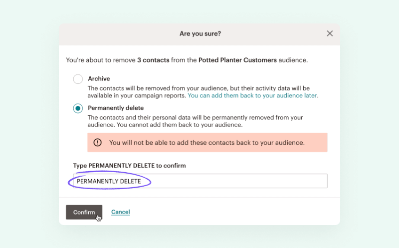
Mailchimp uses this modal dialog box as part of their UI to help users identify and avoid a potentially critical error. When they click to delete an audience, they’re provided with information on the potential negative consequences of the action in a bright yellow box, which is difficult to ignore. The modal asks twice “Are you sure?”, getting the user to really check whether it’s the right decision. If they still want to continue, they have to complete two more steps: 1) type the word into an input field and 2) click on a second delete button.
This delete modal acts as a solid preventative measure, potentially reducing a huge amount of frustration and lost work.
5. Figma's helpful tips for beginners

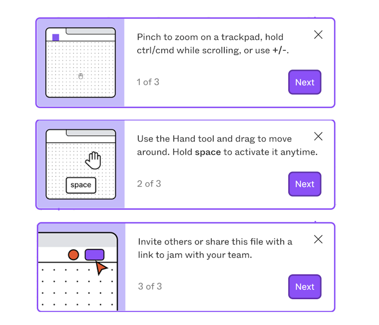
When a user first creates a new file in Figma, animated tooltips appear, giving concise instructions on simple but essential tasks within the app.
The user has to interact with each pop-up before it disappears, signifying that the information is important and increasing the likelihood that they will read it. These UI elements are designed for beginners, who are guided through the tips with bright, purple ‘Next’ buttons. They only appear the first time a file is created and include X icons, so users with the relevant knowledge, or those finding them unhelpful, can quickly close them.
Providing this guidance early on improves the ability of first-time users to grasp tasks, and reduces the number of times they will need to repeat these tasks until they reach efficiency. This results in higher satisfaction, as users feel more confident in their abilities, and are more likely to keep using the app in the future.
6. Bear's customization options

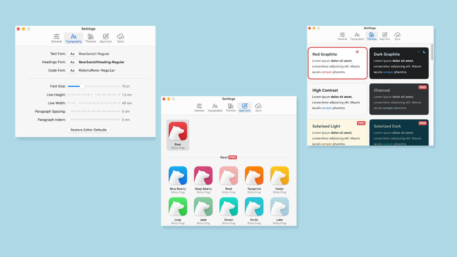
Note-taking app Bear’s customization options options are a great example of UI design that’s inclusive of all users. Users can adapt font sizing and typography, background colours, and icon to personal preferences. While these options are marketed as a way to customize the app, they also provide opportunity to make the UI more accessible for colorblind, low-vision, or neurodivergent users, who require alternate readability requirements and color options.
This flexibility enables all users to mold the app so they can use it successfully. It gives them freedom and control, and a much more enjoyable experience, where they are more likely to return.
7. WordPress's error prevention

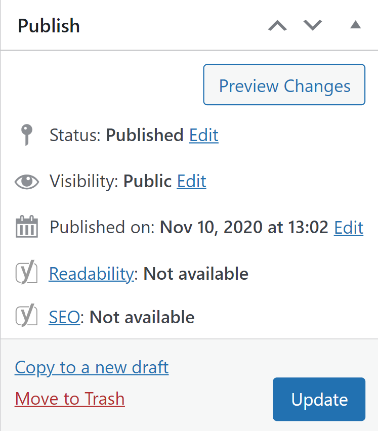
WordPress’s ‘Preview Changes’ button may be small, but its impact is huge, enabling users to see their changes in action before they go live.
Why is this so important? People have expectations on how an app or website will work, help them to complete a task, and achieve their goals. But it's only once the interaction has happened, and they’ve produced work using this app, that they can evaluate whether these expectations were right. In the process, users often make mistakes.
This feature helps users evaluate this and see whether the end result actually meets their goals, before they make a mistake that could be seen by a much wider audience. It also saves the user’s time, as they can quickly make all necessary content changes in the preview interface, before they finally hit that update button.
Users can work faster, more creatively, and avoid a huge amount of time on a redesign, by visually seeing what they’ve produced in front of them.
8. Slack's informative feedback

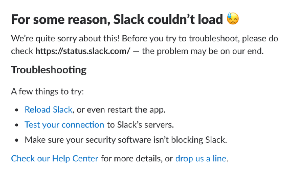
Slack is a great B2B SaaS UX design example with its simple yet effective feedback messages. It ensures users stay constantly informed about the status of the app, and are never left wondering what is going on. If they come across an issue, an alert will pop up to inform the user that there is a problem, what they should do next, and links to get help. Similarly, whenever users are left waiting, Slack uses loaders and update messages to communicate that there is not an issue and that the user interface is functioning as it should.
Slack’s loaders can also be customized to include messages from teammates, adding a fun twist to an otherwise frustrating or dull UI, and making waiting as fun as possible.
This feedback minimizes confusion, helps users to solve technical issues, and ultimately, return to using the app.
UI design and usability heuristics
A lot of our examples of great UI design also fall under one of Jakob Nielsen’s ten usability heuristics for user interface design, such as visibility of system status and error prevention.
9. Typeform's template gallery

Online form-building and design app, Typeform, provides a template gallery list, which appears when a user clicks to create a new form.
They are invaluable time-saving resources for beginners, by showing examples of what great designs look like, and providing a solid starting point to work from. The templates contain all essential information that should be included in a form, which reduces the learning curve for users, who can learn by doing. The templates are useful even for expert form builders, who can get inspiration from the existing designs and forms.
Typeform also provides template examples for various different user goals, which they’ve neatly and clearly structured with a search bar for easy find, making the product more usable for more people.
Templates are great tools for any app to speed up learning for current users and attract more in the future.
10. Tumblr's view settings

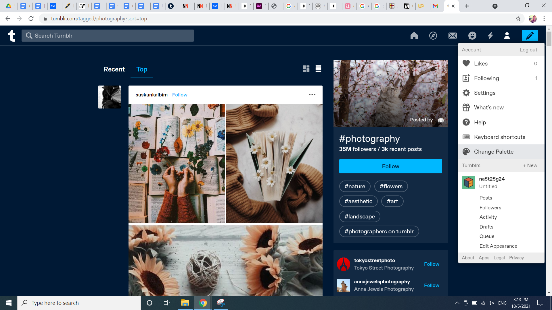
Tumblr’s website design allows users to customize their views in a way that works for them. The customize button is handily placed in the top menu bar and provides a range of options from changing the page width to the color palette. The right choice of color can better support readability, satisfy aesthetic preferences, and speed up navigation.
Additionally, they also include an option for “keyboard shortcuts,” an accelerator that enables their expert users to push past the efficiency plateau and be even faster and more productive using the website. Accelerators are not designed for beginners, as they can be confusing and difficult when users are still learning a platform. So rather than directing users towards it, Tumblr has put it under a menu, where users can come back to it, once they’ve got a good grasp of the basics.
Creating a customizable interface design, with an app or website, gives the user control to adapt the interface to hit their goals and needs. This increases user efficiency, overall usability, and provides an enhanced user experience.
11. Blinkist's card design

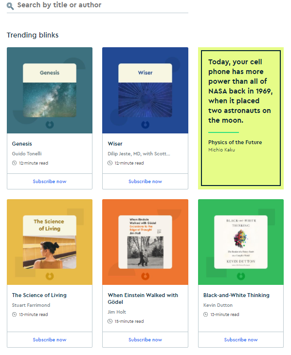
UI designers use card components as resources to give a snapshot into what’s inside and to entice users to click on them. Book-summarizing app, Blinkist, has implemented this UI design concept within their search interface. It displays only the necessary information that users need to make a decision, helpfully provides the reading time, and a simple CTA.
Each card has the same format and a bright unique color design to make them visually distinct. Among these, one card contains a quote from one of the books within the searched topic, teaching the reader something new—in line with Blinkist’s brand as an app for learning. If the reader wants to find out more, they can click on the link within the card to take them straight to the book, saving them time trying to find it themselves.
The UI design is clear and simple, allowing the user to quickly navigate the interface to achieve their goals, or browse if they are not sure what they are looking for. Plus it’s aesthetically pleasing and fun, and leaves users feeling satisfied.
12. Google Docs' save/restore function

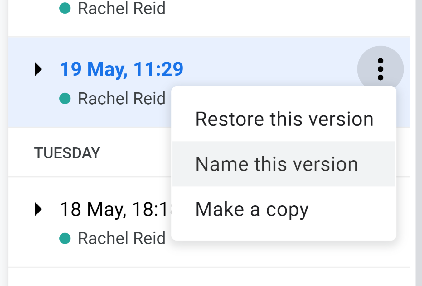
If there’s ever an app that shows trust and confidence, it’s Google Docs, where you’re only a few clicks away from a quick fix! The tool automatically saves your work and provides easy and fast access to previous versions, through a link in the top menu.
Users have full visibility into their previous work and can control what they do, whether it’s grabbing a deleted paragraph, making a copy of the previous version, or restoring it completely. Not only is it ultra forgiving, with the ability to recover from mistakes, but it actually prevents users from ever making them in the first place, as all work is backed up within the app.
13. Squarespace's card carousel

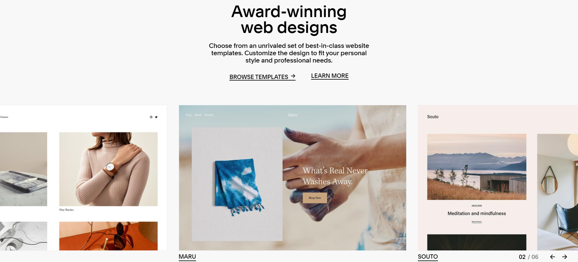
Website design and building app, Squarespace, uses a card carousel on their website to display the templates within their app, allowing the user to quickly scan several at once. They use a clean and simple interface design, minimal copy, and centrally aligned navigation. The use of arrows to scroll between cards is a familiar industry app and web design, and keeps consistency with the rest of the app, enabling users to learn it faster. They also provide an indication of the number of templates available, so the user knows where they are within the progression.
The templates themselves make the product easier to use for people lacking design skills. They don’t have to attempt designs themselves or hire an external designer, reducing frustration and saving time and money. Plus, designers and artists can use them too as a source of web design inspiration.
By providing these resources in a clear and simple way, beginners can not only build a website in minutes but quickly learn the essential elements of website design, fast-tracking their way to becoming expert web designers.
14. Spotify Wrapped's interactivity

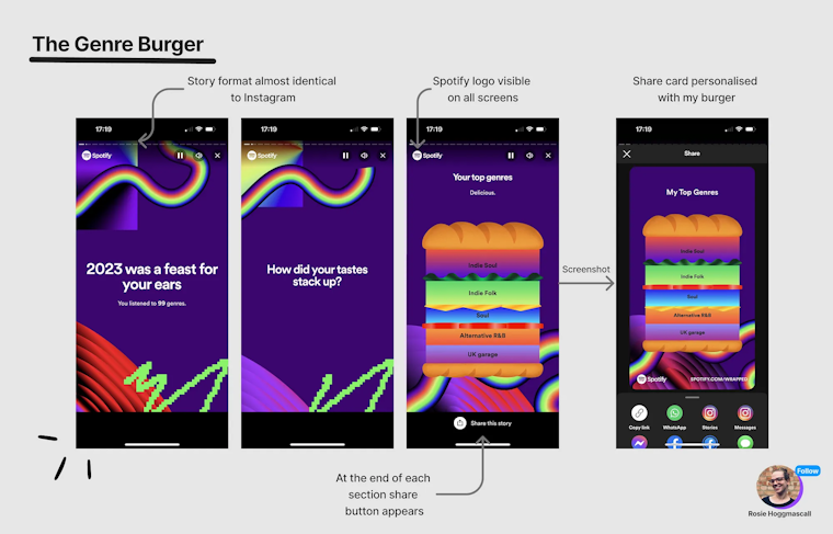
Designer and Growth Manager, Rosie Hoggmascall, breaks down the interactions and UX design of Spotify’s 2023 campaign.
We’d be remiss to talk about UX and UI design without mentioning Spotify Wrapped, wouldn’t we? Spotify has over 100 million tracks, making it undoubtedly the leading music streaming platform. With its famous Spotify Wrapped campaigns, Spotify utilizes its recognizable brand combined with new, creative themes each year, to showcase users’ individual highlights.
Across the board, Spotify’s user-friendly UI design is renowned for its consistency, aesthetic appeal, personalization and knack for sparking joy in users. With the design of its Spotify Wrapped feature, it maximizes interactivity and shareability, utilizing familiar functionality like tap and swipe gestures, engaging animations, and clear user paths.
15. Apple's perfect white space on landing pages

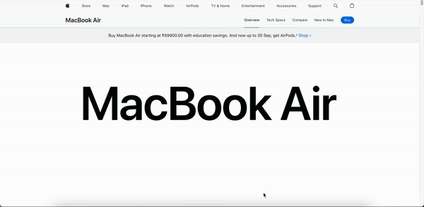
Apple's web design is the perfect example of using white space to create a clean and user-friendly experience. The ample white space ensures that product images and key elements stand out, guiding the user's attention effectively. The landing page features a full-width layout with high-quality imagery and minimal text, enhancing visual appeal and readability.
Interactive elements and subtle animations further enrich the user experience, making navigation intuitive and engaging. This minimalist approach highlights Apple's premium products, allowing product design to speak for itself, and reinforces the brand's commitment to exceptional user experience design.
Your UI Design checklist for a great interface
We’ve put together a quick checklist that you can follow to ensure you’re creating a stellar UI design. These are based on the process for conducting heuristic evaluation. Take a look before you start writing any design proposal, and use it throughout your UI design process to keep yourself on track.
1. Clear and concise
Users should always clearly understand what the purpose of an interface is, how they should use it, and how they can most easily achieve their goals. Simplicity is key—you should only provide the necessary elements to help save users’ time and avoid information overload.
2. Providing feedback
Interfaces should communicate to the user the status of the website or app, any updates, and show that their action has had, or will have, a consequence. This minimizes potential confusion and frustration. You can achieve this through design elements such as loaders, animations, changes in color, text, and images.
3. Consistent
User interface design should be kept consistent with external industry standards and internally, responding in the same way across every UI. Making designs predictable creates patterns that improve learnability, reduce confusion, and create trust.
4. Forgiving
We all make mistakes—it’s a part of being human. So your UI elements need to help prevent users from making errors, recognize them if they do, and provide ways they can be fixed. This includes tools like undo and cancel buttons and warning signs.
5. Providing guidance
To help users learn the product faster, your app or website UI design should provide helpful articles, resources, and courses through onboarding, pop-ups, and easy access to a help center.
6. Diversely accessible
You should work towards a Universal Design that can be used and accessed by as many people as possible, regardless of gender, beliefs, technical abilities, experience levels, challenges viewing a screen, or anything else that distinguishes us as humans.
Make your user interface design adaptable through customizable settings, personalized content, and providing accelerators for experts.
7. Satisfying
People use things they enjoy, and a big part of this is designing user interfaces to be visually attractive, having content that delights users, and creates a great experience. The use of animations, page layout, interactive content, graphic design, and color gradients, themes, and patterns, can all contribute towards an interface that people actually want to use.
User testing—a crucial step in your design process
Now you’re adequately inspired to create your design project, following industry-standard UI design principles as part of your process, there’s one more step you should never skip—user testing.
Testing early and often throughout your UX design process is a key part of creating user-centric interfaces that allow users to perform their intended actions with ease.
How do you know your user interface is actually usable? Or if your users are having a hard time finding what they need? The only way to find out is to ask.
Maze empowers teams of all sizes to ask users for crucial feedback and insights into product design, usability, and functionality. With a comprehensive suite of UX research methods—from Prototype Testing to Interview Studies—Maze enables you to recruit participants, research user needs, and report your findings with ease.