In the early 2000s, creating digital products involved a lot of scrambling to get MVPs to market as fast as possible. There was no time to chat with users or understand their needs—product design and development were based on intuition and personal preference.
Since then, times have changed—and companies worldwide now know that building for your audience and prioritizing user-centered design leads to better experiences.
In this article, we cover all things user-centered design—from why it’s important to its four core principles. We also look at the user-centered design process, both in theory and in action.
Why is user-centered design so important?
TL;DR: User-centered design (UCD) is a philosophy that puts your end-user’s needs, expectations, and problems at the forefront of the design process.
By implementing user-centered design principles and processes into your workflow, product teams can create better experiences and products that users love, while avoiding costly mistakes.
User-centered design is an approach to product development that prioritizes your users and their needs. Adopting this strategy helps you create better user experiences and user-centered products through principles and methods such as user research, testing, and continuous product iteration.
User-centered design has many benefits, including:
- Improved user satisfaction: UCD helps you create designs specifically tailored to meet user requirements; solving their problems and keeping them satisfied
- Increased product usability: Usability plays a key part in UCD, helping to make products that are simple, intuitive, and easy to use
- Increased customer retention and acquisition: The more your product meets user requirements, the happier existing customers are and the more likely they’ll be to recommend it to others
- Minimize mistakes and risk of product failure: If you know your users’ wants and needs beforehand, you can avoid costly design mistakes and ensure your product doesn't fail after launch
- Better overall CX: Putting users at the forefront of design decisions helps you tailor your solution to their specific problems, improving the entire customer experience
Ultimately, user-centered design is about building experiences and products your users will love, buy, recommend, and keep using long into the future.
What are the principles of user-centered design? (With examples)
Applying user-centered design principles to every decision throughout the product development process ensures you never lose touch with what your users want.
Whatever your UX design project is, you can use these four key principles to connect decision-making to user expectations, needs, and preferences.
1. Early and frequent user involvement minimizes costly mistakes
Touching base with users isn’t a one-and-done activity. You need to weave this principle throughout all phases of the design and development process.
By collecting feedback from the start, you can clarify user requirements and build the product they want and need; without wasting time, effort, and money on avoidable mistakes.
Regular user research and continuous feedback is key to ensuring you’re on the right track as you move through the different phases of the design process.
For example, Spotify is known for including users in their product testing ahead of rolling out new features. Using A/B usability tests for new features and prototypes, Spotify assesses how users interact with features and makes necessary adjustments before rollout. This allows them to minimize mistakes and adapt to user expectations before hitting the red button and launching a feature to millions of users.

2. Empathizing with users helps solve real problems
Empathizing with users reminds you of the human behind the screen, helping you understand how users feel. This shift of perspective enables you to form an in-depth understanding of the real problems users face and align your UX and product design accordingly. What’s more, users feel inherently understood, making them more emotionally connected, and cultivating loyalty.
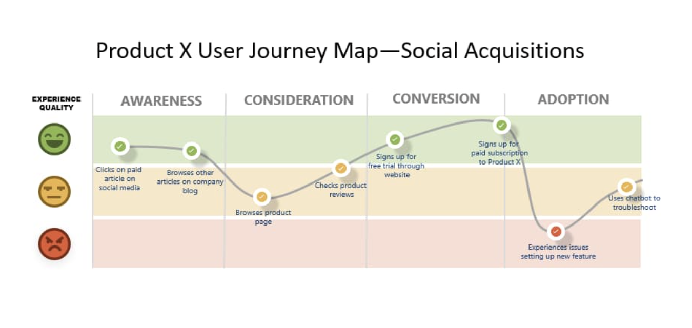
To empathize with users, stay aware of their pain points, and try to match their mental models—how they think about your product in their mind. One way to do this is to create a user journey map, where you can mark relevant touchpoints, sentiments, pain points, and user goals.
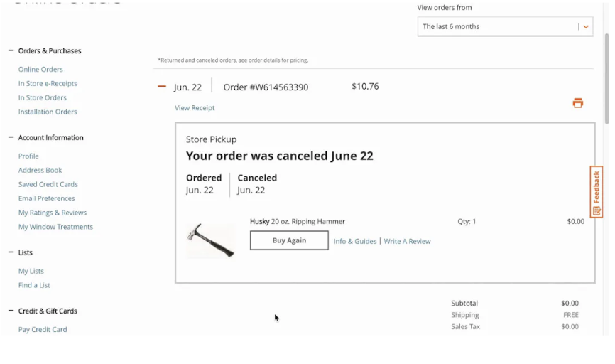
Applying the empathy principle might look like considering copy—for example, amending comms and notifications of a delayed order to apologize for this, or acknowledge disappointment. Or you may consider what currently bothers users about your product, and resolve specific concerns—for example, when a user cancels their order with Home Depot, the e-commerce website immediately updates order status to ‘canceled’ and specifies the order and cancellation date. This minimizes the anxiety of waiting to see if you successfully canceled an order, worrying you may still be charged.
3. Clarity and consistency are key for intuitive designs
A clear and consistent design ensures your product is aesthetically appealing and easy to navigate for users. Users shouldn’t struggle to find features or complete actions while interacting with your digital product. A simple, consistent layout makes it easy to complete actions quickly, and reduces the mental load of a more complex process.
Clarity and consistency are also two of ten design heuristics developed by web usability experts Jakob Nielsen and Rolf Molich. These overarching usability design principles are vital in creating user-friendly and intuitive designs.
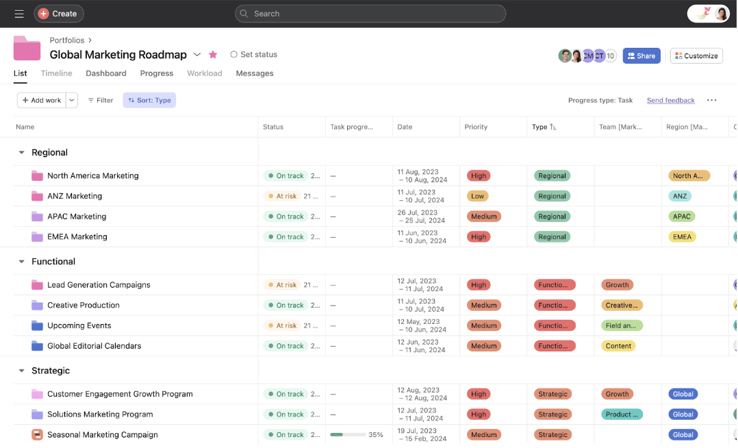
One example of clarity and constituency in action is Asana, a work management platform that helps users organize, track, and manage projects. The platform uses a clear and consistent interface that makes delegating, managing, and finishing projects easier for users. The simple layout helps users conserve the mental energy they need for organizing daily tasks and projects.
4. User data and insights drive decisions
Rather than relying on assumptions, use customer insights to inform every design decision you make.
Collecting the right user data is a matter of choosing the appropriate UX research method. For example, user interviews with open-ended questions gives you rich, qualitative feedback, while feedback surveys with close-ended questions can help you collect quantitative data.
By systematically collecting and analyzing user data, you can inform decisions based on user need and preference—whether it’s usability data on where to place a button, or interview data that indicates growing interest in new product features. Ensuring all your decisions are backed up by user data is a crucial principle in user-centered design.
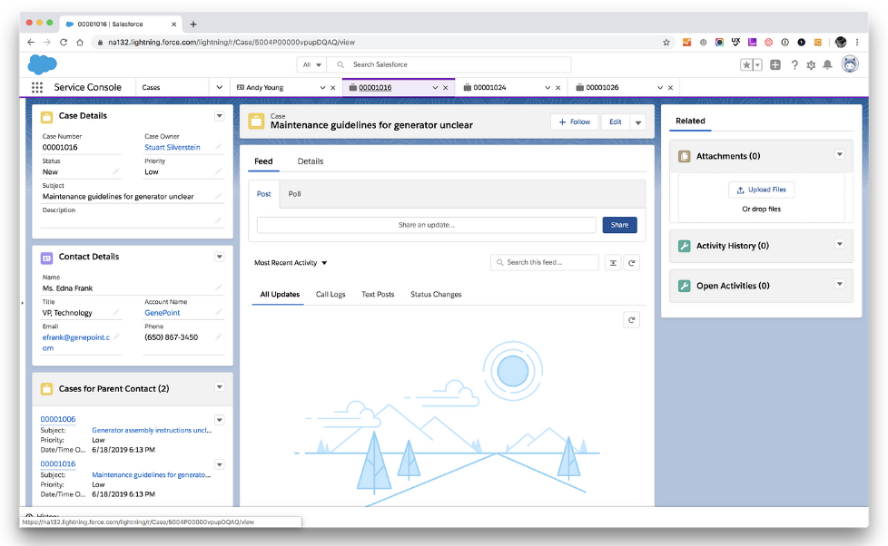
For example, large tech companies like Salesforce rely on user data to shape features and gather feedback. When addressing bugs or customer feedback, Salesforce frequently uses in-app surveys to collect contextual feedback, and better understand user needs.
4 Phases of a user-centered design process
A systematic user-centered design process helps your team ground every product development in the same user-centric workflow, from collecting user insights to reviewing feedback.
While you’ll want to structure your user-centered design process for your own team, there’s four key phases to bear in mind—you’ll find these in any successful UCD workflow.
1. Context analysis and user research: Who will use your product
Before you can design a successful solution, you need to know who you’re designing it for. This follows the first principle of early and frequent user involvement. It means investing in UX research methods to understand who your users are, their problems, what motivates them, and what success looks like.
There’s a wide variety of UX research methods to choose from, including interviews, surveys, usability testing, prototype testing, card sorting, tree testing, and more. The right UX research method for you depends on your specific objectives and needs.
Once you gather insights on users, you can create user personas. These characters reflect real potential users and help you better understand their needs. A user persona will include:
- Bio
- Goals
- Frustrations
- Motivations
- Personality traits
- Associated brands
- Preferred channels
Armed with your user personas, your team is better-equipped to empathize with users, and understand who your product is for and how they’ll use it. Next, it’s time to connect your users’ needs with your business requirements and goals.
2. Requirement specification: Aligning user needs with business goals
While your aim is to solve user problems, you have to do so within the context of business objectives. Users often have many goals, and as much as you’d like it to, your product can't and won’t address them all.
Instead, communicate with stakeholders to understand where user needs and business goals intersect. Solving these specific issues will provide the most value and ROI. As you weigh these two crucial considerations, it’s also important to specify requirements, project scope, and goals.
With stakeholder buy-in, you can ensure your UX research objectives and business goals are aligned. The HEART framework, created by former Lead UX Researcher at Google, Kerry Rodden, can help you align stakeholder metrics with user-centric goals and KPIs by looking at:
- Happiness: A measure of user attitude or satisfaction
- Engagement: A measure of how much a user interacts with a product
- Adoption: A measure of new users in a certain period
- Retention: A measure of keeping users for a certain period
- Task Success: A measure of tasks completed alongside time and resources spent
You should establish goals, signails, and metrics for each of these pillars.
- Goals: High-level outcomes you want to achieve
- Signals: Observable actions or behaviors that indicate you’re moving toward your goal
- Metrics: Quantitative measures that you can collect and analyze to track signals
The HEART framework allows your UX and design team to align goals, signals, and metrics, ultimately helping you define requirements and elements that solve both user and stakeholder needs.
To align HEART with business objectives, you need to understand and communicate how your UX goals relate to your organization’s goals. For example, if your business objective is to increase customer retention, you might show how your UX goals of adoption and task success can lead to more conversions, referrals, and retention.
3. Initial solution design: From user flows to high-fidelity prototypes
This step involves creating design solutions based on the insights you’ve gathered from your initial user research. Bear in mind that these beginner user flows and wireframes will vastly differ from your finished version.
The main materials to create in this step include:
- User flows: Diagrams depicting specific paths users take to complete a specific task
- Wireframes: Schematic, low-fidelity blueprints, representing the basic framework of your product—these focus on the structure and layout of the user interface
- Mock-ups: Refined versions of wireframes that include visual elements like colors, logos, and typography
- Prototypes: Prototypes are low-, mid-, or high-fidelity design representations that simulate your finished product
If you’re just starting with building a software platform, this phase is also where you should organize content categories and establish clear information architecture. You can test this later with both tree tests and card sorting.
Once you have your initial solution design, you need to test it with users to gather their feedback, and make product iterations. Prototype testing in the next step helps turn your user flows into high-fidelity prototypes that mimic the real product.
4. Iterative testing and evaluation: Uncovering insights for product improvement
Although testing is at the end of your user-centered design process, it’s not a phase that you technically complete. Even after launch, you should collect continuous feedback to stay on top of user expectations.
Begin by conducting usability testing with your user flow, wireframe, or prototype. With this method, you connect with users and ask how they’d complete specific tasks, before analyzing their experience to identify areas of improvement.
Ask users for their initial impressions. Did they find the product easy to navigate? Were there any aspects of the interface or flow that confused them?
After gathering user feedback and analyzing your data, it’s time to iterate. Use your insights to apply changes—this will bring you back to phase three of designing your solution.

Continue the process of testing and iterating until your product is ready for launch. Along with the remote usability method above, there are many types of usability tests you can conduct, including:
- A/B testing: A method where you test two different versions of your design to determine which one performs better
- Card sorting: Participants sort cards depicting your site’s content into categories, helping you ensure your information architecture matches users' mental models and intuitions
- Live website analytics: This method involves using UX research tools to monitor how users engage with your website in real time, via heatmaps, five-second tests, and first-click tests
⚙️ Need a tool that does it all?
Maze helps organizations action user-centered design processes with a suite of research methods that focus on getting insights from your users, fast.
3 Examples of user-centered design: How iterative testing builds better products
User-centered principles and phases reap real rewards, but what does it look like in action?
To inspire your next UCD project, here are three examples of companies applying user-centered design principles and earning user satisfaction, loyalty, and more.
How Klarna gets rapid insights to 10x user-informed decisions
Klarna, a popular fintech company, is entrusted by half a million retailers worldwide to make online shopping payments as smooth as possible. However, Klarna needed to revamp its UX research team to better understand its users’ expectations. While they weren’t short on designers and product managers, they didn’t have the UX researchers they thought they needed to run frequent research studies.
Klarna adopted a more user-centered approach by focusing on gathering user feedback and iterating designs more quickly. With help from Maze, they empowered teams around the organization to run tests and hear from users regularly. Not only did this scale their research practice 10x, but it helped Klarna’s product teams make more user-focused design decisions and keep up with evolving user expectations and needs.
How Braze tapped into user preferences with A/B feature testing
Braze is a lifecycle engagement platform that connects businesses with their customers. However, their idea of adding multimedia messaging services (MMS) to their short message service (SMS) options posed a challenge.
How could Braze ensure all its new MMS UI interfaces were intuitive for users, or what they even really wanted?
Instead of risking a feature failure or disappointing users, Braze turned to Maze to conduct A/B testing to:
- Identify which design would maximize the new feature’s discoverability
- Discover usability problems
- Test different visuals
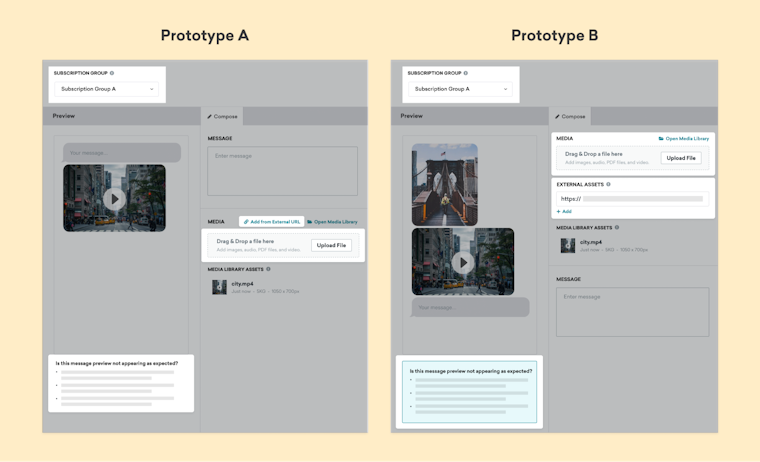
Two prototypes tested by Braze emphasizing different layouts and UI elements
After conducting the test, Braze took an even deeper dive into the results, analyzing metrics from satisfaction to misclicks and bounced user paths. After a final follow-up session with users, Braze was able to validate the best version of its newest feature—gaining the confidence to roll out its design. Braze launched its highly requested feature, allowing customers to add enhanced multimedia to their SMS messages.
How BpiFrance increased research efficiency to launch 3x faster with user-centered design
BpiFrance faced the challenge of meeting its entrepreneurial customers' diverse needs. The team wanted to boost efficiency and free time for meaningful projects more central to their purpose-driven mission.
Doing so entailed:
- Quickly identifying solutions for their clientele and providing a stellar customer experience
- Removing the guesswork from the design process and speeding up iteration
- Empowering their product teams to research autonomously
With the help of Maze, BpiFrance revamped its research strategy and introduced consistent feedback loops with its users. Maze enabled BpiFrance’s 20+ product teams to coordinate and structure research, empowering them to run research projects independently. This enabled them to act fast and gather continuous feedback, gaining insights from users at key stages of the design and development process.
After working with their users directly to create the new feature, in 2022, they launched a new lending offer for SMBs. It only took BpiFrance two months to go to market. That’s three times faster than its previous product development launches!
The future of user-centered design
User-centered design is ultimately about empathy; it’s about understanding the needs, expectations, and motivations of the real people who use your product. Once you understand their problems, you’re in a better position to create user-centric designs and products your target audience will love using.
The best way to get these insights? With UX research.
Maze is the leading user research platform that helps you gain insights with both moderated and unmoderated user testing. With Maze, you can conduct UX surveys, interviews, prototype testing, and more to better understand your users and fuel data-backed decision-making.
Frequently asked questions about user-centered design
What techniques are used in a user-centered design approach
What techniques are used in a user-centered design approach
Applying a user-centered design approach entails various techniques like:
- Conducting user research
- Creating user personas
- Iterating designs based on user feedback
- Heuristic evaluation
What are the four aspects of user-centered design?
What are the four aspects of user-centered design?
The four main aspects of user-centered design include:
- Early and frequent testing
- Empathy for users
- User involvement in the design process
- Constant iteration based on user feedback
What is the difference between UCD and UX?
What is the difference between UCD and UX?
User-centered design (UCD) refers to a methodology, philosophy, and process of creating designs that meet user needs. User experience (UX), on the other hand, refers to the experience a user has while using a particular product.
What is user-centered design?
What is user-centered design?
User-centered design is a philosophy that puts your end-users’ needs, expectations, and problems at the forefront of the design process. Doing so ensures that you avoid costly mistakes throughout the product development process while designing a product that solves your users’ specific pain points and problems.

