


")


When user experience (UX) is done right, users effortlessly glide through interfaces, intuitively use products, and easily achieve their jobs to be done.
A bad user experience, on the other hand, frustrates users and deters them from coming back, making purchases, or engaging with your product. And as with anything, sometimes knowing what not to do is just as valuable as knowing what to do.
In this article, we’ll take you through 10 signs of a bad user experience in digital products, including examples of these indicators, and how to fix them.


What does bad user experience look like?
Bad user experiences come in all shapes and sizes.
We’ll share some specific examples of bad user experience later, but some of the most common offenders are crowded user interfaces (UIs), slow-loading screens, and confusing navigation that makes products burdensome to operate.
The consequences? Frustrated users who are deterred from using your product, and a sudden surge in negative metrics, like bounce and abandonment rates.
🤔 Does bad UX only exist in digital products? In short: no. We’ll be focusing on digital UX in this article, but physical products also suffer from bad UX—for example, a sink faucet that’s too short, spilling water over the counter, or a phone case that covers the headphone jack.
10 Signs of bad UX design
UX plays a pivotal role in influencing user behavior. A bad user experience makes users not only reluctant to use your product, but also increases the likelihood of them turning to your competitors.
Keeping an eye on key UX metrics like conversion and bounce rates, along with any trackable user behavior, is your best bet to monitor the health of user experience. But what signs should you be watching for?
Here’s our 10 red flags of poor UX design—and how to address them.
1. Low conversion rates
Conversion rates show the percentage of users who complete a desired action. In your digital product, these actions could be anything from signing up for your service to filling out a questionnaire. Low conversion rates imply users can’t find what they need to complete tasks, or otherwise aren’t convinced by your offer.
For example, let’s say you’ve launched a brand new sign-up flow. It adheres to industry best practices and collects all the information you need from users to provide them with adequate onboarding experience.
Yet, people are dropping off halfway through. Only 50% of the users that begin the process actually make it past the sign-up finish line and into your product.
To solve this problem, you can conduct live website usability testing to see how users interact with your product. Throughout testing, it’s clear users struggle to locate your CTA, making it difficult to sign up. Mystery solved!
2. High bounce rates
Bounce rates represent the percentage of users who visit your platform and navigate away without viewing more pages. Put simply, they took one look at the website, quickly decided it wasn’t for them, and moved on to another option.
Many underlying UX problems can lead to a high bounce rate.
Some potential causes—and the key elements to optimize—include loading times and navigation functionality.
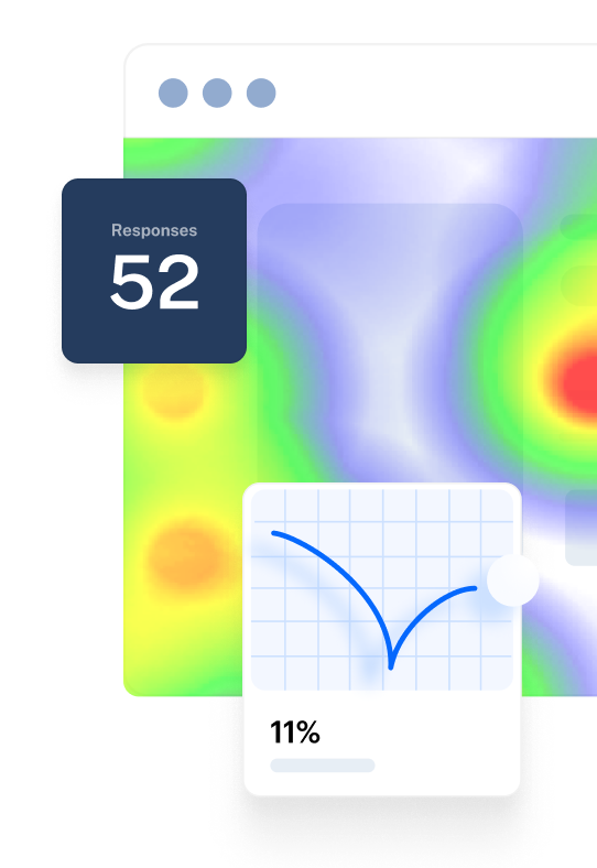
You can conduct a variety of different UX research methods to find the issues users experience, but usability testing specifically should be your first port of call. By watching your users interact with the product and analyzing the usability metrics you collect, you can identify what’s not working and why users aren’t staying on the page.
Maze Reports provide a usability breakdown for exactly that:

Bounce rates can also be investigated with user interviews, as they can provide qualitative data about any disconnect between user needs and the product’s offering. To see if you’ve aligned with your target audience, consider conducting user interviews to uncover contextual feedback about your users’ experience.
4. Bad reviews and negative sentiment
User reviews are useful because they often tell you exactly what’s wrong with your product—in the user’s own words. If users aren’t happy about something, they’ll likely let you know with a negative review.
Do some review mining to understand the voice of your customers. Read through user opinions on review sites, social media, and more. Issues users mention consistently can help you determine how to select the best research method for solving the problem.
For example, users might complain that it��’s difficult to find products on your site. This points to usability issues with your search function or website navigation. If feedback is more widespread about a range of your features, this warrants a broad user experience survey, which can help you get quantifiable data from a large base of users to see if the complaints have statistical significance.
5. Lack of engagement
If you consistently review content, CTAs, links, buttons, and forms on your digital product, but users don’t interact with them, bad UX could be the culprit. Like other signs of poor user experience, low engagement can stem from users not finding the content relevant, meaning they ignore it altogether. Other potential reasons for not interacting with content include outdated designs or a confusing interface.
However, there’s only one way to find out exactly why users aren’t interacting with your content—you guessed it: user research. Since you’re focused on figuring out the ‘why’ behind users' lack of engagement, qualitative research methods like in-depth interviews and focus groups are the best methods for getting tangible feedback. You can also conduct content testing to assess specific pieces of content.
6. Low user retention
User retention rates measure the percentage of customers who renew their contracts once the initial agreement period is up. High retention rates indicate happy customers, whereas low retention rates indicate unhappy customers.
User retention and user experience are closely linked: customers that love the experience you provide are more likely to stick around. Multiple UX issues can be behind low retention rates, such as confusing interfaces, lack of personalization, and a misalignment between your product and user expectations.
Conduct A/B testing to assess which versions of your product design perform the best with users. You can also run user surveys with open-ended questions during or after renewal periods to uncover more information and see if there's a disconnect between your product’s offering and user expectations.
7. High abandonment rates
Abandonment rates show the percentage of users who have given up on a task or process before completing it. Some common examples are abandoned sign-ups, shopping carts, and purchases. If your abandonment rates are high, it can be an indicator that users are struggling to complete tasks that should be simple and straightforward.
Anything from complicated navigation to cluttered UIs can cause users to abandon the product before completing a process.
Conduct various usability tests to understand which element is causing the most issues. Heatmaps, in particular, will help you determine which segments of your website are causing the most friction.
8. High exit rates on specific pages
If a specific page on your website consistently gets high exit rates, there could be something wrong with its UX. This is especially true if an exit page is the final destination for users to complete a specific task, such as a sign-up. High exit rates are closely tied with low conversion and retention, and high abandonment.
Like other metrics dependent on customers completing tasks, high exit rates are usually a sign of frustrated users. To get to the core of your UX issue, conduct live website and usability testing. Ask users to complete tasks on the page, and note any difficulties and friction points to understand which design elements need changing.
9. High amount of customer support requests
Anything from pricing to technical errors can prompt customers to open a ticket, send an email, or call support. If users are constantly contacting you for help with completing tasks, it’s likely bad UX driving them (and your Support team) crazy.
The good news is that with support requests, your users tell you what’s wrong. Comb through emails and recordings of phone calls. Are users reporting trouble customizing their dashboards? Get even more granular. Perhaps multiple users are having problems with your dashboard’s graphs and reporting features. Conduct thematic analysis by reading through the interactions, coding responses, and identifying overarching themes, to hone in on specific problem areas. Then, drill into these with additional user research methods like usability testing or user interviews.
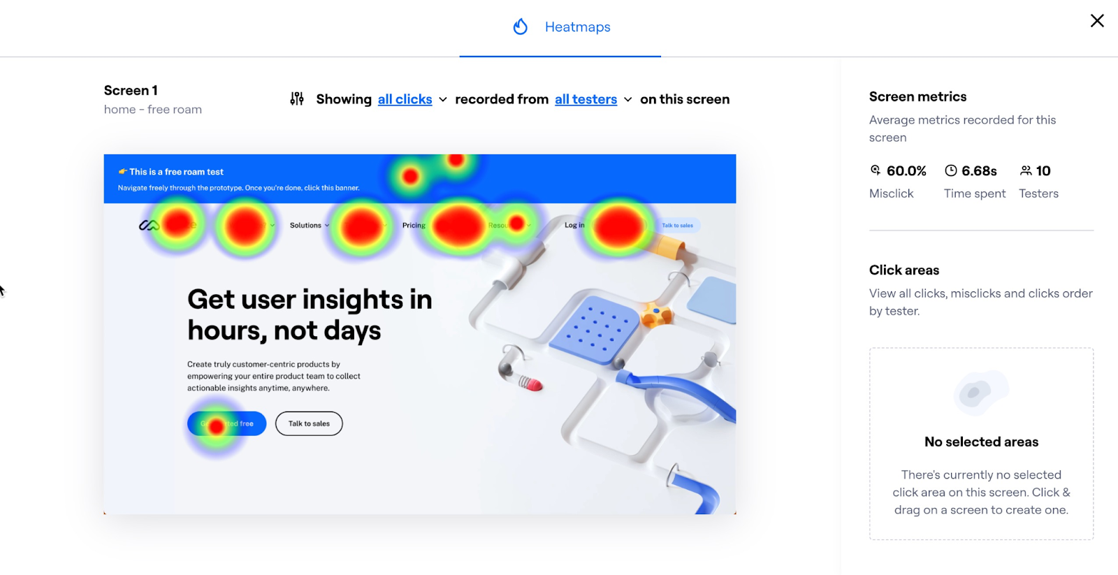
10. Misclicks and excessive scrolling
When users are confused with your product, frustration often takes the form of aimless scrolling, rage clicking, and frantic mouse movements. These panicky, jolty motions signify a user trying to interact with the product and failing—getting more and more frustrated with each action they take. It’s a clear sign that your UX and UI design is not intuitive.
To uncover the worst offenders, use heatmaps and scroll paths.
These visualization tools show you where users spend the most time clicking, scrolling, and interacting with the content on your page. A lot of movement in a particular zone, represented by ‘hot’ colors, signifies users are confused with a particular part of an interface. Once you’ve identified these, you can conduct more specific testing into those areas.

Now that you know what type of user behavior is sparked by bad UX, let’s look at tell-tale signs within the products themselves.
✨ Okay, but what does good UX look like?
Check out our article on these 11 examples of great UX design.
What makes a bad user experience: 5 examples
Checking user behavior metrics is a surefire way to find bad UX. However, there are a few key mistakes to look for in your designs themselves. Think of these signs as the opposite of Jakob Nielsen's usability heuristics for interaction design.
Here are five examples of things that can tear down your digital product’s user design.
1. Confusing navigation
Confusing navigation makes it difficult for users to find what they need or complete tasks in your digital product. If your product’s layout and information architecture don’t match users' mental models or expectations, they become confused and frustrated.
So, how do you solve confusing navigation in your digital experience?
Take the business and technology consulting firm West Monroe as an example. When tasked with creating a comprehensive healthcare website from disparate systems for a client of theirs, they knew that ensuring intuitive website navigation was key.
With no unified and cohesive digital experience, they needed to create an intuitive navigation system. After ideating potential solutions, West Monroe came up with two different information architecture options. They could either bucket their pages by topic or split content into healthcare and insurance options.
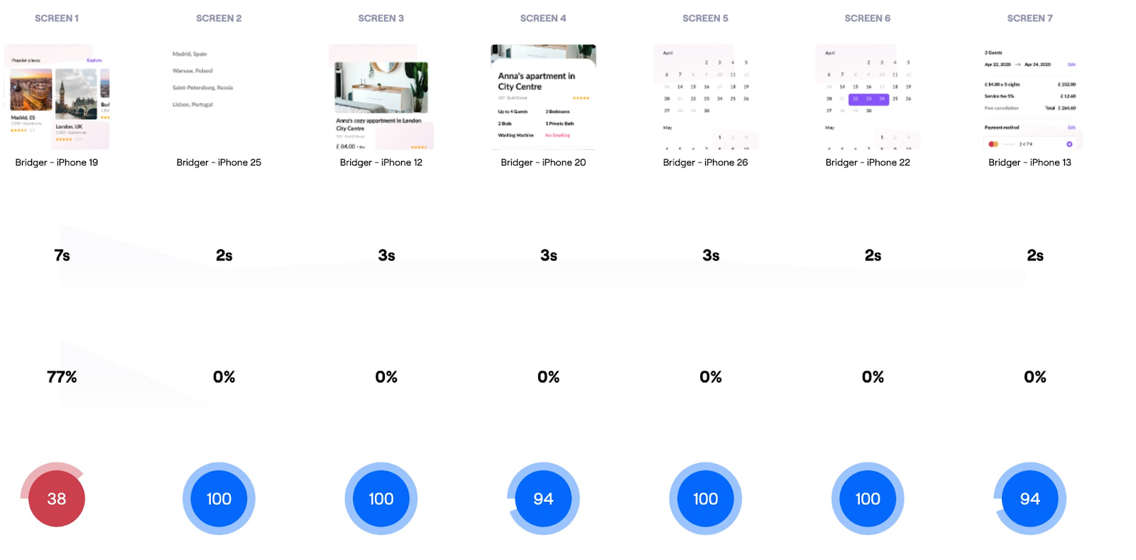
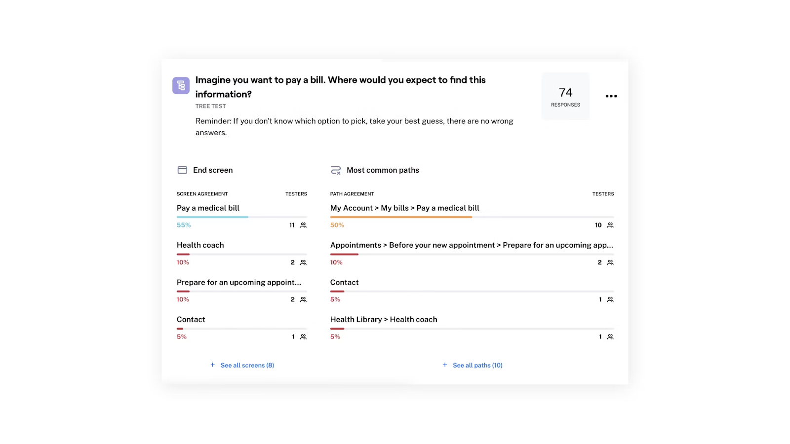
To find the best option, they brought in Maze tree tests. These tests gave the West Monroe team a broad idea of where participants would complete a specific task. Within 24 hours, West Monroe got 100 people to complete the Maze tests. They were then able to identify which paths garnered the most consensus and take the next steps for building an intuitive information architecture.

2. Accessibility issues
When a product isn’t accessible, it excludes users with disabilities from having a seamless and inclusive design experience. For example, things like poor color contrast make user interfaces more difficult to read, as do websites or products that aren’t compatible with screen readers.
Let’s look at an example. Target Corporation, a major retailer from the U.S., faced significant legal challenges in 2006 due to its website’s poor accessibility. It had multiple issues, such as incompatibility with screen readers, missing form labels, and absent alternative texts—all of which made the website unusable for people with low or no vision.
Target ended up paying $6 million in damages showing just how much lack of accessibility can cost you—not to mention your reputation. Target was mandated to improve its website by addressing the highlighted issues and prioritizing inclusive experiences to ensure it’s accessible to everyone.
3. Slow-loading screens
A slow-loading screen can make users leave your site before they even interact with your UI and features. In fact, 53% of users will leave a website if it takes more than 3 seconds to load. Slow loading can occur for a variety of reasons, including heavy traffic, poor coding, and even large images. Optimizing your digital experience’s speed is a priority.
For example, SpeedMonitor.io has identified CNN’s homepage as one of the slowest on the internet. CNN is one of the world’s leading news organizations, but slow load times significantly hinder the experience and can frustrate users trying to get their news.
There are ample adjustments you can make to avoid slow load times, such as:
- Optimize and compress images
- Minimize redirect usage
- Use browser HTTP caching
- Limit HTTP requests
4. Website design and apps that aren’t mobile friendly
Mobile users make up approximately 58% of all global internet traffic. Modern products need to prioritize mobile experiences as much as they do desktop experiences.
Use a responsive design approach to ensure your product is mobile-friendly and fits perfectly across all devices. Incorporate mobile testing from early prototypes to live app interactions to catch issues early and ensure a smooth experience. Otherwise, you’ll frustrate your users with unreadable content, poorly sized buttons, and broken layouts.
Zara is a prime example of user experience difficulties arising from poor mobile device optimization. The website’s desktop version typically features an unconventional design, which Zara has (unsuccessfully) tried to keep the same on its unresponsive mobile equivalent, including its mobile app. Users find it difficult to navigate due to oversized images, unclear information, and inaccessible navigation. In fact, it’s so well-known as an example of poor design, that numerous UX/UI designers like Sai Satvik, Sam Samvura, and Anand Pradeep, and William Ng have done case studies on how they could solve these usability issues.

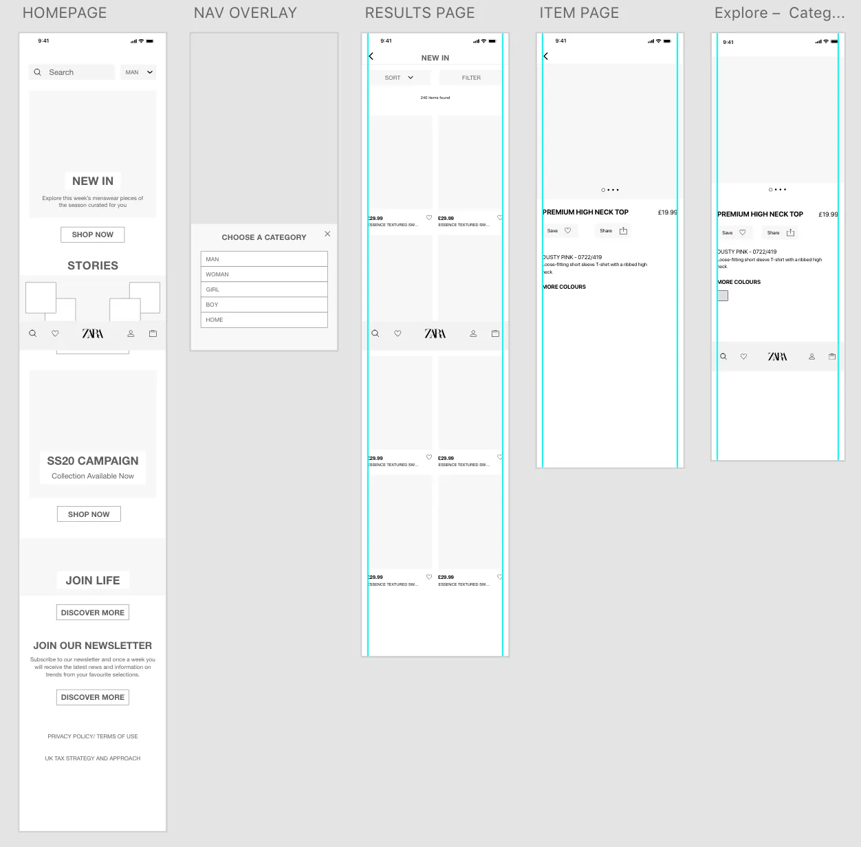
Sam Samvura's medium fidelity wireframes for the Zara app
5. Overuse of components
If your design uses the same patterns, components, and elements regardless of the context, it’s time to revisit your UI/UX. For example, pop-ups are particularly useful for high-stakes errors, important messages, and urgent feedback. However, you shouldn’t repeatedly use them for all product notifications, because it could quickly frustrate your users and interrupt task completion (not to mention, the higher the frequency, the less urgent it seems).
Take online news sites, for example. Excessive ads and popups on desktop ruin the reading experience. On mobile, where there’s less screen space, they make it virtually impossible to navigate the site—often leaving you scrolling to search for the content you came for.


What’s the impact of bad UX decisions?
Bad UX negatively impacts your organization by providing a sub-par experience. At best, users are dissatisfied. At worst, they’re leaving with no plans to ever return. Some issues that can stem from a bad user experience include:
- An ineffective product: If they can’t use it, why bother? Cluttered UIs and poorly designed features keep users from completing their goals with a digital product. This bad UX can confuse, frustrate, and ultimately deter them from using your product in the future.
- Negative brand perception: A user’s experience with your digital platform influences their perception of your brand. Bad UX leads to a bad impression, where users associate your product or service with unreliability or inefficiency.
- Lost revenue: If users abandon a purchase (or your business as a whole) due to bad UX, your company misses out on revenue and sales. It’s a huge problem for businesses, as reported by Amazon’s Trillion Dollar UX Problem Report, with over $1.4 trillion being missed out on due to bad UX.
- Diminished competitive advantage: A good user experience is a differentiator from other brands, giving your product an attractive edge. With bad UX, users are more likely to switch to a company that offers a smoother and easier experience.
Make data-backed UX decisions with Maze
Understanding the signs and impact of bad UX is the first step to improving it. To identify friction points and facilitate data-informed design solutions, you need the right UX research tool.
Maze is a leading user research platform that empowers businesses to uncover user insights that inform UX decisions. With Maze, you have access to a suite of moderated and unmoderated user research methods—including Interview Studies, Prototype Testing, Card Sorting, and plenty more methods for building a better user experience. Because creating an exceptional user experience doesn’t have to be difficult.
Frequently asked questions about bad user experience signs
How to identify bad UX?
How to identify bad UX?
Depending on where you are in the product development process, some of the best methods for identifying bad UX include:
- Conducting UX research
- Making detailed user personas
- Creating user journey maps
- Leveraging customer support data
- Checking user reviews and ratings
What is dark UX?
What is dark UX?
Dark UX includes design patterns and experiences that are meant to mislead users into doing something that wasn’t their original intent. They’re shortcuts that typically use patterns like hidden cost, forced continuity, and even contact theft.
What are some characteristics of good UX?
What are some characteristics of good UX?
Good user experience design makes it easy for users to interact with your product and complete tasks. Some of its main characteristics include:
- User-friendly UIs
- Error prevention and recovery
- Accessibility
- Visual appeal
- Efficient navigation
- Consistency
- Relevance
- Personalization