For all of the typing, talking, and hand signals someone can do when expressing an idea, it's so hard to convey instantly. Communicating an entire brand, vision, or feeling often comes easier visually.
People process images 60,000x faster than words—here's a visual to help you digest that information quicker.
Mood boards have been around for a while. They are a vital tool for UX designers, product designers, web designers, graphic designers (the list goes on) for ideating and communicating ideas rapidly and effectively.
In this article, we'll explore the science behind a mood board, how to create one, and share eleven mood board examples to inspire your next design project. Whether you're "mood boarding"—yes, it's a verb—for personal or professional projects, a mood board is an incredibly useful tool to inspire and jump-start the design process.
Let this article be your mood board, of sorts, to kick-off mood boarding. Enjoy!
What is a mood board?
In short, a mood board is a collection of content to translate an idea or thought visually.
A mood board sets a specific tone for anything. Whether you're building a new product, a campaign, or a brand, a mood board can communicate ideas using shared design references.
A mood board is used for a team or an individual's work process and benefits both. Also known as an inspiration board, they are the first step between an idea and the first rendition of work. They help to get minds collectively, visually organized and inspired for what's to come.
It saves time in the early stages of a design process by getting a team on the same page and eradicating lengthy meetings trying to explain how something should feel. Research shows, mood boards allow designers the creative freedom they need while remaining coordinated and organized. Win, win.
What is a mood board used for?
Mood boards serve three primary purposes:
- Define an idea or project: By turning your idea or concept into a series of images, colors, and designs, it becomes tangible. Mood boards help translate the feel of your ideas into real, visual assets and inspiration, which helps support your project and ensure everyone’s on the same page.
- Inspire new angles or creative routes: Especially useful if you’re still in the process of discovering your project (e.g. a brand identity, new product design), mood boards are invaluable for bringing together the vision, identity, and impact you want your project to convey.
- Direct in times of uncertainty throughout a project: In one glance, a mood board can tell people much more about your project than you can in ten minutes. Not only can mood boards become a source of truth when designing, they can act as a guiding star for brand identity and project goals; somewhere for people to come back to and remind themselves what you’re working on, and what that looks like.
What to include in a mood board?
The truth is, anything goes if it helps you achieve your goal. Mood boards are not only great for ideation and generating new ideas, but they can also aid the production process. They can do this by being a reference point for inspiration or research if a product team is ever feeling lost.
Most people turn to images as their base for a mood board. However, don't shy away from blocks of color, textures, fonts & typography, and other visual formats.
The content a mood board will include often depends on the type of project and goal. If you’re creating a mood board for a UI or UX project, you’re more likely to have website or app mockups that inspire ideas and development.
Whereas, if you’re creating a mood board for the interior design of an office, you’re likely to have texture samples, furniture designs, and color palettes. Look for the content that suits your goal best.
Picking a theme for your mood board will help you decide on the type of content you want. Your theme doesn’t have to line up directly with your product, but it’s there to unify the mood board.
For example, an app that tells surfers what the tide is like in their area could have a beach themed mood board. This doesn’t mean every image needs shells and beach towels, but it could direct the color scheme to corals, and include natural textures.
Think about what you want to feel when looking at the mood board; each item should evoke that feeling or serve a particular purpose based around it. If it doesn't serve its purpose on its own, then get rid of it.
Pro tip ✨
If you like a piece of content because of its UX appeal, don't disown it because the color, for example, doesn't fit your mood board's aesthetic. Likewise, don’t disregard a product with a design you love, simply because the product is not the same type of product as yours—consider everything. Sometimes the best ideas come from translating inspiration to a different platform.
Should I create a physical or digital mood board?
This question comes up a lot: there's no right or wrong answer. Both online and offline mood boards have their advantages and disadvantages. The type of mood board that works best for you will depend on your project, resources, and the goal of your board.
Offline mood boards
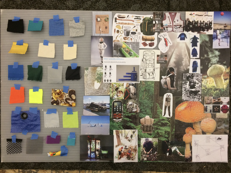
The great thing about offline mood boards is they're tactile, impactful, and can appeal to more senses— smell, touch, taste. They're also collaborative when you're in the same space. Offline mood boards can be great for client pitches, small same-space teams, and designers looking to immerse themselves in the process.
However, offline mood boards are limited to precisely that, offline. It means for all the work you put into them, only those in the same room can utilize them. A photo or even a video of a physical mood board will never do it justice, resulting in temporary work and a missed opportunity to grow your ideas as your project does.
Online mood boards
Although limited on the tactile front, the amount of digital tools and resources available at a few clicks is massive. You're also able to find styles, images, and thought pieces that are more likely to evoke the feelings of what you want, rather than relying on your handy skills to create them.
Of course, a massive bonus with online mood boards is their shareability. If using a mood board tool or platform, like Milanote, Pinterest, or Adobe Spark, online collaboration opportunities are endless.
This is especially useful after 2020’s shift into remote work. With more companies taking the remote leap and staying there than ever before, our processes need to be as readily remote as we are.
Plus, online mood boards don't need to be removed because someone wants the whiteboard. They can be a work in progress throughout the entire design process—a digital canvas never runs out of paper.
How to create a mood board
For this article, we'll focus on creating a digital mood board. There are a few things to keep in mind when designing your mood board.
1: Start early
Start a mood board before a project officially launches, to enter the process with a clear idea of its tone and feel. This will help you organize ideas and kick the project off with everyone on the same page, or board in this case.
2. Include different design elements
Consider every possible piece of content to include, from quotes to GIFs to specific images. Whatever helps you get your theme across. This might be:
Imagery, art & graphics
Imagery is possibly one of the most powerful mood boarding tools, so use it. The imagery you include can portray so much, from colors schemes and emotions, to design style and target audience. Don’t just think about the colors or literal images though, consider the feel of them. Use visual metaphors (a fast car for speed, lightning for power, the ocean for tranquility) and mix it up with a variety of photography, illustration styles, even classical art.
Colors
The right color can convey everything from emotion to brand identity. If you have a distinct color palette in mind, now’s the time to lay them out together and introduce other design elements (graphics, patterns, fonts) in to bring it to life. If you’re still brainstorming, use this time to play around this different color schemes and combinations until you hit one that conveys what you want.
Tip 🎨 If you’re brainstorming color palette ideas, use a helpful tool like ColorSpace to generate infinite color palettes fitting different criteria
Words & phrases
In our everyday life, words are infinitely impactful. The swap of one word to another can change the whole tone of a sentence. Even a simple piece of punctuation can complete change something’s meaning. Use words and phrases to your advantage, whether it’s a single word that encapsulates the energy of your project, or a quote that envisions what you aspire to create.
Typography
Different styles of font send different messages with them. A serif font feels professional, organized. While a sans serif font is more relaxed. Cursive, script typography feels extravagant or creative, and block capitals show a sense of authority. Think about what tone you want to get across—how do fonts play into that?
Textures
Textures are powerful. Marble feels sleek, simple, elegant. Smooth concrete is strong, modern. A bumpy piece of fabric feels disruptive, tiles on a wall feel orderly. Use photos of textures on a digital board, or real materials on a physical mood board to bring this emotion and messaging to life. Play with fabric, paper, tiles, buttons, sand, leaves.
Patterns & shapes
Consider the patterns and shapes you see each day—how do they make you feel? Designers have a great understanding of how different patterns and shapes convey emotions or concepts, so look to existing mood boards or product UI you like for inspiration. Use organic shapes, like those found in nature (the soft curve of a wave, the gentle bumps of a tree) to show calm, while busier patterns reflect energy and movement. Repeated patterns can convey order, or mania.
It's worth noting here that looking on Google should not be your go-to option if you want to find great media, consider more design-focused platforms like Behance or Dribbble—a sort of social media platform for design—to curate your own mood board.
3. Think of your audience
It's important to consider who you're mood boarding for and the type of person they are. Is it for yourself? A product team? A client? An entire business? Don’t limit this to only the audience of your design concept, consider the audience of your project as well. By fine-tuning your audience, it will inform your work.
4. Let it support briefs
A good mood board can come hand-in-hand with a design brief. For example, you can share a brand board with a designer alongside a UX design brief of a new product. It will help team members understand how you want the task to look and feel.
5. Find a layout that works
As you'll see with the mood board examples below, they come in different layouts, some are regimented and present content in the same dimensions, while others come with different content in various sizes.
All creative processes are different and you need to find the layout that works best for you and your project. For example, if you’re working on a mood board for UX purposes you may want to consider a layout that reflects the interaction of your product.
The layout will also depend on the design ideas you want to convey and the platform you're using. For example, Canva or Adobe Spark grants a lot more flexibility than Pinterest.
Whereas, if you’re working on a mood board for interior design purposes, different shapes and sized content can help add the same amount of depth and result you’d like to see with your interior design.
6. Keep in mind brand guidelines
It can be easy to stray away from a brand as you dive deep into mood boarding. Try to stay on-brand or as close to it as you can with the graphic design of your work.
7. Keep it up to date
Dependent on what you're mood boarding for and why, it might be a good idea to keep the mood board updated regularly. When you’re building a mood board for a product, then it should evolve just ahead of your product. Let your process inform your mood board and use it as a constant reference point if ever lost for inspiration.
8. There's never too much
When you're mood boarding, don't get in your head about using too many examples. You can always remove some later, but it's harder to get back into the mood board mindset and add more if you're falling short. Overdo it and then analyze each piece of content and ask whether it enhances the mood board by being there.
Plus, concepts, or comps— comprehensive layouts— rarely come as one rendition. Don't be afraid of creating two or even three mood boards that take your idea down different visual paths, then lock down the one you think works best for the goal at hand.
To lock down a mood board you want to run with, share it with your team and get feedback, and align it with your brand mission and vision. What feels right for everyone?
9. Make it an available reference point
To keep your mood board as a reference point, you need to make it accessible. Also, consider collaborating on the mood board with key stakeholders. When used as an idea generation tool, everyone involved in the project should contribute to the mood board.
11 Mood board examples to inspire you
Looking for mood board inspiration? Look no further. We’ve scoured Behance (Adobe’s social media platform for showcasing creative work) for the greatest uses of mood boards, and collected 11 styles to inspire your next design project.
Hint: If you're looking for more design inspiration, check out these 17 graphic design books to change your approach to design.
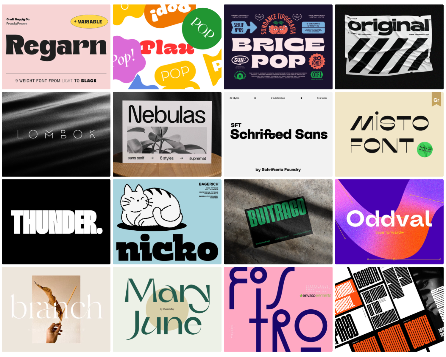
1. Typography mood board example
A typography mood board is an opportunity to narrow down the style of font and text you’d like to use. Consider how you feel about serif, cursive, all caps? Seeing all your options together is a great way to see which reads best, and you can make an additional mood board with final elements to see how well your chosen typography ties in.
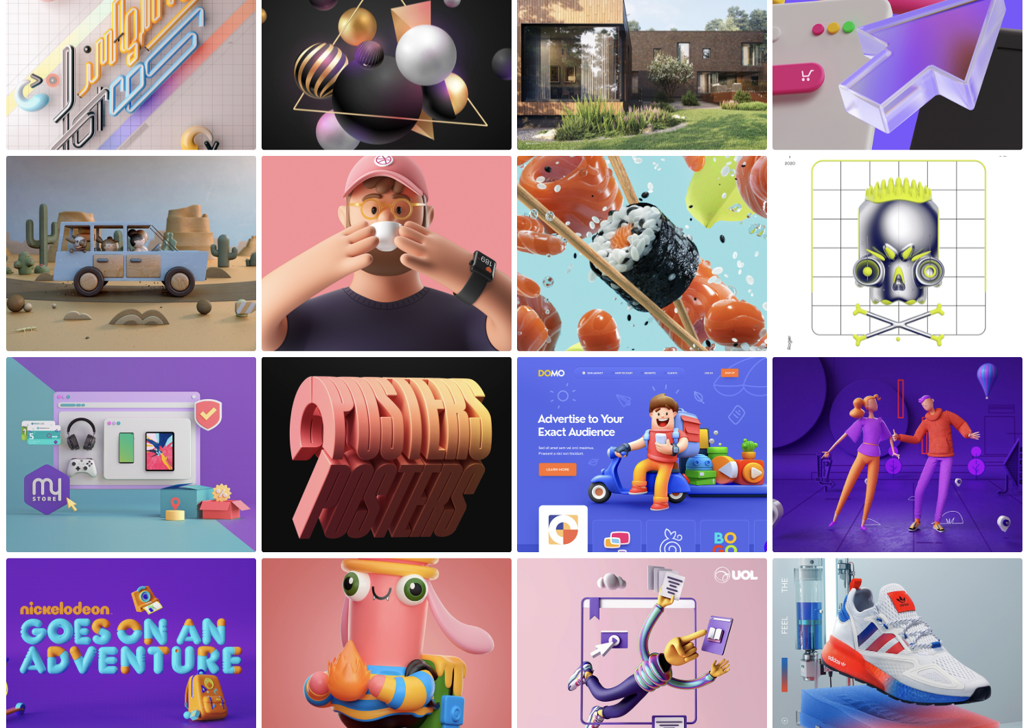
2. 3D design mood board example
We love some 3D design at Maze, so this is a popular mood board in our design teams. Using 3D designs can create more depth to your ideas, and carry more weight as a result.
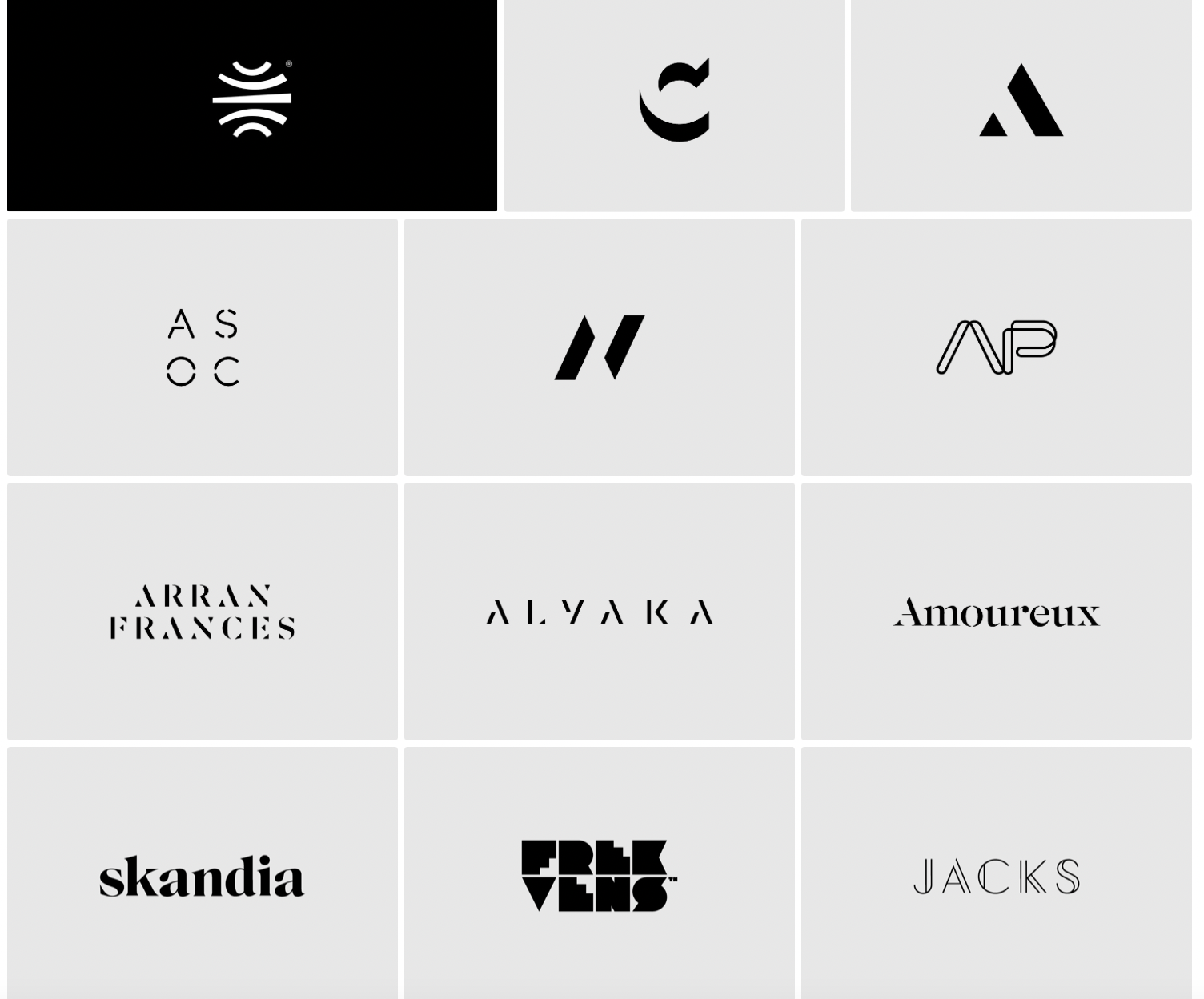
3. Logos mood board example
Who hasn’t thought about their favorite—and least favorite—logos? Whether it’s your local sports team or an indie tech company, logos are vast and varied. Collate some of your favorites together for some inspiration.
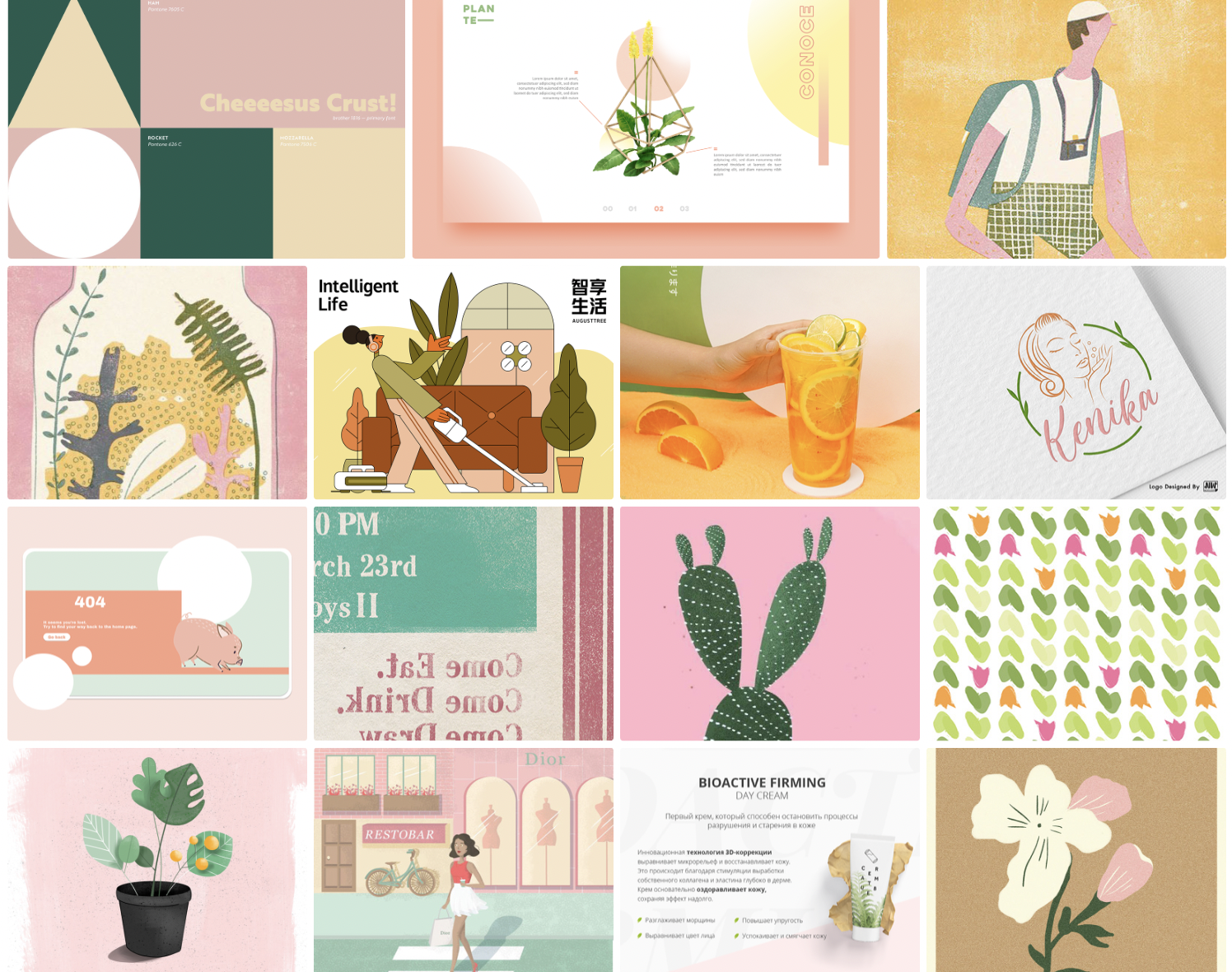
4. Color palette mood board example
Selecting a color palette is a big task. Putting all your options in one place makes it easier to compare the variations, from bold, contrasting schemes to minor hue differences.
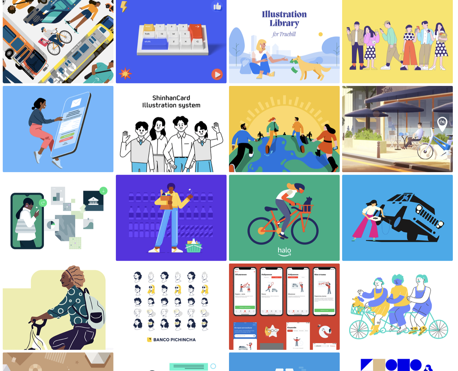
5. Illustrations mood board example
Determining your illustration style—or if you want illustration at all—can be overwhelming. From simple line-work to detailed realism or cartoon-style graphics, there’s a lot of options. Collate your favorites on one mood board, or make a series to compare the individual styles.
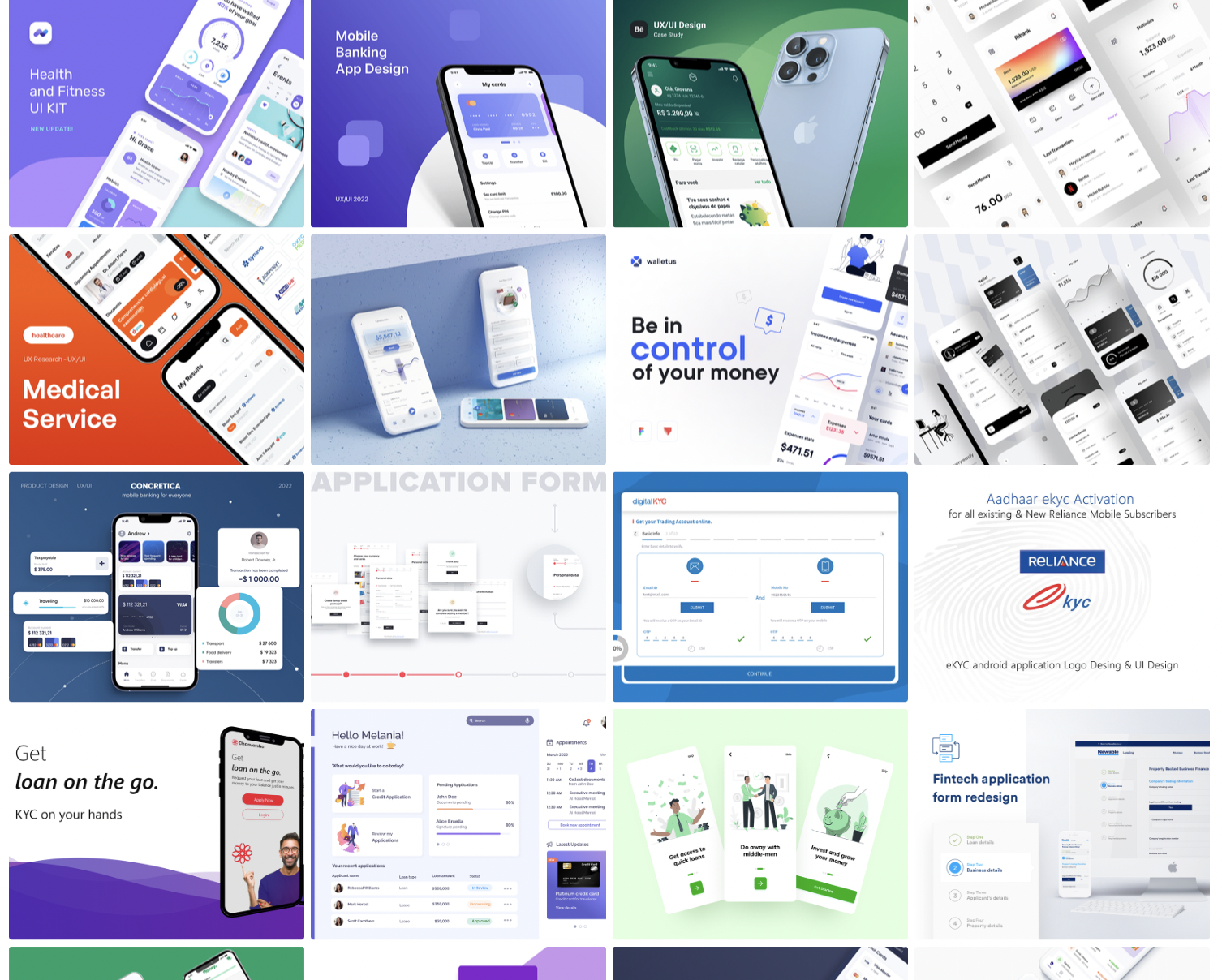
6. UI mood board example
Mood boards are an ideal way to start brainstorming your UI. Consider what colors draw attention, which typography works best for the home page, where should the logo sit?
7. UX design mood board example
Just as with UI, mood boards are a great way to present different UX elements and decide which you want, and how to lay them out. Use a mood board to collect your favorite examples of innovative, inspiring, or effective UX design.
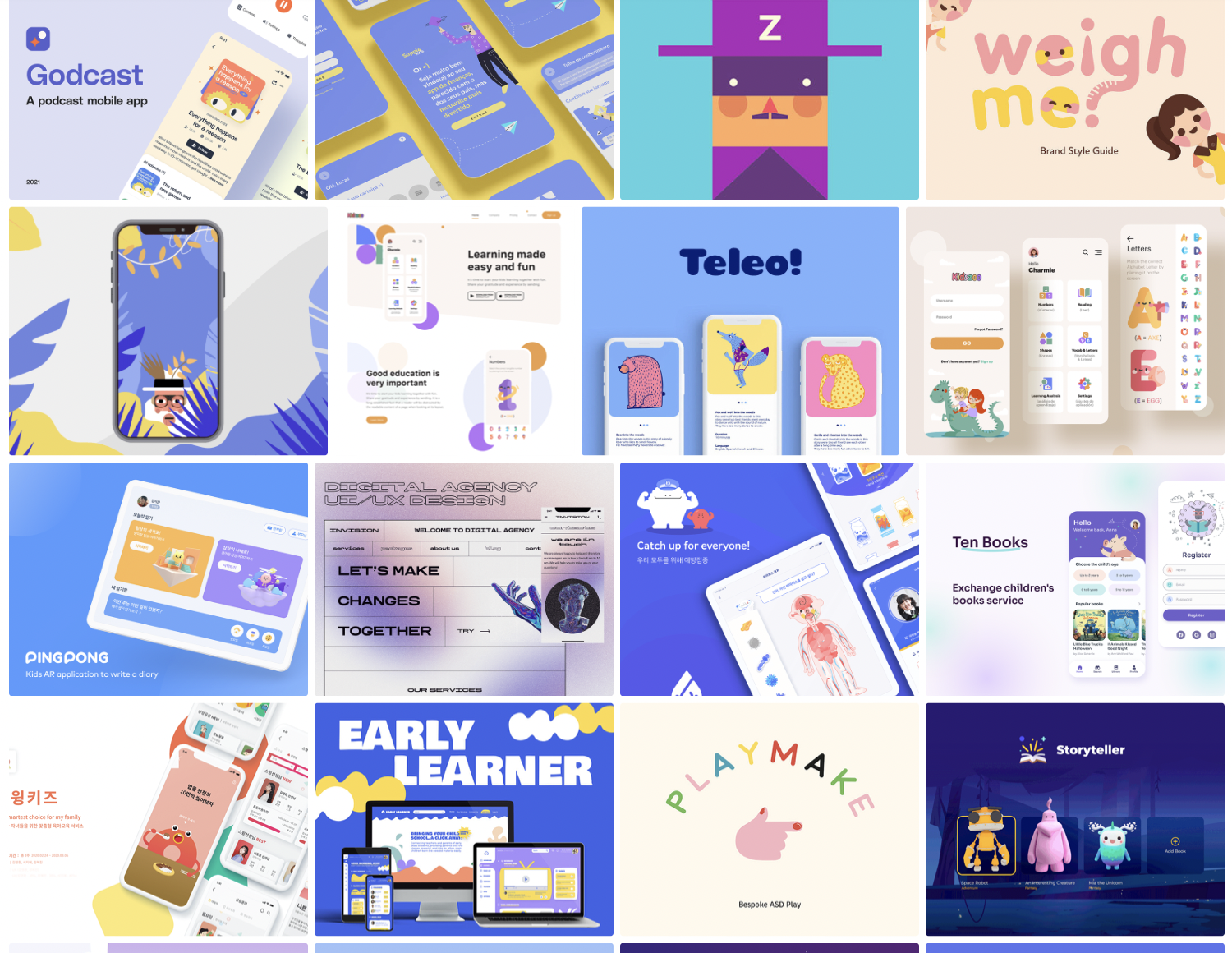
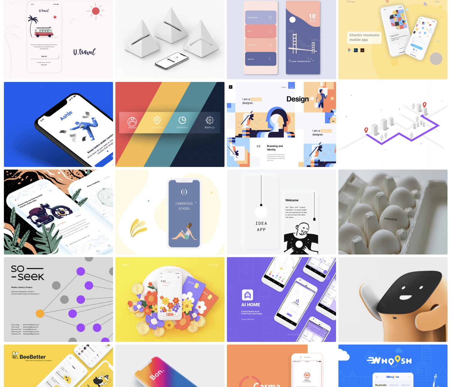
8. Mobile app design mood board example
Designing a mobile app has many complex steps, but this can be made easier with a mood board. Gather inspiration from your favorite apps to use, from the app layout to illustration style and color palette. Putting these options all in one place will help clearly show what direction you want to set off in.
9. Posters mood board example
Working on a poster? Whether it’s digital or print, getting the design right is crucial. You need to be aware of space, color, font, images… the list goes on. A mood board can help narrow down each of these elements until you’re left with a definitive picture of what you want energy you want your poster to give off.
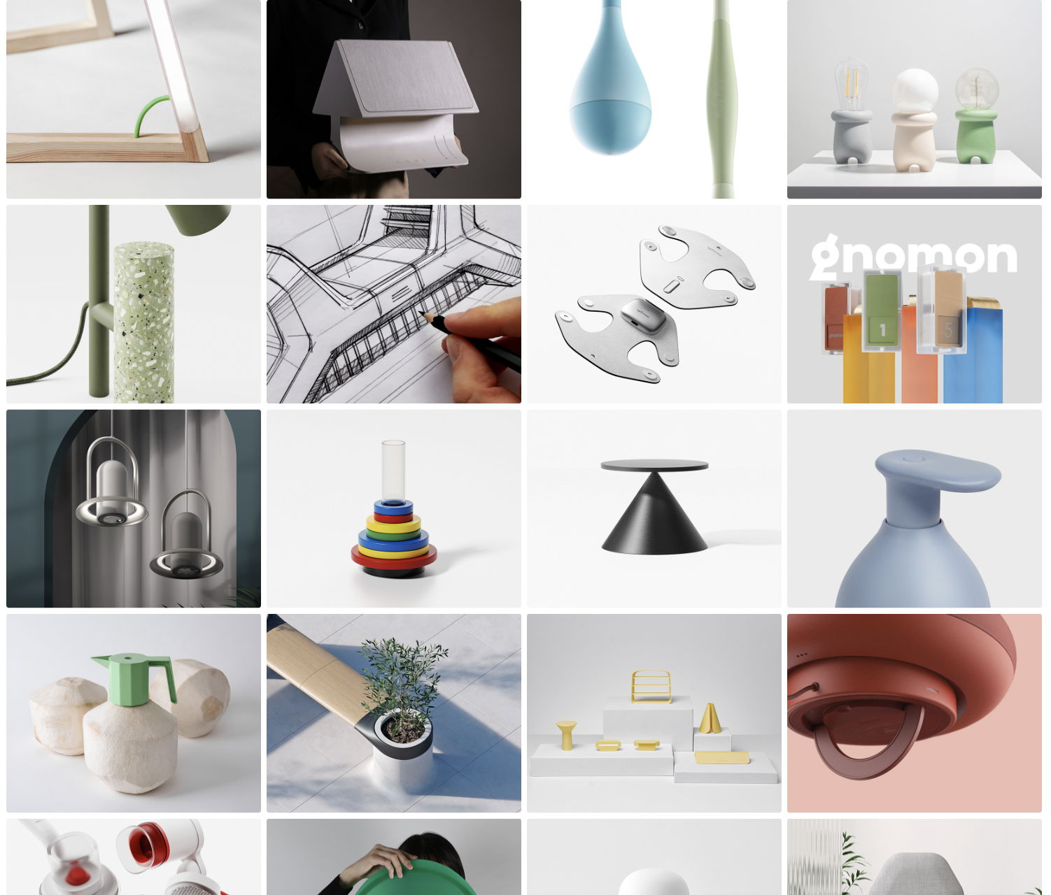
10. Product design mood board example
Using a mood board for product design can really help streamline your conceptualizing. If you have a definitive product style in mind, put together a set of products that exemplify this style. If you’re still narrowing down what design you want, then use a mood board to display product designs you find inspiring or intriguing. Which work well, and which don’t?
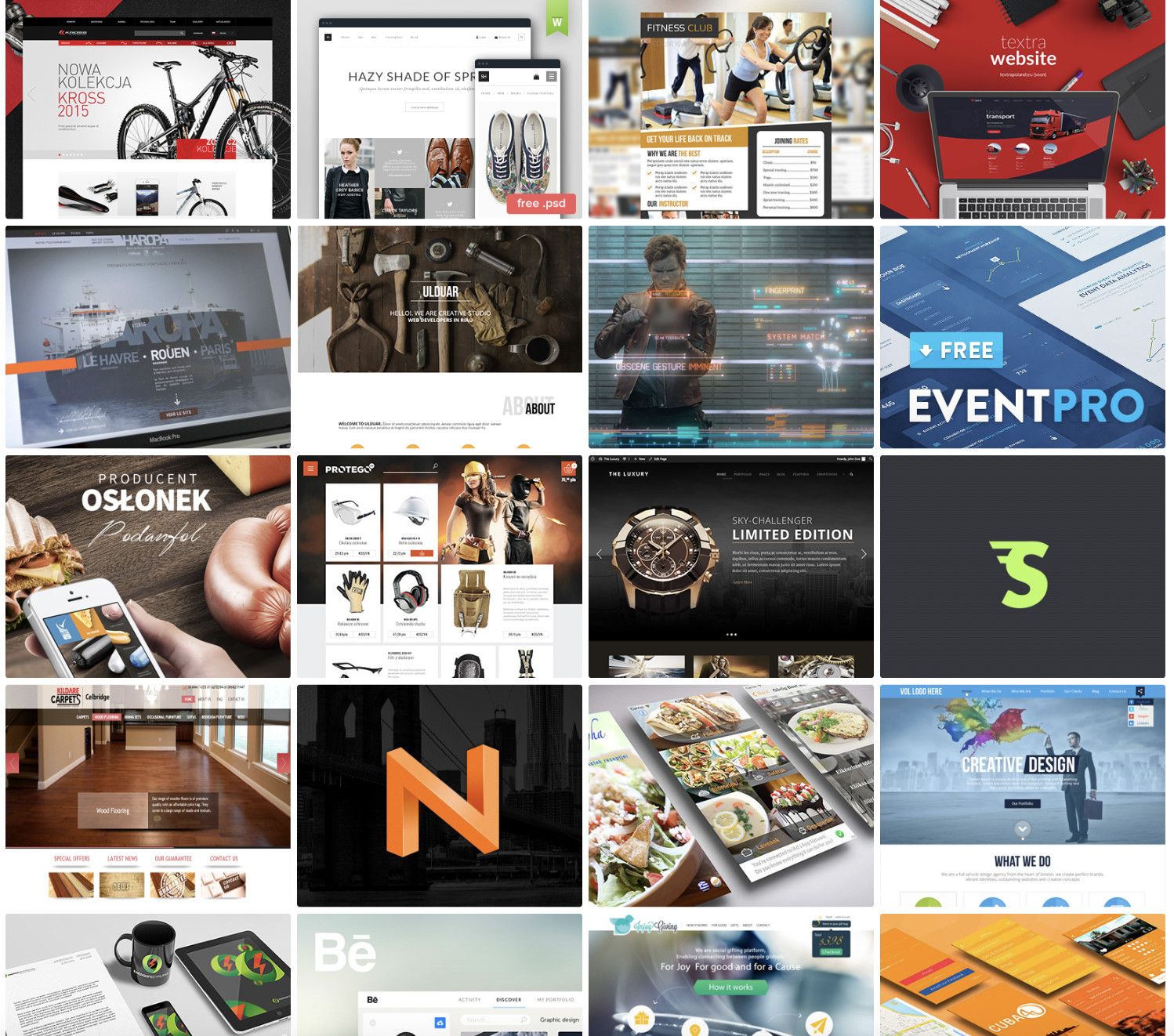
11. Website design mood board example
There's a lot to consider with a new website, whether you're designing from scratch, using a template, or just creating a new page. Use a mood board to consider your favorite websites to use and look at. What elements work, and what don't?
