


Chapter 3
7 Card sorting examples to inform your UX research
Before you get started on your own card sorting study, it’s useful to see how others have used card sorting in their UX research—and how they conducted the sessions. In this chapter, we’ll take a look at seven real-life examples of card sorting, covering different methods and approaches.


While it’s invaluable to learn about each element of card sorting, there’s nothing quite like getting a look at what an actual card sorting session looks like, before you jump into creating your own.
To help inspire you, we’ll be looking at seven different real-life card sorting case studies:
- Mattel, Barbie®
- Eurostar
- Maze
- Activity portal
- Singapore Polytechnic
- Website redesign
- Fortune 500 financial company

You’re probably familiar with card sorting by now, but in case you need a refresher, let’s remind ourselves:
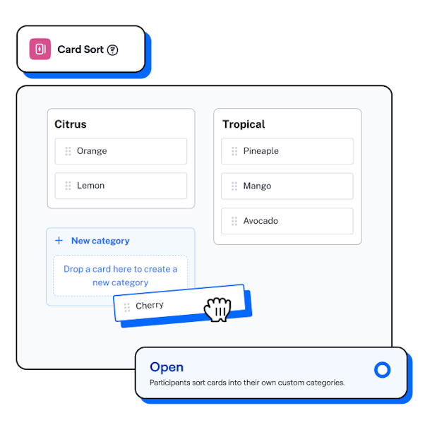
Card sorting is a UX research method which involves people grouping different information cards—physical or digital—into various categories, in a way that makes sense to them.
Card sorting is very valuable, particularly for determining information architecture, because it reveals how certain items would be grouped together if the user were to look for them in their ‘natural habitat’, when no one is looking—which of course, is the real-life condition for our products.
Netali Jakubovitz
Group Product Manager at Maze
Share
The benefits of card sorting are varied and depend on your research goals. They include:
- Understanding your users’ mental models
- Review existing information architecture (IA) or planning new IAs
- Generate ideas and validating current ones
Check out chapter one for more detail on what card sorting is and what it’s used for.
7 card sorting examples (and what we can learn from them)
Now we’re caught up on the what and why of card sorting, let’s get into some examples of card sorting in action.
1. Mattel: Barbie®
Mattel, creators of the Barbie doll, wanted to review the IA of the Doll Showcase section of their Barbie collectors’ website. With a comprehensive gallery of 2,000+ items, the Showcase was popular in user research, but user visits were declining.
The problem
The problems facing the Barbie collectors’ website was largely two-fold:
- The site was organized by marketing-based themes rather than collector perception
- Each theme contained multiple collections/series, with many layers of sub-navigation
The goals
Understand collectors’ mental models regarding the Showcase, and gain ideas for how to reorganize the Showcase using card sorting.
The card sort
Working with nine participants—from new to dedicated collectors, to represent the range of Showcase users—the team ran two card sorts. The first was an open sort, with ~130 cards/dolls from a fashion-focused subset of the Collection. Next up, a closed card sort was conducted, where participants reviewed ~100 cards representing the existing collections/series and were tasked with organizing them into themes.
Card sorting is an excellent tool to use if you’re evaluating whether the current IA works: you can use closed card sorting to validate the structure, or open card sorting to understand how people would group the information themselves.
Guillermo Gineste
Senior Product Designer at Maze
Share
The results
Both the card sort and prior usability tests directed the team to the same conclusion: all collectors browse for dolls and organize their collections in unique ways. This meant a single method of search wasn’t an option. The outcome was a faceted navigation system that allowed users to browse the Showcase by doll name, release year, serial numbers or themes. As a result, use of the Showcase noticeably increased.

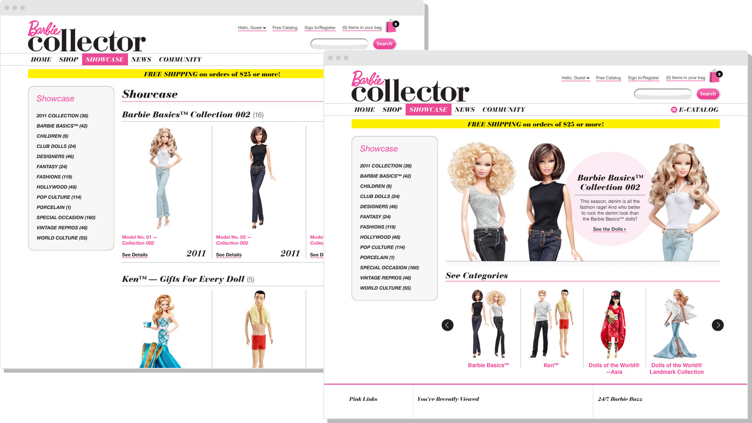
The Barbie collector website
2. Eurostar
In 2005, Eurostar set about to streamline the usability of its website, introduce new booking features, and incorporate a new global brand identity. This required redesigning Eurostar’s global IA, which serves the company’s main website, as well as its country and region-specific websites, too.
The problem
An ambitious project, with a limited timeframe of just six months, Eurostar was faced with several challenges:
- The new IA needed to serve for UK, Europe, and global versions of the site
- Usability of topline navigation needed to be significantly improved
- The existing website contained more than 11,000 different webpages and PDFs (in English alone) which users found challenging to navigate
The goals
Card sorting would be used to identify the navigational elements and IA of Eurostar’s website.
In order to ensure that the redesigned version was as user-friendly as possible, we decided to make card sorting an integral part of the redevelopment process.
Donna Spencer
Independent Design Consultant
Share
The card sort
After inventorying existing content, spreadsheets were used to capture the details and position of the website’s IA. Stakeholder workshops determined which items were deemed most important to be sorted and well-defined areas like About Us, Contact Us etc. were omitted.
With the goal of uncovering how users instinctively grouped Eurostar’s content, the team decided on unmoderated, open card sorting. This took place through online card sorting software, featuring ~80 cards and 180 participants—split into 20-user groups—from three different countries.
The results
With 14,400 results items to catalog, the use of an online platform was invaluable. Analysis of the results showed users broadly grouped content either chronologically, or according to established online conventions/expectations. Additional cluster analysis of the card sort resulted in Eurostar’s new IA, which combined a chronological layout with top-level groups for booking and planning-related information.
At a later date, a further card sort (closed) was conducted to verify the improved IA, and results were overwhelmingly positive, validating four-out-of-five of the top-level groups.

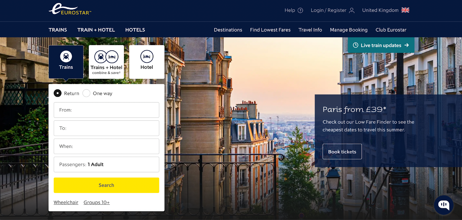
Eurostar's website today
3. Maze
Maze is a product research platform that empowers anyone to test and learn rapidly—via intuitive, customizable user tests and surveys (called mazes).
While researching the value of notifications, the Maze product team used card sorting to gather information on which notifications, if any, users would like to receive regarding the status of their and their team members’ mazes.
The problem
Implementing new platform notifications or altering existing ones is a tentative process, as too many notifications may overwhelm or frustrate users, and editing existing notifications may cause confusion. The team had several key questions:
- What information, if any, are users interested in receiving from their own mazes?
- What information, if any, are users interested in receiving from other members’ mazes?
- What impact do we expect notifications to have on the number of teams with 2+ monthly result/report consumers?
The goals
Use card sorting and a bank of existing research questions to understand the user’s experience and problems. The team also wanted to get initial feedback on potential high-level solutions.
The card sort
Deciding on closed, unmoderated card sorting conducted via Maze, the team ran the session with a group of 20 participants. To gain feedback on possible solutions, respondents were given four categories (from ‘painful’ to ‘very helpful’) and a number of solutions, then asked to sort by ‘level of helpfulness’.
The results
The results were organized via Maze’s report tool, before being further analyzed and put into a Notion document by the product team. The primary findings shared that a majority of users would find it helpful to receive notifications when their target number of responses have been reached, and the majority prefer email as a notification channel.


Agreement matrix visualization from Maze’s card sorting feature
While the final outcomes of this research are still underway, the results from this card sort will be valuable to future developments. And if you’re a Maze user, you’ll even see the changes for yourself!
4. Activity portal
Tasked with organizing information for a young people’s activity portal, UX designer and founder of UXParis, Sylvie Daumal, needed to determine how users would like the IA to be structured. Card sorting seemed like the obvious solution.
Card sorting was incredibly helpful because it gave us some very good insight about the way young people see their lives and organize their schedules (their mental models, in a sense).
Sylvie Daumal
UX Designer at UXParis
Share
The problem
With lots of information needed on the website, from school-focused content, to extracurricular and local activities, the team had many questions about how to organize the content, like:
- Should we create categories for things like school, culture, art, and sports at the first level of navigation?
- Would it be relevant to create a distinction between things like swimming pool times and school swim team training?
- Should we create a distinction between the diploma levels (two, three, or four-year)?
The goals
Use card sorting to gain insight into users’ mental models and guide the structure and IA of the activity portal.
The card sort
Deciding on an open card sort with a group of target users, cards were populated with different words representing everything from local concerts to regular school activities and educational courses. The participants were then asked to sort these into groups that made sense to them.
The results
The results offered valuable and surprising insight—respondents didn’t differentiate between subjects, like culture and sport, but they did consider differences between regular activities (e.g. training, classes or clubs) and events they could opt into (e.g. a concert or one-off activity). As a result, the first layer of navigation was determined to be ‘Activities’ and ‘Going Out’.
Further results revealed that users focused on fields of study or potential vocations (e.g. tourism course), rather than diploma-related categories (e.g. three-year diploma). This determined that school-related sections of the portal should be organized according to field, with course/diplomas that related back to that field being displayed within the content.
The insight gained from the card sort overwhelmingly informed—and altered—the final portal and levels of navigation, and the team felt fully confident in their final site map.
5. Singapore Polytechnic
As part of an ongoing project to evaluate the usability of Singapore Polytechnic’s current website, Hilary Chan, an Economic Architect based in Singapore, employed a combination of user research methodologies—including card sorting.
The problem
- The project had identified some key issues with the existing website, namely:
- The site contained multiple layers of sub-navigations within sub-navigations
- Inconsistent branding across different academic schools within the wider university—each school maintained its own website with different design, content and branding
- Good content was typically hidden in obscure links or hard-to-find pages
The first task we had on hand was to understand how users of the site grouped pieces of the available content—knowing these groupings would help inform and guide the foundation of our IA.
Hilary Chan
Economic Architect
Share
The goals
The Singapore Polytechnic team used card sorting to understand how users group pieces of content and information together on the site.
The card sort
The team went for an open card sort via a digital card sorting tool, working with 24 respondents. They provided participants with existing content from the website and asked them to sort the content into categories as participants saw fit. This data would later be reviewed and narrowed down via tree testing.
The results
Using the results of the card sort, it became clear that three major groups could be derived from the exercise: courses grouped by topic, student life, and admissions & financial matters. This then formed the basis of the IA for Singapore Polytechnic’s new site.

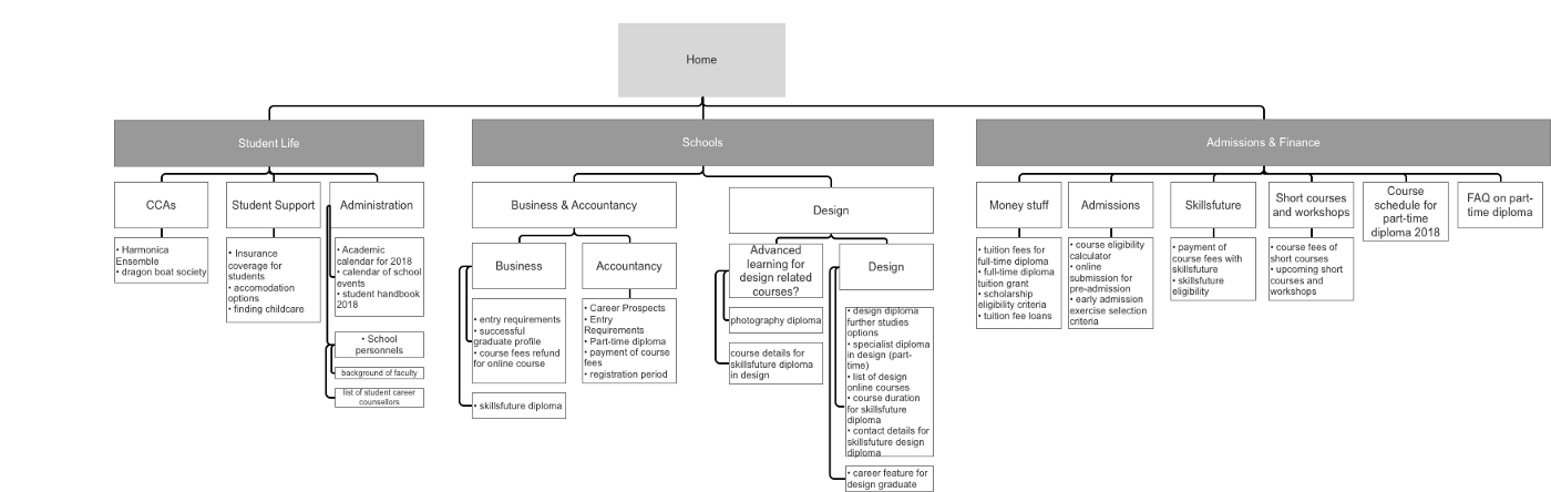
Dendrogram from Singapore Polytechnic card sorting exercise
6. Website redesign
While working on a website redesign project, Donna Spencer, Independent Design Consultant, decided to use card sorting to inform the website’s IA and site map.
The problem
There were two key issues with the current website that needed to be addressed in the redesign:
- The company had a varied—and sometimes very technical—set of responsibilities, which needed to be made accessible to a visitor
- The current website was organized by company structure, meaning the average user couldn’t find the information they needed
I spent a long time analyzing the content—learning what was on the website, the types of information, topics covered, and the key relationships between topics. Even after staring at the content for days, I couldn’t figure out how it fit together or how I could reorganize it. The natural solution was to run a card sort.
Donna Spencer
Independent Design Consultant
Share
The goals
By using card sorting, the website IA could be redesigned to ensure users could find information, understand the company’s purpose and areas of expertise, and allow the website to expand along with the company.
The card sort
The team wanted to understand how users familiar with the content would organize it, so the card sorting session took the form of open, moderated card sorting with 21 internal staff members as participants. Main topics of content were used for cards, rather than specific pages, and a simple spreadsheet analysis matrix was used after the sort.
The results
While some cards were sorted in similar ways by everyone, there were many outliers. Here, the team discussions that accompanied the sort were most useful, revealing why some topics were linked, what was understood—and what wasn’t.
Following in-depth analysis of the card sort and user research, it was determined that a hierarchical categorization scheme for this website would be near impossible. So, the final website was organized by rough topic groupings, with independent mini-sites as offshoots for each topic. As a result, the home page clearly showed all areas of the company’s responsibilities, while users—regardless of prior knowledge—could head straight to the topic they were focused on.
7. Fortune 500 financial company
The marketing team of a Fortune 500 financial company were working with John Nicholson, Principal Consultant at Marketade, to create a microsite to hold brand-related and marketing content that had previously been spread across multiple channels. With a plethora of unsorted content and a new website IA to determine, they needed a site structure that would help visitors navigate and browse content.
They had about 125 articles ready to go, spanning a wide range of topics, and plans to create hundreds more. The microsite would have its own navigation, but the team needed a way to organize the content that made sense to users.
John Nicholson
Principal Consultant at Marketade
Share
The problem
Starting from scratch, the challenge was to design a website that worked for both the user and the company’s goals. The team already had ideas about how to structure and label the IA—but none of these had been validated with real users, and were based on a majority of guesswork and intuition.
The goals
Having already invested time into the ideas and pre-design of the website, the company was looking to validate these existing IA ideas, with minor tweaks where needed.
While the project team initially wanted to use hybrid or closed card sorting, as they already had proposed categories, it was decided that to ensure the site made sense to users, an open sort would be most effective.
The card sort
And so, an open, digital card sorting session took place, as stage one of a four-week project. The card sort would then be followed by a series of IA tree tests, between design iterations.
The card sort featured 100 cards out of a potential 125 content pieces, all of which were at the same content ‘level’ (e.g. all articles). First, 55 participants were selected from the target market, who took part in qualitative, moderated card sorting as part of five user groups. Next, 50 users ran through quantitative, unmoderated sessions with the same cards.
The results
Using an online tool to sort the quantitative data, the team used data visualizations—a dendrogram and similarity matrix—to get an overview of standardized categories.
After capturing observations from the moderated sessions, all the results were combined and reviewed to form three IA options. These were then tree tested (more on tree testing vs. card sorting in our Tree Testing Guide), and ultimately the final IA resulted in a 75% increase in content findability.
After running an open card sorting study, I may want to test the results again, using a closed card sort. At this point, tree testing works just as well for validating whether your results mean what you think they mean.


Guillermo Gineste
Senior Product Designer at Maze
Share
Take card sorting into your own hands
We’ve reached the end of this chapter, and you’re ready to go forth and run your own card sorting sessions! Ultimately, whether you’re redesigning a website, building a new product, or gathering ideas—these examples show how varied the application of card sorting can be, and how valuable the results are.
While all the examples above used card sorting in different ways, it’s overwhelmingly clear that card sorts are made far more manageable with the assistance of a digital card sorting tool.
Card sorting is a complex process with many considerations needed, and many chances for mistakes or missing UX best practices. Removing the risk of human error—and relieving yourself of the manual workload—can be a big support, giving you room to breathe and focus on the bigger picture.
Next in our card sorting guide, we’ll be delving into the best card sorting tools for your tool stack. Read on to find out more.
Build better, with card sorting
Design plans are great, but they’re only plans. Use card sorting from Maze to validate ideas, generate new ones, and get insight from real users earlier on.
Frequently asked questions about card sorting examples
How many users is enough for a card sorting study?
How many users is enough for a card sorting study?
With card sorting, between 20-30 users is an ideal number of participants. However, some studies feature up to 100 users or less than 15 participants. Regardless of number, if you’re going for a moderated card sort, it’s good practice to divide users up into smaller groups—often around four or five people per group.
How do you organize a card sort?
How do you organize a card sort?
There’s eight steps to organizing a card sort:
- Document your assumptions
- Choose a topic based on your research goals
- Prepare the card sorting test
- Choose your card sorting type
- Run a dry test before a real session
- Launch the study
- Hold follow-up interviews for additional analysis
- Analyze the results
How do you present card sorting findings?
How do you present card sorting findings?
There’s several ways to present your card sorting findings. Some people prefer to work with spreadsheets to display the data, however this can be time-consuming if you’re manually inputting all the results.
When using a digital card sorting tool, many will have functionality that can collate your findings and generate a report presenting them for you.