


Chapter 9
Reporting with Maze
Maze reporting turns every study into a decision-ready story so you can move from usability testing data to actionable user insights fast.
Reports are automatically created for each study as soon as at least one participant completes it, giving your team AI-powered, automated reports with usability metrics like success rate, usability score, and misclick rate.
You also get heatmaps, open question learnings, and user behavior trends that you can benchmark, embed, and share with stakeholders in just a few clicks.
In this chapter, we'll cover:
- What Maze reports are
- Key elements included in a report
- Customizing and tailoring your report
- Sharing reports
- How to integrate reports into your research workflow
What Maze reports are
Maze reports are automatically created dashboards that summarize results from your Maze tests in a structured, slide-like format. They surface the most important usability metrics, visualizations, and insights in a structured format so you can:
- Understand how users interacted with your design, prototype, or live website test
- Communicate results with teammates and stakeholders in a consistent format
- Inform decisions for your next sprint, release, or design iteration
Reports are created for every live study as soon as at least one participant completes it, though testing with 20+ participants is recommended for stronger statistical confidence.
Key elements included in a report
Each Maze report is made up of a set of sections that highlight different parts of your user research.
As mentioned in chapter 8, the exact sections you see depend on the blocks in your live maze, but most reports will include the following:
- An overview and usability score
- Core usability metrics
- Navigation and path analysis
- Heatmaps and block-specific results
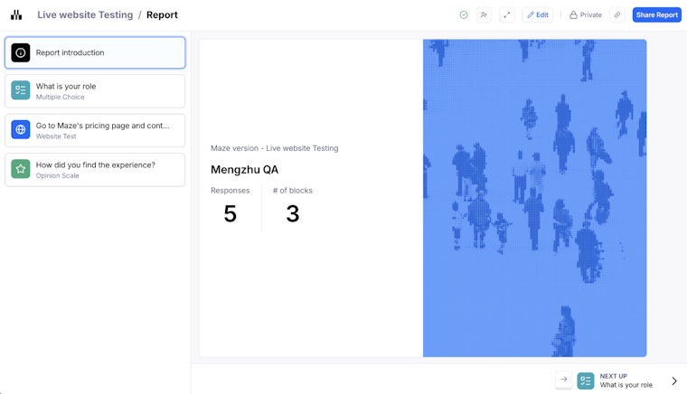
Report overview and usability score
The report overview gives you a quick snapshot of your live maze before you dive into detailed usability metrics. On this first slide, you’ll see the study name, Maze version, number of responses, and how many blocks are included in the report.

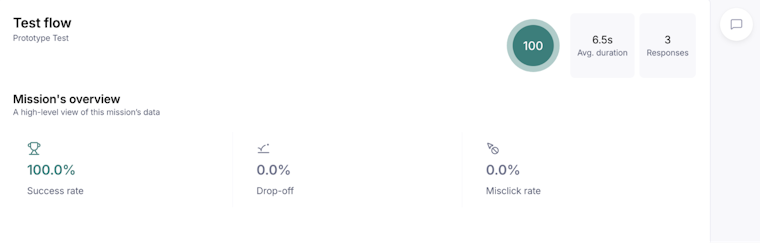
The usability score then measures your design’s usability on a scale from 0 to 100. It’s calculated from three key indicators:
- Success
- Duration
- Misclicks
Maze applies this score to the overall study, to each task, and to each screen in your expected paths, using thresholds of 80–100 for high usability, 50–80 for medium, and 0–50 for low. This allows you to quickly compare user experience across different versions or iterations.

Usability and success metrics
The usability metrics section breaks down how each task performed in your usability testing.
For every task, Maze shows:
- Usability score, based on exit rate, misclick rate, and average duration
- Direct success, the percentage of participants who completed the task via an expected path
- Task unfinished, the percentage of participants who abandoned the task or stopped before the final screen
- Total participants, the number of people who attempted that task
- Misclick rate, the percentage of clicks outside a clickable area
- Average duration, the average time each participant took to complete the task
You can quickly spot flows that have a high success rate but still hide friction, like long completion times or a high misclick rate, before you move on to navigation and path analysis.

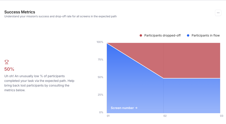
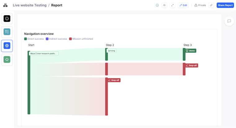
Navigation, user paths, and expected paths
The navigation overview shows how participants moved through your expected paths during a task. It focuses on the paths you defined as part of your usability testing, so you can see how user behavior lines up with the ideal flow.
In this section, you can:
- Scan each expected path to see how participants progressed screen by screen
- Click into individual frames to open the full expected path analysis for that screen
- Spot where people drop off or diverge from the intended journey
Since Maze reports only show expected paths, this view works best when your success rate is already high. If success rates are lower, you can pair this navigation overview with the raw results dashboard to investigate indirect paths and understand where participants took alternative routes.

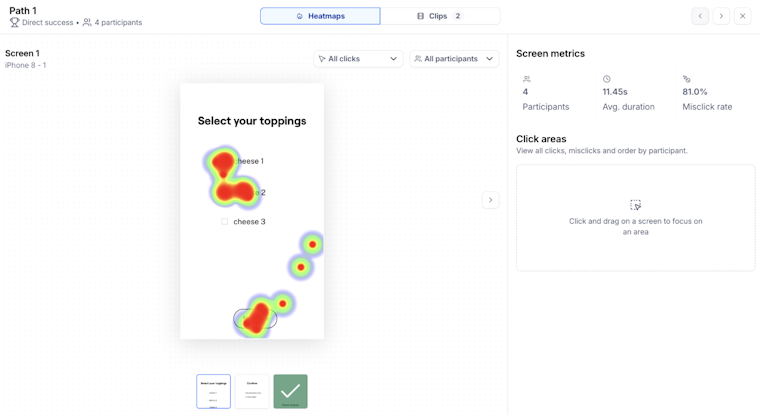
Heatmaps and interaction visualizations
Visual heatmaps show where participants clicked or tapped, and path analysis highlights flow patterns, helping reveal unexpected interactions or design friction. They complement your usability metrics by showing the actual interactions behind success rates and usability scores.
In this section, you can:
- View click heatmaps to see which elements drew attention and where misclicks clustered
- Scan screens where participants went off the expected path to understand what they tried first
- Pair visual patterns with metrics like misclick rate and average duration to pinpoint friction in the user experience

Question, card sorting, and tree test results
This part of the Maze report focuses on results from your question blocks and information architecture tests. It brings together closed questions, open questions, card sorting, and tree tests. So you can see how people think, feel, and organize information alongside your usability metrics.
For question results, Maze reports show:
- Card sorting insights, including Top categories, Top cards, Outlier cards, and Unique categories for open card sorts, with optional agreement and similarity matrices
- Tree test results showing the most popular end screen and the most common paths through your hierarchy

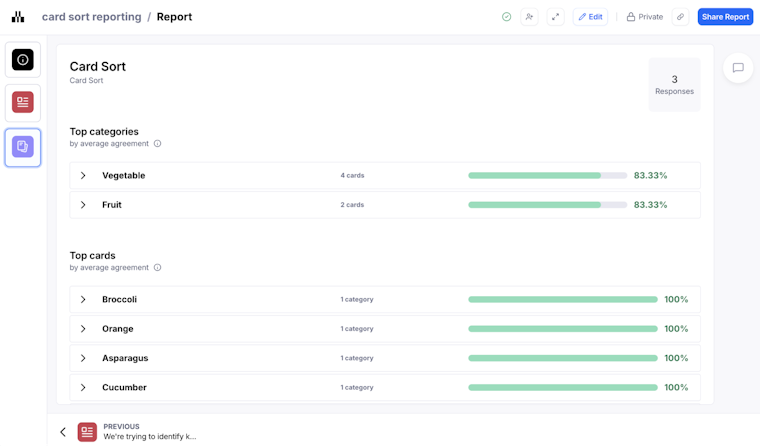
Together, these questions, card sorting, and tree test results help you connect your usability metrics with rich user insights and mental models.
Customizing your Maze report
You can edit the Maze report to add context, shape the narrative, and focus attention on the most useful user insights.
You can:
- Add or remove slides
- Edit text or narrative context
- Rearrange sections to fit your story
- Hide the usability score if appropriate for your audience
- Show or hide card sorting matrices and Open Question responses depending on what’s most relevant
Any changes you make are saved automatically, and all authenticated team members with the right access can edit the report (more on roles and access in the next chapter).
💡 If you change your live study, for example, by editing blocks, adding tasks, or updating questions, Maze regenerates the report and resets any custom edits you’ve made. To avoid redoing your work, finish making the changes you need to your live maze first, then customize the report once you are happy with your final study setup.
How reports fit into your workflow
Reports should be a central part of your research process. It sits between running research and making decisions, turning raw user behavior into a clear story your team can act on:
- Run a study (prototype test, live site test, survey, card sort, etc.)
- Review the automated report to spot trends and performance signals
- Add context or narrative to elevate insights
- Share with product, design, and leadership to create alignment
- Act on findings in your next design or development cycle
By automating heavy analysis and preparing shareable outputs, Maze helps teams spend more time on decisions and actions rather than manual reporting.
Up next: Collaborating and sharing your Maze reports
In the next chapter, we look at how you can use Maze reports as a shared space for collaboration, feedback, and decision-making. We’ll also show you how to share or embed reports with stakeholders and export them. So, insights from Maze move into everyday product conversations.